
React Native is an open source JavaScript framework used to build mobile applications. One of the biggest advantages that React Native has when compared to other languages and frameworks is its ability to build cross-platform applications, which use one codebase and run on both iOS and Android.

This is an important aspect because it allows for much faster app development; you don’t have to build the same app twice and separate your teams for each platform. Mobile apps continue to grow in popularity so having an effective mobile app development workflow is an essential part of any digital business.
Having good layout management is also extremely important when developing a responsive mobile design that is visually appealing to users. React Native supports the web layout box model Flexbox, which makes it easy for any web developer to learn because you are essentially writing the same CSS styles. This implementation is handled by the Yoga layout engine, which was developed for React Native applications.
In this article, we will explore the latest release of React Native v0.74, featuring the release of the Yoga 3.0 layout engine, which brings with it some new functionalities and bug fixes.
The Replay is a weekly newsletter for dev and engineering leaders.
Delivered once a week, it's your curated guide to the most important conversations around frontend dev, emerging AI tools, and the state of modern software.
Yoga 3.0 is a layout system that can be implemented into different frameworks, including React Native. Its main purpose is to calculate the position and sizes of various boxes on a screen. This is the core principle used for putting together a user interface. The layout system is designed to use the popular CSS flexbox model, which makes it easy to share code between web and mobile applications.
With the latest release of Yoga 3.0, there have been some improvements to layout performance, especially with improving predictability and consistency in web interactions. Although there may be some intentional layout quirks, those are preserved for backwards compatibility. Overall, the latest version of React Native more closely follows the web standards set out in the Yoga 3.0 API.
One of the most important additions in Yoga 3.0 is its complete support for CSS’s static position. This is essential when developing online applications and web pages. The static position guarantees that items stay in their original spot and do not move around.
Elements with a static position cannot be offset, which means they will not move from their default position. Additionally, they are ignored when defining the containing block for absolutely positioned items. This allows you to place an element relative to an ancestor other than its immediate parent, giving you more layout options.
Overall there have been quite a few improvements to this latest version, including:
position: static and align-content: space-evenlyNow let’s take a look at some of the updates that have been made in React Native v0.74.
The first new update to mention are layout inversions. The behavior of margin, padding, and border properties on row-reverse containers has changed; it is now the same as the web so there are no more discrepancies. For example, the flex-direction property in Yoga 3.0 now works the same way as it does in CSS when using flexbox on the web.
Another new addition is the CSS property alignContent: space-evenly, which evenly distributes the lines inside of multi-line flex containers.
These updates are likely to require old codebases to be updated. However, in the long run, the outcome is much more positive and you can expect your codebase to more finely line up with the web version of flexbox.
You can see what they look like in the following code example:
import { View, SafeAreaView, Text } from 'react-native';

export default function HomeScreen() {
  return (
    <SafeAreaView>
      {/* Improved layout code example */}
      <Text style={{ margin: 10, fontSize: 24 }}>
        Improved layout code example
      </Text>
      <View
        style={{
          flexDirection: 'row',
          backgroundColor: 'red',
          margin: 10,
          width: 200,
          height: 100,
        }}
      >
        <View
          style={{
            flexDirection: 'row-reverse',
            backgroundColor: 'blue',
            flex: 1,
            marginLeft: 50,
          }}
        >
          <View
            style={{
              backgroundColor: 'green',
              height: '50%',
              flex: 1,
              marginLeft: 50,
            }}
          />
        </View>
      </View>

      {/* alignContent: "space-evenly" code example */}
      <Text style={{ margin: 10, fontSize: 24 }}>
        alignContent: "space-evenly" code example
      </Text>
      <View
        style={{
          flexWrap: 'wrap',
          alignContent: 'space-evenly',
          height: 200,
          backgroundColor: 'yellow',
        }}
      >
        <View style={{ width: 50, height: 50, backgroundColor: 'red' }} />
        <View style={{ width: 50, height: 50, backgroundColor: 'blue' }} />
        <View style={{ width: 50, height: 50, backgroundColor: 'green' }} />
      </View>
    </SafeAreaView>
  );
}
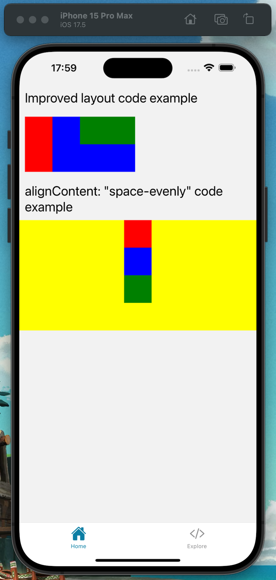
The new and improved code layout can be seen at the top of the code, which now accurately matches up with how the logic works for CSS flexbox on the web and space-evenly can be seen in the bottom half of the code.
Due to the bug in this example, the layout would look like the following image for row reverse:

To get a visual representation of how the new and correct code looks, take a look at the screenshot below here in an iOS simulator:
In addition to the updates mentioned above, React Native 0.74 also introduced a new Bridgeless Mode that enhances interoperability and performance by reducing the overhead caused by the JavaScript bridge that previously led to bottlenecks and slowdowns.
The last major update to talk about is the new Batched Layout, which brings with it a new batched onLayout update that is capable of decreasing the amount of time it takes for your app to render.
We can see a code example of it here:
import { useState } from 'react';
import { View, Text, StyleSheet, LayoutChangeEvent } from 'react-native';

export default function CombinedWidth() {
    const [combinedWidth, setCombinedWidth] = useState<number>(0);
    const [widths, setWidths] = useState<number[]>([0, 0, 0]);

    const handleChildLayout = (event: LayoutChangeEvent, index: number) => {
    const { width } = event.nativeEvent.layout;
    const newWidths = [...widths];
    newWidths[index] = width;
    setWidths(newWidths);
    setCombinedWidth(
    newWidths.reduce((sum, currentWidth) => sum + currentWidth, 0)
    );
};

return (
    <View style={styles.container}>
        <Text style={styles.text}>Combined Width: {combinedWidth}</Text>
    <View style={styles.row}>
    <View
        onLayout={(event) => handleChildLayout(event, 0)}
        style={styles.box}
    />
    <View
        onLayout={(event) => handleChildLayout(event, 1)}
        style={styles.box}
    />
    <View
        onLayout={(event) => handleChildLayout(event, 2)}
        style={styles.box}
    />
    <View
        onLayout={(event) => handleChildLayout(event, 3)}
        style={styles.box}
    />
    </View>
    </View>
    );
}

const styles = StyleSheet.create({
    container: {
        flex: 1,
        justifyContent: 'center',
        alignItems: 'center',
    },
    text: {
        fontSize: 18,
        margin: 10,
    },
    row: {
        flexDirection: 'row',
    },
    box: {
        width: 50,
        height: 50,
        backgroundColor: 'green',
        margin: 10,
    },
});
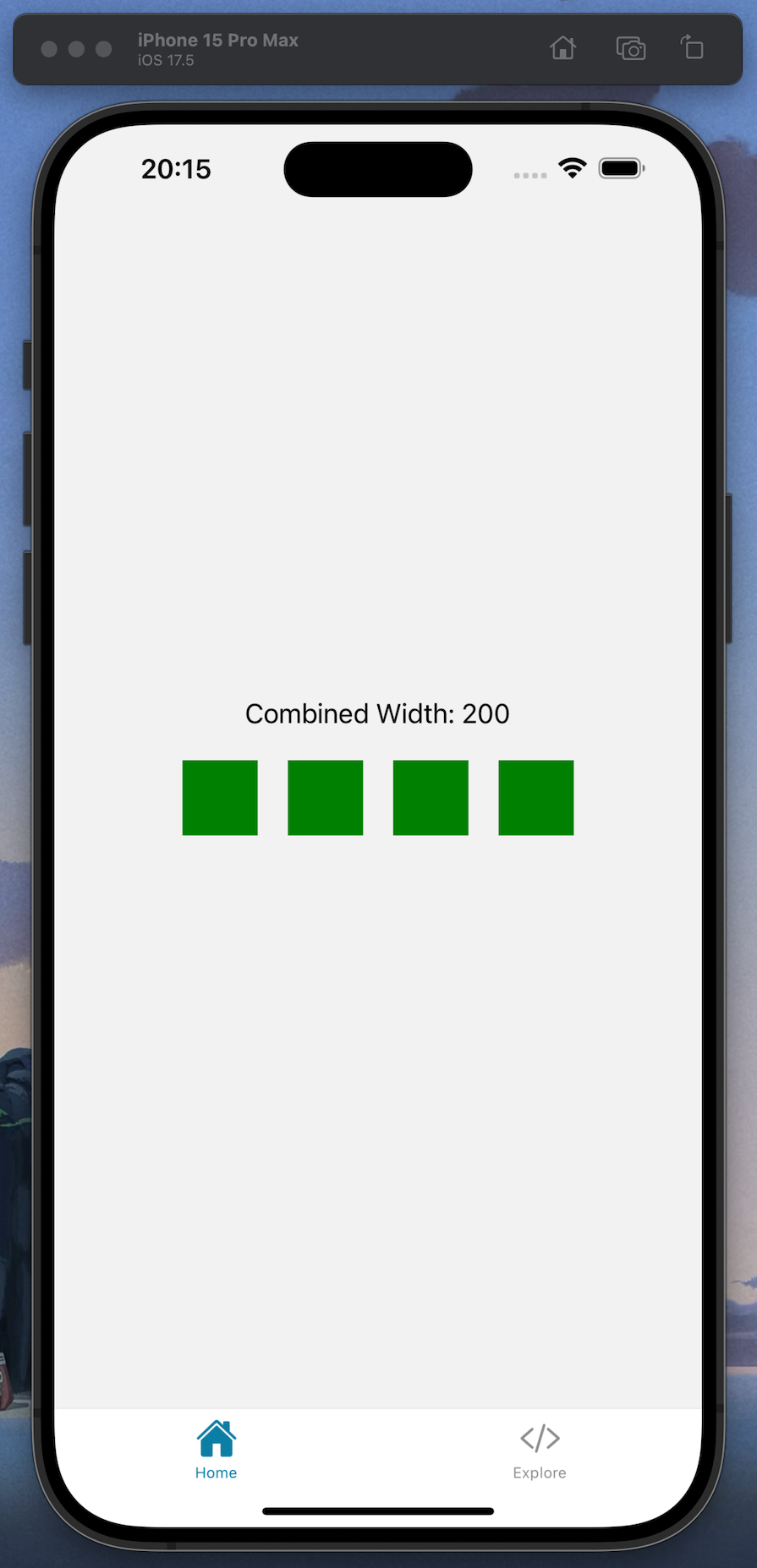
This code example demonstrates how to quickly determine and display the total width of multiple child elements within a parent component. It uses batched onLayout changes to keep the state in a performance-optimized approach and dynamically manage layout changes.
Take a look at a running demo of the code in this iOS simulator screenshot:
Now that we reviewed the latest features, breaking changes, and updates, let’s take a look at how Yoga’s flexbox implementation compares with CSS flexbox.
Yoga 3.0 was designed for mobile development environments, so it is better optimized when used in React Native applications because of its integration with native mobile operating systems.
When using Yoga 3.0 in React Native applications, it’s possible to make use of the natural native layout systems, which result in better performance and significantly fewer calculations when creating layouts. The Yoga 3.0 documentation on styling covers all the available styles.
In comparison, flexbox is primarily used when creating layouts for web-based applications and websites. Flexbox works inside of web browsers and makes use of their rendering engines. It is built to work with HTML and CSS and excels in those types of web-based environments.
Although Yoga 3.0 is a good layout engine, there are some areas and properties of the CSS flexbox model that Yoga 3.0 either does not support or handles slightly differently. Let’s take a look at some of the differences next.
Yoga 3.0 supports much of the CSS flexbox API, however there are some differences. One such difference is that pseudo-classes and pseudo-elements such as :first-child and ::before are not supported in Yoga 3.0; styles must be used directly in the logic. It’s a similar case with media queries, which are typically done through JavaScript logic like Dimensions, whereas in regular CSS all of these would be achieved in stylesheets.
There are also some missing properties that I have listed here:
flex-basisflex-shorthandflex-wrap with wrap-reverseordergapIn the following sections, we will explore them in more detail and compare them to their CSS flexbox counterparts.
flex-basisIn CSS flexbox, the flex-basis property is used to set the default size for elements on a page before the remaining space is allocated. Yoga 3.0 does not support flex-basis and instead uses the width and height properties alongside flex-grow and flex-shrink to achieve the same effect.
Comparison examples can be seen here. In this example, we can see how to do flex-basis in plain CSS:
.container {
  display: flex;
}

.item {
  flex-basis: 200px;
  height: 100px;
  background-color: lightblue;
}
And here we can see what it looks like in Yoga 3.0. In this example, we use the width property instead of flex-basis:
import { View, StyleSheet } from 'react-native';

export default function FlexBasisExample() {
  return (
    <View style={styles.container}>
      <View style={styles.item} />
    </View>
  );
}

const styles = StyleSheet.create({
  container: {
    flexDirection: 'row',
    justifyContent: 'flex-start',
  },
  item: {
    width: 200, // Use width instead of flex-basis
    height: 100,
    backgroundColor: 'lightblue',
  },
});
flex-shorthandWhen using CSS flexbox, we can use the shorthand flex property to set different properties all on one line of code — for example, setting grow, shrink, and basis on one line as shown here:
flex: 1 0 auto;
Yoga 3.0 does not support shorthand code, meaning all properties must be set directly.
flex-wrap with wrap-reverseWith CSS flexbox, it’s possible to wrap elements on multiple lines using wrap-reverse, which is capable of reversing the direction. Yoga has support for flex-wrap but is unable to use wrap-reverse.
Here we can see what it’s like to use it in plain CSS:
.container {
  display: flex;
  flex-wrap: wrap-reverse;
}

.item {
  width: 100px;
  height: 100px;
  background-color: lightBlue;
  margin: 5px;
}
As you can see, the syntax is pretty readable. And this is what it looks like when using React Native:
import { View, StyleSheet } from 'react-native';

export default function WrapReverseExample() {
  return (
    <View style={styles.container}>
      <View style={styles.item} />
      <View style={styles.item} />
      <View style={styles.item} />
      <View style={styles.item} />
    </View>
  );
}

const styles = StyleSheet.create({
  container: {
    flexDirection: 'row',
    flexWrap: 'wrap',
    justifyContent: 'flex-start',
    alignItems: 'flex-end', // Align items to the end to simulate wrap-reverse effect
  },
  item: {
    width: 100,
    height: 100,
    backgroundColor: 'lightblue',
    margin: 5,
  },
});
In this example, we have to use alignItems: 'flex-end', to get the same outcome.
orderThe order property lets us change the order of our elements on the page or screen in the web version of flexbox. It does not appear to be well supported in Yoga, however. Let’s see how this looks in the code.
First is our CSS example, which you can see here for order:
.container {
display: flex;
}

.item1 {
order: 2;
width: 100px;
height: 100px;
background-color: lightBlue;
}

.item2 {
order: 1;
width: 100px;
height: 100px;
background-color: lightGreen;
}
The code works as expected with each item having its order set by numerical value. And here is our React Native code example:
import { View, StyleSheet } from 'react-native';

export default function OrderExample() {
  return (
    <View style={styles.container}>
      <View style={styles.item1} />
      <View style={styles.item2} />
    </View>
  );
}

const styles = StyleSheet.create({
  container: {
    flexDirection: 'row',
  },
  item1: {
    width: 100,
    height: 100,
    backgroundColor: 'lightblue',
  },
  item2: {
    width: 100,
    height: 100,
    backgroundColor: 'lightgreen',
  },
});
Order is not supported so you can’t change the order of the items.
gapIn CSS flexbox, the gap properties determine how much spacing there is between our flex items. This can be achieved by using the properties gap, row-gap, and column-gap. Yoga only has support for gap.
Let’s compare the two in our code examples. First up is our flexbox CSS example:
.container {
  display: flex;
  gap: 20px;
  width: 200px;
  height: 250px;
  padding: 10px;
  flex-wrap: wrap;
}

.item {
  width: 100px;
  height: 100px;
  background-color: lightBlue;
}
As you can see, there is a 20px gap for all items inside of the container.
Now let’s take a look at the same code in React Native:
import { View, StyleSheet, SafeAreaView } from 'react-native';

export default function GapExample() {
  return (
    <SafeAreaView>
      <View style={styles.container}>
        <View style={styles.item} />
        <View style={styles.item} />
        <View style={styles.item} />
        <View style={styles.item} />
        <View style={styles.item} />
        <View style={styles.item} />
      </View>
    </SafeAreaView>
  );
}

const styles = StyleSheet.create({
  container: {
    width: 200,
    height: 250,
    padding: 10,
    flexWrap: 'wrap',
    gap: 20,
  },
  item: {
    width: 100,
    height: 100,
    backgroundColor: 'lightblue',
  },
});
The main container also has a value of 20, for the gap property.
After reviewing the code, we can now see how Yoga 3.0 supports different areas of the CSS flexbox model but not all of them. To achieve the same layout results on mobile, it might be necessary to try different techniques to get the same outcome.
Today we took an in-depth look at the improvements and updates provided by the latest version of React Native v0.74, which includes the new Yoga 3.0 API for CSS flexbox. These improvements make React Native development easier while building on existing features.
Future developments are likely to further enhance React Native, reinforcing its status as one of the industry’s best tools for building cross-platform mobile applications. It’s worth updating your codebase to take advantage of the new features available in React Native v0.74, especially the new batched onLayout event, which improves performance by reducing re-renders.
LogRocket's Galileo AI watches sessions for you and and surfaces the technical and usability issues holding back your React Native apps.
LogRocket also helps you increase conversion rates and product usage by showing you exactly how users are interacting with your app. LogRocket's product analytics features surface the reasons why users don't complete a particular flow or don't adopt a new feature.
Start proactively monitoring your React Native apps — try LogRocket for free.

Learn how Vite+ unifies Vite, Vitest, Oxlint, Oxfmt, Rolldown, and Node.js management in one CLI.

AI companies are buying developer tools as coding agents turn runtimes, package managers, and linters into strategic infrastructure.

Learn how AI-assisted development governance uses rules, agents, hooks, and protocols to help AI coding tools produce safer, more consistent code.

A step-by-step guide to building your first MCP server using Node.js, covering core concepts, tool design, and upgrading from file storage to MySQL.
Hey there, want to help make our blog better?
Join LogRocket’s Content Advisory Board. You’ll help inform the type of content we create and get access to exclusive meetups, social accreditation, and swag.
Sign up now