Editor’s note: This article was last updated 14 April 2023 to include additional information about supported CSS color systems.

Colors are very important in web and mobile development, making a page look either sleek and beautiful or unpleasant and distracting. Choosing the right color combination for your application can come with some frustrating obstacles; it’s not as easy as it seems. However, by using a color picker library, choosing the right colors for your application is much easier.
A color picker is a software tool or graphical user interface (GUI) widget used to navigate through colors on a color spectrum. These handy tools can help developers quickly find, preview, and select the color values that fit their needs. Color picker libraries have a wide range of color options and allow us to play around with, browse through, and try out different color options for our application.
There are many color picker libraries available for React Native applications, and in this article, we’ll explore some of the best ones. By the end of this article, you should have a better sense of which color picker library is the right fit for your unique project. Let’s get started!
Jump ahead:
react-native-color-pickerreact-native-hsv-color-pickerreact-native-light-color-pickerBefore we review the different color picker libraries available, we should first have a basic understanding of five different color systems in CSS: RGB, RGBA, HSL, HSV, and HEX.
The colors in RGB (Red Green Blue) are generated by combining varying levels of colors with values ranging between 0 and 255. For example, rgb(255, 0, 0) creates a red color because blue and green color values are 0. RGBA is just like RGB, but with the addition of the alpha value, which ranges between 0 and 1 and determines the opacity level of the color. For example, rgba(0, 255, 0, 0.5) creates a transparent green color.
HSL is a color system that describes colors in terms of their hue, saturation, and lightness. Hue is a degree on the color wheel between 0 and 360; saturation describes the intensity of the color, taking a percentage from 0 to 100. Finally, lightness determines how much light the color has, accepting values between 0 and 100 percent. The HSV (Hue Saturation Value) system is very similar to the HSL system, with value representing how light or dark the color will be.
The HEX system creates colors by combining three values of red, blue, and green; it uses six digits to represent these colors, where the first two digits describe the red color value, the second two digits represent the green color value, and the last two digits represent the blue color value. For example, #ffffff represents a white color, and #000000 represents a black color. You can also use three digits if the color combination is similar or identical, for example, #fff and #000.
Color picker libraries provide a UI component that allows users to select a color visually, so you don’t have to know the specific color combinations to create an exact color. Instead, you can play around in the library, and it will generate the color codes for you. In addition, color picker libraries provide a much wider range of colors with the ability to specify values for each color channel individually.
The colors in color picker libraries are outputted in the format of all the color systems, including RGBA, HSL, and HEX colors formats. You can use the colors in color picker libraries everywhere that color is used in CSS, so it’s not platform specific.
react-native-color-pickerThe react-native-color-picker library has two color picker types, holo and triangle. This library is not very complex, making it very intuitive and easy to use. On npm, it has thousands of weekly downloads, making it one of the most popular color picker libraries.
To use the react-native-color-picker library in your application, first install it using either of the commands below:
//Npm
npm install react-native-color-picker --save

// Yarn
yarn add react-native-color-picker
You also need to install the @react-native-community/slider package. The native Slider component in React Native has been deprecated, so you have to provide the slider component as a prop.
Run either of the commands below to install the slider package:
// Npm
npm install @react-native-community/slider --save

// Yarn
yarn add @react-native-community/slider
After installation, you can then import it into your application’s component and call it like below:
/* App.js */

import { ColorPicker } from 'react-native-color-picker'

const App = () => (
  <ColorPicker
    onColorSelected={color => alert(`Color selected: ${color}`)}
    style={{flex: 1}}
  />
)
As we know, the react-native-color-picker library has two color picker types. To use either the holo or triangle color picker, we must explicitly specify the type in the import. Let’s look at the two color picker types and how to use them.
The triangle color picker comes in the shape of a triangle inside a circle:
/* Controlled Triangle Color picker */

import React, { useState } from 'react';
import { View, Text } from 'react-native';
import { TriangleColorPicker, toHsv } from 'react-native-color-picker';

export const App = () => {
  const [color, setColor] = useState(toHsv('green'));

  function onColorChange(color) {
    setColor({ color });
  }
  return (
    <View style={{ flex: 1, padding: 45, backgroundColor: '#212021' }}>
      <Text style={{ color: 'white' }}>
        React Native Color Picker
      </Text>

      <TriangleColorPicker
        oldColor="purple"
        color={color}
        onColorChange={onColorChange}
        onColorSelected={(color) => alert(`Color selected: ${color}`)}
        onOldColorSelected={(color) => alert(`Old color selected: ${color}`)}
        style={{ flex: 1 }}
      />
    </View>
  );
};
The code above will give you the color picker below. You can adjust the hue using the outer circle and the lightness using the inner triangle:
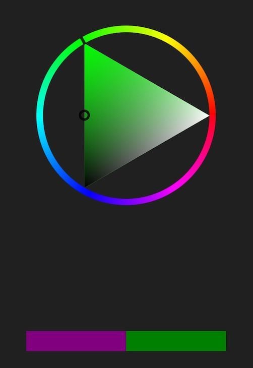
In the image above, the bar at the bottom shows the previously selected color on the left and the currently selected color on the right. This allows you to compare colors visually and select options that work well together.
The holo color picker is the default color picker, denoted by a circular color picker and some sliders:
/* App.js */

import React, { useState } from 'react';
import { View, Text } from 'react-native';
import { ColorPicker, toHsv } from 'react-native-color-picker';

export const App = () => {
  const [color, setColor] = useState(toHsv('green'));
  function onColorChange(color) {
    setColor({ color });
  }
  return (
    <View style={{ flex: 1, padding: 45, backgroundColor: '#212021' }}>
      <Text style={{ color: 'white' }}>
        React Native Color Picker
      </Text>

      <ColorPicker
        oldColor="purple"
        color={color}
        onColorChange={onColorChange}
        onColorSelected={(color) => alert(`Color selected: ${color}`)}
        onOldColorSelected={(color) => alert(`Old color selected: ${color}`)}
        style={{ flex: 1 }}
      />
    </View>
  );
};
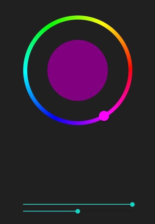
The code above will result in the color picker below. You can choose the hue using the outer circle and adjust the saturation and lightness using the slider bars at the bottom. The resulting color will display in the inner circle:
The React Native Wheel Color Picker is a pure JavaScript library. It is lightweight, meaning it’s small in size and works for Android, iOS, and the web.
React Native Wheel Color Picker uses a hue and saturation color wheel and a lightness slider. Animations on the color picker’s wheel, slider, and swatches will show the changes in color as you make adjustments.
At the time of writing, React Native Wheel Color Picker has fewer weekly downloads on npm than react-native-color-picker, but it still has around two thousand downloads weekly, making it the second most popular color picker library in our list.
While React Native Wheel Color Picker is easy to use overall, it also has some complex functionalities. Two of the most useful ones are swatches and discretes.
Swatches are tiny dots under the slider. They represent different color types, like blue, red, green, etc. Users can turn swatches off or on depending on their choice by adding the boolean to the color picker, like below:
<ColorPicker swatches={true} />
Discretes, on the other hand, represent the different shades of the swatches. For example, if you select the green color from the swatches, discretes show you the different variations of the selected green color ranging from lighter to darker variations. You can add discretes to your color picker like below:
<ColorPicker discretes={true} />

The image above shows examples of discretes and swatches. The top row of dots contains the discrete, which shows the different variations of the selected blue color. The bottom row of dots contains the swatches.
To use the React Native Wheel Color Picker library, install it with either of the commands below:
/* Npm */
npm install react-native-wheel-color-picker

/* Yarn */
yarn add react-native-wheel-color-picker
After installation, you can use React Native Wheel Color Picker in your component as shown below:
/* App.js */

import React, {useState} from 'react';
import {SafeAreaView, StyleSheet, View} from 'react-native';
import ColorPicker from 'react-native-wheel-color-picker';

const App = () => {
  const [color, setColor] = useState('');

  const onColorChange = color => {
    setColor(color);
  };
  return (
    <SafeAreaView>
      <View style={styles.sectionContainer}>
        <ColorPicker
          color={color}
          onColorChange={(color) => onColorChange(color)}
          onColorChangeComplete={color => alert(`Color selected: ${color}`)}
          thumbSize={30}
          sliderSize={30}
          noSnap={true}
          row={false}
        />
      </View>
    </SafeAreaView>
  );
};
const styles = StyleSheet.create({
  sectionContainer: {
    marginTop: 70,
    paddingHorizontal: 24,
  },
});
export default App;
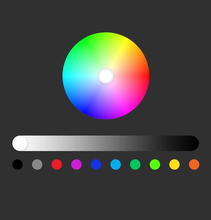
The code above will result in the following color picker, which shows a color wheel, a slider bar to adjust lightness, and a row of swatches. You can adjust the wheel in the circle to pick a color. Similarly, you can choose different color variations from the swatches or color types below. You can then use the slider to adjust the color to your liking:
react-native-hsv-color-pickerThe react-native-hsv-color-picker library helps you to build colors using hue, saturation, and value (HSV). Supported by both React Native and Expo projects, the react-native-hsv-color-picker library’s weekly download stats average around 40 or more at the time of writing. Although it’s easy to use, this library may not be as intuitive as the other ones listed above.
To install react-native-hsv-color-picker in your project, run either of the commands below:
/* Npm */
npm install react-native-hsv-color-picker --save

/* Yarn */
yarn add react-native-hsv-color-picker
Unless you’re using Expo, this library has some peer dependencies that you’ll need to download and configure before using. To add the necessary dependencies for the library, follow the instructions provided in the docs.
The sample code below details how to use react-native-hsv-color-picker in your application:
/* App.js */

import React, { useState } from 'react';
import { StyleSheet, View } from 'react-native';
import HsvColorPicker from 'react-native-hsv-color-picker';

export default App = () => {
  const [state, setState] = useState({
    hue: 0,
    sat: 0,
    val: 1,
  });

  const onSatValPickerChange = ({ saturation, value }) => {
    setState({
      sat: saturation,
      val: value,
    });
  };

  const onHuePickerChange = ({ hue }) => {
    setState({hue});
  };

  return (
    <View style={styles.container}>
      <HsvColorPicker
        huePickerHue={state.hue}
        satValPickerHue={state.hue}
        satValPickerValue={state.val}
        satValPickerSaturation={state.sat}
        onHuePickerPress={onHuePickerChange}
        onHuePickerDragMove={onHuePickerChange}
        onSatValPickerPress={onSatValPickerChange}
        onSatValPickerDragMove={onSatValPickerChange}
      />
    </View>
  );
};
const styles = StyleSheet.create({
  container: {
    flex: 1,
    backgroundColor: 'grey',
    alignItems: 'center',
    justifyContent: 'center',
  },
});
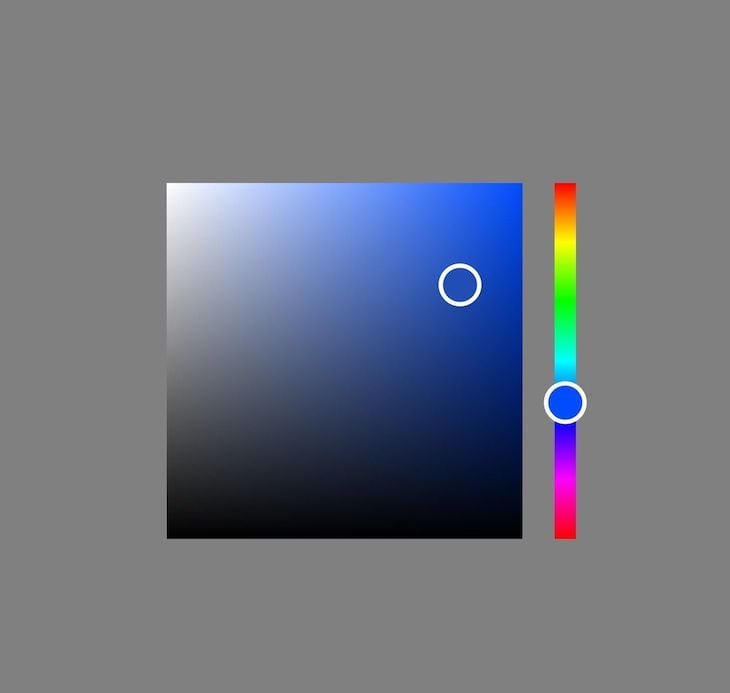
The code above will give you the color picker below. The slider allows you to choose between different color types. Then, using the block, you can browse through the color variations and make your choice:
Reanimated Color Picker is a highly customizable, pure JavaScript color picker library for React Native. It supports Android, iOS, Expo, and the web, and it averages around 1,400 downloads on npm weekly at the time of writing.
Unlike the others, the Reanimated Color Picker library has some cool APIs that allow you to customize your color picker to suit your needs. Some of these APIs include:
ColorPicker: A wrapper that houses all the built-in components. Every other component is wrapped or enclosed inside of ColorPickerPanel: A slider used to change the color’s hue, saturation, and brightness. These are separated into Panel1, Panel2, and Panel3Preview: Allows you to preview your selected color combinationsPreviewText: React Native Text component that displays the preview color textSlider: Comes with four slider options for changing the color’s propertiesHueSlider: Allows you to adjust the gradationBrightnessSlider: Allows you to change the lightness or darknessSaturationSlider: Allows you to change the intensityOpacitySlider: Allows you to change the transparencyTo install the Reanimated Color Picker library, run any of the commands below:
/* Npm */
npm i reanimated-color-picker

/* Yarn */
yarn add reanimated-color-picker
After installation, you can use this library below as follows:
/* App.js */

import React from 'react';
import { StyleSheet, View, Text } from 'react-native';
import ColorPicker, {
  Preview,
  OpacitySlider,
  BrightnessSlider,
  HueSlider,
  SaturationSlider,
} from 'reanimated-color-picker';

export default App = () => {
  return (
    <View style={styles.container}>
      <ColorPicker
        style={{ width: '75%', justifyContent: 'center' }}
        sliderThickness={30}
        thumbSize={40}
        thumbShape="pill">
        <Preview
          style={[styles.previewStyle, styles.shadow]}
          textStyle={{ fontSize: 18 }}
          colorFormat="rgba"
          hideInitialColor
        />
        <Text style={styles.sliderLabel}>Hue:</Text>
        <HueSlider
          style={[{ borderRadius: 15, marginBottom: 25 }, styles.shadow]}
        />
        <Text style={styles.sliderLabel}>Brightness:</Text>
        <BrightnessSlider
          style={[{ borderRadius: 15, marginBottom: 25 }, styles.shadow]}
        />
        <Text style={styles.sliderLabel}>Saturation:</Text>
        <SaturationSlider
          style={[{ borderRadius: 15, marginBottom: 25 }, styles.shadow]}
        />
        <Text style={styles.sliderLabel}>Opacity:</Text>
        <OpacitySlider
          style={[{ borderRadius: 15, marginBottom: 25 }, styles.shadow]}
        />
      </ColorPicker>
    </View>
  );
};
const styles = StyleSheet.create({
  container: {
    flex: 1,
    backgroundColor: '#e8e8e8',
    paddingBottom: 0,
    width: '100%',
    maxWidth: 500,
    margin: 'auto',
  },
  sliderLabel: {
    fontSize: 20,
    color: '#000',
    marginBottom: 10,
  },
  previewStyle: {
    height: 55,
    borderRadius: 50,
    marginBottom: 30,
  },
  shadow: {
    shadowColor: '#000',
    shadowOffset: {
      width: 0,
      height: 2,
    },
    shadowOpacity: 0.25,
    shadowRadius: 3.84,
    elevation: 5,
  },
});
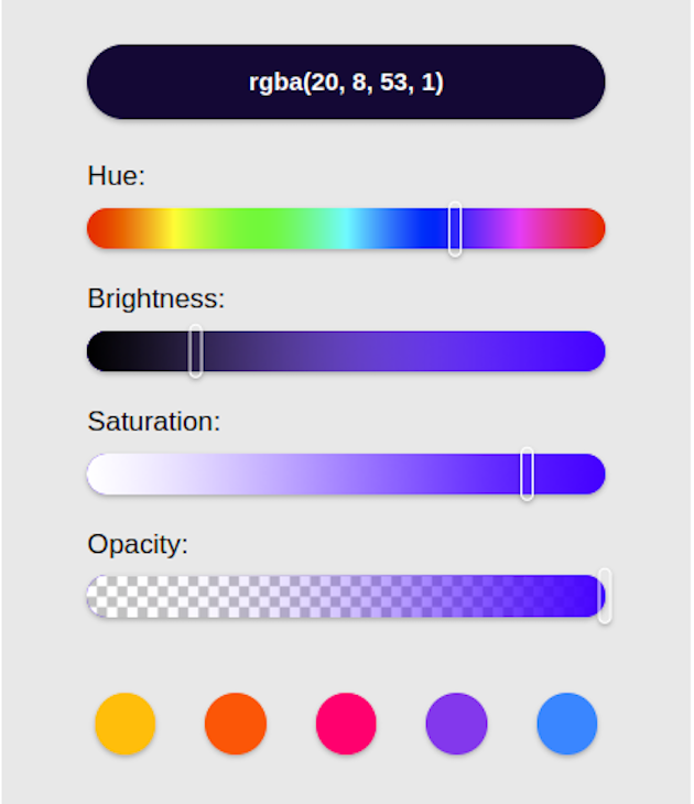
In the code above, we use the four sliders to combine the various settings to get our desired color. We’re also using the Preview component to see what the resulting color is. Every component is wrapped inside the ColorPicker wrapper. Below is the result:
react-native-light-color-pickerThe react-native-light-color-picker library works for Android and iOS. At the time of writing, it averages around 130 npm downloads per week.
Below are the commands to install react-native-light-color-picker:
/* Npm */
npm i react-native-light-color-picker

/* yarn */
yarn add react-native-light-color-picker
After installation, import calcTextColor, CCTPicker, and RGBPicker from the react-native-light-color-picker module:
/* App.js */

import React from 'react';
import { Dimensions, StyleSheet, View, SafeAreaView, Text, Button } from 'react-native';
import {
  calcTextColor,
  CCTPicker,
  RGBPicker,
} from 'react-native-light-color-picker';
const { width, height } = Dimensions.get('screen');

export default function App() {
  const [color, setColor] = React.useState('#FFFF00');
  const [value, setValue] = React.useState(0);
  const [mode, setMode] = React.useState(1);
  return (
      <SafeAreaView style={styles.SafeAreaView}>
        <View>
          <Button
            onPress={() => {
              setMode(mode === 0 ? 1 : 0);
            }}
          >
            Switch mode
          </Button>
        </View>
        {mode === 0 && (
          <>
            <RGBPicker
              value={color}
              onChangeComplete={console.log}
              onChange={setColor}
            />
            <View
              style={[
                styles.demo,
                {
                  backgroundColor: color,
                },
              ]}
            >
              <Button
                labelStyle={{
                  color: calcTextColor(color),
                }}
                onPress={() => {
                  setColor('#FF0000');
                }}
              >
                Set color
              </Button>
            </View>
          </>
        )}
        {mode === 1 && (
          <>
            <CCTPicker
              value={value}
              onChangeComplete={console.log}
              onChange={setValue}
            />
            <View
              style={[
                styles.demo,
                {
                  backgroundColor: color,
                },
              ]}
            >
              <Button
                labelStyle={{
                  color: calcTextColor(color),
                }}
                onPress={() => {
                  setValue(30);
                }}
              >
                Set value
              </Button>
              <Text style={styles.text}>{value}</Text>
            </View>
          </>
        )}
      </SafeAreaView>
  );
}
const styles = StyleSheet.create({
  SafeAreaView: {
    width,
    height,
    flex: 1,
    justifyContent: 'space-between',
    alignItems: 'center',
  },
  container: {
    width: '100%',
    height: '100%',
    flex: 1,
  },
  demo: {
    width: '100%',
    height: 100,
  },
  text: {
    alignSelf: 'center',
  },
});
In the code above, we switch between the two color picker options, the CCTPicker and the RGBPicker, by toggling the Switch mode button:
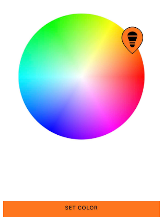
Just like in the other React Native color picker libraries, we can move around the color picker and browse through the different colors using the teardrop-shaped color picker selector. When we stop moving the color picker selector, the resulting color will be logged in our console so we can copy it.
Now that we know how the different color picker libraries work, let’s summarize how they compare against one another:
| Color picker library | Color systems supported | Additional features | Alpha support |
|---|---|---|---|
react-native-color-picker |
RGB, HSL, HSV, HEX | None | Yes |
react-native-hsv-color-picker |
HSV | Ability to set initial color | Yes |
react-native-light-color-picker |
RBG, HEX | Ability to set initial color and alpha value. | Yes |
| React Native Wheel Color Picker | RGB, HSL, HSV | Ability to choose the size of the wheel | Yes |
| Reanimated Color Picker | RGB, HEX | Ability to show and hide the picker. Also has a customizable UI | Yes |
In this tutorial, we considered why colors are important in our applications and how various React Native color picker libraries can help us select the right color scheme for our apps.
As we reviewed the different color picker library options available to us, we also explored what makes each one unique. We also saw what each library looks like, how we can use them in our application, and how they can help us choose a pleasing color theme for our app.
Now, it’s up to you to choose which of the options is easier and works for your needs. Thanks for reading!

LogRocket's Galileo AI watches sessions for you and and surfaces the technical and usability issues holding back your React Native apps.
LogRocket also helps you increase conversion rates and product usage by showing you exactly how users are interacting with your app. LogRocket's product analytics features surface the reasons why users don't complete a particular flow or don't adopt a new feature.
Start proactively monitoring your React Native apps — try LogRocket for free.
Would you be interested in joining LogRocket's developer community?
Join LogRocket’s Content Advisory Board. You’ll help inform the type of content we create and get access to exclusive meetups, social accreditation, and swag.
Sign up now
Learn how OpenAPI can automate API client generation to save time, reduce bugs, and streamline how your frontend app talks to backend APIs.

Discover how the Interface Segregation Principle (ISP) keeps your code lean, modular, and maintainable using real-world analogies and practical examples.

<selectedcontent> element improves dropdowns

Learn how to implement an advanced caching layer in a Node.js app using Valkey, a high-performance, Redis-compatible in-memory datastore.

 Learn more →

2 Replies to "Exploring 5 popular React Native color picker libraries"
A small and quick colour picker library React Colourful may unquestionably take the place of React Colour.
Amazing content you are providing, thank you so much for this information