Phrases like, “use data, not intuition,” are the bread and butter of product management. To stay up-to-date with the latest market trends, you should lean on data analysis tools that move beyond basic spreadsheets and bar charts.

But where do you even start? After all, you could spend hundreds of hours exploring various data points without moving the needle. You should rely on a targeted approach geared toward your particular use-case.
An altitude map is a great tool to help you grasp the broader context of data and give your pursuits more context.
In this article, you will learn what an altitude map is, how to build one, and ways to implement an altitude map for your product.
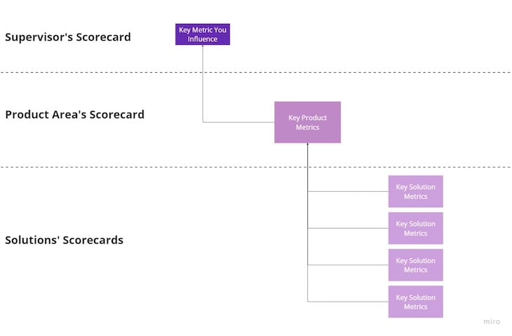
An altitude map is a landscape that displays various levels of product metrics visually. It maps out the most relevant metrics and shows how each influences each other:

Altitude maps help you understand which solutions drive outcomes. Because of this, they allow you to become more strategic with roadmaps and data pursuits.
An altitude map separates out metrics from three distinctive scorecards:
The supervisor’s scorecard answers the question, “What are the key metrics that my supervisor wants me to influence?”
After all, you were hired to help your boss drive their outcomes. Building the best product in the world won’t help you grow your career if it doesn’t help your boss achieve their goals as well.
This is the heart of your product. The product area’s scorecard tells you which metrics best showcase the performance of the area you are responsible for.
For example, if you are a PM responsible for acquisition, metrics such as traffic, new registration, and CAC will serve as the primary measure of your success. Make sure you understand how these metrics influence your boss’s metrics.
Depending on the maturity of your product, a solution might be either a specific feature, or a set of features you own.
Each of these solutions should also have a set of performance metrics. After all, how do you know if your new feature is performing or not?
Ultimately, as a product manager, you drive business outcomes by driving product metrics by building solutions that move the needle.
Now let’s look at how you can build an altitude map from scratch. Imagine you are a product manager for a subscription product. You can divide up the process into:
Start by identifying which metrics your supervisor cares about and how you can influence them directly.
Let’s assume you are working in a revenue area. For a subscription app, the most important metric would be monthly recurring revenue (MRR), so let’s focus on that.
Start by asking yourself:
These questions will help you identify the best metrics to track your performance and also help you focus on the most relevant and impactful solutions later on.
Let’s say you are responsible for driving MRR (supervisor’s metric) by increasing the number of new subscribers. Other metrics (e.g., churn, ARPPU, etc.) are in the scope of other product managers.
Your target would be a basic user (one without a subscriber). In this case, ads in the app and limited access to premium features are your pain points. You decide to focus on communicating the value of premium, pushing people to try out free trials, and personalizing offers.
Now, let’s look at potential metrics to track the general performance. There are five main types of metrics you can track:
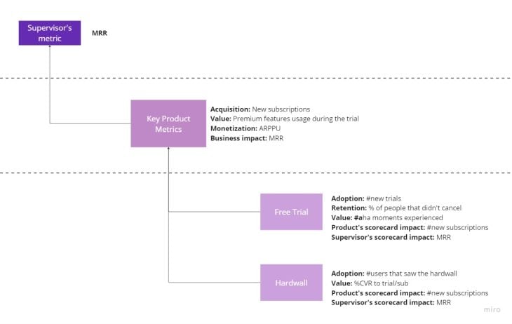
Each product area will track a specific type of metric. For instance, in this case the breakdown would look like:
Now, take a look at all the solutions you own and try to identify their key metrics. For solutions, we usually differentiate:
Because you own new subscribers acquisition, you may be responsible for the following solutions:
Let’s try to map out what the metrics would look like for the two first solutions:
Again, the specific metrics will depend on your particular context. The important part is to understand how you measure the feature’s adoption, the value it delivers, and its contribution to the product and business.
From the steps above, you can create an altitude map that clearly answers:

Not only is this a great starting point for any further explorations, the exercise itself will help you understand your product and metrics on a deeper level.
Building the altitude map is just the first step. Now you can use it to drive product and business outcomes.
An altitude map can help you by:
Now that you have a clear picture of which metrics best measure your solutions’ performance, you can quickly assess their health.
Maybe your free trial feature has excellent retention and value delivery, but the adoption leads to a bottleneck. Or, although you push people to trials, they don’t seem to use them too much.
The altitude map can help you better understand how your solutions perform.
You can make more informed next steps by assessing the health of your solutions and their impact on product and business metrics.
Use the data you have to decide if you should improve what you have, or if there are more promising ways to drive your product metrics.
Altitude maps encourage you to ask yourself two questions:
In day-to-day work, it’s easy to lose track of the most important things and focus on over-optimizing metrics that don’t matter. Altitude maps help you spot that early on.
When shared publicly, altitude maps bring transparency to the entire metric ecosystem.
It’s especially important when multiple product teams work under one supervisor. Altitude maps help them spot cross-team dependencies and collaboration opportunities.
If any of your key metrics are underperforming, you can analyze the entire metrics landscape and to discover where the problem is.
There should be corresponding drop solution metrics that will tell you where exactly to focus.
Crafting an altitude map is a great starting point to become a more data-driven product manager.
By understanding the relationship between supervisor’s metrics, product area’s metrics, and solutions’ metrics you can build a solid high-level overview of your product landscape for further exploration.
Ultimately, using data for the sake of using data is a waste of time. To prevent this, altitude maps allow you to be strategic with your data pursuits.
LogRocket identifies friction points in the user experience so you can make informed decisions about product and design changes that must happen to hit your goals.
With LogRocket, you can understand the scope of the issues affecting your product and prioritize the changes that need to be made. LogRocket simplifies workflows by allowing Engineering, Product, UX, and Design teams to work from the same data as you, eliminating any confusion about what needs to be done.
Get your teams on the same page — try LogRocket today.

Trey Courtney talks about his process for evaluating partnerships or acquisitions and how he successfully implements these initiatives.

Asma Syeda shares the importance of responsible AI and best practices for companies to ensure their AI technology remains ethical.

What hard skills do PMs need in 2025? Learn how AI tools can help you level up in SQL, Figma, A/B testing, and more.

Paul Weston talks about “quantifying the unquantifiable,” i.e., bringing in objective data for things that otherwise seem hard to measure.