What data skills should a senior product manager possess?

According to some voices, every single one of us should be SQL native speakers with an advanced degree in statistics, effortlessly whipping up complex dashboards in Tableau, Power BI, or Excel, deep-diving into databases, and extracting the answer to whatever question pops into our heads.
I’ve seen many talented PMs get disheartened by these kinds of catch-all statements. And I’ve had the pleasure of working with many good senior PMs who lacked these skills.
“What data skills do I need” depends on a variety of factors. For example:
To truly understand what working with data means for a good senior product manager, we need to go back to first principles, rather than just rambling off an intimidating list of tools and abbreviations. The latter approach misses the point completely.
Most importantly: Nobody lives up to the “perfect PM” demand list. This list should be an aspirational goal to work towards, not a barrier to entry.
What’s your primary goal as a PM? Keeping stakeholders satisfied? Managing tight deadlines? Climbing the career ladder? I hope not.
The best product managers are primarily driven by their desire to have an impact, on both their users’ lives and on business results. Everything else is a means to that end.
One of the most difficult parts of a PM’s job is prioritization. Whether you’re prioritizing your own time, your team’s work, feature requests, customer opportunities, or outcomes, it’s always about comparing a variety of options and selecting the one that’s most likely to drive the impact you’re after.
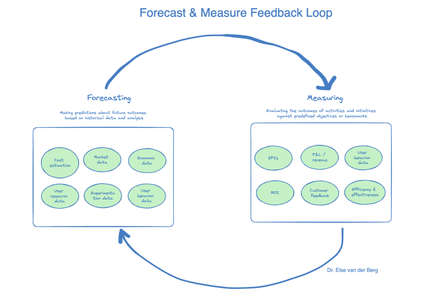
We prioritize better by forecasting. We’re mere mortals, trying our best to predict an unpredictable future.
But our forecasts get better when we take into account a wider variety of data points and learn to distinguish signal from noise.
For example, by combining internal cost data, market data, economic data, user research data, experimentation data, and user/customer behavior data — and weighting each correctly — you’ll come to a far better forecast than if you only take the CEO’s opinion into account.
Fast forward to the future. Your forecast said “go,” and you’ve validated your idea and shipped your solution. Now it’s time to measure. Was our forecast accurate? Why were we right or wrong? If we were wrong, what did we learn from it?
Adopting a win-or-learn approach here can keep spirits and team morale high during the experimentation stages. This is how you build your product instinct over time and learn to prioritize better in the future:
Building your data skills for the sake of having data skills misses the point, if you don’t know how to apply these to forecast and measure impact. Being able to answer questions on your own with data is useless if you don’t know what the right questions to ask are, or how to interpret the data you uncover.
On the flip side, if you have the strategic context and are asking the right question, it’s possible to create a rudimentary forecast with basic data skills. If it’s between having a perfect dashboard that answers a useless question, or a high-level forecast answering a question that matters, I’d pick the latter every time.
Now that we’ve covered the basics, let’s get into the weeds and explore five important ways PMs should be able to work with quantitative data.
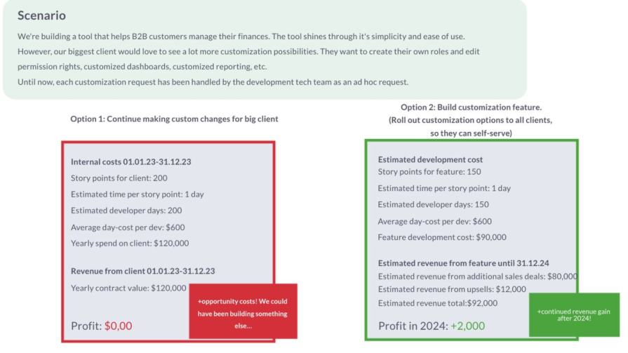
You can’t compare one idea against another if you lack the skills to consider the financial implications of your options.
I don’t believe PMs should “own the P&L,” this would mean they’d have to be able to fire people and be held professionally accountable for revenue dips.
They should however possess the financial and strategic insights to create a (simple) business case.
To calculate the 𝗱𝗲𝘃𝗲𝗹𝗼𝗽𝗺𝗲𝗻𝘁 𝗰𝗼𝘀𝘁 𝗮𝗹𝗿𝗲𝗮𝗱𝘆 𝗶𝗻𝘃𝗲𝘀𝘁𝗲𝗱 into a certain client or strategy, you can calculate the story points or actual time spent on that client or strategy.
To calculate the cost of building and launching something new, you can start by estimating the 𝗱𝗲𝘃𝗲𝗹𝗼𝗽𝗺𝗲𝗻𝘁 𝗲𝗳𝗳𝗼𝗿𝘁 𝗿𝗲𝗾𝘂𝗶𝗿𝗲𝗱 𝗳𝗼𝗿 𝗮 𝗻𝗲𝘄 𝗳𝗲𝗮𝘁𝘂𝗿𝗲.
If you have an approximation for the cost of one sprint, it’s an easy starting point for your calculation. But don’t forget to factor in maintenance and go-to-market costs when truly comprehending the cost of bringing a new feature to market.
Calculating projected revenue is much more difficult than internal costs. It relies on how well your product or feature is received in the market and is therefore far less predictable. To calculate 𝗽𝗿𝗼𝗷𝗲𝗰𝘁𝗲𝗱 𝗿𝗲𝘃𝗲𝗻𝘂𝗲, make a rough estimation of how this new feature might bring in new revenue (e.g. enabling new sales deals, or expanding existing customers). Stay as close to the truth and conservative as you can. This usually means diving into the sales pipeline and customer database. Make sure to steer clear of wild speculation. You can look at past features’ performance to grab a baseline.
As Sascha Brossmann puts it, simply asking the following three questions can be an excellent starting point:
A senior PM should understand how to leverage data to think strategically and drive business growth. This means that they must be able to deeply understand the company’s business goals, and translate those into actionable product goals that inform the product strategy.
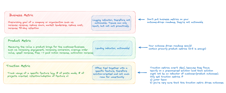
PMs should be able to identify the most important product metric(s) that reflect a change in user behavior or sentiment and have a high likelihood of driving the company’s business goal. When delivering solutions or features, they should check whether they have indeed managed to move both their product goal (leading indicator) and ultimately the business goal (lagging indicator):
Again, you can be a superstar at SQL, Python, SAS, Tableau, Looker, or Excel, but none of these hard skills will save you if you can’t see the bigger picture. There are no prizes for getting caught down a data rabbit hole.
As a product manager, you should have a grasp on fundamental concepts of statistics, such as mean, median, outliers, quartiles, and percentiles. For example: In which case is it better to look at the mean, and in which case should we choose the median? How do we handle outliers that might skew our results?
In data visualization, it helps to understand what the different graphs at your disposal represent. I see many PMs using pie charts and bar charts almost interchangeably, even though they serve distinct purposes.
You wouldn’t be the first Product Manager aimlessly staring at dashboards and thinking…. So what? Data and metrics are useless without context.
Just looking at revenue, MAU, DAU, page views, or clicks can make you feel hopeless. Sure, we have more active users today than we had yesterday, but why? Users are spending a lot of time on our page and clicking around, but does that mean that they’re getting value? What does value even mean?
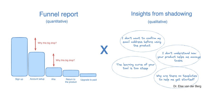
A good PM combines qualitative and quantitative data to get a deep understanding of how users are using and experiencing the product. While the quantitative data brings in objective numbers, the qualitative data adds the layer of subjective context you need to extract meaning from the numbers and insights.
For example, by building funnel reports or looking at session replays you can see where in our user journey people are dropping off to identify potential friction points. By looking at heatmaps, scroll maps, or feature audits, you can see which parts of the product your users are visiting, and which features show the best adoption and retention rates.
But only by combining this information with qualitative data, such as survey data (which I consider qualitative if you don’t have a statistically significant dataset) or insights from shadowing or usability tests, you can understand the “why” behind the “what:”
I’m thrilled to see the rise of easy-to-use product analytics tools like Logrocket to democratize access to user analytics.
These tools are relatively easy to install and offer out-of-the-box reports and dashboards that help product managers self-serve their way to data-informed decision-making.
Good product management is about de-risking your ideas before shipping them.
A great user experience is built through quick iterations and feedback cycles.
Experimentation and learning are at the core of both these two principles.
Although A/B testing is often considered the “gold standard” of testing, PMs have a wide variety of test methods at their fingertips when trying to de-risk or validate an idea. A good PM can select the right test method based on the circumstances, set up the test — including setting feasible success metrics — read the results, and understand why a test failed or passed:
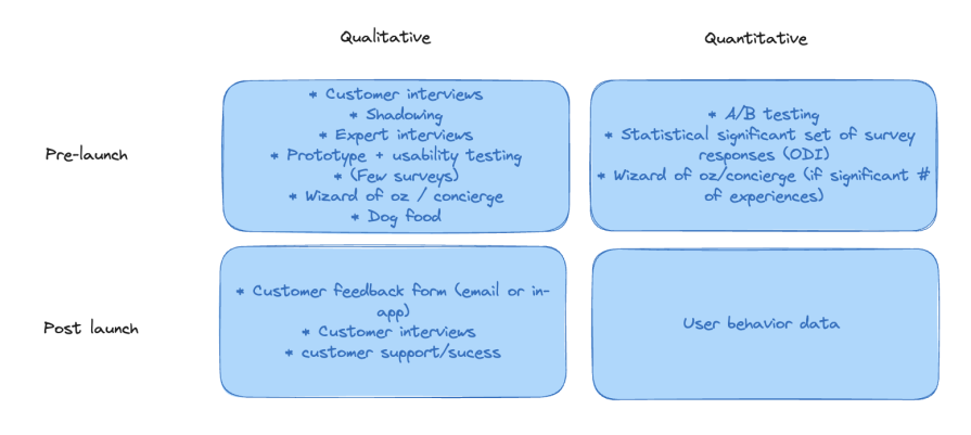
A/B testing is likely the right test method if you’re trying to understand what users will do (not why they do it), you have enough traffic going to the area of the product you’re testing, and you have a certain level of confidence that this idea will move the needle.
A good PM knows that sometimes it’s okay to forego statistical significance when running A/B tests. When you’re testing product surface areas that are deep inside the product and don’t get that much traffic, getting to a big enough sample size to achieve a 95 percent confidence level is either impossible or will take too long.
Decisions must be made when they must be made, not when your A/B testing tool gives you the green light. The good news: most product decisions don’t require a 95 percent confidence level. Especially when you’re looking for a directional read, backing up your test results with results from other tests (see the toolkit above), and/or are making reversible product decisions, you can work with far smaller sample sizes.
Let me recap what a strong, data-informed product management process looks like:
I’m always surprised to see how many product teams skip step three because it’s “too hard.”
It’s great if your A/B test predicted a 15 percent conversion uplift between steps one and five of the onboarding journey. But keep in mind that an A/B test is a simulation. It doesn’t guarantee the same user behavior when your feature is released to the public.
When I confront such teams with the harsh reality, I tend to get:
Both are valid points.
But my bar is high. I expect PMs to be curious and to dig into why this is happening — even if they might need to initiate a company-wide project that is outside their team periphery to solve it.
Whether you call it data-driven or data-informed, PMs need to know how to work with qualitative and quantitative data to support their decision-making.
It’s not just about how well you understand statistical deviations, data models, or whether you can query a database or visualize data, although those things help a lot.
It’s about using data to prioritize the right ideas. It’s about having a deep business, product, and customer understanding to understand the story behind the numbers you’re looking at, and knowing when to question them.
Featured image source: IconScout
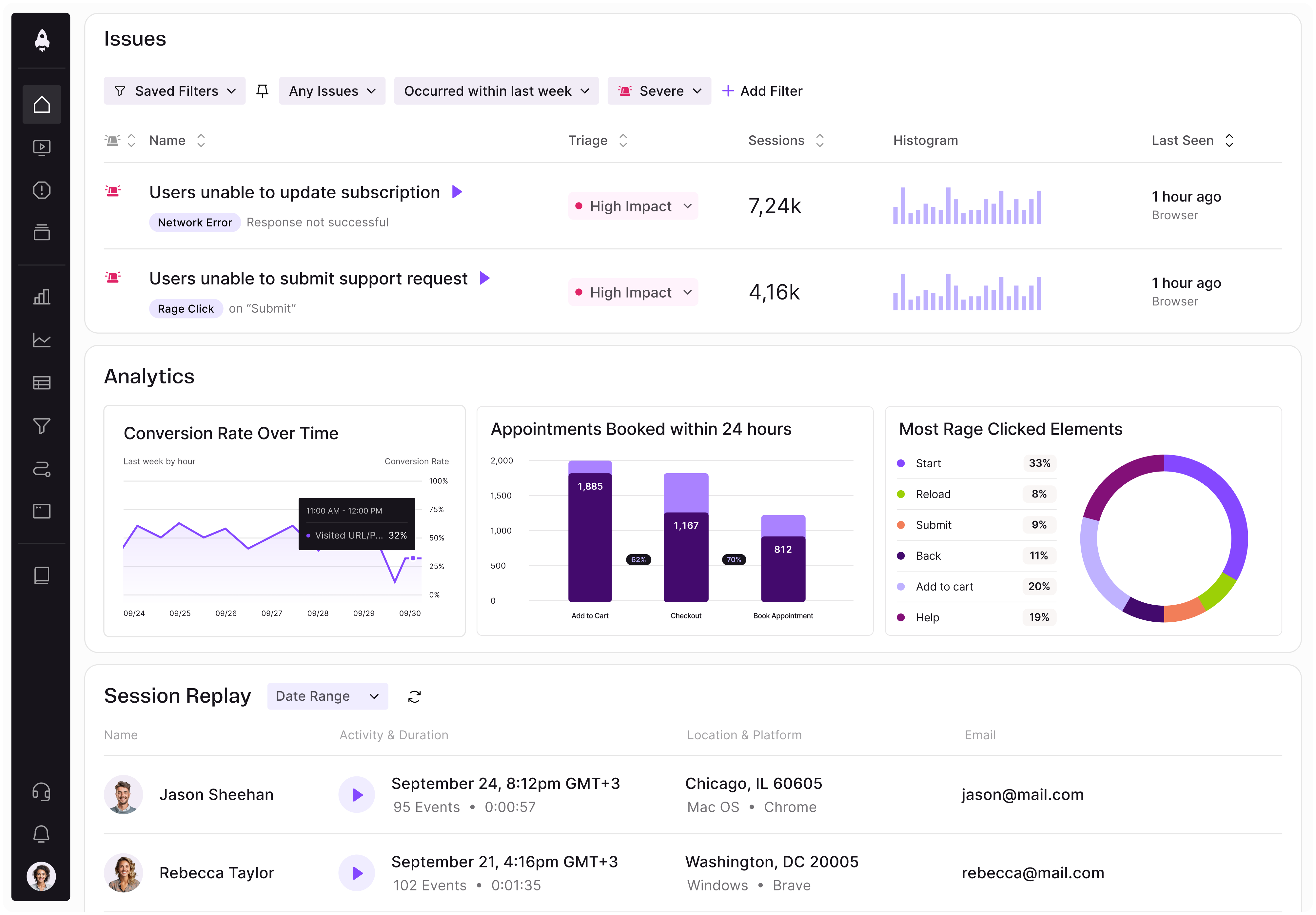
LogRocket identifies friction points in the user experience so you can make informed decisions about product and design changes that must happen to hit your goals.
With LogRocket, you can understand the scope of the issues affecting your product and prioritize the changes that need to be made. LogRocket simplifies workflows by allowing Engineering, Product, UX, and Design teams to work from the same data as you, eliminating any confusion about what needs to be done.
Get your teams on the same page — try LogRocket today.

Map AI data risks, vet vendors, run safer pilots, and build legal buy-in for AI tools without creating security gaps.

SVP of Product Sriram Iyer visits to chat about how he uses AI to launch the “thinnest slice of pizza” product and shift mindsets around AI.

Controlled scope creep can help PMs use capacity buffers, AI tools, and clear guardrails to turn new ideas into better outcomes.

According to SVP Julia Dalton, managing humans at scale and managing AI agents have a lot more in common than most people realize.