Put yourself in this scenario. You’ve just done some product discovery, and found some great solutions to customer problems. You’re ready to queue up the delivery work with your team, but you can’t help but ask them how long they think building and deploying this new feature will take. Turns out, they have no idea!

There’s nothing more frustrating than having a bunch of great features sitting on the runway, waiting for delivery, with no certainty on when those features will arrive. Enter the control chart.
If you’ve used popular product management tools before, you’ve probably come across a control chart. However, unless you have a background in statistics or quality control, you may have never used one before and may not know how they can help with product delivery.
In this article you will learn what a control chart is, the benefits of using one, and where you can find them.
A control chart is a visual tool that shows deviations in a process over time. Control charts give you a picture of each piece of work that has been completed, how long it took to be completed, and visually displays the average amount of time it takes to complete a piece of work for a given team or project.
Typically, control charts are used to show deviations in a quality control process, however they can also be used to show how a team delivers work over time.
A control chart often has a few components that are consistent across different software in product management:
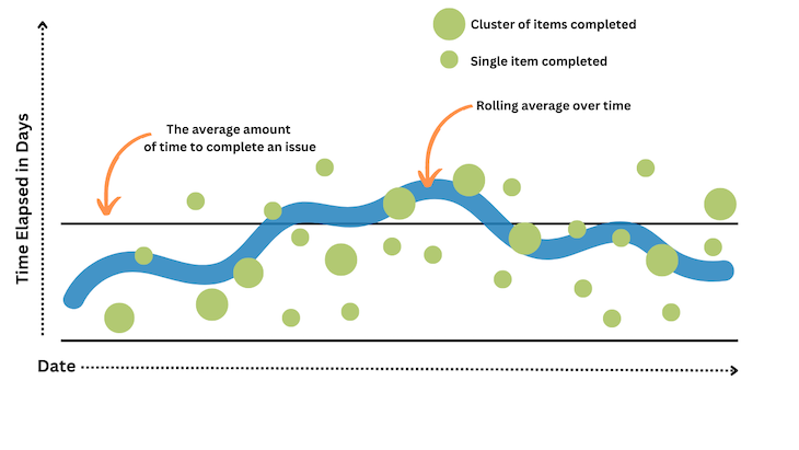
The Y axis of the control chart is elapsed time. This is how long a piece of work was in progress, and how many cycles it took to complete that piece of work
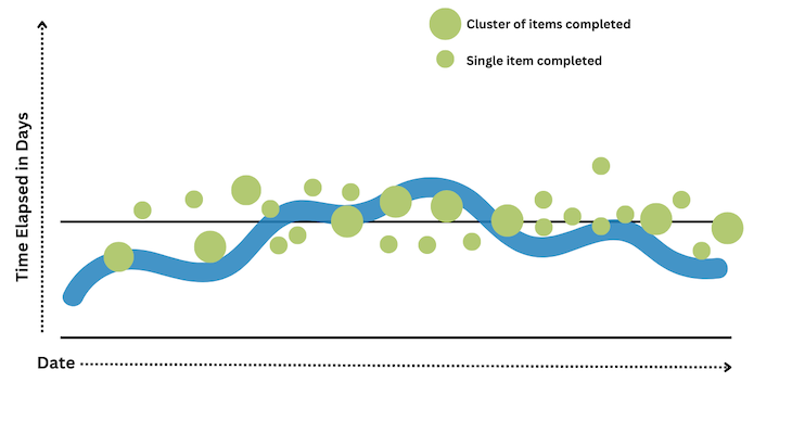
A control chart will help you see how predictably you are delivering value to customers. The closer the dots representing the work items are to the solid line, the more predictable your process and deliveries are:
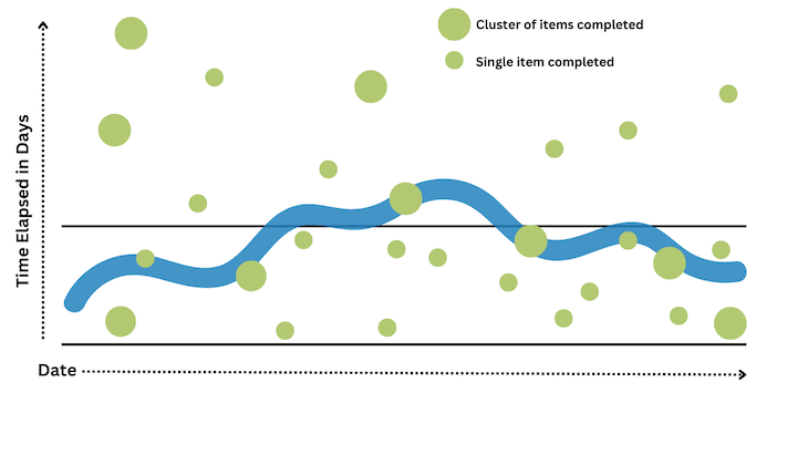
The further away the green dots are from the solid line, either toward the bottom or top of the chart, the less predictable your deliveries are:
As mentioned previously, control charts help in a product management context in two primary ways:
A control chart can help you estimate how long something might take by giving you an accurate, historical picture of how long things have taken in the past. The catch is, however, that your control chart must have a tight coupling between the rolling average line and your work items.
If the control chart shows that there is not a tight coupling, your estimate will be as varied as the work items represented on the control chart. If your work items frequently vary from two weeks to six months, the most accurate estimate you would be able to provide would be that kind of range.
However, as the process becomes more predictable, and the range of time across issues becomes tighter, it becomes easy to predict a ranged estimate. If the average amount of time that it takes to complete a piece of work is consistently three to six weeks, the team will be predictably delivering work every three to six weeks.
Providing this kind of estimate to stakeholders, as long as it aligns with your past performance and is accurate, can build trust. It also helps your stakeholders and dependent teams understand when features might be available. This kind of communication can bridge gaps across different types of delivery teams, for example engineering and marketing, who need to coordinate launch efforts.
When a process is not predictable, it can be difficult to understand where things are going wrong. A control chart, when utilized to spot outliers in the process, can be helpful in understanding where there may be gaps in the process or if work is not being broken down into small enough pieces.
There are two main issues that might you might face when working with control charts:
One problem you may need to troubleshoot is scope creep, and a control chart can help you spot it. For issues that are outliers toward the top of the chart, where an issue took longer to solve than usual, you can dig in and lead a post-mortem or retrospective meeting that takes a look at why the process took longer in that case.
Why is it important to eliminate scope creep? In a world where urgency matters, consistently delivering value to customers improves the chances that the product will be successful. Spotting and eliminating scope creep allows teams to more consistently deliver value to customers and iterate, instead of delivering big-bang deployments.
Another common issue teams encounter is breaking work down into inconsistent sizes. While it’s true that features may have different scope or have a different size, the issues or cards moving across the board don’t necessarily have to follow that same pattern. Alternatively, teams can make efforts to break work into consistent sizes.
One way to do this is, when breaking work down with a team, ask if it’s about one to two days worth of work. As you continue to break down work as a part of the process, the team can hone their ability to get each issue within one to two days worth of work.
While this may never be perfect, it can help eliminate the worst of the outliers and give the team a more accurate picture of how long each work item will take. This may require more effort on the frontend while breaking down the work, but over time, it will help eliminate bottlenecks, make delivery more predictable, and create a consistent process for delivering work to production.
Many product management tools have control charts built in. If you’ve poked around Jira enough, you’ve probably encountered the control chart in the reports section of the tools.
Additionally, there are tools that integrate into Trello and Jira that may also be helpful in producing control charts, or charts that are very similar to control charts.
To find the control chart report in Jira:
This will pull up a control chart based on the project data in Jira. You can adjust the date range to see how the consistency in the process has evolved over time.
Nave is a tool that integrates with Jira, Trello, Asana and other tools to build visualizations for cycles, also sometimes referred to as sprints. While this tool does not specifically build a control chart visualization, its Cycle Time Scatterplot and Due Date Performance Chart are very similar tools.
Control charts can be very helpful tools that allow you to spot inconsistencies in a process, estimate the amount of time a work item or issue takes on average, and help you see if work is being sized consistently across different projects.
Using a control chart can help improve the predictability of your delivery process, ensuring that projects get delivered on time.
Featured image source: IconScout
LogRocket identifies friction points in the user experience so you can make informed decisions about product and design changes that must happen to hit your goals.
With LogRocket, you can understand the scope of the issues affecting your product and prioritize the changes that need to be made. LogRocket simplifies workflows by allowing Engineering, Product, UX, and Design teams to work from the same data as you, eliminating any confusion about what needs to be done.
Get your teams on the same page — try LogRocket today.
Learn how tech PMs can take over inherited products, gather context, clean up backlogs, find quick wins, and make smarter decisions.

Learn how PMs can use AI evals to diagnose output quality issues, set pass criteria, and improve AI features with less guesswork.

Learn how PMs can replace bloated PRDs with lightweight docs that align teams, reduce risk, and keep AI-assisted development moving.

New from LogRocket: Galileo AI now spots your highest-impact bugs and dispatches them to AI agents in Cursor, Claude Code, or Codex to fix.


