
Interacting with elements on a webpage typically results in something happening. For example, clicking a button could open a dropdown. As developers, we know what takes place behind the scenes in the browser. However, users can only see the direct results of their actions.

The browser’s job is to render a webpage and all its elements as fast as possible. The faster it renders the page, the smoother the user experience will be.
Developers often have good computers and strong network connections, and therefore wouldn’t have any issue loading a webpage. Not everyone has this luxury, so you’ll have to consider users with slow PCs and networks.
In this article, we’ll explore how to optimize style recalculations in CSS. We’ll discuss how the browser’s rendering process works, how the way you write CSS impacts its speed, and more, including:
Later in this article, we’ll explore CSS animations as a specialized case of this style recalculation problem by comparing optimal and non-optimal animation examples. You can check out our demo animation on CodePen.
The Replay is a weekly newsletter for dev and engineering leaders.
Delivered once a week, it's your curated guide to the most important conversations around frontend dev, emerging AI tools, and the state of modern software.
When a webpage initially loads, the browser looks at the HTML and creates a Document Object Model (DOM) tree. It then looks at the CSS and applies its rules to relevant selectors on this DOM tree. Lastly, it executes JavaScript code and displays the page.
Imagine a page with a navbar where one of the navbar links opens a dropdown menu. When you open this dropdown, the browser adds a new element to the page. It then repeats the process of fetching HTML, creating the element, applying CSS styling, and displaying it on the page.
This process may only take seconds or even milliseconds, but a lot is happening in the background. Creating the dropdown modifies the DOM, which will trigger the rendering pipeline. The rendering process starts with invalidation and recalculation.
Invalidation is a process that identifies and marks all elements that need restyling after a DOM change.
Once the browser finds all the changed elements in the new DOM tree, it creates an invalidation set — a collection of the elements that need to be restyled after a mutation. Style recalculation begins after this.
A DOM change can also be described as a DOM mutation. It encompasses actions such as toggling a class name, adding or removing an element, hovering animations, and so on.
There are two types of invalidation: immediate and pending.
Immediate invalidation happens when changes affect the invalid elements immediately, like toggling a class name:
dropdownMenu.classList.toggle("active");
This JavaScript code toggles the active class that opens and closes a dropdown menu. The browser creates an invalidation set, and because the action needs to happen as soon as you click on the link, the elements are restyled immediately.
Pending invalidation happens when the browser isn’t sure which elements will change. For example, if you change CSS variables, the browser creates an invalidation set for all the elements that use the variable. However, it doesn’t immediately recalculate the styles.
Now that the browser has a list of invalid elements, it’s time to add their styling. The browser identifies CSS rules that apply to these invalid elements and computes their values in a process called selector matching:
.dropdown{
  display: none;
  position: absolute;
  left: 0;
  top: 100%;
  background-color: #22232e;
}
/* Show the dropdown when you click on the link */
.dropdown.active {
  display: block;
}
The first set of CSS rules sets display to none. This becomes invalid when you click on the link because we now have a new class selector, — active — with display now set to block. The browser then finds and applies the new CSS rule before rendering the page:
// Show/hide the dropdown when clicking the link
    dropdownLink.addEventListener("click", function (event) {
      event.preventDefault(); // prevent the link from being followed
      dropdownMenu.classList.toggle("active");
    })
Every browser has a rendering engine with the primary function of displaying the webpage as fast as possible. This engine handles style invalidation and recalculation.
Blink serves as the rendering engine for Chrome and other Chromium-based browsers such as Opera and Edge. Meanwhile, Gecko is the rendering engine for Firefox, and WebKit is the rendering engine for Safari.
There are three more steps in the rendering pipeline before the browser displays the final page — layout, painting, and compositing:
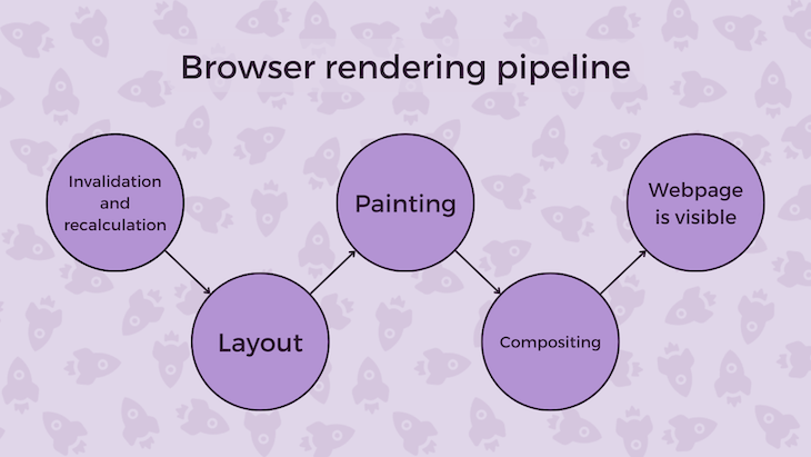
Changes to the DOM can affect the layout of the webpage. The browser may need to figure out the new size or position of elements on the page. Some CSS properties that can trigger this include margin, border, and padding.
After the layout step, the browser may need to repaint the elements that have changed or been added to the page. Painting involves filling in the pixels with color.
Compositing is when the browser combines the different layers of the webpage and displays one final image. This is the fastest and least task-intensive process.
As we’ve seen, the browser handles style recalculation with a rendering engine. We can’t directly observe this happening or see how it works, but we know the way you handle your CSS can impact style recalculation speed. Let’s explore a few examples.
Large and deep DOM trees can cause slower performance. If there are too many HTML elements, the browser will take more time to render the page:
<div id="container">
  <div class="header">
    <h1>This is a header</h1>
  </div>
  <div class="content">
    <p>This is a paragraph</p>
  </div>
  <div class="footer">
    <p>This is a footer</p>
  </div>
</div>
Using more semantic elements instead of always using a div can help create a smaller DOM tree:
<header>
    <h1>This is a header</h1>
  </header>
  <article>
    <p>This is a paragraph</p>
  </article>
  <footer>
    <p>This is a footer</p>
  </footer>
Having a small DOM tree will also reduce the amount of invalidation after a mutation. Semantics help the browser understand the element’s purpose and render it faster. The code is also more readable.
Fewer CSS rules can make the browser’s job easier by reducing the number of invalidations and optimizing style recalculation. Using CSS variables can help you avoid repetitive code.
Let’s say the header and footer have the same background color:
header {
  background-color: #00c2cb;
}
footer {
  background-color: #00c2cb;
}
/*Alternative*/
header,
footer {
  background-color: #00c2cb;
}
If there’s a mutation that affects them both, like changing themes, the browser will create two invalidation sets. When using CSS variables instead, the browser creates a single invalidation set for every element that uses that variable:
:root {
  --bg-color: #00c2cb;
}

header,
footer  {
  background-color: var(--bg-color);
}
A preprocessor like Sass can also support this further.
If your page has too many elements and there’s no way to reduce them, consider using multiple stylesheets.
Browsers focus more on the selectors than the CSS rules applied to them. Without selectors, the browser wouldn’t know what to style in the first place. If they are too complex or non-specific, it may take longer for the browser to render the page.
As a result, it’s best to be specific when using selectors — for example, use class and id selectors to target elements. Examples of non-specific selectors include *, div, p, a, and so on.
Likewise, avoid descendant selectors, as they may require the browser to invalidate many child elements. If you wanted to select a nested element, you’ll have to use a rule like .a .b{...}:
<div>
  <p>Lorem, ipsum dolor sit amet consectetur adipisicing elit.</p>
</div>
If you want to style these elements, this is how you would do it:
div {
      /*CSS rules*/
}
div p {
      /*CSS rules*/
}
If there’s any change, the browser will have to invalidate the parent and child elements. As with our previous example, this will mean two invalidation sets. The browser reads from right to left as it works up the DOM, so it will match the p element first and move on to the div.
In contrast, with one specific selector, the browser can focus solely on matching it to its CSS rules:
<div>
  <p class="text">Lorem, ipsum dolor sit amet consectetur adipisicing elit.</p>
</div>
With a specific class name, this is how you’d style the paragraph element:
.text{
  /*CSS rules*/
}
Changing many elements simultaneously or frequently will slow down the rendering process. Frequent mutations mean the browser has to create more invalidation sets for each affected element.
Keep animations minimal, or save them for interactive elements.
One way to implement changes in the DOM is through CSS animation. The browser animates CSS properties differently, and some methods will require more system resources than others.
Observe the following animation:
See the Pen Translate And Margin Animation by Oscar Jite-Orimonio (@oscar-jite)
on CodePen.
They look identical, right? But the browser is doing more work to render the box on the right.
For the first box, the animated property is transform, and it’s being translated along the Y axis by -20px. For the second box, we’re animating the margin-top property and changing it to -20px.
Here’s the HTML:
<body>
    <div class="box"></div>
    <div class="box-2"></div>
  </body>
And here’s the CSS:
div {
  height: 250px;
  width: 200px;
  background: #00c2cb;
  border: 2px solid #22232e;
  border-radius: 20px;
  margin: 20px;
}
.box{
  animation: translate 1s infinite alternate;
}
.box-2{
  animation: margin 1s infinite alternate;
}
@keyframes translate {
  100%{
    transform: translateY(-20px);
  }
}
@keyframes margin {
  100%{
    margin-top: -20px;
  }
}
On any Chromium-based browser, open up the dev inspector tool and click on the three dots in the top right corner of the tab. Select More tools, then Rendering, and finally Paint Flashing like so:
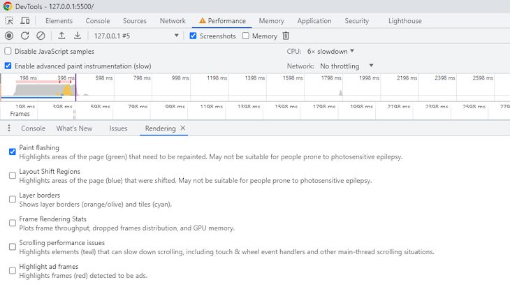
This setting will show you whenever the browser is running the painting process by flashing green. Please note that you may not be able to observe paint flashing in CodePen, so you should try using a live preview.
Here’s a recording of the animation with paint flashing selected:

The browser constantly has to repaint the box on the right with the margin animation at every frame of the animation. This means it’s using more resources to render that box, which might be a problem on a slow computer.
We can also use the Performance tab in your Chromium browser’s dev tools to track how long it takes to complete each step in the rendering pipeline. Using the Performance tab, you can record the animation and see how long the browser takes to run the animation.
Here’s the data from the box animated with the transform property:
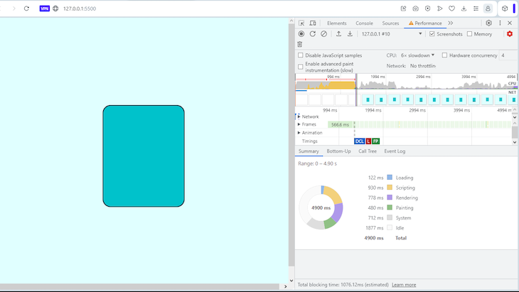
The recording is about five seconds in length. Note that we’re throttling the CPU to be six times slower to mimic a user using a slower device or network connection.
As you can see, rendering took 778 milliseconds, including layout and compositing. Painting took 480 milliseconds. There were also 1877 milliseconds of idle time.
Now observe the data from the box animated with the margin-top property:
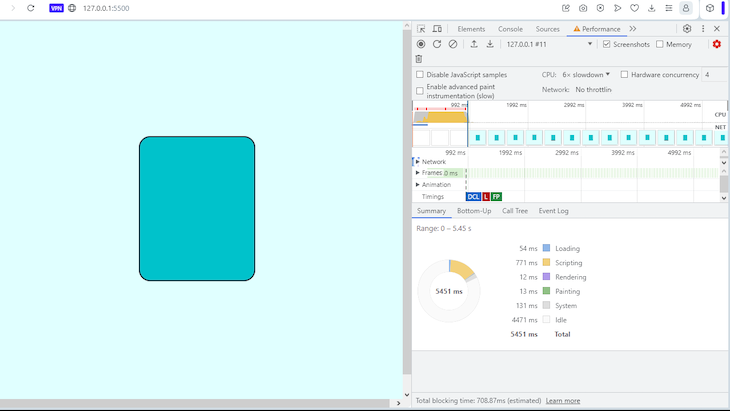
There’s a significant difference in speed. Rendering is down to just 12 milliseconds, and painting is down to 13 milliseconds. Meanwhile, the browser is idle for 4471 milliseconds — that’s a lot of rest time for the browser.
We can take a closer look at the margin animation by highlighting a small section. You can observe when style recalculations are triggered and how long they take:
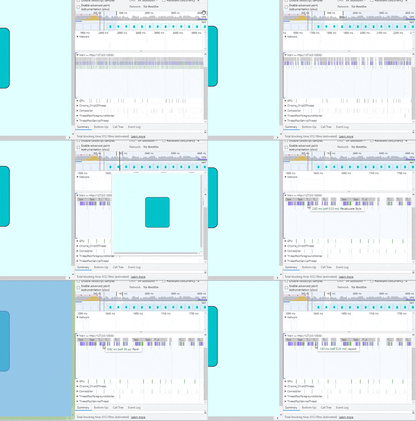
All this is non-existent in the transform animation.
This is just one specialized case, but other properties that do not trigger the layout or painting steps include opacity and filter. An element with display set to none is still visible to the browser, so I would suggest using opacity from the start.
Unfortunately, there’s no defined list of resource-heavy properties. Reduce the size of your stylesheets, optimize your selectors, and don’t go crazy with CSS animations, and you’ll be just fine.
Like the butterfly effect tells us, a small change (to your CSS) can have a massive impact elsewhere (on your app’s performance). In this article, we covered how the browser renders a page after any change, what can cause performance issues, and what you can do to avoid such issues.
It’s also important to listen to complaints from the users, as they’ll know firsthand what isn’t working properly on the client side. Optimizing style recalculation with CSS can help improve UX and ensure even users with slow devices or networks experience your webpage as intended.
As web frontends get increasingly complex, resource-greedy features demand more and more from the browser. If you’re interested in monitoring and tracking client-side CPU usage, memory usage, and more for all of your users in production, try LogRocket.

LogRocket lets you replay user sessions, eliminating guesswork around why bugs happen by showing exactly what users experienced. It captures console logs, errors, network requests, and pixel-perfect DOM recordings — compatible with all frameworks.
LogRocket's Galileo AI watches sessions for you, instantly identifying and explaining user struggles with automated monitoring of your entire product experience.
Modernize how you debug web and mobile apps — start monitoring for free.

useEffect breaks AI streaming responses in ReactSee why useEffect breaks AI streaming in React, and how moving stream state outside React fixes flicker and stale updates.

A real-world debugging session using Claude to solve a tricky Next.js UI bug, exploring how AI helps, where it struggles, and what actually fixed the issue.

CSS wasn’t built for dynamic UIs. Pretext flips the model by measuring text before rendering, enabling accurate layouts, faster performance, and better control in React apps.

Why do real-time frontends break at scale? Learn how event-driven patterns reduce drift, race conditions, and inconsistent UI state.
Would you be interested in joining LogRocket's developer community?
Join LogRocket’s Content Advisory Board. You’ll help inform the type of content we create and get access to exclusive meetups, social accreditation, and swag.
Sign up now