
The Replay is a weekly newsletter for dev and engineering leaders.
Delivered once a week, it's your curated guide to the most important conversations around frontend dev, emerging AI tools, and the state of modern software.
Storybook controls constitutes a mechanism to display graphical UI controls (e.g., a color picker) on a dedicated Storybook panel to interact with your React components dynamically. As an example, thereby, the user can easily change the background color or font size of a component for manual testing or demonstration purposes.

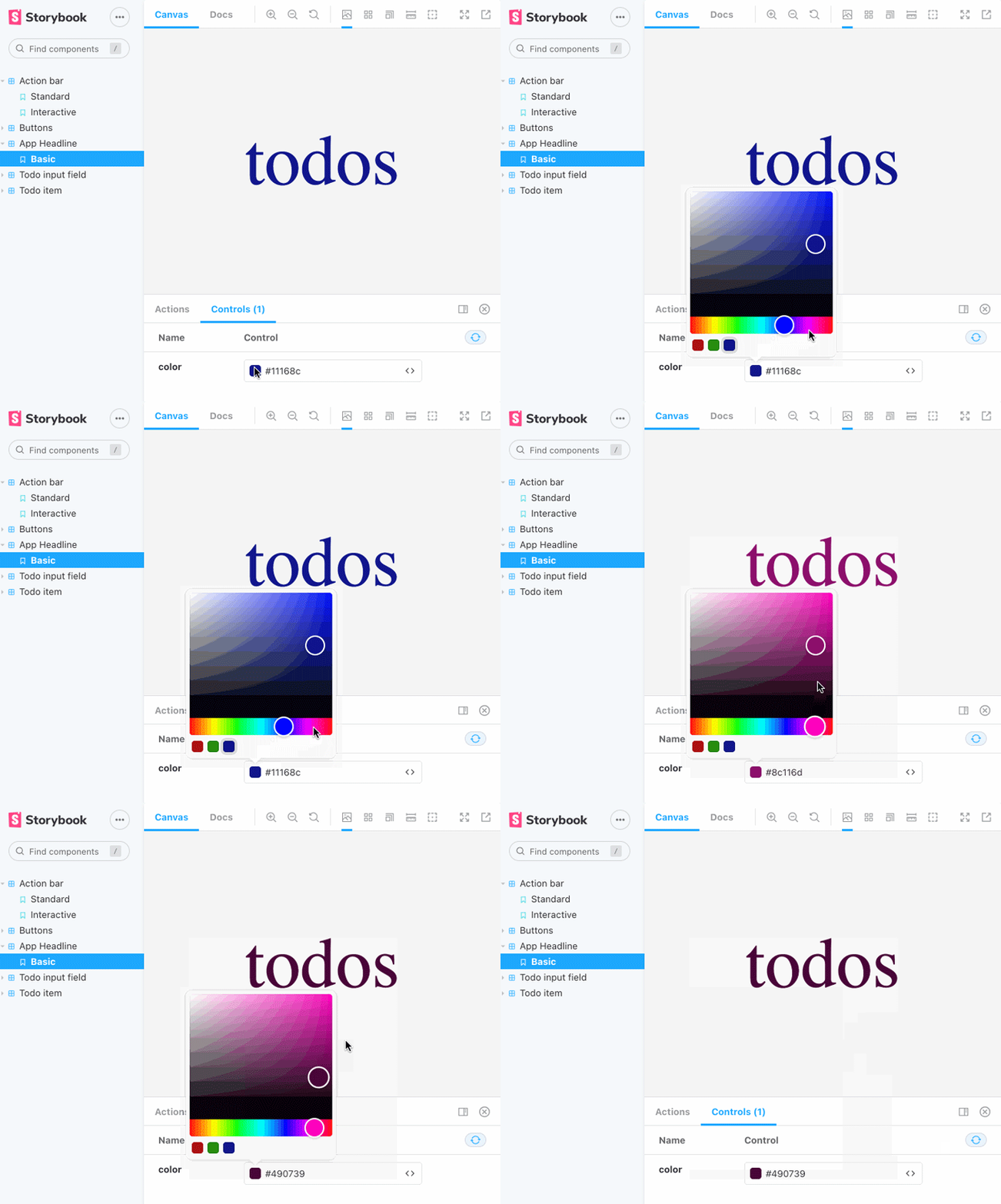
The important aspect here is that you do not have to code these demonstration use cases as part of the component’s codebase, which means you don’t have to mix these separate concerns and can instead avoid watering down your React component.
It’s actually quite the opposite — Storybook provides an elegant way to let these “interaction UI elements” be configured directly in the story code. Furthermore, in contrast to using Storybook knobs, which is now largely considered obsolete in favor of controls, you don’t have to write a ton of code to do the trick.
This is because the new controls mechanism relies on intelligent analysis of your React component’s code by leveraging static code analysis tools, such as react-docgen or react-docgen-typescript.
If you are already familiar with Storybook knobs, or you’re curious about the differences between these mechanisms, I’ll show you a comparison of the same use case implemented with knobs at the end of this article. For now, let’s look into working the new way, with Storybook controls.
sb initThe easiest way to install Storybook is with the help of npx and the sb package. Additional ways to get it up and running can be found in the Storybook for React tutorial.
$ npx sb init
Storybook will detect the project type automatically when added to an existing project — in our case, it’s a React project. As you can see from the next screenshot, you can start with an opinionated React project betting on CSS files and SVG images with Storybook up and running.
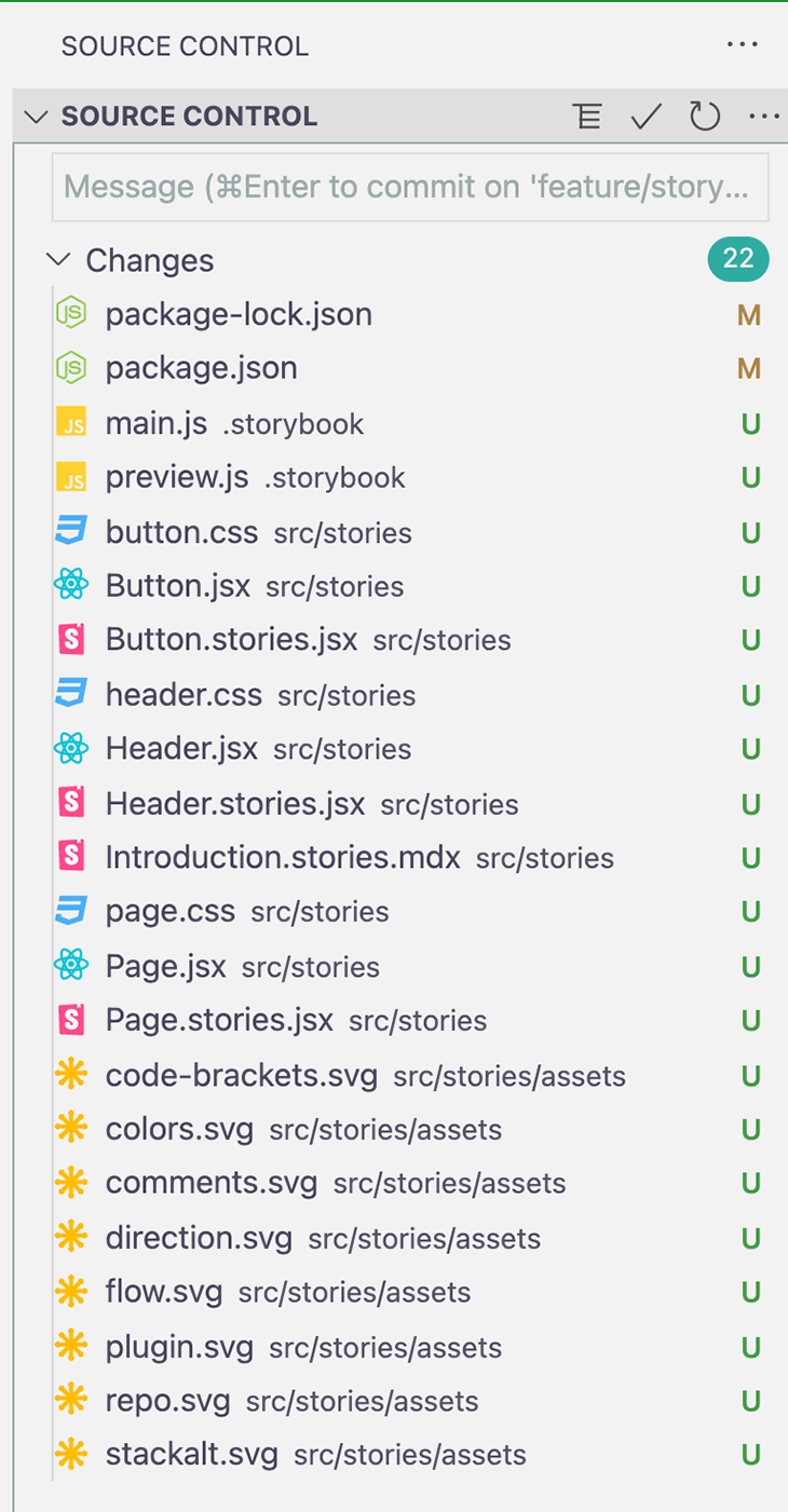
sb init commandCurrently, Storybook controls do not come out of the box with the above installation script. Thus, we need to install the addon manually.
$ npm i -D @storybook/addon-controls
Since Storybook is a Lerna monorepo project, all addons are located in sub-projects with additional Readme.md files that document how to install and integrate them in your Storybook project.
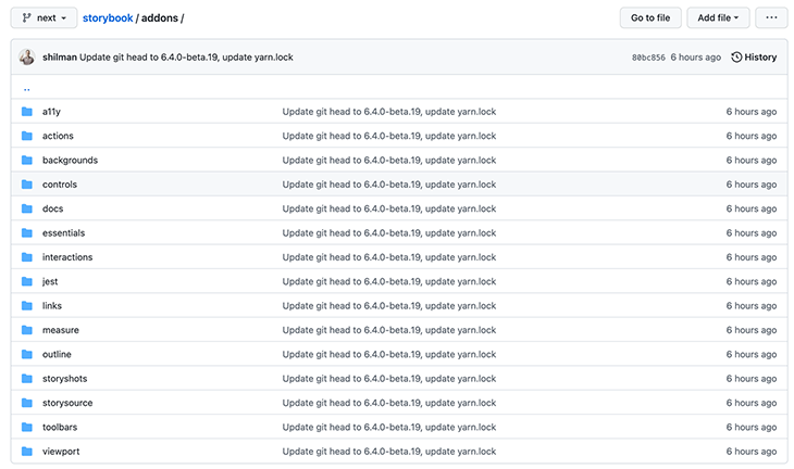
The sb script has already created a .storybook/main.js file with a couple of inbuilt addons for us. We have to add our controls addon to this file, too. The following config is sufficient for our use case.
  "addons": [
    '@storybook/addon-controls',
    "@storybook/addon-essentials"
  ]
In addition, the sb script added npm scripts to package.json. With npm run storybook, we can test if everything is working.
"scripts": {
  // ...
  "storybook": "start-storybook -p 6006",
  "build-storybook": "build-storybook"
}
To demonstrate how to use Storybook controls, I created a companion GitHub project that consists of a React application and stories that heavily use controls. The React app is heavily inspired by todomvc.
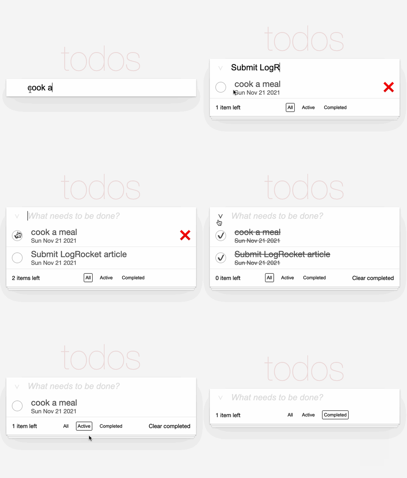
After you clone the GitHub repo, install the dependencies and then start the React dev server to run the demo app.
$ npm i
$ npm run dev
To open Storybook, execute the following command.
$ npm run storybook
At the time of this writing, Storybook does not work out of the box with webpack 5.

Because we’ll be using webpack 5 in this demo project, we need to take some extra steps. First, we have to install two additional packages: @storybook/builder-webpack5 and @storybook/manager-webpack5.
$ npm i -D @storybook/builder-webpack5 @storybook/manager-webpack5
Finally, we need to add the webpack 5 builder to our .storybook/main.js file.
  core: {
      builder: 'webpack5',
  }
The final result looks like this:
// .storybook/main.js
module.exports = {
  core: {
    builder: "webpack5",
  },
  stories: ["../src/**/*.stories.mdx", "../src/**/*.stories.@(js|jsx|ts|tsx)"],
  addons: ["@storybook/addon-essentials", "@storybook/addon-controls"],
};
Let’s take a look at our first story, which is based on the Headline component. On the right side of the below screenshot, you can see the component as it will appear as part of the demo app. On the left side, you see a story in the section App Headline named Basic. The story is set up to use a single color-picker control to dynamically adjust the font color of the headline.
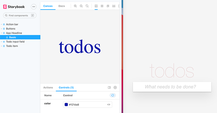
The following code is all you need to add the color picker control to the story and wire it to the Headline component.
// src/stories/Headline.stories.jsx
import Headline from "../Headline";
export default {
  component: Headline,
  title: "App Headline",
};
export const Basic = ({ color }) => <Headline color={color} />;
Basic.args = {
  color: "#516dd0",
};
Although it’s not part of Storybook controls, I would like to say a few words about the structure of the story.
As you can read in Storybook’s docs about story structure, the default export defines metadata about your component. We override the default name (Headline) of the Storybook node with the title property. Additionally, every named export constitutes a story — in our case, we just have one named Basic. The name is derived from the variable that gets exported.
You may wonder where the reference to controls is. The underlying controls concept is to write stories using args. Storybook will automatically generate UI controls based these args and what it can infer about your component.
Below, I slightly rewrote the above story code to make it more clear how controls work.
// src/stories/Headline.stories.jsx
// ...
export const Basic = (args) => <Headline {...args} />;
Basic.args = {
  color: "#516dd0",
};
The following snippet shows the implementation of the Headline component. The demo project uses styled components as a CSS library, but this is beyond the scope of this article.
// src/Headline.jsx
import styled from "styled-components";
const Headline = styled.h1`
  color: ${(props) => props.color};
  font-size: 100px;
  font-weight: 100;
  text-align: center;
`;
const HeadlineComponent = ({ color }) => {
  return <Headline color={color}>todos</Headline>;
};
As you can see, the Headline component just has a color prop of type string as input. To get the color picker control working, we need to export a function that accepts args as single-method arguments, and pass it to the actual React component.
In the second example, we spread all args into the component by (args) => <Headline {...args} />. Since we know that we have only one color argument, we can also make it more explicit, as shown in the first example: ({ color }) => <Headline color={color} />.
How does Storybook know that we want to show a color picker control? It makes the decision based on the initial value of the arg.
Basic.args = {
  color: "#516dd0",
};
If you understand why this is enough information for Storybook, then I’ll provide you with the last part of the puzzle, which is configured in .storybook/preview.js.
// .storybook/preview.js
export const parameters = {
  controls: {
    matchers: {
      color: /(background|color)$/i,
      date: /Date$/,
    },
  },
  // ...
}
The .storybook/preview.js file, along with this code, was generated by the aforementioned sb script. With the help of this file, you can control the way things are rendered in stories — for example, you can configure the layout of stories so that components will be centered inside of them.
From a control’s point of view, the important part is the controls property, as you can see above. Whenever Storybook recognizes an arg named as specified in the regex, it uses the custom control type matcher color to display a color picker UI control. In addition, we will see an example for a date picker control later in this article.
argTypesIn the next story example, we will see that using only args is not sufficient. We have to configure the controls further with the help of argTypes.
As the below screenshot shows, two stories display TodoItem components and let the user interact with them via controls.
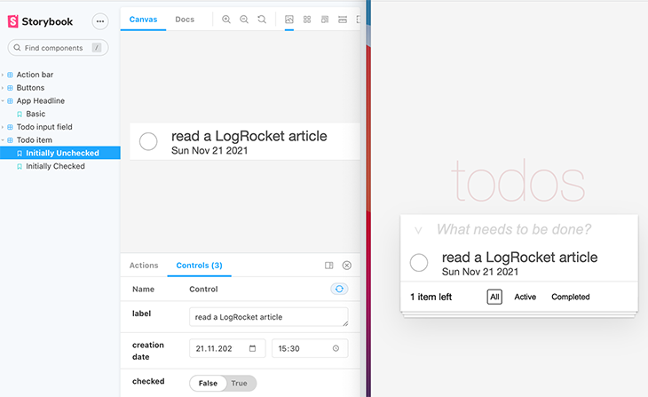
In my opinion, it is not possible to explain Storybook concepts without reference to the underlying project design. How to write your stories depends on the React concepts you used to build your components.
As an example, in contrast to components that just accept React props (as with our Headline component), you need to do some extra work if components rely on the React Context API.
Before we get to the story implementation, let’s take a look at some key aspects of the TodoItem component that we need to take care of first, before we get to configuring our controls.
// src/TodoItem.jsx
const Container = styled.div`
  height: 30px;
  // ...
`;
const TodoItem = ({ todo }) => {
  const { todos, setTodos } = useContext(AppContext);
  const [hover, setHover] = useState(false);
  const [checkHover, setCheckHover] = useState(false);
  return (
    <Container
      onMouseEnter={() => setHover(true)}
      onMouseLeave={() => setHover(false)}
    >
      // skip implementation for reasons of clarity
    </Container>
  );
};
The important takeaway of this snippet is that the component makes use of React Context, and therefore, we need to provide todos and setTodos in our story. Concretely, we need to provide the context values to AppContext.Provider, which is part of the Todos component. Our TodoItem component gets rendered as part of the TodoList component.
// src/Todos.jsx
// ...
const Todos = () => {
  const [todos, setTodos] = useState([]);
  const [filterIndex, setFilterIndex] = useState(0);
  return (
    <AppContext.Provider
      value={{
        todos,
        setTodos,
        filterIndex,
        setFilterIndex,
        theme: theme.LIGHT,
        translation,
      }}
    >
      <Container>
        <TodoInput />
        <TodoList />
        {todos.length > 0 && <ActionBar />}
      </Container>
    </AppContext.Provider>
  );
};
In contrast to the Headline component that used a single prop, writing this story is a little bit more complicated. Take a look at the following code snippet that wraps the UI component (TodoItem) in two containers (StyleAndContextProvider, StorySpecificContainer).
// src/stories/TodoItem.stories.jsx
import TodoItem from "../TodoItem";
// ...
const TodoItemWithProvider = ({ label, checked, date, ...ctxValues }) => (
  <StyleAndContextProvider {...ctxValues}>
    <StorySpecificContainer styles={{ width: commonStoryContainerWidth }}>
      <TodoItem
        todo={{
          id: 1,
          date: new Date(date).toDateString(),
          label,
          checked,
        }}
      />
    </StorySpecificContainer>
  </StyleAndContextProvider>
);
The most important part is the props parameter of the TodoItemWithProvider React component. In our example, we directly destructure the relevant information into variables because we need to pass them as arguments to different components.
As I’ll describe soon, label, checked, and date are the Storybook args that are responsible for rendering the UI controls in the controls panel (notice the label, creation date, and checked controls in the previous screenshot).
With ...ctxValues, we take all remaining properties defined in the props object and collect them in the ctxValues variable.
Let’s take a look at the two wrapper components. First, we examine the StyleAndContextProvider. We provide all properties of ctxValues as props by spreading them into the component by {...ctxValues}.
// src/storie/storyHelper.js
import { GlobalStyle } from "../App";
import AppContext from "../AppContext";
export const commonStoryContainerWidth = 750;
export const StyleAndContextProvider = ({ children, ...ctxValues }) => (
  <AppContext.Provider
    value={{
      ...ctxValues,
    }}
  >
    <GlobalStyle />
    {children}
  </AppContext.Provider>
);
This code is the “glue code” that makes sure that we wrap our UI component (children) in a container that passes the required context values (ctxValues) to the AppContext.Provider, as it is also used in the application code (in the Todos component).
In addition, GlobalStyle is imported and rendered to initialize the global styles (e.g., styles and margins of the body element). For the sake of clarity, I do not show these styles.
The second container (StorySpecificContainer) can be used by stories to provide additional styles that are important to render the isolated UI component appropriately inside of a story.
// src/stories/storyHelper.js
/*
    since every component is layout-agnostic and streteches 100% of parent
    width, we need to take care of a container with appropriate width.
    Therefore, we can define styles, e.g., width or height.
*/
export const StorySpecificContainer = ({ children, styles }) => (
  <div style={styles}>{children}</div>
);
With that said, let’s move on to the actual control-specific code.
argTypesWith the following code, Storybook renders the text input, date picker, and boolean controls to the panel. In combination with the “glue code” described in the last section, we can interact with our TodoItem component.
// stories/TodoItem.stories.jsx
// ...
// some meta information
export default {
  component: TodoItem,
  title: "Todo item",
};
// code for the story "Initially Unchecked"
/*
  provide context values for component:
  - todos array with one todo item
  - Mocked setTodos function to prevent crashes
*/
const ctxProps = {
  todos: [{
      id: 1,
      date: new Date(Date.now()).toDateString(),
      label: "LogRocket rocks",
      checked: false,
    }],
    setTodos: () => {
      // mock impl
    },
};
export const InitiallyUnchecked = (args) => (
  <TodoItemWithProvider {...args} {...ctxProps} />
);
InitiallyUnchecked.argTypes = {
  date: {
    name: "creation date",
    description: "Creation date of an todo entry.",
    table: {
      type: { summary: "Date.toDateString() result" },
      defaultValue: { summary: "Date.now()" },
    },
    control: "date",
  },
};
InitiallyUnchecked.args = {
  label: "read a LogRocket article",
  date: new Date(),
  checked: false,
};
Let’s break down this code in pieces. The ctxProps object is required for our application design to provide additional context values to the context provider. If you recall from the code of the TodoItem component, todos and setTodos are pulled out of the context (const { todos, setTodos } = useContext(AppContext)).
The following code creates a concrete story and delegates these ctxProps to the TodoItemWithProvider component. In addition, we also spread the args to the component. These args constitute the controls.
export const InitiallyUnchecked = (args) => (
  <TodoItemWithProvider {...args} {...ctxProps} />
);
In summary, args represent the values needed to initialize the Storybook controls and pass them to the context provider. The ctxProps are the other values passed to the context provider to initialize the TodoItem component completely.
The last part of the setup is the configuration of args and argTypes.
InitiallyUnchecked.argTypes = {
  date: {
    name: "creation date",
    description: "Creation date of an todo entry.",
    table: {
      type: { summary: "Date.toDateString() result" },
      defaultValue: { summary: "Date.now()" },
    },
    control: "date",
  },
};
InitiallyUnchecked.args = {
  label: "read a LogRocket article",
  date: new Date(),
  checked: false,
};
The args section provides both the initial values for the story and the information for the controls addon to infer concrete controls. From the point of view of the text input control (label), and the boolean control (checked), this is all that is necessary. Based on the data types of every properties of the args object, Storybook can decide what controls to render. That’s why label, which is of type string, gets rendered as a text field and date, which is of type date, gets rendered as date picker.
Let’s recall the TodoItemWithProvider component. label and checked are used to initialize the todo prop that is the input for the TodoItem component.
const TodoItemWithProvider = ({ label, checked, date, ...ctxValues }) => (
      // skip containers
      <TodoItem
        todo={{
          id: 1,
          date: new Date(date).toDateString(),
          label,
          checked,
        }}
      />
);
To setup the date picker control, we need to do some extra work once more, with the help of argTypes. control: "date" is required to tell Storybook to render a date picker instead of a text input field.
InitiallyUnchecked.argTypes = {
  date: {
    name: "creation date",
    control: "date",
    // ignore the rest for now
  },
};
The initial value for the date picker has to be specified in the args object.
InitiallyUnchecked.args = {
  // initialize date picker with current time and date
  date: new Date(),
  // skip other args
};
Basically, that’s all!
ArgTypes and ArgsTableThe following screenshot shows how our date picker control is rendered.
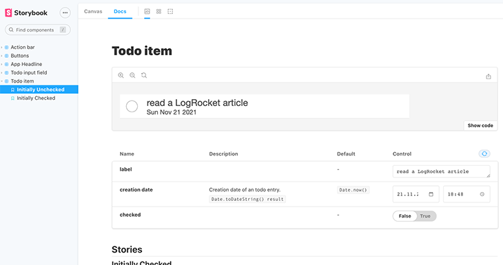
With the InitiallyUnchecked.argTypes object, we can provide additional information to specify the story in more detail.
InitiallyUnchecked.argTypes = {
  date: {
    name: "creation date",
    description: "Creation date of an todo entry.",
    table: {
      type: { summary: "Date.toDateString() result" },
      defaultValue: { summary: "Date.now()" },
    },
    control: "date",
  },
};
The name, description, and table properties are used in this example to provide more information to the so-called ArgsTable.
The following screenshot shows an overview of available controls and how they map to the data types.
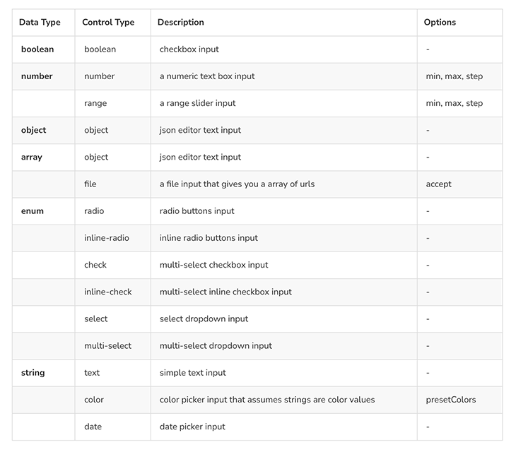
The second story we looked at, Initially Checked, differs from the previous story in how the checked control is implemented.
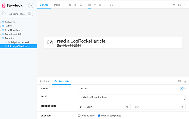
The implementation of this story’s checked control demonstrates how to work with the data type enum and how to map it to an inline-radio control type with custom labels.
// src/stories/TodoItem.stories.jsx
// ...
export const InitiallyChecked = InitiallyUnchecked.bind({});
InitiallyChecked.argTypes = {
  ...InitiallyUnchecked.argTypes,
  checked: {
    options: ["openTodo", "completedTodo"],
    mapping: {
      openTodo: false,
      completedTodo: true,
    },
    control: {
      // Type 'select' is automatically inferred when 'options' is defined
      type: "inline-radio",
      labels: {
        openTodo: "todo is open",
        completedTodo: "todo is completed",
      },
    },
  },
};
InitiallyChecked.args = {
  ...InitiallyUnchecked.args,
  checked: "completedTodo",
};
First, we define a new, named export to create a new story by cloning the former story with Storybook’s preferred technique (InitiallyUnchecked.bind({})).
The goal with our custom control is to map the radio button values to boolean values that are passed as a checked prop to the TodoItem component. Therefore, we need a combination of options, mapping, and labels to make this happen. It’s important that the string values of the enum (options) match with the property keys of mapping and labels.
options and mapping are sufficient to initialize the custom control. However, without setting type: "inline-radio", Storybook would render the default control (select). If we do not provide the labels object, the string values of options are used as the labels for the radio control.
It’s also important to provide an initial value for the radio control with the help of the args object (checked: "completedTodo"), otherwise, neither radio button is initially selected.
The second story — called Interactive, for its Action bar — demonstrates two more controls. As you can see in the next screenshot, I added a control with the name “list of todos” with the data type object. Storybook infers a control type of object and, therefore, renders a JSON editor control.
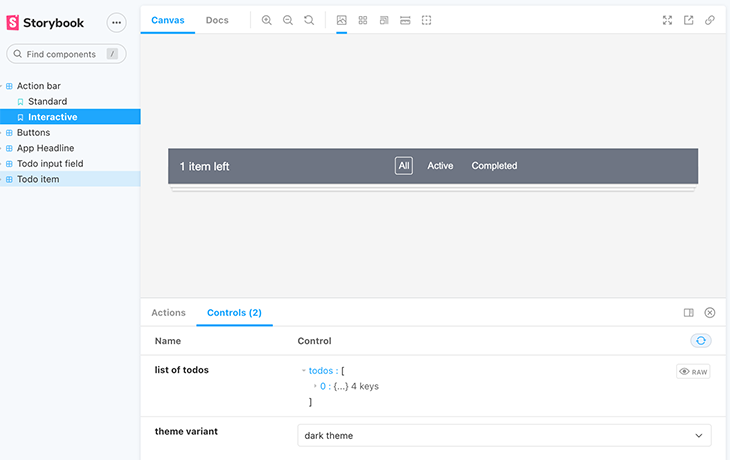
This is another, more technical way to provide interactive data to the component. Depending on the use case and the user type, this control might be appropriate.
If your stories are used by stakeholders without a development background, this “JSON control” may be unclear for use. As an example, a less flexible dropdown control that enables the user to select from a few values to showcase the relevant use cases may be more appropriate.
To find out more about this “Standard” story for the Action bar component, take a look at the source code of the companion project.
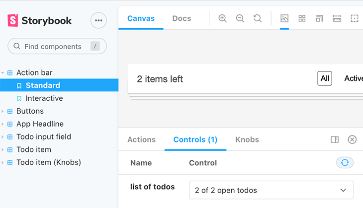
However, for the “JSON control” we need to set the control type to “object” Interactive.argTypes.todos. To set the initial value, we assign a list of todos to Interactive.args.todos.
export const Interactive = (args) => (
  <ActionBarWithProvider {...args} {...ctxProps} />
);
Interactive.argTypes = {
  todos: {
    name: "list of todos",
    description: "Status component shows number of unchecked todos.",
    control: { type: "object" },
  },
  theme: {
    name: "theme variant",
    description:
      "There exists a dark and light theme with different background and foreground colors.",
    options: ["light", "dark"],
    mapping: {
      light: theme.LIGHT,
      dark: theme.DARK,
    },
    control: {
      type: "select",
      labels: {
        light: "light theme",
        dark: "dark theme",
      },
    },
  },
};
Interactive.args = {
  todos: [
    {
      id: Date.now(),
      date: new Date(Date.now()).toDateString(),
      label: "a todo",
      checked: false,
    },
  ],
  theme: "dark",
};
Let’s look at the second control named “theme variant”. As a reminder, the theme can be set as context value, so we need to provide an arg with the key of theme.
// src/Todos.jsx
// ...
<AppContext.Provider
      value={{
        todos,
        setTodos,
        filterIndex,
        setFilterIndex,
        theme: theme.LIGHT,
        translation,
      }}
    >
    // ...
</AppContext.Provider>
To configure the select control to switch the theme variant, we again utilize options, mapping, and control.labels as properties of the Interactive.argTypes.theme object. We could omit the control.type because “select” is the default. The initial value of the control is set with Interactive.args.theme.
You may not know, but Storybook knobs have been deprecated in favor of controls. According to this discussion, the biggest advantage of controls over knobs is that they are based on args, so Storybook can infer information to render controls.
However, there are still use cases where knobs may be required, e.g., to archive type-safety and IDE support in TypeScript projects. According to the same discussion linked above, Storybook is working on removing these shortcomings.
To give you an idea of the differences, here is a knobs example: TodoItemKnobs.stories.jsx, of the same use case we already implemented with controls, TodoItem.stories.jsx.
// src/stories/TodoItemKnobs.stories.jsx
import TodoItem from "../TodoItem";
import { withKnobs, text, boolean, date } from "@storybook/addon-knobs";
import {
  StorySpecificContainer,
  StyleAndContextProvider,
  commonStoryContainerWidth,
} from "./storyHelper";

export default {
  component: TodoItem,
  title: "Todo item (Knobs)",
  decorators: [withKnobs],
};

const exampleTodo = {
  id: 1,
  date: new Date(Date.now()).toDateString(),
  label: "hello",
  checked: false,
};

const TodoItemWithProvider = (ctxValues) => (
  <StyleAndContextProvider {...ctxValues}>
    <StorySpecificContainer styles={{ width: commonStoryContainerWidth }}>
      <TodoItem
        todo={{
          ...exampleTodo,
          date: new Date(date("creation date", new Date())).toDateString(),
          label: text("label", "a todo"),
          checked: boolean("checked", false),
        }}
      />
    </StorySpecificContainer>
  </StyleAndContextProvider>
);
// provide context to prevent crashes in event handlers
const ctxProps = {
  todos: [{ ...exampleTodo }],
  setTodos: () => {
    // mock impl
  },
};
export const InitiallyUncheckedKnobs = () => (
  <TodoItemWithProvider {...ctxProps} />
);
The code above implements the same story, InitiallyUnchecked, from TodoItem.stories.jsx with the help of the knobs addon. To get this running, we first have to install the addon.
$ npm i -D @storybook/addon-knobs
The main difference from controls is that, with knobs, the code is more explicit, meaning you have to use more API functions.
import { withKnobs, text, boolean, date } from "@storybook/addon-knobs";
In our example, we want to create three knobs; therefore, we imported the three data types — text, boolean, and date — to render a text input, a checkbox, and a date picker, respectively. The withKnobs function is also important, because we have to add a decorator to the default export of the story.
export default {
  component: TodoItem,
  title: "Todo item (Knobs)",
  decorators: [withKnobs],
};
In contrast to controls, the story is written without args, so the function of the named export does not have an argument.
export const InitiallyUncheckedKnobs = () => (
  <TodoItemWithProvider {...ctxProps} />
);
Another difference is that we do not pass in the data (along with initial values) to the React component. Instead, we have to calculate them inside of the component with the help of the above imported data type functions.
const TodoItemWithProvider = (ctxValues) => (
  // ...
      <TodoItem
        todo={{
          ...exampleTodo,
          date: new Date(date("creation date", new Date())).toDateString(),
          label: text("label", "a todo"),
          checked: boolean("checked", false),
        }}
      />
  // ...
);
The first arguments of the function constitute the label for the knobs, and the second one provides the initial value.
This article focus on Storybook controls. After a short ramp-up time, the principles of args and argTypes quickly become clear. Due to the concept of convention over configuration, developing with controls does not require a lot of code. As you saw in the last section, using knobs does not confer the benefit of inferring data types — thus, every knob needs to be explicitly implemented with the help of data type functions.
In my opinion, the controls approach scales better for bigger projects and in the long run.
The examples shown in this article focus on a small but realistic use case to demonstrate most of data types and control types. If you still need more inspiration, feel free to check out the companion project that provides even more stories.
Install LogRocket via npm or script tag. LogRocket.init() must be called client-side, not
server-side
$ npm i --save logrocket

// Code:

import LogRocket from 'logrocket';
LogRocket.init('app/id');
// Add to your HTML:

<script src="https://cdn.lr-ingest.com/LogRocket.min.js"></script>
<script>window.LogRocket && window.LogRocket.init('app/id');</script>

When should you move API logic out of Next.js? Learn when Route Handlers stop scaling and how ElysiaJS helps.

Explore how Dokploy streamlines app deployment with Docker, automated builds, and simpler infrastructure compared to traditional CI/CD workflows.

A side-by-side look at Astro and Next.js for content-heavy sites, breaking down performance, JavaScript payload, and when each framework actually makes sense.

AI-generated tests can speed up React testing, but they also create hidden risks. Here’s what broke in a real app.re
Hey there, want to help make our blog better?
Join LogRocket’s Content Advisory Board. You’ll help inform the type of content we create and get access to exclusive meetups, social accreditation, and swag.
Sign up now