According to the 2020 Kaggle Machine Learning and Data Science survey, Matplotlib is the number one data visualization library among Kagglers, leading by a significant margin.
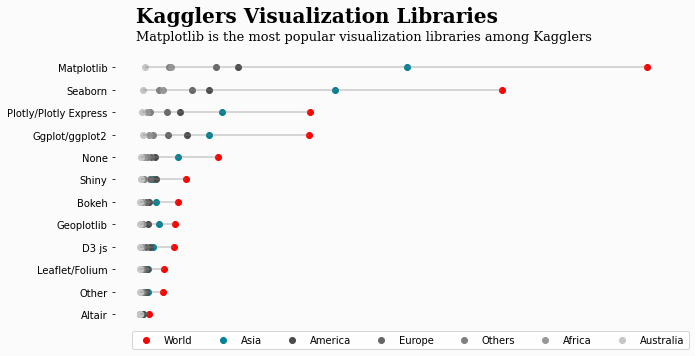
Many courses and tutorials have recently drawn beginner data scientists’ attention to new, shiny, interactive libraries like Plotly, but Matplotlib remains the king of data visualization libraries and, I suspect, will likely continue to be for the foreseeable future.
Because of this, I highly recommend that you learn it and go beyond the basics because the power of Matplotlib becomes more evident when you tap into its more advanced features.
In this tutorial, we will cover some of them and give a solid introduction to the object-oriented (OO) interface of Matplotlib.
When you first learn Matplotlib, you probably start using the library through its PyPlot interface, which is specifically designed for beginners because it’s user-friendly and requires less code to create visuals.
However, its features fall short when you want to perform advanced customizations on your graphs. That’s where the object-oriented API comes into play.
Under the hood, Matplotlib consists of base classes called artists.
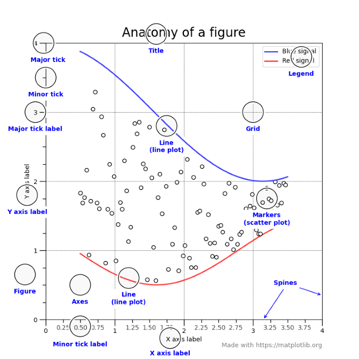
Having unique classes for each element in a visual gives Matplotlib users a ton of flexibility. Each circle-annotated component in the above graph is a separate class that inherits from the base artists. This means that you can tweak every little line, dot, text, or object visible on the plot.
In the following sections, we will learn about the most important of these classes, starting with figure and axes objects.
Let’s first import Matplotlib and its submodules:
import matplotlib as mpl  # pip install matplotlib
import matplotlib.pyplot as plt
Next, we create a figure and an axes object using the subplots function:
>>> fig, ax = plt.subplots()

Now, let’s explain what these objects do.
fig (figure) is the highest-level artist, an object that contains everything. Think of it as the canvas you can draw on. The axes object (ax) represents a single set of XY coordinate systems. All Matplotlib plots require a coordinate system, so you must create at least one figure and one axes object to draw charts.
plt.subplots is a shorthand for doing this — it creates a single figure and one or more axes objects in a single line of code. A more verbose version of this would be:
>>> fig = plt.figure()
>>> ax1 = fig.add_axes()

<Figure size 432x288 with 0 Axes>
Because this requires more code, people usually stick to using subplots. Besides, you can pass extra arguments to it to create multiple axes objects simultaneously:
>>> fig, axes = plt.subplots(nrows=1, ncols=3)
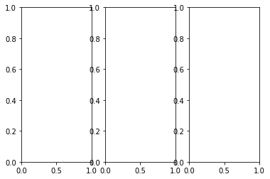
By changing the nrows and ncols arguments, you create a set of subplots — multiple axes objects stored in axes. You can access each one by using a loop or indexing operators.
Learn how to use the subplots function in-depth in its documentation.
When you switch from PyPlot to OOP API, the function names for plots do not change. You call them using the axes object:
import seaborn as sns

tips = sns.load_dataset("tips")

fig, ax = plt.subplots()

ax.scatter(tips["tip"], tips["total_bill"])
ax.set(
   title="Tip vs. Total Bill amount in a restaurant",
   xlabel="Tip ($)",
   ylabel="Totalb bill ($)",
);
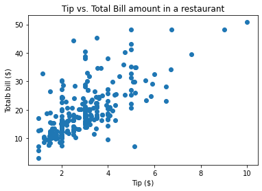
Here, I introduce the set function, which you can use on any Matplotlib object to tweak its properties.
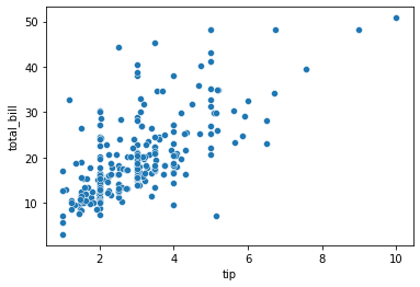
The above plot is a bit bland and in no way compares to default scatterplots created by Seaborn:
>>> sns.scatterplot(tips["tip"], tips["total_bill"]);
For this reason, let’s discuss two extremely flexible functions you can use to customize your plots in the next section.
Remember how Matplotlib has separate classes for each plot component? In the next couple of sections, we’ll take advantage of this feature.
While customizing my plots, I generally use this workflow:
setp function (more on this later)Here, we will discuss the third step — how to extract different components of the plot.
First, let’s create a simple plot:
fig, ax = plt.subplots()

# Create the data to plot
X = np.linspace(0.5, 3.5, 100)
Y1 = 3 + np.cos(X)
Y2 = 1 + np.cos(1 + X / 0.75) / 2
Y3 = np.random.uniform(Y1, Y2, len(X))

ax.scatter(X, Y3)
ax.plot(X, Y1)
ax.plot(X, Y2);
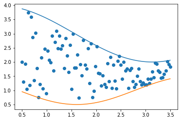
We used the subplots function to create the figure and axes objects, but let’s assume we don’t have the axes object. How do we find it?
Remember, the figure object is the highest-level artist that contains everything in the plot. So, we will call dir on the fig object to see what methods it has:
>>> dir(fig)

[
...
'gca',
'get_agg_filter',
'get_alpha',
'get_animated',
'get_axes',
'get_dpi',
'get_edgecolor',
'get_facecolor',
'get_figheight',
'get_figure',
'get_figwidth',
'get_frameon',
'get_gid',
'get_in_layout'
...
]
In the list, we see the get_axes method, which is what we need:
axes = fig.get_axes()

>>> type(axes)
list

>>> len(axes)
1
The result from get_axes is a list containing a single axes object we created in the above plot.
The axes example serves as proof that everything in Matplotlib is just a class. A single plot contains several components implemented as separate classes, and each of those components can have one or more subclasses.
They all have one thing in common: you can extract those classes or subclasses using the relevant get_* functions. You just have to know their names.
What do you do once you extract those objects? You tweak them!
plt.getp and plt.setp functionsTo tweak the properties of any component, you have to know what arguments it has and what values each argument receives. You will be working with many objects, so visiting the documentation every time can become tiresome.
Fortunately, Matplotlib creators thought of this issue. Once you extract the relevant object, you can see what parameters it accepts using the plt.getp function. For example, let’s see the properties of the axes object:
fig, _ = plt.subplots()

ax = fig.get_axes()[0]

>>> plt.getp(ax)
   ...
   xlabel =
   xlim = (0.0, 1.0)
   xmajorticklabels = [Text(0, 0, ''), Text(0, 0, ''), Text(0, 0, ''), T...
   xminorticklabels = []
   xscale = linear
   xticklabels = [Text(0, 0, ''), Text(0, 0, ''), Text(0, 0, ''), T...
   xticklines = <a list of 12 Line2D ticklines objects>
   xticks = [0.  0.2 0.4 0.6 0.8 1. ]
   yaxis = YAxis(54.0,36.0)
   yaxis_transform = BlendedGenericTransform(     BboxTransformTo(     ...
   ybound = (0.0, 1.0)
   ygridlines = <a list of 6 Line2D gridline objects>
   ylabel =
   ylim = (0.0, 1.0)
   ymajorticklabels = [Text(0, 0, ''), Text(0, 0, ''), Text(0, 0, ''), T...
   yminorticklabels = []
   yscale = linear
   ...
As you can see, the getp function lists all properties of the object it was called on, displaying their current or default values. We can do the same for the fig object:
>>> plt.getp(fig)
   ...
   constrained_layout_pads = (0.04167, 0.04167, 0.02, 0.02)
   contains = None
   default_bbox_extra_artists = [<AxesSubplot:>, <matplotlib.spines.Spine object a...
   dpi = 72.0
   edgecolor = (1.0, 1.0, 1.0, 0.0)
   facecolor = (1.0, 1.0, 1.0, 0.0)
   figheight = 4.0
   figure = Figure(432x288)
   figwidth = 6.0
   frameon = True
   gid = None
   in_layout = True
   label =
   linewidth = 0.0
   path_effects = []
   ...
Once you identify which parameters you want to change, you must know what range of values they receive. For this, you can use the plt.setp function.
Let’s say we want to change the yscale parameter of the axis object. To see the possible values it accepts, we pass both the axes object and the name of the parameter to plt.setp:
>>> plt.setp(ax, "yscale")
yscale: {"linear", "log", "symlog", "logit", ...} or `.ScaleBase`
As we see, yscale accepts five possible values. That’s much faster than digging through the large docs of Matplotlib.
The setp function is very flexible. Passing just the object without any other parameters will list that object’s all parameters displaying their possible values:
>>> plt.setp(ax)
 ...
 xlabel: str
 xlim: (bottom: float, top: float)
 xmargin: float greater than -0.5
 xscale: {"linear", "log", "symlog", "logit", ...} or `.ScaleBase`
 xticklabels: unknown
 xticks: unknown
 ybound: unknown
 ylabel: str
 ylim: (bottom: float, top: float)
 ymargin: float greater than -0.5
 yscale: {"linear", "log", "symlog", "logit", ...} or `.ScaleBase`
 yticklabels: unknown
 yticks: unknown
 zorder: float
 ...
Now that we know what parameters we want to change and what values we want to pass to them, we can use the set or plt.setp functions:
fig, ax = plt.subplots()

# Using `set`
ax.set(yscale="log", xlabel="X Axis", ylabel="Y Axis", title="Large Title")

# Using setp
plt.setp(ax, yscale="log", xlabel="X Axis", ylabel="Y Axis", title="Large Title")

plt.setp(fig, size_inches=(10, 10));

The most common figures in any plot are lines and dots. Almost all plots, such as bars, box plots, histograms, scatterplots, etc., use rectangles, hence, lines.
Matplotlib implements a global base class for drawing lines, the Line2D class. You never use it directly in practice, but it gets called every time Matplotlib draws a line, either as a plot or as part of some geometric figure.
As many other classes inherit from this one, it’s beneficial to learn its properties:
from matplotlib.lines import Line2D
xs = [1, 2, 3, 4]
ys = [1, 2, 3, 4]

>>> plt.setp(Line2D(xs, ys))
 ...
 dash_capstyle: `.CapStyle` or {'butt', 'projecting', 'round'}
 dash_joinstyle: `.JoinStyle` or {'miter', 'round', 'bevel'}
 dashes: sequence of floats (on/off ink in points) or (None, None)
 data: (2, N) array or two 1D arrays
 drawstyle or ds: {'default', 'steps', 'steps-pre', 'steps-mid', 'steps-post'}, default: 'default'
 figure: `.Figure`
 fillstyle: {'full', 'left', 'right', 'bottom', 'top', 'none'}
 gid: str
 in_layout: bool
 label: object
 linestyle or ls: {'-', '--', '-.', ':', '', (offset, on-off-seq), ...}
 linewidth or lw: float
 ...
I recommend paying attention to the linestyle, width, and color arguments, which are used the most.
One of the essential aspects of all Matplotlib plots is axis ticks. They don’t draw much attention but silently control how the data is displayed on the plot, making their effect on the plot substantial.
Fortunately, Matplotlib makes it a breeze to customize the axis ticks using the tick_params method of the axis object. Let’s learn about its parameters:
Change the appearance of ticks, tick labels, and gridlines.

Tick properties that are not explicitly set using the keyword
arguments remain unchanged unless *reset* is True.

Parameters
----------
axis : {'x', 'y', 'both'}, default: 'both'
   The axis to which the parameters are applied.
which : {'major', 'minor', 'both'}, default: 'major'
   The group of ticks to which the parameters are applied.
reset : bool, default: False
   Whether to reset the ticks to defaults before updating them.

Other Parameters
----------------
direction : {'in', 'out', 'inout'}
   Puts ticks inside the axes, outside the axes, or both.
length : float
   Tick length in points.
width : float
   Tick width in points.
Above is a snippet from its documentation.
The first and most important argument is axis. It accepts three possible values and represents which axis ticks you want to change. Most of the time, you choose both.
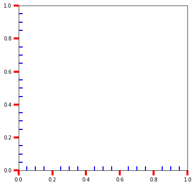
Next, you have which that directs the tick changes to either minor or major ticks. If minor ticks are not visible on your plot, you can turn them on using ax.minorticks_on():
fig, ax = plt.subplots(figsize=(10, 10))

ax.minorticks_on()

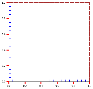
The rest are fairly self-explanatory. Let’s put all the concepts together in an example:
fig, ax = plt.subplots(figsize=(6, 6))

ax.tick_params(axis="both", which="major", direction="out", width=4, size=10, color="r")
ax.minorticks_on()
ax.tick_params(axis="both", which="minor", direction="in", width=2, size=8, color="b")
While we are here, you can tweak the spines as well. For example, let’s play around with the top and right spines:
fig, ax = plt.subplots(figsize=(6, 6))

ax.tick_params(axis="both", which="major", direction="out", width=4, size=10, color="r")
ax.minorticks_on()
ax.tick_params(axis="both", which="minor", direction="in", width=2, size=8, color="b")

for spine in ["top", "right"]:
   plt.setp(ax.spines[spine], ls="--", color="brown", hatch="x", lw=4)
You can access the spines using the spines attribute of the axes object, and the rest is easy. Because a spine is a line, its properties are the same as that of a Line2D object.
The key to a great plot is in the details. Matplotlib defaults are rarely up to professional standards, so it falls on you to customize them. In this article, we have tapped into the core of Matplotlib to teach you the internals so that you have a better handle on more advanced concepts.
Once you start implementing the ideas in the tutorial, you will hopefully see a dramatic change in how you create your plots and customize them. Thanks for reading.
Install LogRocket via npm or script tag. LogRocket.init() must be called client-side, not
server-side
$ npm i --save logrocket

// Code:

import LogRocket from 'logrocket';
LogRocket.init('app/id');
// Add to your HTML:

<script src="https://cdn.lr-ingest.com/LogRocket.min.js"></script>
<script>window.LogRocket && window.LogRocket.init('app/id');</script>

Discover how to build, render, and automate product demo videos with Remotion, replacing traditional screen recordings with reusable React code.

Chrome’s Modern Web Guidance embeds modern web platform skills into AI coding agents, helping them choose native HTML, CSS, and browser APIs over legacy patterns.

Learn how to use Fallow to analyze AI-generated code, detect dead code, duplicate logic, and complexity issues, and integrate automated code quality checks into your AI-assisted development workflow.
Learn how to protect full-stack projects from NPM supply chain attacks with a practical security checklist.
Hey there, want to help make our blog better?
Join LogRocket’s Content Advisory Board. You’ll help inform the type of content we create and get access to exclusive meetups, social accreditation, and swag.
Sign up now