
When I first heard of CSS Shapes, I fell into the trap of expecting a drawing API. I thought it’d be a CSS version of SVG for doing crazy, single div, CSS-only drawings, but that’s not what CSS Shapes are — and I think we’re better for it.
SVG already handles complex shapes way better than CSS ever could. Adding a clunky syntax to combine complex shapes would just clutter CSS without providing additional value. Instead, CSS shapes let you do something SVG can’t do: they let you change how text flows around other elements.
When you float an image within text, the content flows around the rectangle, but what if that image is a coffee cup, or you want to accentuate part of the photo by positioning text at an angle on it? CSS Shapes lets you flow text around circles, ellipses, rounded rectangles, polygonal shapes and more.
CSS Shapes are more about cutting a space out of text than about drawing shapes. They’re more analogous to the artistic concept of negative space — the area around and between the subject or subjects of an image.
Still, I thought I’d be able to put backgrounds on the CSS Shapes and make shapes that way. That’s not the case. CSS Shapes are independent of the shape of the element they are added to. As floated objects, they only affect how text flows around them.
That said, they are still limited by the bounding box of the element. You can make the shape any size you want, but it can only push text around within its bounding box. If you go beyond the bounding box, the rectangular bounding box becomes the de facto shape.
Text will only flow around the shapes in one direction. If you float the shape left, content will flow around to the right and vice versa. If you have a five-pointed star shape, content will only flow down one side, it won’t flow down both sides. The top point of the star will have text just down the right side if it’s floated left or vice versa. You cannot encapsulate a shape within a single column of text.
CSS shapes are defined by the shape-outside property. Shape functions include circle, ellipse, inset (rectangle and rounded rectangle) and polygon. You can also use image transparency and gradient transparency to cut spaces out of text areas.
Pro tip: While learning CSS shapes, float your shapes left. (If text is aligned right, float the shapes right). The straight edge of that side will make the shapes easier to see. The ragged edge can make it harder to know where the text ends because the next word won’t fit or because the shape is stopping it.
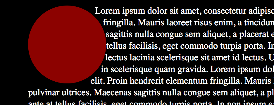
The circle function takes the form:
shape-outside: circle( radius at x-point y-point)
Or:
.circle {
      shape-outside: circle( 100px at 50% 50%);
    float: left;
}
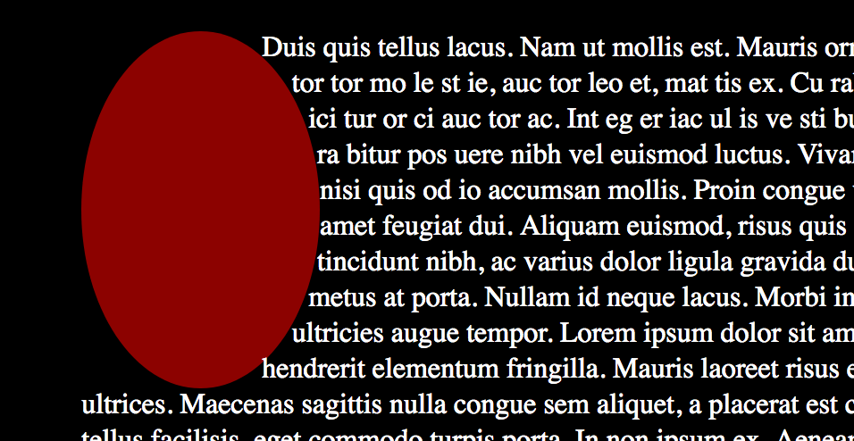
Ellipses have virtually the same input as circles, except you can set both a vertical and horizontal radius:
shape-outside: ellipse( radius-x radius-y at x-point y-point)
Or:
.ellipse {
      shape-outside: ellipse( 100px 140px at 50% 50%);
    float: left;
}
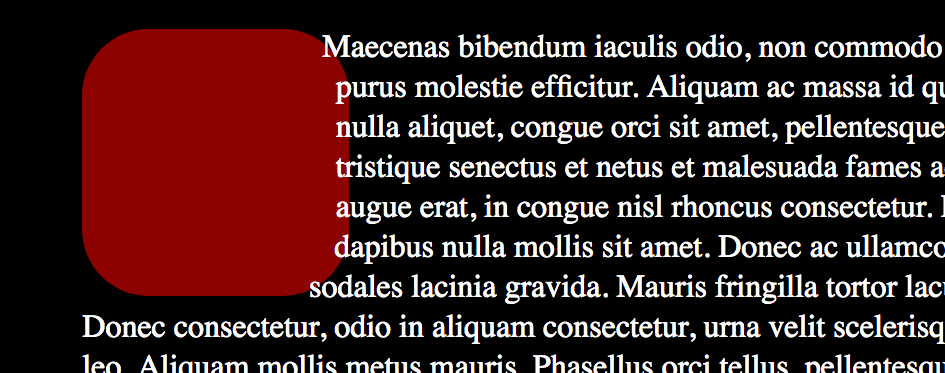
While rectangular shapes are easy to produce, inset allows you to have the rectangular edge inside the element and also allows you to do rounded rectangles.
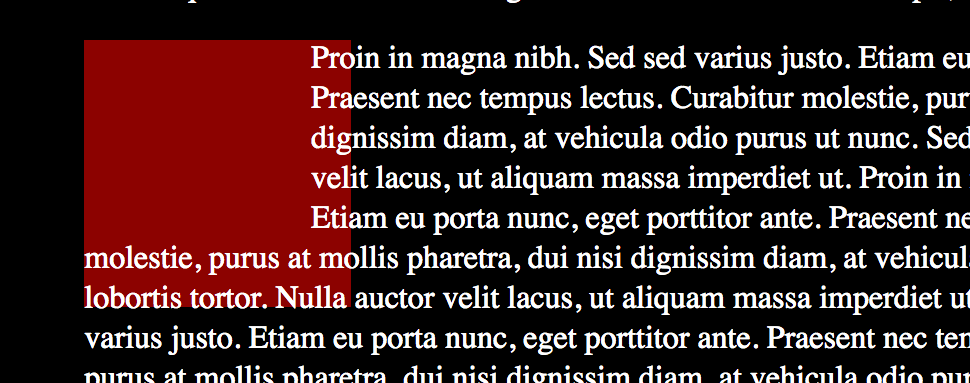
.rectangle {
      shape-outside: inset( 20px 30px 50px 0);
    float: left;
}

.rounded-rectangle {
      shape-outside: inset( 10px 10px 10px 10px round 50px);
    float: left;
}

For complex shapes, you can give the shape-outside property a polygon to work with.
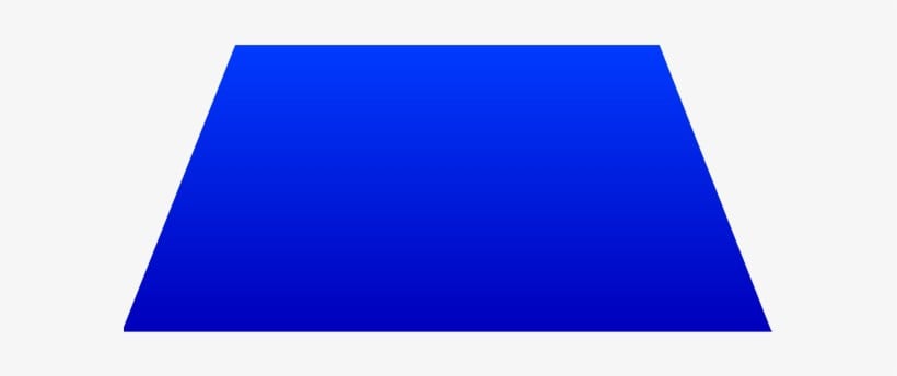
.trapezoid {
      shape-outside: polygon(37px 9px, 157px 7px, 189px 131px, 7px 127px);
    float: left;
}
Pro tip: To help you see what’s going on, put a background color on the element. Add a clip-path using the same function and parameters as the shape-outside property. This works great in Firefox, not so great (if at all) in other browsers. But since it’s only a guide during development, browser compatibility issues won’t affect your final product.
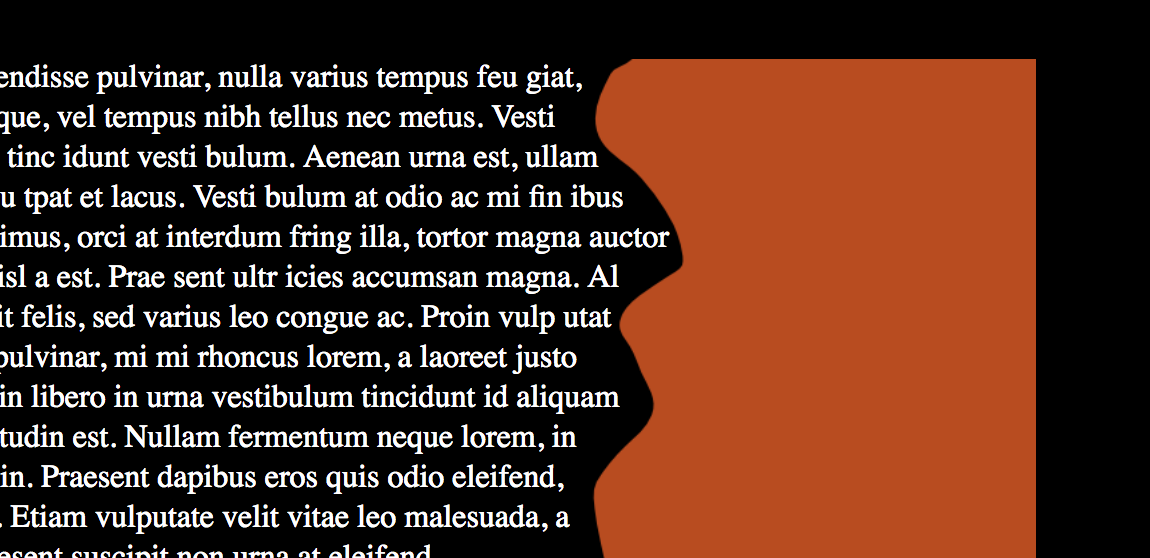
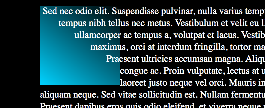
For really complex shapes, or for ones from images, you can use their transparency to have text flow around them. The shape-image-thresholdproperty is a value between 0 and 1. It designates what level of transparency should be used as the edge in an image or gradient.
The Replay is a weekly newsletter for dev and engineering leaders.
Delivered once a week, it's your curated guide to the most important conversations around frontend dev, emerging AI tools, and the state of modern software.
.image {
      shape-outside: url(image-shape.png);
      shape-image-threshold: 0.5;
    float: left;
}

.gradient{
      shape-outside: linear-gradient(37deg, rgba(0,212,255,1) 0%, rgba(2,0,36,0) 100%);
      shape-image-threshold: 0.5;
    float: left;
}
Here are all the examples in one Codepen for you to play with, fork, and explore:
See the Pen
CSS Shapes – Simple Shapes by Undead Institute (@undeadinstitute)
on CodePen.
Pro tip: The image must be from within the same domain as your site. Otherwise, it causes a CORS violation and will not work properly. It also means that if you’re just trying this on your desktop and aren’t using a server, it won’t work.
shape-margin does just what you’d expect: it allows you to push the text further out from the shape. You could also make the shape larger for the same effect, but if you have complex polygon or were using an image and needed some extra space, shape-margin will be a lifesaver.
.gradient-with-margin {
      shape-outside: linear-gradient(37deg, rgba(0,212,255,1) 0%, rgba(2,0,36,0) 100%);
      shape-image-threshold: 0.5;
           float: left;
           shape-margin: 1em;
}
Building and positioning these shapes manually through code can be really, really, really annoying (really). You can’t actually see the edges of the shapes, and it’s often hard to tell whether you’ve hit the bounding box or not.
There is, however, a free tool that will make your life so much easier (really). Firefox’s developer tools comes with a shape path editor that lets you visually make changes to any of the shapes.
Circles and ellipses have radius and center controls, and insets have controls for each side. And best of all, you can edit the polygon in real time, adding and removing points as needed: double-click on a line to add a point; double-click on a current point to remove it.
Pro tip: When Firefox adds a point in this way, it uses percentages to define the coordinates. If you want to use something other than percentages, put in some dummy points to get started. Firefox will let you manipulate them while keeping the units you want.
The shape editor also shows you where the bounding box of the element is when you cross it so that you can be more confident in building and positioning your shapes.
To use the shape editor, just open Firefox, inspect the element you want to put a shape on, and put in a starter shape-outside property with the shape function you want to use. There will be a little polygon shape in the inspector next to the polygon (or circle, or inset, etc.) function:
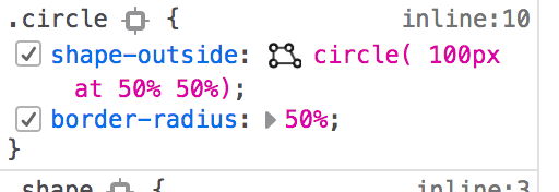
Click on it and you’ll get a visual representation of the shape you’re using, complete with control points:
Now that you’ve seen how CSS Shapes work, let’s look at how to utilize them.
As a kid, I loved concrete poems, where the shape of the words on the page are part of the aesthetic. With CSS shapes, we can approximate these on the web. Take, for instance, “The Mouse’s Tale,” by Lewis Carroll, which he shaped—you guessed it—to look like a mouse’s tail.
See the Pen
The Mouse’s Tale – by Lewis Carroll by Undead Institute (@undeadinstitute)
on CodePen.
One thing you need to be careful about when using these in production contexts is readability. If you use crazy/jagged shapes, it can make the text much harder to read, particularly if you use a large, irregular shape on the left side (or the right side if you read right to left). When we jump from the end of one line to the beginning of another, the eye has an easier time if the beginning of the lines are aligned.
With the advent of CSS animation, one of the first questions I ask after learning a new CSS property is, “Can I animate it?” (The other question I ask is, “How can I bend it to my evil, evil will?” but that’s a question for a different article.)
Turns out you can actually animate CSS Shapes, but not directly — or, as is so often the case with CSS Shapes, not the way you’d think. You can animate the size of the shape-outside property, but because of the bounding box, there’s a limit on how much of the animation you can show.
For instance, you can create a circle and animate the radius, but as the circle pushes out, it only affects the content still within the bounding box. Once the circle is bigger than the bounding box, it no longer affects the text, and you have a rectangular shape.
The same is true with shape-margin. While it allows you to animate the margin between the shape outside and the surrounding text, it is also limited by the bounding box and can only push the text as far as the width of the bounding box.
If you want to use an expanding circle animation without it turning into a rectangular block, the trick is to make your element much larger than the smallest size of your shape. If you can’t use the element itself, you can use a parent element and put the shape-outside and animation on that element. You can then set a small radius on the circle and animate shape-margin to explode or implode, depending on your preference.
See the Pen
Heartbeat by Undead Institute (@undeadinstitute)
on CodePen.
Another way to animate the shape is to animate the element along with the shape. So we create an element and move the center of the circle along with the element. This can create a cool effect, like a wrecking ball smashing its way through text, or you could drop it from the top of the page down to the bottom, shoving text out of the way as it goes.
See the Pen
Wrecking Ball by Undead Institute (@undeadinstitute)
on CodePen.
Pro tip: For these types of animations, set the center of your circle in something other than percentages, or the calculation may have trouble keeping up with where the actual element is.
A caution, though: animating margins, be it shape or otherwise, is not the most performant way to move elements on a web page because the browser must constantly reflow the text.
Since CSS shapes are loosely related to the elements on which they are put, transforms (a more performant animation method) won’t work. Using a transform will move the element the CSS Shape is attached to but will not move the shape itself. This could lead to some interesting animations, but we’ll let you explore those on your own.
A second caution: readability. Because the shape is pushing through the text, the text has to get out of its way and reflows around the changed size or placement of the shape. When you push into text, this will make the text move to quite a different place and can cause the reader to lose their place.
Therefore, it’s best to use this on content the user either has already read or has not yet read, not on content they are reading unless they can very easily find their place again.
Lastly, you can also animate a polygon’s points by simply setting two different polygons in your keyframes.
Pro tip: Keep the number of points the same between the two polygons and they’ll animate fluidly. If there’s a different number of points, it’ll just switch from one polygon to the next without any tweening.
See the Pen
The Mouse’s Tale – by Lewis Carroll – Animated by Undead Institute (@undeadinstitute)
on CodePen.
While CSS shapes might not be what you expected when you started this article, hopefully you’ve seen their power. They’re an excellent tool to have in your toolbox even if you only use it as often as a coping saw.
One important note, even though CSS shapes have been in the CSS spec since version 1, Microsoft browsers still don’t support them. Pretty much every other browser has for some time. It’s under consideration for the next version of Edge and the switch to the Blink rendering engine may have an affect on support as well.
Don’t feel trapped by a lack of Microsoft support, though. The worst case scenario is that you’ll have a rectangle instead of a smooth curve or IE and Edge will ignore it completely and the text will run the regular length.
CSS shapes have a lot of potential to increase the beauty and wonder of the web. I hope CSS shapes will now be more trapezoid than trap for you.
As web frontends get increasingly complex, resource-greedy features demand more and more from the browser. If you’re interested in monitoring and tracking client-side CPU usage, memory usage, and more for all of your users in production, try LogRocket.

LogRocket lets you replay user sessions, eliminating guesswork around why bugs happen by showing exactly what users experienced. It captures console logs, errors, network requests, and pixel-perfect DOM recordings — compatible with all frameworks.
LogRocket's Galileo AI watches sessions for you, instantly identifying and explaining user struggles with automated monitoring of your entire product experience.
Modernize how you debug web and mobile apps — start monitoring for free.

This article showcases a curated list of open source mobile applications for Flutter that will make your development learning journey faster.

Discover what’s new in The Replay, LogRocket’s newsletter for dev and engineering leaders, in the April 1st issue.

This post walks through a complete six-step image optimization strategy for React apps, demonstrating how the right combination of compression, CDN delivery, modern formats, and caching can slash LCP from 8.8 seconds to just 1.22 seconds.

Learn what vinext is, how Cloudflare rebuilt Next.js on Vite, and whether this experimental framework is worth watching.
Hey there, want to help make our blog better?
Join LogRocket’s Content Advisory Board. You’ll help inform the type of content we create and get access to exclusive meetups, social accreditation, and swag.
Sign up now