Interest Invoker API is a new and experimental API designed to help developers create UI changes with little or no need for JavaScript. Initially announced at Google I/O 2025 as part of the Web Platform updates, this experimental API aims to simplify how developers manage UI components like modals, popovers, and other layered interactions.
Although it’s just in the experimental stage, Interest Invoker holds great prospects for the problem of accessibility in web development. (Note that it’s only available in Chromium-based browsers like Chrome, and hasn’t yet been adopted or implemented by other browser engines like Firefox or Safari.)
In this article, we will look at the problems that the Interest Invoker API seeks to solve in web development. We’ll also get hands-on, using the API to add modals and popovers to our webpage, and leveraging the Interest Invoker pseudo classes for styling in CSS.
We will then see how to use it in conjunction with JavaScript to trigger an action when a user indicates or loses interest.
To follow along, you’ll need the following
The Replay is a weekly newsletter for dev and engineering leaders.
Delivered once a week, it's your curated guide to the most important conversations around frontend dev, emerging AI tools, and the state of modern software.
You will need to run Chrome version 135 or higher on your machine and also enable experimental features on Chrome for Interest Invoker to work.
For this article, we have a pre-built mini dashboard that we will use to learn and practice. We will add the popover, modal, and some styles as we progress into the tutorial.
I have provided two files:
The interest target attribute is currently only supported on the following elements:
<button><a href=my-Link<a href=my-Link><area>We will be using the <button> element for our practice.
Overdependence on JavaScript for common UI patterns has been a big issue in web development.
Existing solutions like the HTML <title> tag for tooltips are inadequate; they’re very limited in how far they can be styled, and also have poor accessibility for keyboard and touchscreen users. The content is not focusable, not screen reader-friendly, and often doesn’t appear on touch devices at all.
With the Interest Invoker API, it’s possible to style declarative controlled elements without the need for complex JavaScript.
The current solution involving JavaScript leaves out screen readers, as there’s a lack of proper aria-expanded attributes or aria-details relationships. There is also difficulty in dismissing the current JavaScript-created elements with keyboard keys like Esc .
The Interest Invoker API provides a way to implement hover-on HTML elements without the need for complex JavaScript.
The syntax goes like so:
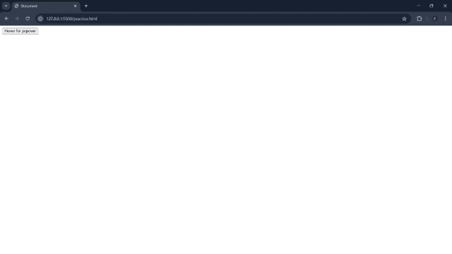
<button interesttarget="my-popover" type=button>Hover for popover</button><div id="my-popover" popover="hint">Hello world</div>
In the above, interesttarget="my-popover" on the button element calls on the div with the id="my-popover" to display the popover text “Hello world” when the button is hovered upon.
The Interest Invoker API works closely with another API, the Popover API. You can see it calling on the popover="hint".
You can read about the Popover API here.
Before we implement it in our dashboard widget, let’s try out the above code.
Copy the above code and paste it into your practice.html file:
 Nice, it works.
Apart from the bland popover, we can style it to our taste using CSS. Let’s add some CSS to bring it to life.
Copy the code below and paste it into your practice.html file’s style section:
[popover] {
    background-color: tomato;
    padding: 80px;
    border-radius: 5px;
    color: white;
    font-family: sans-serif;
}
Refresh the page, and we now have it looking all nice:
You can also style it by using the id of the popover like so:
#my-popover {
    background-color: tomato;
    padding: 80px;
    border-radius: 5px;
    color: white;
    font-family: sans-serif;
}
This API also has the has-interest pseudo-class for styling the trigger element.
Let’s give the button a nice orange background color and a border when a user gains interest:
:has-interest {
  background-color:orange ;
  border: 2px solid green;
}
There you go:
Let’s now add it to our dashboard.
First, let me show you how the webpage that we’ll be working on looks: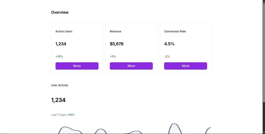
We are going to add and style popovers for the three buttons.
First, let’s make the buttons triggers for our popovers.
Like we saw earlier, we will add the interesttarget="my-popover" attribute to the button.
We have three buttons in total. We will create the following differently named triggers for the buttons:
interesttarget="my-popover1”interesttarget="my-popover2”interesttarget="my-popover3”Next, we will create three divs that our trigger will be calling when hovered on.
Let’s give them the following ids:
id="my-popover1”id="my-popover2”id="my-popover3”We now need to add the popover attribute to our divs like so:
popover="hint”
Our three divs should now look like the code below:
<div id="my-popover1" popover="hint">Hello world1</div>
<div id="my-popover2" popover="hint">Hello world2</div>
<div id="my-popover3" popover="hint">Hello world3</div>
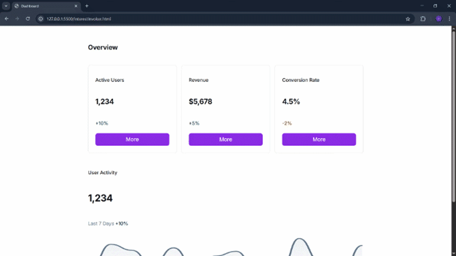
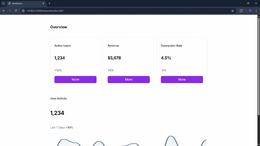
Our popover now works:
It doesn’t look too nice; let’s add some style to it.
First, we update the content of the popover with the following HTML:
<div id="my-popover1" popover="hint">
    <div class="popover-div">
        <p>This will lead you to Active Users page.</p>
        <p>Are you sure you wanna go there?</p>
    </div>
</div>
<div id="my-popover2" popover="hint">
    <div class="popover-div">
        <p>This will lead you to revenue page.</p>
        <p>Are you sure you wanna go there?</p>
    </div>
</div>
<div id="my-popover3" popover="hint">
    <div class="popover-div">
        <p>This will lead you to Conversion Rate page.</p>
        <p>Are you sure you wanna go there?</p>
    </div>
</div>
Then we go ahead and add some styling to it:
.popover-div {
    border: 1px dotted greenyellow;
    padding: 5px;
}

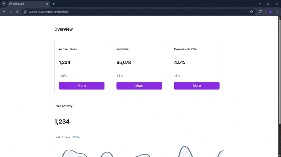
Let’s now use the :has-interest pseudo-class to style the trigger element for our popover:
:has-interest {
    background-color: rgb(146, 84, 204);
}
The API also provides a way to set delays on the popover’s appearance and disappearance when they are hovered over:
[interesttarget] {
  interest-target-show-delay: 0.5s;
  interest-target-hide-delay: 200ms;
}
In the above code, the interest-target-show-delay sets the duration it will take for the popover to appear, and the interest-target-hide-delay sets how long it will take for it to disappear when the user loses interest in the element.
The interesttarget and commandfor attributes can both be present on a single element, and this is effective. Essentially, this provides a popover to show the user what the click of the button will do, and a modal pops up when the user clicks on the button.
This is all achieved with HTML.
Let’s see it in code:
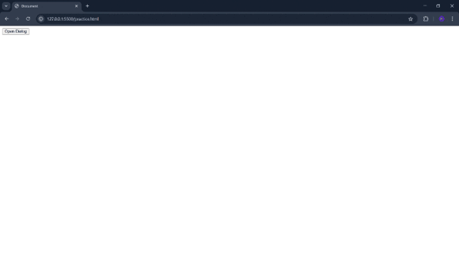
<button type="button" interesttarget="my-popover" commandfor="my-dialog" command="show-modal">Open Dialog</button>

<dialog id="my-dialog">
    Hello world!

    <button type="button" commandfor="my-dialog" command="close">Close</button>
</dialog>


<div id="my-popover" popover="hint">Hello world</div>
In the above code, we have a button with an interest target set to display the popover div with id="my-popover".
There is also a commandfor="my-dialog" attribute that calls on the dialog element, and command="close" on the button inside the dialog element.
Let us see it in action:
It is now time to implement it in our mini dashboard. We will do two things:
commandfor="dialog" and command="show-modal" to the button under the info-card div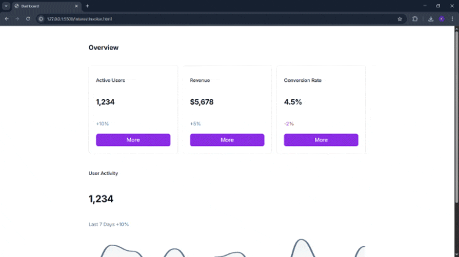
Alright, it works.
Next, let’s add some content to the dialog element:
<div class="modal-wrapper">
    <div class="layout-container">
        <div class="content-wrapper">
            <div class="modal-content-container">
                <div class="card-section">
                    <div class="card-item">
                        <p class="card-title">Account Overview</p>
                        <p class="account-value">$12,345</p>
                        <div class="period-info">
                            <p class="period-text">Last 30 Days</p>
                            <p class="percentage-change">+5%</p>
                        </div>
                        <div class="bar-chart">
                            <div class="bar" style="height: 90%;"></div>
                            <p class="bar-label">Jan</p>
                            <div class="bar" style="height: 60%;"></div>
                            <p class="bar-label">Feb</p>
                            <div class="bar" style="height: 30%;"></div>
                            <p class="bar-label">Mar</p>
                            <div class="bar" style="height: 30%;"></div>
                            <p class="bar-label">Apr</p>
                            <div class="bar" style="height: 20%;"></div>
                            <p class="bar-label">May</p>
                            <div class="bar" style="height: 100%;"></div>
                            <p class="bar-label">Jun</p>
                        </div>
                    </div>
                </div>
                <div class="button-container">
                    <button class="connect-button">
                        <span>Connect Accounts</span>
                    </button>
                </div>
            </div>
        </div>
    </div>
</div>
I also added some styling for the modal. Let’s test it one more time:
Looking good!
The InterestEvent interface lets you run custom JavaScript when someone shows or loses interest without setting up manual event handlers for mouseenter and mouseleave.
To demonstrate this, we will use JavaScript to trigger the window alert method and display the text, “You’ve gained interest!” when the user indicates interest and display, “You’ve lost interest!” when the user loses interest.
Copy and paste the code below into the script tag of our interestInvoker.html file:
const custom = document.getElementById("my-popover");
custom.addEventListener("interest", (e) => {
    custom.classList.add('active');
    alert("You've gained interest!");
});

custom.addEventListener("loseinterest", (e) => {
    custom.classList.remove('active');
    alert("You've lost interest!");
});
The Interest Invoker API may still be experimental, but it explores the possibilities for rethinking user intent and interaction in web applications.
Before the introduction of this API, web interfaces relied on explicit actions like clicks, hovers, or focus to trigger UI elements like tooltips, modals, and dropdowns. These interactions are often managed manually with a combination of JavaScript and ARIA attributes, which can lead to inconsistent behaviour and accessibility issues.
The Interest Invoker API introduces a more declarative approach that shifts the focus from low-level event handling to what the user intends to do.
In this hands-on tutorial, we explored the real-world problems this API aims to solve and walked through building tooltip popovers with custom behaviour and styling. We also added custom delays to our popover, and made it support multiple actions of hovering to display a tooltip, and button clicks to open a modal.
We finally added JavaScript to display an alert when the user gains or loses interest.
As with all experimental features, keep in mind that this API can change or be removed at any time. It’s best to avoid using it in production as it can break your app in future updates. Use it only in development environments, and always check the release notes for breaking changes.

Learn how inline props break React.memo, trigger unnecessary re-renders, and hurt React performance — plus how to fix them.

This article showcases a curated list of open source mobile applications for Flutter that will make your development learning journey faster.
Discover what’s new in The Replay, LogRocket’s newsletter for dev and engineering leaders, in the April 1st issue.
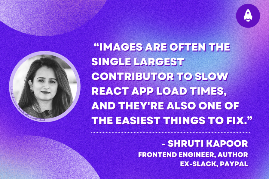
This post walks through a complete six-step image optimization strategy for React apps, demonstrating how the right combination of compression, CDN delivery, modern formats, and caching can slash LCP from 8.8 seconds to just 1.22 seconds.
Hey there, want to help make our blog better?
Join LogRocket’s Content Advisory Board. You’ll help inform the type of content we create and get access to exclusive meetups, social accreditation, and swag.
Sign up now

 Learn more →
