In this article, we’ll focus on testing the interactions of our components while using React 18 and Storybook. Before we get started, you may want to read this introductory article from Chak Shun Yu that explores React 18’s new APIs, and the blog post announcing of React 18, which provides in-depth insight into the new, opt-in concurrent rendering capabilities of React 18.

play function
The Replay is a weekly newsletter for dev and engineering leaders.
Delivered once a week, it's your curated guide to the most important conversations around frontend dev, emerging AI tools, and the state of modern software.
Interaction testing involves testing interactions within React components. These tests simulate user actions within the application, such as interacting with the components by clicking buttons or typing into input components, and the behavior of the application after such interactions.
In modern applications, components hold a lot more responsibility than they once did because developers have begun including things like data fetching operations and state management tools inside components. With interaction tests, we can verify the functional aspects of our application’s user interface more effectively.
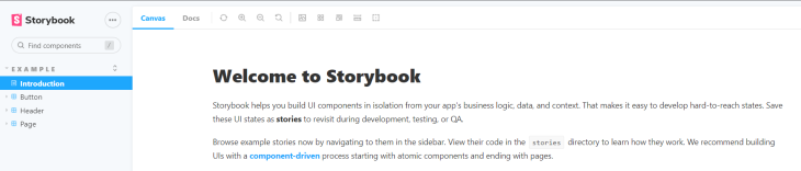
Storybook is an open source tool that lets you build UI components and pages in isolation. It allows you to build documentation for components, which enables easy reuse of components and allows them to be tested visually, which helps prevent bugs.
To get started with Storybook, we need to run the Storybook CLI in an existing project’s root directory. In this case, our project is a React application, created using Create React App.
Run the commands below, to bootstrap the React application and add a story.
Create the React application:
npx create-react-app reactstorybook -template typescript
yarn start
Open up another terminal window and initialize Storybook in our project’s root directory.
npx storybook init
yarn storybook
Once the initialization is done, Storybook should start locally and output an address. Depending on your computer’s configuration, the Storybook environment may open automatically in the browser.
A story is a component that accepts a set of arguments, which describe how to render the component. It essentially captures the rendered state of a UI component.
After initializing Storybook in our Create React App, Storybook creates example components that demonstrate the type of components that can be built with Storybook, i.e., button, header, and page.
The example components outline how Storybook manages state for different stories. The stories for the button component shown on Storybook UI can be found in our code editor.
In the root directory of the React application, open the terminal window and input the following command to view the code for the Button component and its stories.
code src/stories/Button.stories.tsx
code src/stories/Button.tsx
One key importance of stories from Storybook is to enable the developer to keep track of how the UI looks as changes are made. This helps prevent accidental regressions, which Timothy Vernon talks more about in his post, which provides developers with testing strategies for dealing with visual regressions using Jest.
Storybook provides an environment for testing components in isolation. It’s important to test the stories that have been written because it helps prevent UI bugs over time.
Storybook comes with a variety of tools that enable testing the UI, mocking data or dependencies, and even mocking network requests. The test runner is one of such tools. It enables developers to automatically test an entire Storybook and catch broken stories.
There are various testing methods available to developers when using Storybook for testing.
Visual regression tests assist in catching bugs in UI appearance. It works by taking screenshots of every story and comparing them to identify changes. Storybook is great for running visual tests, as every story is a test specification.
Visual regression tests should not be confused with snapshot tests, because snapshots work by comparing the rendered markup of every story against known baselines. Snapshot tests aren’t as accurate as visual regression tests because they compare blobs of HTML instead of what is displayed to the user. This can lead to false positives, as code changes don’t yield visual changes.
Quality assurance professionals rely on accessibility tests to catch accessibility variations that have been committed during application development. Accessibility tests rely on the Web Content Accessibility Guidelines (WCAG) rules to audit the rendered DOM. If the elements in the rendered DOM aren’t in line with WCAG rules, accessibility violations are thrown.
Storybook provides a very handy tool for testing for accessibility in an application with the a11y add-on.
Now, it’s time to look at how interaction testing works when it comes to Storybook and React 18.
As previously stated, interaction testing tests interactions with React components. In interaction tests, the goal is to pretend to be the user, which involves actions such as typing and clicking buttons, and making sure that the expected output is received.
The main goal of a React component is to render the UI given a set of props, but there are also complex components that track application state.
The play function included in version 6.4 of Storybook executes a story once it is loaded. The play function is key to testing our components; with the play function, you enable the ability to simulate a user’s behavior. The test runner can then be used to confirm that the component renders correctly and check that the interaction tests with the play function pass.
There are two key packages you’ll need to install for this to work:
Opening up the terminal in the root directory of our project, install the listed packages.
yarn add -dev @storybook/testing-library @storybook/jest @storybook/test-runner jest@27
If you’re using an older version of Storybook, check your package.json to confirm that the package @storybook/addon-interactions is available in devDependencies. If it isn’t, install the package with the --dev flag, as it is integral to setting up interaction tests in Storybook.
module.exports = {
  stories: ["../src/**/*.stories.mdx", "../src/**/*.stories.@(js|jsx|ts|tsx)"],
  addons: [
    "@storybook/addon-links",
    "@storybook/addon-essentials",
    "@storybook/addon-interactions", // Addon has to be registered
    "@storybook/preset-create-react-app",
  ],
  features: {
    interactionsDebugger: true, // enable playback controls
  },
  framework: "@storybook/react",
  core: {
    builder: "@storybook/builder-webpack5",
  },
};
play functionThe play function holds the logic for the test and is connected to the story we want to test. Let’s look at how to set up an interaction test with Storybook and the play function.
We rely on the @storybook/testing-library and @storybook/jest packages to help with this.
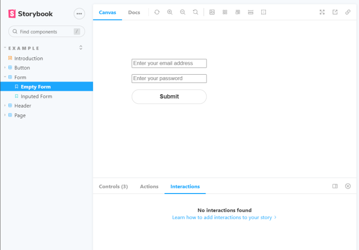
In order to experience what’s going on behind the scenes, we’ll create a form component with two states:
play function to fill in the inputs using interactionsIn the stories directory, create the files Form.tsx and Form.stories.tsx.
touch src/stories/Form.tsx
touch src/stories/form.css
touch src/stories/Form.stories.tsx
Form.tsx is our first component. In that file, paste the following code:
import React from "react";
import { Button } from "./Button";
import "./form.css";

interface FormProps {
  placeholder?: string;
  label?: string;
  name?: string;
}

export const Form = ({
  placeholder = "Enter your email",
  ...props
}: FormProps) => {
  const [details, setDetails] = React.useState(false);

  const onClick = () => {
    setDetails(true);
  };

  return (
    <div className="form-wrapper">
      <input
        autoComplete="off"
        placeholder="Enter your email address"
        className={"storybook-input"}
        name="email"
        aria-label="email"
        id="email"
        data-testid="email"
        {...props}
      />
      <input
        autoComplete="off"
        placeholder="Enter your password"
        className={"storybook-input"}
        name="password"
        id="password"
        data-testid="password"
        {...props}
      />
      <Button label="Submit" onClick={() => onClick()} />
      {details === true ? (
        <p>
          Get ready to experience great development experience with storybook
        </p>
      ) : (
        ""
      )}
    </div>
  );
};
Create our CSS file.
code src/stories/form.css
.form-wrapper {
  padding: 5rem;
  display: flex;
  flex-direction: column;
  gap: 1rem;
  width: 30%;
}
Now, that the parent form is set up, it’s time to create our component’s initial state. Let’s start by setting up a story to set the initial state of the form.
code src/stories/Form.stories.tsx
import React from "react";
import { ComponentStory, ComponentMeta } from "@storybook/react";
import { within, userEvent } from "@storybook/testing-library";
import { expect } from "@storybook/jest";
import { Form } from "./Form";

export default {
  title: "Example/Form",
  component: Form,
} as ComponentMeta<typeof Form>;

const Template: ComponentStory<typeof Form> = (args) => <Form {...args} />;

export const EmptyForm = Template.bind({});

export const InputedForm = Template.bind({});
In the above code block, the base part of our story has been built.
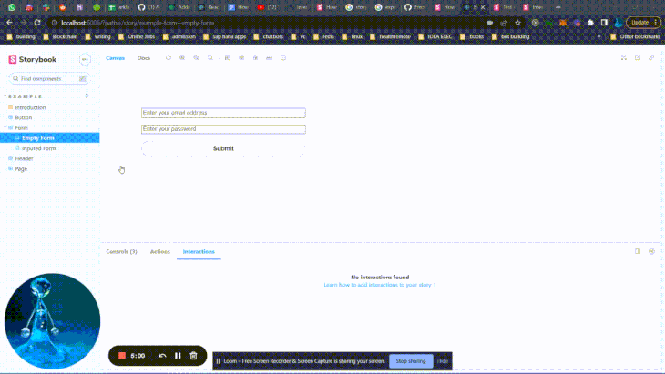
play functionIt’s time to set up the play function that runs after a story finishes rendering. With the play function, user workflows can be tested.
// the play function comes into use
InputedForm.play = async ({ canvasElement }) => {
  // start querying the component from its root element
  const canvas = within(canvasElement);

  // the key part, where the interactions are defined
  // Simulate interactions with the component
  await userEvent.type(canvas.getByTestId("email"), "[email protected]");

  await userEvent.type(canvas.getByTestId("password"), "a-due-password");

  await userEvent.click(canvas.getByRole("button"));

  // assert DOM structure
  await expect(
    canvas.getByText(
      "Get ready to experience great development experience with storybook"
    )
  ).toBeInTheDocument();
};
With the above code block, we’ve set up the interaction tests. userEvent simulates the user’s interactions with the component, which are filling the form and submitting it.
We’ll rely on test-runner to confirm that the component renders correctly. Update your package.json scripts to enable the test runner.
  "scripts": {
    "test-storybook": "test-storybook",
  },
Run the test runner with the following command.
yarn test-storybook
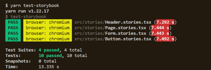
With confirmation of our passing tests, we can navigate to our browser window that holds our Storybook UI components to observe the interaction test in action.
Interaction tests in Storybook are similar to Testing Library’s user-events API. If you use the user-events API, you gain the ability to carry out advanced simulations of browser interactions using the fireEvent method.
Building complex UIs can be a difficult activity, especially when development is done among multiple team members. But building UIs with Storybook, which places a lot of importance on building small atomic components, means components can be tested more effectively.
Visual testing is one area in which Storybook excels, and with the new tools for interaction testing, we can easily see how robust the Storybook ecosystem has become.
Install LogRocket via npm or script tag. LogRocket.init() must be called client-side, not
server-side
$ npm i --save logrocket

// Code:

import LogRocket from 'logrocket';
LogRocket.init('app/id');
// Add to your HTML:

<script src="https://cdn.lr-ingest.com/LogRocket.min.js"></script>
<script>window.LogRocket && window.LogRocket.init('app/id');</script>
I tested the Speculation Rules API in a real project to see if it actually improves navigation speed. Here’s what worked, what didn’t, and where it’s worth using.
How AGENTS.md and agent skills improve coding agents, reduce mistakes, and make AI IDE workflows more reliable and project-aware.

Build a simple, framework-free Node.js app, and then deploy it to three different services that offer a free tier, Render, Railway, and Fly.io.

Understand best practices for structuring Node.js projects, such as separating roles using folder structures and practicing modular code.
Hey there, want to help make our blog better?
Join LogRocket’s Content Advisory Board. You’ll help inform the type of content we create and get access to exclusive meetups, social accreditation, and swag.
Sign up now

 Learn more →
