react-input-mask for web appsModern web applications accept various user inputs: mouse clicks, screen tap and keyboard events, gestures, audio, and files.

Almost all web applications use keyboard events to capture detailed user input data. In other words, users can enter required data into typical web applications using their devices’ keyboards. For example, a user can enter a name, phone number, postal code, and email address during a particular web application’s registration process, and that information is then communicated to the backend.
Every user is different. They may have unique practices when it comes to form-filling, and they often try to use various formats in input fields. If a particular web application displays a raw text input field to capture a phone number, for example, the user may face several usability issues, such as not being able to predict the input field’s accepted format when they’re typing.
To avoid these types of issues, you can use input masks to provide user-friendly constraints for a particular user input field. In this article, I’ll explain how you can use input masking in your React applications.
In user experience (UX) design, an input mask refers to a string template that is created based on a specific input format to prevent transcription errors. If the user tries to enter an invalid character, the masked input element blocks the invalid keystroke. For example, users won’t be able to enter English letters in a masked phone number field.
Frontend developers can use input masks to help ensure clean and valid user inputs are sent to their web application backends. At the same time, input masks motivate users to enter clean, correct inputs.
There are several libraries that we can use to create input masks in React. The react-input-mask library is the most popular one, and it offers a very flexible API for developers. As a bonus, its behavior follows a UX-friendly design pattern.
You can either test this tutorial’s code snippets in a new React project or use them in your existing project. If you are going to get started with a new one, create a new project with the following command:
npx create-react-app input-masking
Next, install the react-input-mask npm package to create input masks in your React application.
npm install react-input-mask --save
Now, let’s try to create a simple masked input box for a phone number to check whether or not the library works. Add the following code into your App.js file or component.
import { useState } from 'react';
import InputMask from 'react-input-mask';
function PhoneInput(props) {
  return (
    <InputMask
      mask='(+1) 999 999 9999'
      value={props.value}
      onChange={props.onChange}>
    </InputMask>
  );
}
function App() {
  const [phone, setPhone] = useState('');
  const handleInput = ({ target: { value } }) => setPhone(value);
  return (
    <div>
      <PhoneInput
        value={phone}
        onChange={handleInput}>
      </PhoneInput>
      <div style={{paddingTop: '12px'}}>Phone: {phone}</div>
    </div>
  );
}
export default App;
If you start the React development server with npm start or yarn start, you will see a masked input to enter a standard USA phone number (starting with the +1 dialing code), as shown below:
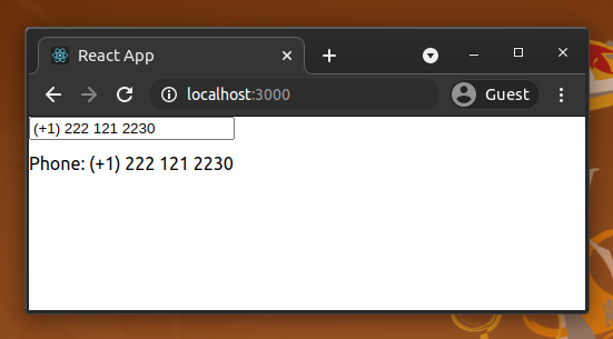
We implemented a reusable component to accept phone numbers with the library’s InputMask component. The library’s generic mask component responds to the following React props:
mask: a template of the user input with predefined special characters — 9 for matching a number, a for a letter, and * for either a number or a lettermaskChar: this character can be used to fill the missing part of the input string; the default value is _ (underscore)formatChars: you can change the default characters and regular expressions used for masking (in the mask property) by changing this propertyalwaysShowMask: the library usually shows the mask when the user focuses on the masked input; set this property to true if you always want to show the maskLike any other typical input element, we can use the onChange event to change the component state based on user inputs.
react-input-mask examplesThe input masking concept can be used in many different scenarios to enhance the user-friendliness of web applications. Check the following basic masking examples.
function PINInput(props) {
  return (
    <InputMask
      mask='9999'
      value={props.value}
      onChange={props.onChange}
      placeholder='Enter PIN'>
    </InputMask>
  );
}
function GoogleOTP(props) {
  return (
    <InputMask
      mask='G-999999'
      maskChar={null}
      value={props.value}
      onChange={props.onChange}>
    </InputMask>
  );
}
function CreditCardInput(props) {
  return (
    <InputMask
      mask='9999 9999 9999 9999'
      value={props.value}
      onChange={props.onChange}>
    </InputMask>
  );
}
Format: DD-MM-YYYY
function DateInput(props) {
  return (
    <InputMask
      mask='99-99-9999'
      placeholder='DD-MM-YYYY'
      value={props.value}
      onChange={props.onChange}>
    </InputMask>
  );
}
Format: YYYY-MM-DD
function DateInput(props) {
  return (
    <InputMask
      mask='9999-99-99'
      placeholder='YYYY-MM-DD'
      value={props.value}
      onChange={props.onChange}>
    </InputMask>
  );
}
The above masked input offers a simple date input with minimal constraints. It accepts only digits for the year, month, and day, but it accepts invalid user inputs like 2020–50–50. Most masked date inputs out there are implemented like this due to backend validations and the user’s knowledge about standard calendars.
However, I will explain how to block invalid dates from date input masks in the upcoming advanced masking examples section.
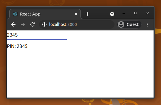
react-input-mask examplesThe above examples use built-in regular expressions for masking. For example, the four-digit PIN’s mask uses 9 to match digits.
However, we cannot implement every masking rule with these predefined regular expressions. In other words, we need to define custom masking characters with different regular expressions. In some scenarios, we also need to have dynamic masks, where the user’s input directs the constraints of subsequent characters they enter in the field.
Below, we’ll look at some advanced examples that use custom masking characters and conditional masks.
Assume that you need to implement a mask to capture a valid product code in a grocery store management app written in React. Let’s define the rules for a valid product code as such:
P (single product) or K (kit)We need to define custom masking characters to implement the above rules. Check the following code.
const MaskedInput = (props) => {
  // Defining custom masking characters
  // P will match P or K
  // 0 (zero) will match even digits
  const formatChars = {
    'P': '[PK]',
    '0': '[02468]'
  };
  return (<InputMask
    mask='P0000'
    value={props.value}
    onChange={props.onChange}
    formatChars={formatChars}
    placeholder='Eg: P2266'>
  </InputMask>)
};
Assume that you need to ask the user to enter a time by using the hh:mm format. The simpler implementation of the time input mask may use the 99:99 mask, but users can still enter some invalid time entries, such as 59:10, 08:65, etc.
An input mask typically refers to a string input with a specific format — not related to strict validation. However, we can apply conditional masking based on user input to add improvements to these scenarios.
For example, we can only accept the digits 0, 1, and 2 for the first mask character position. After that, we can change the second mask character’s logic based on the first digit of the user input.
Take a look at the following code that uses conditional masking.
function TimeInput(props) {
  let mask = '12:34';
  let formatChars = {
    '1': '[0-2]',
    '2': '[0-9]',
    '3': '[0-5]',
    '4': '[0-9]'
  };

  let beforeMaskedValueChange = (newState, oldState, userInput) => {
    let { value } = newState;

    // Conditional mask for the 2nd digit base on the first digit
    if(value.startsWith('2'))
      formatChars['2'] = '[0-3]'; // To block 24, 25, etc.
    else
      formatChars['2'] = '[0-9]'; // To allow 05, 12, etc.
    return {value, selection: newState.selection};
  }
return (
    <InputMask
      mask={mask}
      value={props.value}
      onChange={props.onChange}
      formatChars={formatChars}
      beforeMaskedValueChange={beforeMaskedValueChange}>
    </InputMask>
  );
}
The beforeMaskedValueChange event will be triggered before the masked input field gets updated with the most recent user input. This means we can use it to change the mask dynamically.
In the previous simple date input examples, we used the default format character 9 for the mask. Those implementations provide correct input masks for users to enter a date, but they don’t provide strict validation. Therefore, we can implement validation for the date mask like in the previous time input.
We are going to improve the date input mask by adding the following validation rules:
0 and 1 for the first digit. If the user entered 0, the second digit position allows any digit between 1 and 9. If the user entered 1, the user can only enter digits between 0 and 2 for the second digit’s location2022-02, the masked input accepts only integers from 01 to 28 for the date part, since 2022 February’s last day is 28We can implement the above validation rules with react-input-mask library API, as shown below.
import { useState } from 'react';
import InputMask from 'react-input-mask';

function TimeInput(props) {
  let mask = 'YYYY-mM-dD';
  let formatChars = {
    'Y': '[0-9]',
    'm': '[0-1]',
    'M': '[0-9]',
    'd': '[0-3]',
    'D': '[1-9]'
  };

  let beforeMaskedValueChange = (newState, oldState, userInput) => {
    let { value } = newState;

    let dateParts = value.split('-');
    let yearPart = dateParts[0];
    let monthPart = dateParts[1];
    let dayPart = dateParts[2]

    // Conditional mask for the 2nd digit of month based on the first digit
    if(monthPart.startsWith('1'))
      formatChars['M'] = '[0-2]'; // To block 13, 15, etc.
    else
      formatChars['M'] = '[1-9]'; // To allow 05, 08, etc - but blocking 00.

    // Conditional mask for day
    if(!yearPart.includes('_') && !monthPart.includes('_')) {

      // Find last day of the month
      let endOfMonth = new Date(`${yearPart}-01-01`);
      endOfMonth.setMonth(parseInt(monthPart));
      endOfMonth.setDate(0);
      let lastDayOfMonth = endOfMonth.getDate().toString();

      // Set [0-x] dynamically for the first digit based of last day
      formatChars['d'] = `[0-${lastDayOfMonth[0]}]`;

      if(dayPart.startsWith(lastDayOfMonth[0]))
        formatChars['D'] = `[0-${lastDayOfMonth[1]}]`; // Limit month's last digit based on last day
      else if(dayPart.startsWith('0'))
        formatChars['D'] = '[1-9]'; // To block 00.
      else
        formatChars['D'] = '[0-9]'; // To allow days to start with 1 Eg: 10, 12, 15, etc.
    }

    return {value, selection: newState.selection};
  }
  return (
    <InputMask
      mask={mask}
      value={props.value}
      onChange={props.onChange}
      formatChars={formatChars}
      beforeMaskedValueChange={beforeMaskedValueChange}>
    </InputMask>
  );
}

function App() {
  const [date, setDate] = useState('');
  const handleInput = ({ target: { value } }) => setDate(value);
  return (
    <div>
      <TimeInput
        value={date}
        onChange={handleInput}>
      </TimeInput>
      <div style={{paddingTop: '12px'}}>Date: {date}</div>
    </div>
  );
}
export default App;
For the DD-MM-YYYY date format, we have to enter the date before the month. Therefore, we cannot implement a proper validation for date digits.
As a solution, we can simplify the validation logic by allowing an integer value up to 31 for the date part regardless of the month — assuming that the user knows the end date of a specific month. Look at the following DD-MM-YYYY formatted date mask validation.
import { useState } from 'react';
import InputMask from 'react-input-mask';

function TimeInput(props) {
  let mask = 'dD-mM-YYYY';
  let formatChars = {
    'Y': '[0-9]',
    'd': '[0-3]',
    'D': '[0-9]',
    'm': '[0-1]',
    'M': '[1-9]'
  };

  let beforeMaskedValueChange = (newState, oldState, userInput) => {
    let { value } = newState;

    let dateParts = value.split('-');
    let dayPart = dateParts[0];
    let monthPart = dateParts[1];

    // Conditional mask for the 2nd digit of day based on the first digit
    if(dayPart.startsWith('3'))
      formatChars['D'] = '[0-1]'; // To block 39, 32, etc.
    else if(dayPart.startsWith('0'))
      formatChars['D'] = '[1-9]'; // To block 00.
    else
      formatChars['D'] = '[0-9]'; // To allow 05, 15, 25  etc.


    // Conditional mask for the 2nd digit of month based on the first digit
    if(monthPart.startsWith('1'))
      formatChars['M'] = '[0-2]'; // To block 15, 16, etc.
    else
      formatChars['M'] = '[1-9]'; // To allow 05, 06  etc - but blocking 00.

    return {value, selection: newState.selection};
  }
  return (
   <InputMask
      mask={mask}
      value={props.value}
      onChange={props.onChange}
      formatChars={formatChars}
      beforeMaskedValueChange={beforeMaskedValueChange}>
    </InputMask>
  );
}

function App() {
  const [date, setDate] = useState('');
  const handleInput = ({ target: { value } }) => setDate(value);
  return (
    <div>
      <TimeInput
        value={date}
        onChange={handleInput}>
      </TimeInput>
      <div style={{paddingTop: '12px'}}>Date: {date}</div>
    </div>
  );
}
export default App;
The react-input-mask library renders masked input boxes using typical HTML inputs. Therefore, you can change styling by adding CSS classes as you wish. If you would like to use another component instead of HTML input, such as Material, implement your component as below.
import InputMask from 'react-input-mask';
import Input from '@material-ui/core/Input';

const MaskedInput = (props) => (
  <InputMask
    mask='9999'
    maskChar={null}
    value={props.value}
    onChange={props.onChange}
    placeholder='Enter your PIN'>
    {(inputProps) => <Input {...inputProps} />}
  </InputMask>
);
The above code snippet renders the Material input element instead of the native HTML input element as the masked PIN input field.
The react-input-mask library is a flexible library for creating any masked input. Unfortunately, it’s no longer actively maintained, so developers who use this library started looking for alternatives. As a result, now there is an active fork, and it is well-maintained.
Also, there are several alternative libraries that you can use instead of react-input-mask. If you are implementing masks for only digits, such as credit card numbers, dates, monetary values, the react-number-format library is a good alternative. For example, you can implement an input mask for a 4-digit PIN with the following code snippet.
import NumberFormat from 'react-number-format';

<NumberFormat format="####" mask="_" placeholder="Enter PIN"/>
The react-maskedinput library offers most features that react-input-mask has, such as dynamic masking, copy-pasting support, predefined format characters, etc. Also, it offers a feature to transform user inputs. For example, you can implement a simple license plate number mask that only accepts capital letters and digits, as shown below.
import MaskedInput from 'react-maskedinput';

<MaskedInput mask="AAA 1111" placeholder="ABC 1234"/> // A: Auto uppercase letter
However, the react-input-mask library offers a more comfortable way to handle complex masks with custom validations compared to react-maskedinput. Therefore, react-input-mask is suitable for complex and dynamic input masks.
The input masking concept is suitable for capturing user inputs with a specific, standard format, such as IP addresses, credit card numbers, product codes, and ID card numbers, among others.
The maintainer of the react-input-mask library is planning to release a new stable version (v3.0), and already there is a v3.0 alpha version with some enhancements and modifications to the API. The next stable release may contain their current development branch’s implementation. We used the current stable version (v2.0.4) in this tutorial because alpha-versioned dependencies are not recommended for any production system.
Install LogRocket via npm or script tag. LogRocket.init() must be called client-side, not
server-side
$ npm i --save logrocket

// Code:

import LogRocket from 'logrocket';
LogRocket.init('app/id');
// Add to your HTML:

<script src="https://cdn.lr-ingest.com/LogRocket.min.js"></script>
<script>window.LogRocket && window.LogRocket.init('app/id');</script>
Hey there, want to help make our blog better?
Join LogRocket’s Content Advisory Board. You’ll help inform the type of content we create and get access to exclusive meetups, social accreditation, and swag.
Sign up now
Which AI frontend dev tool reigns supreme in July 2025? Check out our power rankings and use our interactive comparison tool to find out.

Learn how OpenAPI can automate API client generation to save time, reduce bugs, and streamline how your frontend app talks to backend APIs.

Discover how the Interface Segregation Principle (ISP) keeps your code lean, modular, and maintainable using real-world analogies and practical examples.

<selectedcontent> element improves dropdowns

 Learn more →

One Reply to "Implementing <code>react-input-mask</code> for web apps"
this repo looks super dead, last update 2 years ago, tons of unanswered PRs