
Editor’s note: This web fonts in CSS tutorial was last updated on 20 October 2022.

In the early days, designers were limited to popular system fonts such as Arial, Verdana, and Times New Roman. This handful of fonts was guaranteed to be available across all browsers and platforms — they are the so-called web safe fonts. Reliable custom font use was only possible with image replacement or plugins such as Flash.
The solution to this custom font issue was web fonts. Web fonts enable you to set the font for your text in CSS, using fonts that are available on the web, and are downloaded along with your website as it is accessed. Basic support for web fonts was introduced in Internet Explorer 4.0, released in 1997. However, it took more than a decade for cross-browser support of web fonts to be implemented through the @font-face rule set.
The wide availability of open source fonts has encouraged usage of a wide range of fonts by people were previously reluctant to use commercial typefaces with restrictive licenses.
In this tutorial, we’ll discuss various techniques and best practices for adding custom fonts to CSS webpages.
To jump ahead:
The Replay is a weekly newsletter for dev and engineering leaders.
Delivered once a week, it's your curated guide to the most important conversations around frontend dev, emerging AI tools, and the state of modern software.
Just because you can add dozens of fonts to every page doesn’t mean you should. Here’s why:
You can set the font of text through the font-family property — this allows you to specify a font (or list of fonts) for the browser to apply to the selected elements. The browser will only apply a font if it is available on the machine the website is being accessed on; if it is not available, it will use a browser default font. This is the most basic example:
body {
  font-family: Arial;
}
Because you can’t guarantee the availability of the fonts you want to use on your webpages (even a web font can fail), you can supply a font stack so that the browser has multiple fonts it can choose from. You can specify one or more font family as a comma-separated list to font-family. When displaying a webpage, a browser will travel down the list of font-family values until it finds a font available on the system it is running on.
CSS defines five generic names for fonts: serif, sans-serif, monospace, cursive, and fantasy. The exact font face used from these generic names can vary between each browser and each operating system that they are displayed on. It represents a worst-case scenario where the browser tried its best to provide a font that looks appropriate for that category of font. Here is a typical example of a font stack:
body {
  font-family: Arial, Helvetica, sans-serif;
}
Web apps may feel more native if they use a standard system font. For example, the following stack implemented at GitHub targets system fonts available across MacOS, iOS, Windows, Linux, and Android platforms:
body {
  font-family: -apple-system, BlinkMacSystemFont, "Segoe UI", Roboto, Helvetica, Arial, sans-serif, "Apple Color Emoji", "Segoe UI Emoji", "Segoe UI Symbol";
}
Medium and the WordPress admin panels use a similar version:
body {
  font-family: -apple-system,BlinkMacSystemFont,"Segoe UI",Roboto,Oxygen-Sans,Ubuntu,Cantarell,"Helvetica Neue",sans-serif;
}
You can use a web-safe font such as Arial, and it can provide a noticeable performance boost because it is one of the few fonts guaranteed to be available locally. The list of web-safe fonts will change as operating systems evolve, but it’s reasonable to consider the following fonts web safe, at least for now:
The cssfontstack.com website maintains a list of web-safe fonts available on Windows and macOS operating systems, which can help you make your decision about what you consider safe for your usage.
If you want to use a different font, then you need to reach for a web font. You can source these fonts from a font repository such as Google Fonts, you can buy them directly from a font foundry (font design studio) such as Hoefler & Co, or find some open source font projects, like Fira Code.
With the @font-face CSS at-rule, you can specify a font for a website that is not installed on the user’s computer. The font can be located on a remote server or it can be locally installed.
The @font-face has a number of descriptors to identify and describe the font. The most common descriptors you will want to specify are:
font-family: Specifies a name that will be used as the value for font properties.font-weight: Specifies the weight (or boldness) of the font. Accepts two values to specify a range that is supported by a font-face, for example font-weight: 100 400;font-style: Specifies whether a font should be styled with a normal, italic, or oblique face from its font-familysrc: Specifies the resource containing the font data. This can be a URL to a remote font file location or the name of a font on the user’s computerHere is a basic example using the Lato font as the font throughout the website (for body):
@font-face {
  font-family: Lato;
  font-style: normal;
  font-weight: 400;
  src: url("https://mdn.github.io/web-fonts/LatoReg.ttf");
}

body {
  font-family: Lato, sans-serif;
}
The source of this file is on a remote server. If you want to tell the browser to use the user’s local copy of the “Lato” font, you can use the local() function.
The src property works similarly to the font-family property where you can supply a comma-separated list of sources, and the browser will run through the list until one is found. For example, we can modify our previous example to instruct the browser to look for the local copy first.
If the user does not have that font installed, then the downloadable font named LatoRef.ttf is used instead:
@font-face {
  font-family: Lato;
  font-style: normal;
  font-weight: 400;
  src: local("Lato"), url("https://mdn.github.io/web-fonts/LatoReg.ttf");
}

body {
  font-family: Lato, sans-serif;
}
If a system typeface makes your marketing manager wince, there are several repositories that offer a wide range of open source fonts that are served from a CDN. Popular options include:
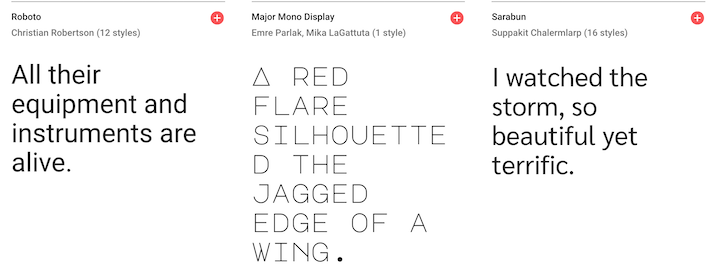
Google Fonts is probably the most popular font repository because all the fonts are free and have open source licenses. It provides a searchable, filterable list of fonts:
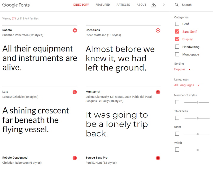
Google Fonts has a CSS API, which enables you to use the web fonts directly from the Google servers. Let’s discuss how you can add a font to your website from Google Fonts.
When you select your desired font on Google Fonts, it will show you a list of the font type and font weight variants. You can select the variants you are interested in and it will add them to cart. The cart by accessed by clicking the icon in the top right corner:
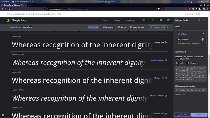
Inside the cart (right-side of screenshot above), you get two options for embedding your selected fonts to your webpage. You can add it using link element to the HTML, or you can add an @import statement to the CSS. Selecting the option will show you a code snippet that you can copy.
To embed a font in a page, use the standard <link> tag in the HTML head. It will look like this:
<link rel="preconnect" href="https://fonts.googleapis.com">
<link rel="preconnect" href="https://fonts.gstatic.com" crossorigin>
<link href="https://fonts.googleapis.com/css2?family=Open+Sans&display=swap" rel="stylesheet">
This contains some additional link elements that contain the preconnect keyword for the rel attribute. These act as a hint to the browser that the user needs resources from the target resource’s origin, and therefore the browser can preemptively initiate a connection to that origin. This can speed up the downloading of the font files.
Alternatively, you can use a CSS @import:
<style>
@import url('https://fonts.googleapis.com/css2?family=Open+Sans&display=swap');
</style>
The downside of this method is that this blocks the processing of further style sheets until the font styles have been parsed, but this can be mitigated.
There is a display parameter in the URL, which is used to set the font-display descriptor for the font. This lets you control what happens while the font is unavailable. The value swap gives the font face an extremely small block period (100ms or less is recommended in most cases) and an infinite swap period. Specifying a value other than the default auto is usually appropriate as it does not block processing.
The font can then be used in CSS through the font-family or font properties:
body {
  font-family: "Open Sans", sans-serif;
}
You can optimize the request by modifying the URL. For example, you can request multiple font families using family parameter:
https://fonts.googleapis.com/css2?family=Crimson+Pro&family=Literata
You can also request other individual styles, such as specific weights, using a special notation. For example, to request weights 400 and 700 for the Crimson Pro font, the URL looks like this:
https://fonts.googleapis.com/css2?family=Crimson+Pro:wght@400;700
You are most likely going to generate these URLs through the web app, so I would not worry about learning the API in depth. You can refer to the Google Fonts API v2 quickstart guide for more information.
Any font file can be used in your webpage but make sure you check that you have permission from the owner of the typeface. All modern browsers support WOFF and WOFF2 formats. WOFF2 offers typical compression savings of 30 percent. For older or more obscure applications, TTF, EOT, or SVG may be an option.
The Font Squirrel Webfont Generator provides a simple tool to upload one or more fonts, tweak settings, and download a kit containing the converted fonts and CSS code:
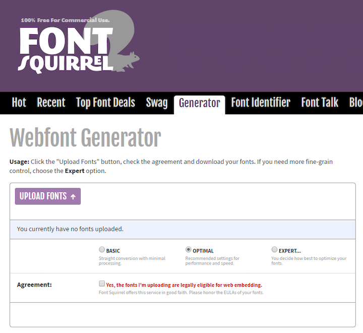
By default the Webfont Generator provides a WOFF2 font, a WOFF fallback, and the appropriate CSS @font-face settings. For example:
@font-face {
  font-family: 'mytypeface';
  src: url('mytypeface-webfont.woff2') format('woff2'),
       url('mytypeface-webfont.woff') format('woff');
  font-weight: normal;
  font-style: normal;
}

body {
  font-family: mytypeface, serif;
}
A web font may take several seconds to download, especially on a slower device or network. Strategies about handling this loading period are quite a deep topic. Zach Leatherman wrote a comprehensive list of font loading strategies that have been widely shared. I will outline the broad strokes here.
While the font is downloading, the browser can choose to:
Zach recommends two strategies in his article:
You can read Zell Liew’s article,The best font loading strategies and how to execute them, to understand how to execute these strategies.
Each font file has its own weight (boldness), style (italic slant), stretch, and variants. The browser will attempt its own interpolations if you make adjustments to the CSS without loading an associated font. Rendering will be slower, fonts may look worse, readability could be affected, and widths could be dramatically different and break layouts. For example:
/* load font with a weight of 300 */
@import url('https://fonts.googleapis.com/css?family=Open+Sans:300')
body {
  font-family: "Open Sans", serif;
}
/* but use a weight of 600 - do not do this! */
strong {
  font-weight: 600;
}
The solution is to load a separate font file for every weight and style you require, then explicitly set all styles accordingly:
/* load font with weights of 300 and 600 */
@import url('https://fonts.googleapis.com/css?family=Open+Sans:300,600');
/* weight 300 for all elements */
* {
  font-weight: 300;
}
body {
  font-family: "Open Sans", serif;
}
/* weight 600 for bold elements */
h1, h2, h3, strong {
  font-weight: 600;
}
Variable fonts are an evolution of the OpenType font specification that enables many variations of a typeface to be incorporated into a single file, rather than having a separate font file for every width, weight, or style. Now, browser support is almost ubiquitous for variable fonts.
The core concept of the variable font format is the concept of an axis of variation describing the allowable range of that particular aspect of the typeface design. So the ‘weight axis’ describes how light or how bold the letterforms can be; the ‘width axis’ describes how narrow or how wide they can be; the ‘italic axis’ describes if italic letterforms are present and can be turned on or off and so on:

An axis can be a range or a binary choice. Weight might range from 1 to 999, whereas italics might be 0 or 1 (off or on). For a range, any value between these two extremes can be used, enabling fine control of the appearance of text.
Here are some axes you can control with CSS properties.
The weight axis is the thickness of the font. It can be set between 1 and 1000 using:
font-weight: 400;
It is also possible to use font-variation-settings: "wght" 400;, but it is poorly supported by browsers.
The italic axis is either on or off because standard and italic characters can be different:
font-style: italic;
It is also possible to use font-variation-settings: 'ital' 1; , but it is poorly supported by browsers.
The font can be stretched to produce condensed or extended variations. 100% is normally considered the default with ranges above or below that value for narrower or wider widths accordingly:
font-stretch: 80%;
It is also possible to use font-variation-settings: 'wdth' 80;, but it is poorly supported by browsers.
The slant — or oblique — differs from italic in that the letterforms are not changed but can vary on an axis typically between zero and 20 degrees:
font-style: oblique 10deg;
It is possible to use font-variation-settings: 'slnt' 10;, but it is poorly supported by browsers.
Variable font files can be found in most font repositories now, such as Google Fonts. There are some sites that are specific to variable fonts such as v-fonts and Axis-Praxis.
Variable font files can be loaded using @font-face with a woff2-variations format and the allowable ranges. For example:
@font-face {
  font-family: 'MyVariableFont';
  src: 'myvariablefont.woff2' format('woff2-variations');
  font-weight: 200 800;
  font-stretch: 75% 125%;
  font-style: oblique 0deg 20deg;
}
Specific styles can then be set in any selector with multiple CSS properties:
p {
  font-family: 'MyVariableFont';
  font-weight: 300;
  font-stretch: 100%;
  font-style: oblique 0deg;
}
You can also use the shorthand font-variation-settings property (poorly supported):
p {
  font-family: 'MyVariableFont';
  font-variation-settings: 'wght' 300, 'wdth' 100, 'slnt' 0;
}
Because variable fonts are so well supported now, it is not necessary to have a fallback.
Web fonts have revolutionized typography on the web. Designers have fewer constraints now for using custom fonts, and now have more advanced control of the appearance of text.
However, there are important considerations to understand with regard to performance and UX of using web fonts. You should be aware of the implications of unstyled text while a font is being downloaded, and mitigate the impact it has on layout and appearance. Having so much choice of fonts and the ability to use variable fonts presents web developers with more options, but there are still challenges with making the right tradeoffs between the desired design and the desired performance.
As web frontends get increasingly complex, resource-greedy features demand more and more from the browser. If you’re interested in monitoring and tracking client-side CPU usage, memory usage, and more for all of your users in production, try LogRocket.

LogRocket lets you replay user sessions, eliminating guesswork around why bugs happen by showing exactly what users experienced. It captures console logs, errors, network requests, and pixel-perfect DOM recordings — compatible with all frameworks.
LogRocket's Galileo AI watches sessions for you, instantly identifying and explaining user struggles with automated monitoring of your entire product experience.
Modernize how you debug web and mobile apps — start monitoring for free.
Learn how sibling-index() enables clean, JavaScript-free stagger animations using native CSS.

useEffect breaks AI streaming responses in ReactSee why useEffect breaks AI streaming in React, and how moving stream state outside React fixes flicker and stale updates.

A real-world debugging session using Claude to solve a tricky Next.js UI bug, exploring how AI helps, where it struggles, and what actually fixed the issue.

CSS wasn’t built for dynamic UIs. Pretext flips the model by measuring text before rendering, enabling accurate layouts, faster performance, and better control in React apps.
Would you be interested in joining LogRocket's developer community?
Join LogRocket’s Content Advisory Board. You’ll help inform the type of content we create and get access to exclusive meetups, social accreditation, and swag.
Sign up now