Flutter is known for the flexibility it offers to a wide variety of programs, from ecommerce to education to banking apps, and so much more. All of this is possible by using widgets that act as simple building blocks for complex applications. You can break down each app into various components, some of which are general to all apps while others are specific.

This article is based on one of the more general components used across various apps: the search bar. Search bars are used for querying a database for a particular piece of data.
In this article, we will be building a search bar from scratch, using Flutter’s container widget and various properties offered by box decoration.
The app containing the search bar will be a bare-bones journal app. It will consist of a textField class, appear when the “search” icon is clicked, and disappear when “canceled” in the sample app.
Before we begin, note that this article assumes you have the Flutter development environment set up and are familiar with the basics of Flutter widgets and development.
The Replay is a weekly newsletter for dev and engineering leaders.
Delivered once a week, it's your curated guide to the most important conversations around frontend dev, emerging AI tools, and the state of modern software.
The first step is to create a new project using the Flutter create command:
flutter create search_bar
Next, we need to clear out the content of the main.dart file and create a new MaterialApp:
import 'package:flutter/material.dart';
void main() => runApp(MyApp());
class MyApp extends StatelessWidget {
 @override
 Widget build(BuildContext context) {
 return const MaterialApp(
  debugShowCheckedModeBanner: false,
  title: 'Material App',
  home: HomeScreen(),
 );
 }
}
We are using Material Design for this app in order to make it easier to set up; our main focus will be on creating the search bar rather than designing the app itself.
Now let’s create a new stateful widget named HomeScreen and pass it to the home property of the MaterialApp:
class HomeScreen extends StatefulWidget {
 const HomeScreen({Key? key}) : super(key: key);
 @override
 _HomeScreenState createState() => _HomeScreenState();
}
class _HomeScreenState extends State<HomeScreen> {
 @override
 Widget build(BuildContext context) {
 return Scaffold(
  appBar: AppBar(
  title: const Text('My Personal Journal'),
  automaticallyImplyLeading: false,
  centerTitle: true,
  ),
  body: Column(
  mainAxisAlignment: MainAxisAlignment.center,
  children: [
   const Center(
   child: Text('Hi'),
   ),
  ],
  ),
 );
 }
}
You’ll notice I added some details to this app in the code above, including an appBar and a title. Once again, these are less important additions that we can ignore in favor of focusing on creating the search bar, but may come in handy if you are practicing your app building skills along with this tutorial.
The next step is to create the search button. The AppBar provides us with a property named actions, a collection we can use to list various activities:
 appBar: AppBar(
  title: const Text('My Personal Journal'),
  automaticallyImplyLeading: false,
  actions: [
   IconButton(
   onPressed: () {},
   icon: const Icon(Icons.search),
   )
  ],
  centerTitle: true,
  ),
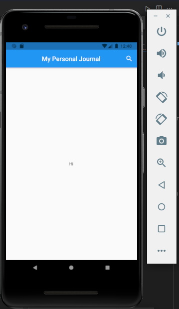
Because we are making a button that displays something (the search bar) when it is clicked, we will use the IconButton widget. This widget will generate a small animation when pressed, indicating that the user’s selection was registered by the app. We pass in the name to the icon parameter; you can see in the image below that I have chosen the magnifying glass icon to represent “search.”
The image below depicts our app in its current state:
We need to implement the onPressed functionality to trigger the state rebuild that will display the text field. We also have to make the current magnifying glass search icon change to a “cancel” icon once the text field is displayed. The cancel button will be used to cancel the search operation, as its name implies.
The next step is to create two variables inside the HomeScreen widget: the first is an icon, and the second is a widget. They will hold the default search button as well as the title for the AppBar.
Instead of hard coding them as we did earlier, we will pass them into variables and then pass the variables anywhere they are needed:
 @override
 _HomeScreenState createState() => _HomeScreenState();
}
class _HomeScreenState extends State<HomeScreen> {
 Icon customIcon = const Icon(Icons.search);
 Widget customSearchBar = const Text('My Personal Journal');
 @override
 Widget build(BuildContext context) {
 return Scaffold(
  appBar: AppBar(
  title: customSearchBar,
  automaticallyImplyLeading: false,
  actions: [
   IconButton(
   onPressed: () {},
   icon: customIcon,
   )
  ],
  centerTitle: true,
  ),
Because we want to show the text field in the app bar when the search button is pressed, we have to update the app’s state. For this article, we will be using the setState({}) function to update the state.
In the onPressed function of the IconButton, we call the setState function to update the state of the variables we earlier declared (i.e., the customIcon variable and the customSearchBar variable).
Then, we run an if-else condition to check the current icon and make the correct decision:
 onPressed: () {
    setState(() {
    if (customIcon.icon == Icons.search) {
     // Perform set of instructions.
    } else {
     customIcon = const Icon(Icons.search);
     customSearchBar = const Text('My Personal Journal');
    }
    });
   },
Currently, it checks if the customIcon is a searchIcon and then performs some instructions based on the result. If it’s not a search icon, it updates the variables to their defaults/original values:
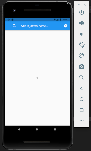
if (customIcon.icon == Icons.search) {
   customIcon = const Icon(Icons.cancel);
   customSearchBar = const ListTile(
   leading: Icon(
    Icons.search,
    color: Colors.white,
    size: 28,
   ),
   title: TextField(
    decoration: InputDecoration(
    hintText: 'type in journal name...',
    hintStyle: TextStyle(
     color: Colors.white,
     fontSize: 18,
     fontStyle: FontStyle.italic,
    ),
    border: InputBorder.none,
    ),
    style: TextStyle(
    color: Colors.white,
    ),
   ),
   );
  }
Inside the if-else logic block, we pass in the new state values we want to call: the customIcon gets assigned the cancel icon (Icon.cancel), and the customSearchBar gets assigned a ListTile that contains the TextField.
In the code above, the search icon is passed to the app’s leading parameter, and TextField is given to the title widget. The hintText and styles are adjusted through the InputDecoration widget, and the InputBorder is removed using the InputBorder.none property.
Finally, our search bar has been fully implemented!
Some components are common to Flutter apps regardless of what type of app they are, one of which is the search bar. Querying a database for a particular piece of information is a tool that a large number of mobile applications will require. With what you have learned in this article, you can now build and customize search bars in your Flutter applications.

When should you move API logic out of Next.js? Learn when Route Handlers stop scaling and how ElysiaJS helps.

Explore how Dokploy streamlines app deployment with Docker, automated builds, and simpler infrastructure compared to traditional CI/CD workflows.

A side-by-side look at Astro and Next.js for content-heavy sites, breaking down performance, JavaScript payload, and when each framework actually makes sense.

AI-generated tests can speed up React testing, but they also create hidden risks. Here’s what broke in a real app.re
Hey there, want to help make our blog better?
Join LogRocket’s Content Advisory Board. You’ll help inform the type of content we create and get access to exclusive meetups, social accreditation, and swag.
Sign up now

 Learn more →
