Split panes are a constant part of a developer’s life. Whether it’s to divide the many areas of your favorite desktop or web IDE, it’s a great feature to improve the user experience in terms of screen organization.

In this article, we’re going to create a split pane component in React from scratch.
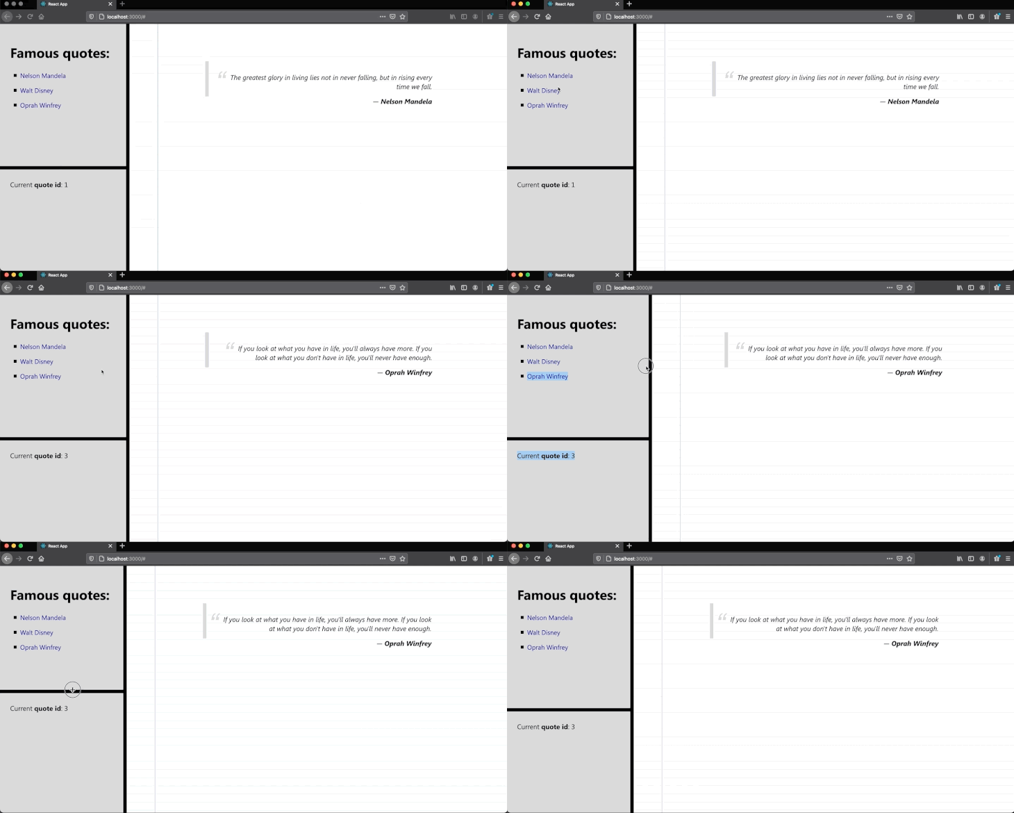
We’ll build an app with no external libraries, just React, that shows a predefined list of famous names on the left-side pane, while displaying a quote of theirs on the right-side pane.
The image below demonstrates the nature of this app example:

Rather than demonstrating how to simply create the component, we’ll also show how to diversify its dimensions with two split panes — a vertical and a horizontal one.
The example also shows how to accomplish some state interactions among the panels via React’s context. This way, you can see how to use it in a more suitable real-world scenario.
The Replay is a weekly newsletter for dev and engineering leaders.
Delivered once a week, it's your curated guide to the most important conversations around frontend dev, emerging AI tools, and the state of modern software.
To run things quickly, we’ll make use of the create-react-app tool. So, run the following command:
npx create-react-app splitpane-react
Open the created project into Visual Studio Code and create a few more files:
--| splitpane-react
-----| src
--------| ...
--------| QuoteContext.js
--------| SplitPaneContext.js
--------| SplitPane.js
--------| index.css
Let’s start with the context files. Make sure to paste the following content into QuoteContext.js:
import { createContext } from "react";

const QuoteContext = createContext();

export default QuoteContext;
Since the advent of React 16, it’s introduced a new Context API to help developers to pass data through the various hierarchies of component levels without the need for props.
Here, we’re creating a context store to hold data for the list of in-memory quotes, since we won’t retrieve such information from anywhere else.
The following is the content of SplitPaneContext.js:
import { createContext } from "react";

const SplitPaneContext = createContext();

export default SplitPaneContext;
Yes, they’re practically equal. The reason we’re exporting them to an external file is that it’s easier to import the context to other JavaScript files this way.
Next, let’s move on to the app’s structure in order to understand better how things stack up to one another.
This is the content of the App.js file:
import SplitPane, {
  Divider,
  SplitPaneBottom,
  SplitPaneLeft,
  SplitPaneRight,
  SplitPaneTop,
} from "./SplitPane";
import QuoteContext from "./QuoteContext";
import { useState } from "react";

import "./App.css";

const quotes = [
  {
    id: 1,
    author: "Nelson Mandela",
    description:
      "The greatest glory in living lies not in never falling, but in rising every time we fall.",
  },
  {
    id: 2,
    author: "Walt Disney",
    description: "The way to get started is to quit talking and begin doing.",
  },
  {
    id: 3,
    author: "Oprah Winfrey",
    description:
      "If you look at what you have in life, you'll always have more. If you look at what you don't have in life, you'll never have enough.",
  },
];

function App() {
  const [currQuote, setCurrQuote] = useState(1);

  return (
    <div className="App">
      <QuoteContext.Provider value={{ quotes, currQuote, setCurrQuote }}>
        <SplitPane className="split-pane-row">
          <SplitPaneLeft>
            <SplitPane className="split-pane-col">
              <SplitPaneTop />
              <Divider className="separator-row" />
              <SplitPaneBottom />
            </SplitPane>
          </SplitPaneLeft>
          <Divider className="separator-col" />

          <SplitPaneRight />
        </SplitPane>
      </QuoteContext.Provider>
    </div>
  );
}

export default App;
When you import this code to your project, you may see a couple of errors showing up. Don’t worry, this is because we haven’t created any of the split pane components yet.
Let’s focus on the understanding for now.
The quotes array represents our in-memory list of famous quotes and it’s better to stay within the top component in the hierarchy.
It’ll be assigned directly to the QuoteContext provider for you to be able to access its values later on the SplitPane components.
Notice how we’re hierarchically stacking one pane on top of another. Each pane can, optionally, have its own CSS class which we’ll need to further add some styles.
Everything has been pretty straightforward up to this point. The real magic happens within the SplitPane.js component and since there’s a lot of code there, let’s build it step by step.
The following lists the first and most important part of this file:
import React, {
  createRef,
  useContext,
  useEffect,
  useRef,
  useState,
} from "react";
import QuoteContext from "./QuoteContext";
import SplitPaneContext from "./SplitPaneContext";

const SplitPane = ({ children, ...props }) => {
  const [clientHeight, setClientHeight] = useState(null);
  const [clientWidth, setClientWidth] = useState(null);
  const yDividerPos = useRef(null);
  const xDividerPos = useRef(null);

  const onMouseHoldDown = (e) => {
    yDividerPos.current = e.clientY;
    xDividerPos.current = e.clientX;
  };

  const onMouseHoldUp = () => {
    yDividerPos.current = null;
    xDividerPos.current = null;
  };

  const onMouseHoldMove = (e) => {
    if (!yDividerPos.current && !xDividerPos.current) {
      return;
    }

    setClientHeight(clientHeight + e.clientY - yDividerPos.current);
    setClientWidth(clientWidth + e.clientX - xDividerPos.current);

    yDividerPos.current = e.clientY;
    xDividerPos.current = e.clientX;
  };

  useEffect(() => {
    document.addEventListener("mouseup", onMouseHoldUp);
    document.addEventListener("mousemove", onMouseHoldMove);

    return () => {
      document.removeEventListener("mouseup", onMouseHoldUp);
      document.removeEventListener("mousemove", onMouseHoldMove);
    };
  });

  return (
    <div {...props}>
      <SplitPaneContext.Provider
        value={{
          clientHeight,
          setClientHeight,
          clientWidth,
          setClientWidth,
          onMouseHoldDown,
        }}
      >
        {children}
      </SplitPaneContext.Provider>
    </div>
  );
};
A quick look at the beginning of the code listing shows that we are making strong use of React hooks. That’s also a way to ensure that the implementation is the freshest possible.
The SplitPane component is the most important component of our app.
It’s responsible for keeping the positions of the panes, their dimensions, the mouse events, and its child components. Yes, each pane has one or more internal panels. You can think of this implementation in a recursive way.
The SplitPaneContext is responsible for holding data and functions that are common for both the top panel and its child panels, such as the height and width of the pane.
The logic for the pane drag-and-drop is pretty simple. We must track the mouse events mousedown and mouseup to set the current x and y position of the mouse on the screen and nullify them, respectively.
This way, we can keep track of these values on the mousemove event and dynamically update the pane’s dimensions accordingly.
The return of the component builds the context provider along with the children’s panels.
See the rest of the code below:
export const Divider = (props) => {
  const { onMouseHoldDown } = useContext(SplitPaneContext);

  return <div {...props} onMouseDown={onMouseHoldDown} />;
};

export const SplitPaneTop = (props) => {
  const topRef = createRef();
  const { clientHeight, setClientHeight } = useContext(SplitPaneContext);
  const { quotes, setCurrQuote } = useContext(QuoteContext);

  useEffect(() => {
    if (!clientHeight) {
      setClientHeight(topRef.current.clientHeight);
      return;
    }

    topRef.current.style.minHeight = clientHeight + "px";
    topRef.current.style.maxHeight = clientHeight + "px";
  }, [clientHeight]);

  return (
    <div {...props} className="split-pane-top" ref={topRef}>
      <h1>Famous quotes:</h1>
      <ul>
        {quotes.map((el, i) => {
          return (
            <li key={i}>
              <a href="#" onClick={() => setCurrQuote(el.id)}>
                {el.author}
              </a>
            </li>
          );
        })}
      </ul>
    </div>
  );
};

export const SplitPaneBottom = (props) => {
  const { currQuote } = useContext(QuoteContext);

  return (
    <div {...props} className="split-pane-bottom">
      Current <b>quote id</b>: {currQuote}
    </div>
  );
};

export const SplitPaneLeft = (props) => {
  const topRef = createRef();
  const { clientWidth, setClientWidth } = useContext(SplitPaneContext);

  useEffect(() => {
    if (!clientWidth) {
      setClientWidth(topRef.current.clientWidth / 2);
      return;
    }

    topRef.current.style.minWidth = clientWidth + "px";
    topRef.current.style.maxWidth = clientWidth + "px";
  }, [clientWidth]);

  return <div {...props} className="split-pane-left" ref={topRef} />;
};

export const SplitPaneRight = (props) => {
  const { quotes, currQuote } = useContext(QuoteContext);
  const quote = quotes.find((el) => el.id === currQuote);

  return (
    <div {...props} className="split-pane-right">
      <div className="quote">
        <blockquote>{quote.description}</blockquote>—{" "}
        <span>{quote.author}</span>
      </div>
    </div>
  );
};

export default SplitPane;
Here comes the rest of the components, starting with the Divider. This component represents a single pane divider line that can be both vertical or horizontal depending on the CSS class it’s inheriting. Note how we’re retrieving the mousedown event from the SplitPane's context object.
The other components are related to each of the dimensional panels. The SplitPaneTop, for example, is responsible for managing the pane’s height via CSS properties according to the context’s value.
We’re also retrieving and iterating over the list of quotes from the context to display the list of author links. You may consider this logic not suitable for this component, which is fine if you’d want to move it to the upper component.
The SplitPaneBottom takes care of displaying the currently selected quote ID.
The SplitPaneRight, in turn, finds the currently selected quote in order to display its description and author.
Before you can test the app, you must fill in the index.css file with the following content:
html,
body {
  padding: 0;
  margin: 0;
}

.App {
  font-family: "Segoe UI", sans-serif;
  font-size: 1.2rem;
  text-align: center;
}

.split-pane-col {
  width: 100vw;
  height: 100vh;
  display: flex;
  flex-direction: column;
}

.split-pane-row {
  width: 100vw;
  height: 100vh;
  display: flex;
  flex-direction: row;
}

.split-pane-top,
.split-pane-bottom,
.split-pane-right,
.split-pane-left {
  flex: 1;
  overflow: hidden;
}

.split-pane-right {
  background-color: #fff;
  background-image: linear-gradient(
      90deg,
      transparent 79px,
      #abced4 79px,
      #abced4 81px,
      transparent 81px
    ),
    linear-gradient(#eee 0.1em, transparent 0.1em);
  background-size: 100% 1.2em;
}

.split-pane-top,
.split-pane-bottom {
  background-color: #ccc;
  text-align: left;
  padding: 2%;
}

.separator-col {
  border: 5px solid black;
  cursor: col-resize;
}

.separator-row {
  border: 5px solid black;
  cursor: row-resize;
}

ul {
  margin-left: -2%;
}

ul li {
  margin: 1rem;
  list-style-type: square;
}

ul a {
  text-decoration: none;
  color: darkblue;
  font-size: large;
}

ul a:hover {
  color: black;
}

blockquote {
  border-left: 10px solid #ccc;
  margin: 5.5em 0 0 0;
  quotes: "\201C""\201D""\2018""\2019";
  padding: 2rem 0 1rem;
}

blockquote:before {
  color: #ccc;
  content: open-quote;
  font-size: 4em;
  line-height: 0.1em;
  margin-right: 0.25em;
  vertical-align: -0.4em;
}

blockquote p {
  display: inline;
}

.quote {
  max-width: 60%;
  text-align: right;
  margin: auto;
  font-style: italic;
}

.quote span {
  font-weight: bold;
}
To test the application, make sure to save all the files and run the following command:
npm run start
It’ll open your default web browser and display the application running as we’ve seen in the previous image. And you can run your tests from here.
You may find the source code repo for this tutorial here.
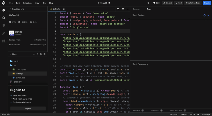
I’d also recommend going for more complex and nested panels such as the ones you can see when coding within https://codesandbox.io/:

More than that, make them cohesive and interoperate with each other via React’s state and context. Good luck!
Install LogRocket via npm or script tag. LogRocket.init() must be called client-side, not
server-side
$ npm i --save logrocket

// Code:

import LogRocket from 'logrocket';
LogRocket.init('app/id');
// Add to your HTML:

<script src="https://cdn.lr-ingest.com/LogRocket.min.js"></script>
<script>window.LogRocket && window.LogRocket.init('app/id');</script>

When should you move API logic out of Next.js? Learn when Route Handlers stop scaling and how ElysiaJS helps.

Explore how Dokploy streamlines app deployment with Docker, automated builds, and simpler infrastructure compared to traditional CI/CD workflows.

A side-by-side look at Astro and Next.js for content-heavy sites, breaking down performance, JavaScript payload, and when each framework actually makes sense.

AI-generated tests can speed up React testing, but they also create hidden risks. Here’s what broke in a real app.re
Hey there, want to help make our blog better?
Join LogRocket’s Content Advisory Board. You’ll help inform the type of content we create and get access to exclusive meetups, social accreditation, and swag.
Sign up now