charts_flutterCharts within applications provide graphical displays or pictorial representations of data, spanning industries and apps. Mobile applications like Mint use pie charts to monitor spending habits and fitness apps like Strava use line charts and bar charts for analyzing pacing, heart rate, and elevation gain.

When building Flutter apps, developers can use the official charts_flutter library, maintained by Google, to create these types of charts.
In this tutorial, we’ll learn how to create some of the most common charts — a line chart, pie chart, and bar chart — using charts_flutter.
We’ll use these charts to display the growth of a fictional Flutter charts developer community over five years. While the data in this tutorial is fabricated, this tutorial can easily utilize real data.
To follow this tutorial, you must have the following:
charts_flutterTo create a new Flutter project, run the following command:
flutter create projectName
Next, open the new project in your code editor. As mentioned above, we’ll use chart_flutter, Flutter’s official library.
To import chart_flutter into your project, open the pubspec.yaml file and add it under dependencies:
dependencies:
  flutter:
    sdk: flutter

  charts_flutter: ^0.11.0
Now we have the basic code that comes with new Flutter apps: a counter that keeps a record of how many times a button is pushed.
Since we don’t need that in our bar chart app, go ahead and delete that code found in the main.dart page. Delete everything except the following:
import ‘package:flutter/material.dart’;
void main() => runApp(MyApp());
class MyApp extends StatelessWidget {
@override
Widget build(BuildContext context) {
            //TODO: implement build
            Return MaterialApp(
            );
     }
}
Now, return the MaterialApp class in our build widget so we can use Material Design.
To create a homepage for our app, navigate into the lib folder and create a new page named home.dart:
import 'package:flutter/material.dart';

class HomePage extends StatelessWidget {
  @override
  Widget build(BuildContext context) {
    return Scaffold(
      body: Center(
        child: ,
      ),
    );
  }
}
With import 'package:flutter/material.dart', we can then import Material Design.
Then, the HomePage class extends the statelessWidget, as no states change on this page.
Inside the BuildContext widget, we return the Scaffold class to give us a basic Material Design layout structure. Our bar chart will go where the child parameter is, and we will center it on the body of our screen.
All of this now serves as the scaffold for our app.
With the homepage complete, we can specify HomePage in our main.dart file since main.dart brings all the features in our app together:
class MyApp extends StatelessWidget {
  @override
  Widget build(BuildContext context) {
    return MaterialApp(
      debugShowCheckedModeBanner: false,
      home: HomePage(), //This is where we specify our homepage
    );
  }
}
With this code, main.dart knows which page to show first whenever the app loads.
Note that setting debugShowCheckedModeBanner to false removes the debug mark from our app.
Before we create the chart app, let’s familiarize ourselves with two terms commonly used with Flutter charts: series and models.
A series is a group (or series) of information that we can use to plot our chart. A model is the format our information comes in that specifies the attributes every data item using the model must have.
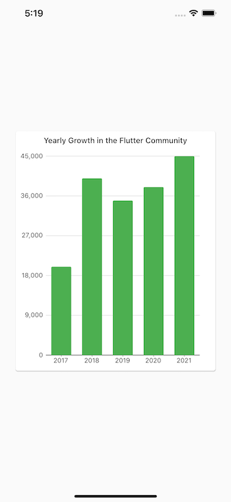
To begin, we’ll create a bar chart to show the number of new fictional Flutter chart developers that were added over the past five years. In other words, we want to track the growth the fictional Flutter chart community.
Our model, which defines the format of our data, consists of the year we are looking at, the number of developers that joined the Flutter chart community that year, and the color of the corresponding bar.
Inside the lib folder, create a file named developer_series.dart. Below, implement the code for our model:
import 'package:charts_flutter/flutter.dart' as charts;
import 'package:flutter/foundation.dart';

class DeveloperSeries {
  final int year;
  final int developers;
  final charts.Color barColor;

  DeveloperSeries(
    {
      @required this.year,
      @required this.developers,
      @required this.barColor
    }
  );
}
We named the model DeveloperSeries and specified the properties that each series item must have (year, developers, and barColor).
To prevent the parameter of a class from being null when creating an object of the class, we use the @required annotation, as seen in the code block above.
To use the @required keyword, we must import the foundation.dart package.
Now that we have a model for our bar chart data, let’s proceed to actually create some data. In the homepage, generate data for the bar chart by adding the following:
import 'package:flutter/material.dart';
import 'package:charts_flutter/flutter.dart' as charts;
import 'package:;lib/developer_series.dart';

class HomePage extends StatelessWidget {
  final List<DeveloperSeries> data = [

    DeveloperSeries(
      year: "2017",
      developers: 40000,
      barColor: charts.ColorUtil.fromDartColor(Colors.green),
    ),
    DeveloperSeries(
      year: "2018",
      developers: 5000,
      barColor: charts.ColorUtil.fromDartColor(Colors.green),
    ),
    DeveloperSeries(
      year: "2019",
      developers: 40000,
      barColor: charts.ColorUtil.fromDartColor(Colors.green),
    ),
    DeveloperSeries(
      year: "2020",
      developers: 35000,
      barColor: charts.ColorUtil.fromDartColor(Colors.green),
    ),
    DeveloperSeries(
      year: "2021",
      developers: 45000,
      barColor: charts.ColorUtil.fromDartColor(Colors.green),
    ),
  ];

  @override
  Widget build(BuildContext context) {
    return Scaffold(
      body: Center(
        child: ,
      ),
    );
  }
}
This is a simple list named data. Each item in the list is modeled after the DeveloperSeries model, meaning each item has a year (year), number of developers (developers), and bar color (barColor) property.
Note that the above data above real, so feel free to manipulate the numbers and colors.
We’ve successfully created the data for our bar chart. Now, let’s create the bar chart itself. To make our project organized, we’ll put the code for our bar chart in a separate file.
Inside lib, create a developer_chart.dart file:
import 'package:flutter/material.dart';
import 'package:charts_flutter/flutter.dart' as charts;
import 'package:lib/developer_series.dart';

class DeveloperChart extends StatelessWidget {
  final List<DeveloperSeries> data;

  DeveloperChart({@required this.data});
  @override
  Widget build(BuildContext context) {
    List<charts.Series<DeveloperSeries, String>> series = [
      charts.Series(
        id: "developers",
        data: data,
        domainFn: (DeveloperSeries series, _) => series.year,
        measureFn: (DeveloperSeries series, _) => series.developers,
        colorFn: (DeveloperSeries series, _) => series.barColor
      )
    ];

    Return charts.Barchart(series, animate: true);
  }

}
With final List<DeveloperSeries> data, we defined a list called data, which is a List of data items in the form of our DeveloperSeries model we created earlier.
Every data item on the list comes with a corresponding year, number of developers, and bar color.
The DeveloperChart constructor inside the class ensures that everywhere the bar chart class is used, the data it requires is always provided; this is done using the @required keyword.
The actual bar chart is created inside our build widget. As you know, all bar charts have groups of data plotted against each other (in our case, the last five years and the number of developers the Flutter chart community gained).
Together, these groups of data are known as a series. The series tells us Flutter which group of data to put on the horizontal side and which group to put on the vertical side of our bar chart.
The list of data we created earlier then inserts into our series and used appropriately by Flutter.
With List<charts.Series<DeveloperSeries, String>> series, we created a list named series. This list has a type of charts.Series; charts imports Flutter into our project and the Series function creates series for a bar chart in Flutter.
The series we just created is modeled after our DeveloperSeries model.
The parameters we’ll be specifying inside our series include id, data, domainFn, measureFn, and colorFN:
id identifies the chartdata points to the list of items to plot on the bar chartdomainFn points to the values that will be on the horizontal side of the bar chartmeasureFn points to the quantity of the values on the vertical sidecolorFN refers to the color of the barsWith the domainFn, measureFn, and colorFN functions, we create functions that take the Subscriber series as an argument, create instances of it, and then use the instances to access its different properties.
The underscores in the developer_chart.dart file signify that the second arguments are not required.
After pointing our series to all the data it requires, we then use it to create our bar chart using Flutter’s BarChart function.
We can also add an animation for visual appeal by simply setting animate to true, which renders the chart with a nice animation.
Now, we can add our newly created bar chart to our homepage and display it:
import 'package:flutter/material.dart';
import 'package:charts_flutter/flutter.dart' as charts;
import 'package:lib/developer_series.dart';
import 'package:lib/developer_chart.dart';

class HomePage extends StatelessWidget {
  // ...

  @override
  Widget build(BuildContext context) {
    return Scaffold(
      body: Center(
        child: DeveloperChart(
          data: data,
        )
      ),
    );
  }
}
Here, we simply call the DeveloperChart class inside the body of our page and point it to the data we want to use.
To ensure our chart fits well on a screen, we’ll put it in a Card, wrap a container around it, and give it a set height and some padding:
…

class DeveloperChart extends StatelessWidget {
  final List<DeveloperSeries> data;

  DeveloperChart({@required this.data});
  @override
  Widget build(BuildContext context) {
    List<charts.Series<DeveloperSeries, String>> series = [
      charts.Series(
        id: "developers",
        data: data,
        domainFn: (DeveloperSeries series, _) => series.year,
        measureFn: (DeveloperSeries series, _) => series.developers,
        colorFn: (DeveloperSeries series, _) => series.barColor
      )
    ];

    return Container(
      height: 300,
      padding: EdgeInsets.all(25),
      child: Card(
        child: Padding(
          padding: const EdgeInsets.all(9.0),
          child: Column(
            children: <Widget>[
              Text(
                "Yearly Growth in the Flutter Community",
                style: Theme.of(context).textTheme.body2,
              ),
              Expanded(
                child: charts.BarChart(series, animate: true),
              )
            ],
          ),
        ),
      ),
    );
  }

}
By using the expanded widget, we expanded our bar chart nicely into the Card. The Text widget above it gives our bar chart a title to let people know what it’s about.
And, with Theme.of(context).textTheme.body2, we applied Material Design’s default style for the body text to our title.
With padding: const EdgeInsets.all(9.0), we gave the card holding our bar chart padding of 9 px on all sides. Lastly, we wrapped the Card in a container and gave the container a height of 300 px and padding of 25 px on all sides.
Now, our bar chart should render nicely on our screen.
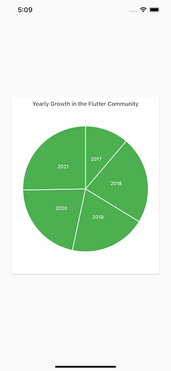
We can also use the charts_flutter package to create pie charts as well. As a matter of fact, the procedure we followed above and the code we’ve written can create a pie chart.
To change the bar chart we created to a pie chart, simply change charts.BarChart(series, animate: true) to child:( charts.PieChart(series, animate: true).
We can then add labels to our pie chart:
Expanded(
          child: charts.PieChart(series,
           defaultRenderer: charts.ArcRendererConfig(
            arcRendererDecorators: [
                     charts.ArcLabelDecorator(
                        labelPosition: charts.ArcLabelPosition.inside)
          ])
           animate: true),
)
The ArcRendererConfig function configures the appearance of a pie chart and we can use the ArcLabelDecorator function to add labels to the chart.
labelPosition specifies where to put the labels, whether inside or outside; in this case, we specified that they should be outside.
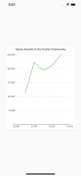
We can create a line chart in the same way we created the other two charts. We’ll simply make one small tweak to our data configuration.
In our series list, List<charts.Series<DeveloperSeries, String>> becomes List<charts.Series<DeveloperSeries, num>>, as line charts only work with numbers:
List<charts.Series<DeveloperSeries, num>> series = [
      charts.Series(
        id: "developers",
        data: data,
        domainFn: (DeveloperSeries series, _) => series.year,
        measureFn: (DeveloperSeries series, _) => series.developers,
        colorFn: (DeveloperSeries series, _) => series.barColor
      )
    ];
Now we can change charts.PieChart to charts.Linechart to get our line chart. By default, line charts start from origin zero. But the years we are concentrating on range from 2016 to 2021. So, here’s how to make our line chart span this range:
Expanded(
          child: charts.LineChart(series,
           domainAxis: const charts.NumericAxisSpec(
                 tickProviderSpec:
                 charts.BasicNumericTickProviderSpec(zeroBound: false),
                 viewport: charts.NumericExtents(2016.0, 2022.0),
           ),
           animate: true),
)
The NumericAxisSpec function sets specifications for the axes in the chart. With the BasicNumericTickProviderSpec function, we set zeroBound to false so our chart doesn’t start from origin zero.
Finally, with the NumericExtents function, we set the range that we want our axes to span.
While I personally prefer charts_flutter, there are other amazing and open source chart libraries as well.
Similar to charts_flutter, fl_chart provides you with bar charts, pie charts, line charts, scatter charts, and radar charts.
All the charts in the library can be customized and animated. They also come with touch interactivity, giving users of your app the ability to interact with your charts and make changes to them.
You can add tooltips and other indicators to your charts, and if none of the inbuilt touch features fit your taste, you can create new ones.
This library provides you with line charts and area charts. The charts can be animated and customized to your needs, and they provide support for date-time axis.
The fl_animated_linechart library makes it easy for you to create charts that have multiple y axes with different units.
Bezier Chart provides you with a bezier line chart widget.
The chart is highly customizable and very interactive. Your app users can interact with it to make modifications or get more information on chart data. The library provides support for gestures like touch, scrolling, and pinch/zoom. You can also add multiple bezier lines to a chart.
Flutter Circular Chart provides you with radial and pie charts. Like the other libraries on the list, the charts in this library are highly customizable and can be animated.
MPFlutterChart comes with different kinds of line charts, bar charts, pie charts, scatter plots, bubble charts, radar charts, candle charts, and scrolling charts.
Similar to the other libraries we’ve looked at, all the charts in this library can be customized and support animation, scaling, and interactivity.
Personally, I prefer charts_flutter the most. It was created by Google (the creators of Flutter) with Material Design, so its charts come in different sleek styles and with great user experience. Also, it comes with a lot of different charts, plots, and graphs.
The goal of this tutorial was to show Flutter developers how to implement different charts in their applications. Using the awesome charts_flutter package created by Google, we were able to implement a bar chart, a pie chart, and a line chart.
To find out more about the capabilities of this package, check it out on pub.dev.
Install LogRocket via npm or script tag. LogRocket.init() must be called client-side, not
server-side
$ npm i --save logrocket

// Code:

import LogRocket from 'logrocket';
LogRocket.init('app/id');
// Add to your HTML:

<script src="https://cdn.lr-ingest.com/LogRocket.min.js"></script>
<script>window.LogRocket && window.LogRocket.init('app/id');</script>
Would you be interested in joining LogRocket's developer community?
Join LogRocket’s Content Advisory Board. You’ll help inform the type of content we create and get access to exclusive meetups, social accreditation, and swag.
Sign up now
Not sure if low-code is right for your next project? This guide breaks down when to use it, when to avoid it, and how to make the right call.

Compare Firebase Studio, Lovable, and Replit for AI-powered app building. Find the best tool for your project needs.
Discover how to use Gemini CLI, Google’s new open-source AI agent that brings Gemini directly to your terminal.

This article explores several proven patterns for writing safer, cleaner, and more readable code in React and TypeScript.