Loading skeletons are placeholders that mimic the content being loaded on a UI for a more user-friendly experience. These placeholders minimize wait time frustration while ensuring a stable and visually smooth UI.

In this guide, we’ll explore practical examples and advanced techniques for building a loading state using the React Loading Skeleton package, as well as how to build a loading skeleton without relying on external dependencies.
The GIFs below illustrate the difference between a traditional loading spinner and a loading skeleton.
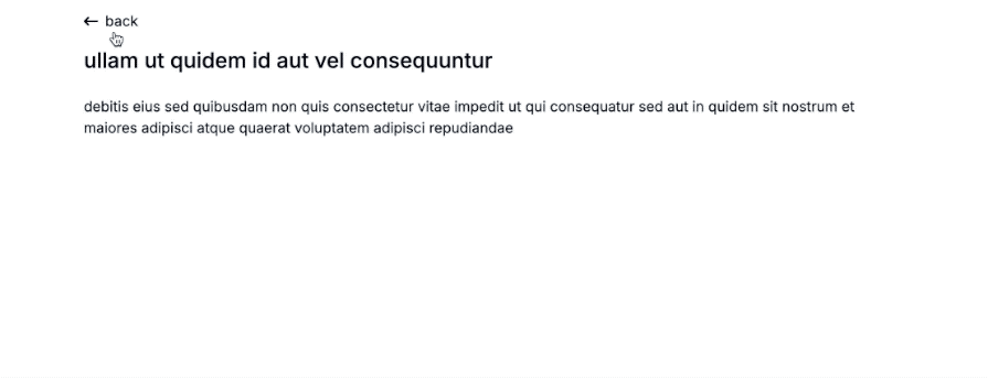
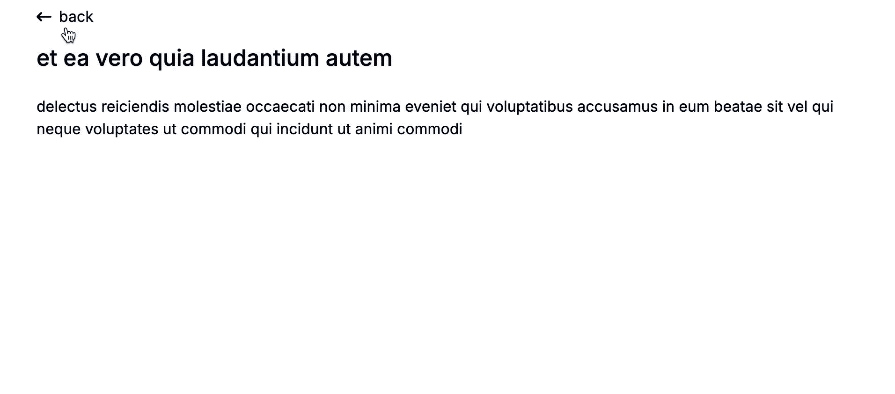
This example demonstrates the use of a loading spinner/loading text:
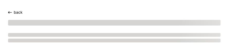
This example demonstrates the use of a loading skeleton:

We’ll take the starter project, which currently uses a loading spinner, and transform it to use a loading skeleton for a smoother loading experience.
N.B., I’ve set the browser’s DevTools network to 3G for the demos in this lesson, as a faster network would make the loading skeleton less noticeable.
The Replay is a weekly newsletter for dev and engineering leaders.
Delivered once a week, it's your curated guide to the most important conversations around frontend dev, emerging AI tools, and the state of modern software.
First, let’s install the library:
npm install react-loading-skeleton
A basic implementation of this package will look like this:
// ...
import Skeleton from 'react-loading-skeleton';
import 'react-loading-skeleton/dist/skeleton.css';
export default function Post() {
  const { data: post, error, isLoading } = useQuery({ /* Your query here */ });
  return (
    <article>
      <h1 className="text-xl md:text-2xl font-medium mb-6">
        {isLoading ? <Skeleton /> : post.title}
      </h1>
      {/* Render other content here */}
    </article>
  );
}
In the example code, we imported the Skeleton component from the React Loading Skeleton package, along with its CSS file for styling. While the data is being fetched (when isLoading is true), a skeleton placeholder is shown for the title. Once the data is loaded, the actual post title is displayed.
Here, we used the Skeleton component directly within the element being loaded. This way, the skeleton automatically adapts to the existing styles of the content:
React Loading Skeleton provides various props to customize the appearance, layout, and behavior of skeleton placeholders. Here’s an example that demonstrates how to customize the Skeleton components:
<div className="flex items-center gap-4 p-4">
  {isLoading ? (
    <Skeleton circle width={48} height={48} />
  ) : (
    <img
      src={'https://picsum.photos/seed/${user.id}/200'}
      alt={`${user?.name}'s profile`}
      className="w-12 h-12 rounded-full object-cover"
    />
  )}
  <div className="flex-1">
    <h3 className="font-semibold text-gray-808">
      {isLoading ? <Skeleton width={'50%'} /> : user.name}
    </h3>
    <p className="text-gray-600 text-sm">
      {isLoading ? (
        <Skeleton
          width={500}
          baseColor="#ffcccb"
          highlightColor="#add8e6"
          duration={2}
        />
      ) : (
        user.email
      )}
    </p>
  </div>
</div>
This code uses the width and height props (with values in pixels or percentages) to define the size of the skeletons, the circle prop to create circular placeholders, duration to control the animation speed, baseColor to set the skeleton’s default background color, and highlightColor to define the highlight color of the animation.
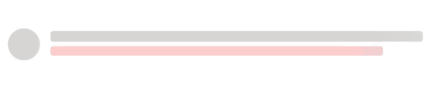
The output visually simulates an avatar and user details while the data is loading:
As we continue, we’ll explore additional props for features such as multi-line rendering, custom styling, and animation control to further improve the loading experience.
Now that we’ve covered the basics of using React Loading Skeleton, let’s revisit the starter project and transform it from using a loading spinner to using a loading skeleton.
As shown earlier, customizing individual Skeleton components works well for simple use cases. However, in larger applications, manually maintaining consistent styling across multiple components can become challenging and inefficient. To simplify this, React Loading Skeleton offers the SkeletonTheme component, which ensures consistent styling for all Skeleton components within the React tree.
SkeletonThemeTo maintain a consistent design, we’ll wrap the top level of our application in a SkeletonTheme. This allows us to define shared styles, such as baseColor, highlightColor, and duration, for all skeleton components. This approach eliminates the need to specify these props individually for each component:
import { SkeletonTheme } from 'react-loading-skeleton';
import 'react-loading-skeleton/dist/skeleton.css';
// ...
createRoot(document.getElementById('root')!).render(
  // ...
  <SkeletonTheme
    baseColor="#d5d4d3"
    highlightColor="#f2f0ef"
    duration={2}
  >
    <RouterProvider router={router} />
  </SkeletonTheme>
);
In this top-level file, we’ve also imported the style file required for the skeleton components to render properly.
To implement a loading skeleton, let’s update the routes/post.tsx file. Initially, it might look like this:
<div className="max-w-4xl mx-auto">
  <GoBack />
  {isLoading && (
    <div className="text-xl font-medium">A moment please...</div>
  )}
  {error && (
    <div className="text-red-700">{`Error fetching post data: ${error}`}</div>
  )}
  <article>
    <h1 className="text-xl md:text-2xl font-medium mb-6">
      {post?.title}
    </h1>
    <p>{post?.body}</p>
  </article>
</div>
Now, by integrating the Skeleton component, we can offer a smooth loading experience while the data is being fetched. Here’s the updated code:
import Skeleton from 'react-loading-skeleton';
export default function Post() {
  // ...
  return (
    <div className="max-w-4xl mx-auto">
      <GoBack />
      {error && (
        <div className="text-red-700">{`Error fetching post data: ${error}`}</div>
      )}
      <article>
        <h1 className="text-xl md:text-2xl font-medium mb-6">
          {isLoading ? <Skeleton /> : post.title}
        </h1>
        <p>{isLoading ? <Skeleton count={2} /> : post.body}</p>
      </article>
    </div>
  );
}
As expected, the Skeleton component is rendered when the isLoading state is set to true. Additionally, we utilized the count prop on the paragraph skeleton to generate multiple lines (two in this case), mimicking the appearance of a block of text. The GIF below showcases the result:

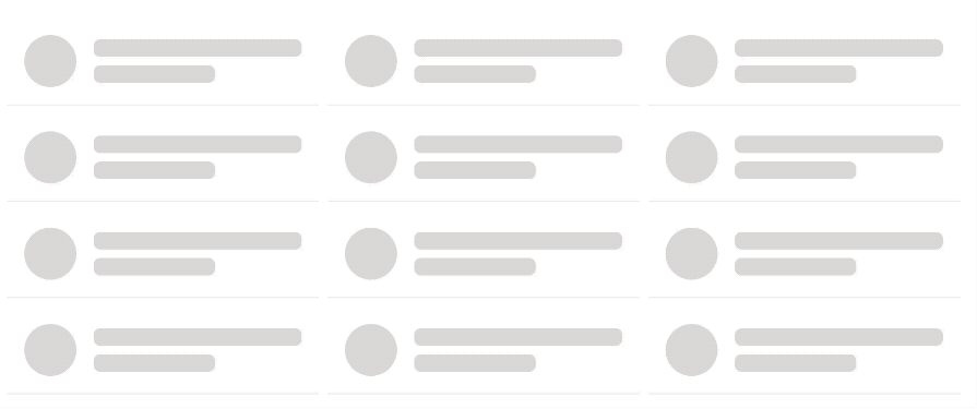
Let’s take a look at the code responsible for rendering the list of posts, or the post cards. Currently, we map through the user data to render individual UserCard components. While the data is being fetched, a loading spinner from RiLoader2Fill is displayed:
<ul className="grid grid-cols-[repeat(auto-fit,minmax(250px,1fr))] gap-2 px-2">
  {isLoading && (
    <div className="min-h-[300px] justify-items-center content-center">
      <RiLoader2Fill className="size-6 animate-spin " />
    </div>
  )}
  {users?.map((user) => (
    <UserCard
      user={{
        ...user,
        imageUrl: `https://picsum.photos/seed/${user.id}/200`,
      }}
      key={user.id}
    />
  ))}
</ul>
To implement the loading skeleton instead, we will create a dedicated CardSkeleton component that mimics the structure of the final card. Here’s how it looks:
import Skeleton from 'react-loading-skeleton';
const CardSkeleton = ({ cardItems }: { cardItems: number }) => {
  const skeletonItems = Array(cardItems).fill(0);
  return skeletonItems.map((_, index) => (
    <li
      className="border-b border-gray-100 text-sm sm:text-base flex gap-4 items-center p-4"
      key={index}
    >
      <Skeleton circle width={48} height={48} />
      <Skeleton count={1.7} containerClassName="flex-1" />
    </li>
  ));
};
export default CardSkeleton;
The component accepts a cardItems prop, which determines the number of skeleton items to display. Each card contains a circular skeleton for the avatar and a text skeleton with the count prop to generate multiple lines of text. Using a value like 1.7 creates one full-width skeleton with a shorter one below it. To allow the skeleton to grow within a flexible layout, containerClassName="flex-1" is used.
If necessary, you can achieve the same layout with this alternative:
<div className="flex-1">
  <Skeleton count={1.7} />
</div>
Now, we can render the CardSkeleton component during loading rather than the loading spinner:
import CardSkeleton from './CardSkeleton';
// ...
const CardList = () => {
  // ...
  return (
    <ul className="grid grid-cols-[repeat(auto-fit,minmax(250px,1fr))] gap-2 px-2">
      {isLoading && <CardSkeleton cardItems={12} />}
      {users?.map((user) => (
        // ...
      ))}
    </ul>
  );
};
export default CardList;
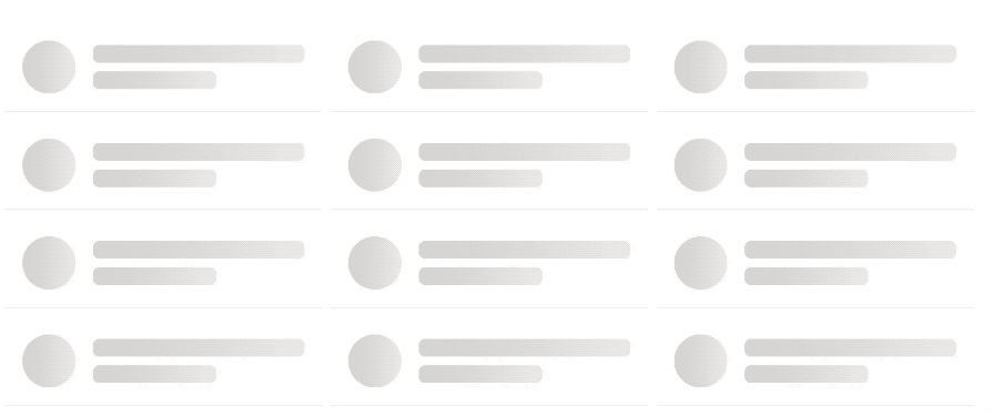
Here is the result:
When images or other resources are fetched from external sources, delays can occur, as shown in the GIF above.
To enhance the user experience, we’ll use skeleton loaders to display placeholder content until the image is fully loaded. This ensures that text appears first, while images or larger assets continue to show their loading skeletons, keeping the interface responsive and ensuring smooth transitions once all data is fully loaded.
The following code tracks the loading state of the image. The handleImageLoad function is triggered once the image finishes loading, setting isImageLoaded to true:
export const UserCard = ({ user }: UserCardProps) => {
  const [isImageLoaded, setIsImageLoaded] = useState(false);
  const handleImageLoad = () => {
    setIsImageLoaded(true); // Set state to true once the image has loaded
  };
  // ...
  return (
    // ...
    <div className="w-12 h-12 relative">
      {!isImageLoaded && <Skeleton circle width={48} height={48} />}
      <img
        src={user.imageUrl}
        alt={`${user.name}'s profile`}
        className={`w-12 h-12 rounded-full object-cover
              ${isImageLoaded ? 'opacity-100' : 'opacity-0'}`}
        onLoad={handleImageLoad}
      />
    </div>
    // ...
  );
};
This addition improves the user experience by showing a loading skeleton until the image is fully loaded, offering a smoother visual transition:
We can customize the gradient of the highlight in the skeleton animation using the customHighlightBackground prop. This prop can be applied individually to each Skeleton, or globally through the SkeletonTheme:
<SkeletonTheme
  baseColor="#d5d4d3"
  highlightColor="#f2f0ef"
  duration={2}
  customHighlightBackground="linear-gradient(
    90deg,
    var(--base-color) 30%,
    #ffcccb 45%,
    var(--highlight-color) 60%,
    #add8e6 80%,
    var(--base-color) 100%
  )"
>
  <RouterProvider router={router} />
</SkeletonTheme>
The skeleton will now use a custom gradient defined by customHighlightBackground instead of the default highlight animation based on the provided baseColor and highlightColor:
When implementing light/dark themes in an application, it’s important to ensure the skeleton loader’s background color aligns with the active theme. Instead of hardcoding baseColor and highlightColor, we will dynamically apply colors based on whether the dark or light theme is active. This ensures the skeleton loader matches the overall theme of the application:
// ...
const isDarkTheme = true;
const darkThemeStyles = {
  baseColor: '#374151',
  highlightColor: '#151c2b',
};
const lightThemeStyles = {
  baseColor: '#ebebeb',
  highlightColor: '#f5f5f5',
};
createRoot(document.getElementById('root')!).render(
  // ...
  <SkeletonTheme
    baseColor={
      isDarkTheme
        ? darkThemeStyles.baseColor
        : lightThemeStyles.baseColor
    }
    highlightColor={
      isDarkTheme
        ? darkThemeStyles.highlightColor
        : lightThemeStyles.highlightColor
    }
    duration={2}
  >
    <RouterProvider router={router} />
  </SkeletonTheme>
  // ...
);
With this update, the skeleton placeholder will now adapt to the chosen theme:
While we’ve demonstrated how the React Loading Skeleton package simplifies the implementation of skeleton loaders, relying on third-party tools can introduce unnecessary dependencies to our project.
With Tailwind CSS, we can easily create a visually appealing and flexible skeleton loader using the following components:
import { cn } from '../lib/utils';
export function CustomSkeleton({
  className,
  ...props
}: React.HTMLAttributes<HTMLDivElement>) {
  return (
    <div
      className={cn(
        'animate-pulse rounded-md bg-[#d5d4d3]',
        className
      )}
      {...props}
    />
  );
}
The Tailwind animate-pulse class adds a pulsing animation to indicate loading, while the className prop lets us customize the shape and size of the skeleton.
Now, let’s update the CardSkeleton component to use the CustomSkeleton component:
import { CustomSkeleton } from './CustomSkeleton';
const CardSkeleton = ({ cardItems }: { cardItems: number }) => {
  const skeletonItems = Array(cardItems).fill(0);
  return skeletonItems.map((_, index) => (
    <li
      className="border-b border-gray-100 text-sm sm:text-base flex gap-4 items-center p-4"
      key={index}
    >
      <div className="flex items-center space-x-4">
        <CustomSkeleton className="h-12 w-12 rounded-full" />
        <div className="space-y-2">
          <CustomSkeleton className="h-4 w-48" />
          <CustomSkeleton className="h-4 w-28" />
        </div>
      </div>
    </li>
  ));
};
export default CardSkeleton;
The skeleton’s size and shape are customized using utility classes (h-12, w-48, rounded-full, etc.). Here’s how the loading experience looks in action:
If you look closely at the GIF, you can see that the loading effect now includes a pulsing animation.
To enable a custom animation, we need to extend the Tailwind CSS configuration by adding keyframes and defining the animation in the configuration file, as shown below:
keyframes: {
  shimmer: {
    '0%': {
      backgroundPosition: '-200% 0',
    },
    '100%': {
      backgroundPosition: '200% 0',
    },
  },
},
animation: {
  shimmer: 'shimmer 2s linear infinite',
},
This configuration defines the shimmer animation, which smoothly moves the gradient across the skeleton.
Next, we’ll replace the pulsing effect with the shimmering gradient animation:
import { cn } from '../lib/utils';
export function CustomSkeleton({
  className,
  ...props
}: React.HTMLAttributes<HTMLDivElement>) {
  return (
    <div
      className={cn(
        'relative overflow-hidden rounded-md',
        'before:absolute before:inset-0 before:animate-shimmer',
        'before:bg-gradient-to-r before:from-[#d5d4d3] before:via-[#f2f0ef] before:to-[#d5d4d3] before:bg-[length:200%_100%]',
        className
      )}
      style={{ backgroundColor: '#d5d4d3' }}
      {...props}
    />
  );
}
The loading effect now looks like this:
The shimmer animation smoothly transitions the gradient across the skeleton, creating a more polished loading effect.
Loading skeletons significantly enhance the user experience during asynchronous data fetching by improving visual stability and reducing perceived wait times. They help prevent layout shifts and ensure a smooth transition as content loads.
In this tutorial, we explored how to implement loading skeletons in React with and without external libraries like React Loading Skeleton. If you found this article helpful, feel free to share it. We’d also love to hear your thoughts or questions in the comments section. And don’t forget to check out the project source code for more information!
For further reading on skeleton loaders, check out these related articles:
Install LogRocket via npm or script tag. LogRocket.init() must be called client-side, not
server-side
$ npm i --save logrocket

// Code:

import LogRocket from 'logrocket';
LogRocket.init('app/id');
// Add to your HTML:

<script src="https://cdn.lr-ingest.com/LogRocket.min.js"></script>
<script>window.LogRocket && window.LogRocket.init('app/id');</script>

useEffect breaks AI streaming responses in ReactSee why useEffect breaks AI streaming in React, and how moving stream state outside React fixes flicker and stale updates.

A real-world debugging session using Claude to solve a tricky Next.js UI bug, exploring how AI helps, where it struggles, and what actually fixed the issue.

CSS wasn’t built for dynamic UIs. Pretext flips the model by measuring text before rendering, enabling accurate layouts, faster performance, and better control in React apps.

Why do real-time frontends break at scale? Learn how event-driven patterns reduce drift, race conditions, and inconsistent UI state.
Hey there, want to help make our blog better?
Join LogRocket’s Content Advisory Board. You’ll help inform the type of content we create and get access to exclusive meetups, social accreditation, and swag.
Sign up now

 Learn more →
