word-wrap, overflow-wrap, and word-break
Editor’s note: This complete guide to word-wrap, overflow-wrap, and word-break in CSS was last updated 24 February 2023 to reflect the reflect the most recent version of CSS, include interactive code examples, and include a section on how to wrap text using CSS. To learn more about the overflow property, check out our guide to CSS overflow.

Making a site responsive so that it displays correctly on all devices is very important in this day and age. Unfortunately, despite your best efforts to do so, you may still end up with broken layouts. Broken layouts can happen when certain words are too long to fit in their container. Content overflow can occur when you are dealing with user-generated content you have no control over, such as the comments section of a post. Therefore, you need to apply styling to prevent content from overflowing their container.
Content overflow is a common problem for frontend developers. On the web, overflow occurs when your content doesn’t fit entirely within its containing element. As a result, it spills outside. In CSS, you can manage content overflow mainly using the overflow, word-wrap, overflow-wrap, and word-break CSS properties. However, our focus in this article will be on the word-wrap, overflow-wrap, and word-break CSS properties.
Jump ahead:
word-wrap, overflow-wrap, and word-break CSS properties
Word-wrap and overflow-wrap CSS properties
Word-break CSS property
overflow-wrap and word-break?word-wrap, overflow-wrap, and word-break CSS propertiesYou can use the word-wrap, overflow-wrap, or word-break CSS properties to wrap or break words that would otherwise overflow their container. This article is an in-depth tutorial on the word-wrap, overflow-wrap, and word-break CSS properties and how you can use them to prevent content overflow from ruining your nicely styled layout. Before we get started, let us understand how browsers wrap content in the next section.
Browsers and other user agents perform content wrapping at allowed breakpoints, referred to as soft wrap opportunities. A browser will wrap content at a soft wrap opportunity, if one exists, to minimize content overflow. In English and other similar writing systems, soft wrap opportunities occur by default at word boundaries in the absence of hyphenation. Because words are bound by spaces and punctuation, that is where soft wraps occur.
Although soft wraps occur in space characters in English texts, the situation might be different for non-English writing systems. Some languages do not use spaces to separate words, meaning that content wrapping depends on the language or writing system. The value of the lang attribute you specify on the HTML element is mostly used to determine which language system is used.
This article will focus mainly on the English language writing system. The default wrapping at soft wrap opportunities may not be sufficient if you are dealing with long, continuous text, such as URLs or user-generated content, which you have very little or no control over. Before we go into a detailed explanation of these CSS properties, let’s look at the differences between soft wrap break and forced line break in the section below.
Any text wrap that occurs at a soft wrap opportunity is referred to as a soft wrap break. For wrapping to occur at a soft wrap opportunity, you need to make sure you’ve enabled wrapping. For example, setting the value of white-space CSS property to nowrap will disable wrapping. Forced line breaks are caused by explicit line-breaking controls or line breaks marking the end or start of blocks of text.
Word-wrap and overflow-wrap CSS propertiesThe name word-wrap is the legacy name for the overflow-wrap CSS property. Word-wrap was originally a non-prefixed Microsoft extension and was not part of the CSS standard, though most browsers implemented it with the name word-wrap. According to the draft CSS3 specification, browsers should treat word-wrap as a legacy name alias of the overflow-wrap property for compatibility.
Most recent versions of popular web browsers have implemented the overflow-wrap property. The draft CSS3 specification refers to the overflow-wrap property as:
This property specifies whether the browser may break at otherwise disallowed points within a line to prevent overflow when an otherwise-unbreakable string is too long to fit within the line box.
If you have a white-space property on an element, you need to set its value to allow wrapping for overflow-wrap to have an effect. Below are the values of the overflow-wrap property:
overflow-wrap: normal;
overflow-wrap: anywhere;
overflow-wrap: break-word;
You can also use the global values inherit, initial, revert, and unset with overflow-wrap, but we won’t cover them here. In the subsections below, we will look at the values of the overflow-wrap CSS property outlined above to understand the behavior of this property.
NormalApplying the value normal will make the browser use the default line-breaking behavior of the system. For English and other related writing systems, line breaks will therefore occur at whitespaces and hyphens, as shown below:
.my-element{
    overflow-wrap: normal;
}
In the example below, there is a word in the text that is longer than its container. Because there is no soft wrap opportunity and the value of the overflow-wrap property is normal, the word overflows its container. It describes the default line-breaking behavior of the system:
See the Pen
overflow-wrap-normal by Joseph Mawa (@nibble0101)
on CodePen.
AnywhereUsing the value anywhere will break an otherwise unbreakable string at arbitrary points between two characters. It will not insert a hyphen character even if you apply the hyphens property on the same element.
The browser will break the word only if displaying the word on its line will cause an overflow. If the word still overflows when placed on its line, it will break the word at the point where an overflow would otherwise occur. When you use anywhere, the browser will consider the soft wrap opportunities introduced by the word break when calculating min-content intrinsic sizes:
.my-element{
   overflow-wrap: anywhere;
}
Unlike in the previous section, where we used overflow-wrap: normal, in the example below, we are using overflow-wrap: anywhere. The overflowing word that is otherwise unbreakable is broken into chunks of text using overflow-wrap: anywhere so that it fits in its container:
See the Pen
overlow-wrap-anywhere by Joseph Mawa (@nibble0101)
on CodePen.
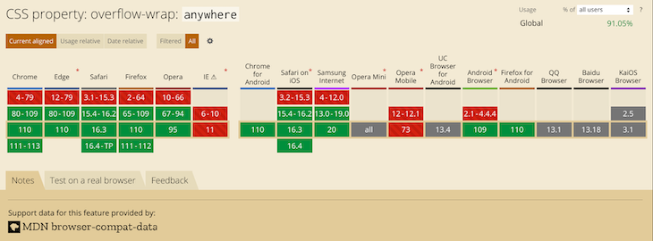
Most recent versions of desktop browsers support overflow-wrap: anywhere. However, support for some mobile browsers is either lacking or unknown. The image below shows the browser support:
Break-wordThe value break-word is like anywhere in terms of functionality. If the browser can wrap the overflowing word to its line without overflowing, that is what it will do. However, if the word still overflows its container even when it is on its line, the browser will break it at the point where the overflow would otherwise occur:
.my-element{
   overflow-wrap: break-word;
}
The example below shows how the browser breaks the overflowing text when you apply overflow-wrap: break-word:
See the Pen
overflow-wrap-break-word by Joseph Mawa (@nibble0101)
on CodePen.
Notice that the text appears the same as in the last subsection. The difference between overflow-wrap: anywhere and overflow-wrap: break-word is in the min-content intrinsic sizes.
The difference between anywhere and break-word is apparent when calculating the min-content intrinsic sizes. With break-word, the browser doesn’t consider the soft wrap opportunities introduced by the word break when calculating min-content intrinsic sizes, but it does with anywhere. For more about min-content intrinsic sizes, check out our guide here.
The value break-word has decent coverage among the most recent versions of desktop browsers. Unfortunately, you cannot say the same about their mobile counterpart. It is, therefore, safer to use the legacy word-wrap: break-word instead of the more recent overflow-wrap: break-word.
The image below shows browser support for overflow-wrap: break-word:
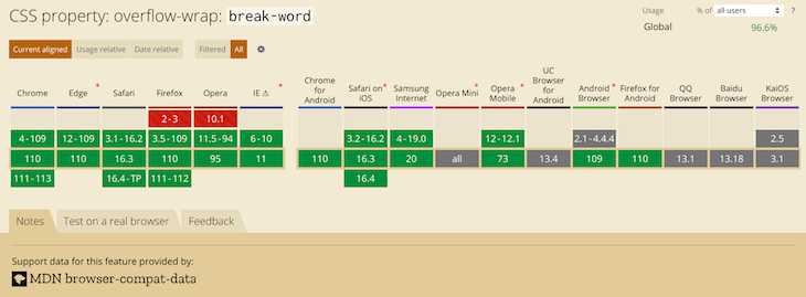
The most recent versions of desktop browsers have support, while support for some mobile browsers is unknown.
Word-break CSS propertyWord-break is another CSS property you can use to specify soft wrap opportunities between characters. You can use this property to break a word at the exact spot where an overflow would occur and wrap it onto the following line.
The draft CSS3 specification refers to the word-break CSS property as:
This property specifies soft wrap opportunities between letters, i.e., where it is “normal” and permissible to break lines of text. It controls what types of letters the browser can glom together to form unbreakable “words” — causing CJK characters to behave like non-CJK text or vice versa.
Below are the possible values of the word-break CSS property. Like overflow-wrap, you can use the global values inherit, initial, revert, and unset with word-break, but we won’t cover them here:
word-break: normal;
word-break: break-all;
word-break: keep-all;
Break-word is also a value of the word-break CSS property, though it was removed. However, browsers still support it for legacy reasons. Specifying this property has the same effect as word-break: normal and overflow-wrap: anywhere.
Now that we know the break-word CSS property and its corresponding values, let us look at them in the subsections below.
word-break to NormalSetting the value of the word-break property to normal will apply the default word breaking rules:
.my-element{
   word-break: normal;
}
The example below illustrates what happens when you apply the styling word-break: normal to a block of text that contains a word longer than its container:
See the Pen
word-break-normal by Joseph Mawa (@nibble0101)
on CodePen.
What you see is the browser’s usual word-breaking rules in effect.
Break-all valueThe value break-all will insert a line break at the exact point where the text would otherwise overflow for non-Chinese, non-Japanese, and non-Korean writing systems. It will not put the word on its own line, even if doing so will prevent the need to insert a line break:
.my-element{
   word-break: break-all;
}
In the example below, I am applying word-break: break-all styling to a p element of width 240px containing an overflowing text. The browser will insert a line break at the point where an overflow would occur and wrap the remaining text to the following line:
See the Pen
word-break-break-all by Joseph Mawa (@nibble0101)
on CodePen.
Using break-all will break a word between two characters at the exact point where an overflow would occur in English and other related language systems. However, it won’t apply the same behavior to Chinese, Japanese, and Korean (CJK) texts.
It doesn’t apply the same behavior for CJK texts because CJK writing systems have their own rules for applying breakpoints. Creating a line break between two characters arbitrarily just for the sake of avoiding overflow might significantly change the overall meaning of the text. For CJK systems, the browser will apply line breaks at the point where such breaks are allowed.
Keep-all valueIf you use the value keep-all, the browser will not apply word breaks to CJK texts, even if there is content overflow. The effect of applying keep-all value is the same as that of normal for non-CJK writing systems:
.my-element{
   word-break: keep-all;
}
In the example below, applying word-break: keep-all will have the same effect as word-break: normal for a non-CJK writing system such as English:
See the Pen
word-break-keep-all by Joseph Mawa (@nibble0101)
on CodePen.
The image below shows the browser support for word-break: keep-all:
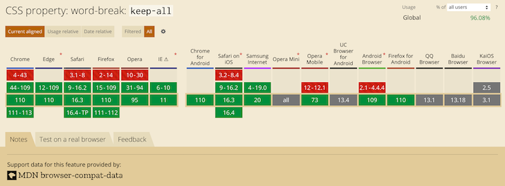
This value has support in most popular desktop browsers. Unfortunately, it is not the case for mobile browsers. Now that we have looked at the overflow-wrap and word-break CSS properties, what is the difference between the two? The section below will shed light on that.
overflow-wrap and word-break?You can use the CSS properties overflow-wrap and word-break to manage content overflow. However, there are differences in the way the two properties handle it.
Using overflow-wrap will wrap the entire overflowing word to its line if it can fit in a single line without overflowing its container. The browser will break the word only if it cannot place it on a new line without overflowing. In most cases, the overflow-wrap property or its legacy name word-wrap might manage content overflow. Using word-wrap: break-word will wrap the overflowing word onto a new line and goes ahead to break it between two characters if it still overflows its container.
Word-break will ruthlessly break the overflowing word between two characters even if placing it on its line will negate the need for word break. Some writing systems, like the CJK writing systems, have strict word breaking rules the browser takes into consideration when creating line breaks using word-break.
As hinted above, if you want to wrap text or break a word overflowing the confines of its box, your best bet is the overflow-wrap CSS property. You can also use its legacy name, word-wrap. Try the word-break CSS property if the overflow-wrap property doesn’t work for you. However, be aware of the differences between overflow-wrap and word-break highlighted above.
Below is an illustration of the overflow-wrap and word-wrap CSS properties. You can play with the CodePen to understand their effects:
See the Pen
how-to-wrap-text by Joseph Mawa (@nibble0101)
on CodePen.
More often than not, you might need to fix broken layouts caused by content overflow, as complex user interfaces are now commonplace in frontend development. Modern web browsers come with tools for troubleshooting such layout issues, such as Chrome DevTools.
It provides the capability to select an element in the DOM tree so that you can view, add, and remove CSS declarations and much more. It will help you track down the offending CSS style in your layout and fix it with ease.
To open the Chrome DevTools, you can use the F12 key. When open, it looks like in the image below. Selecting an element in the DOM tree will display its corresponding CSS styles. You can modify the styles and see the effect on your layout as you track down the source of the bug:
As already mentioned, if you have white-space property on an element, set its value to allow wrapping for overflow-wrap: anywhere or overflow-wrap: break-word to work.
Setting the value of overflow-wrap property to anywhere or break-word on a table content won’t break an overflowing word like in the examples above. The table will overflow its container and create a horizontal scroll if necessary. To get the table to fit within its container and overflow-wrap to work, set the value of the table-layout property to fixed and set the table width to 100% or to some fixed value.
As pointed out in the above sections, overflow-wrap and word-break are similar in so many ways, and you can use both of them for line-breaking controls. The name overflow-wrap is an alias of the legacy word-wrap property. Therefore, you can use the two interchangeably. However, it is worth mentioning that the browser support for the newer overflow-wrap property is still low. You are better off using word-wrap instead of overflow-wrap if you want near-universal browser support.
According to the draft CSS3 specification, browsers and user agents should continue supporting word-wrap for legacy reasons. If you are looking to manage content overflow, overflow-wrap or its legacy name word-wrap might be sufficient. You can also use word-break to break a word between two characters if the word overflows its container. Just like overflow-wrap, you need to tread with caution when using word-break because of limitations in the browser support.
Now that you know the behavior associated with the two properties, you can decide where and when to use them. Did I miss anything? Leave a comment in the comments section. I will be happy to update this article.
As web frontends get increasingly complex, resource-greedy features demand more and more from the browser. If you’re interested in monitoring and tracking client-side CPU usage, memory usage, and more for all of your users in production, try LogRocket.

LogRocket lets you replay user sessions, eliminating guesswork around why bugs happen by showing exactly what users experienced. It captures console logs, errors, network requests, and pixel-perfect DOM recordings — compatible with all frameworks.
LogRocket's Galileo AI watches sessions for you, instantly identifying and explaining user struggles with automated monitoring of your entire product experience.
Modernize how you debug web and mobile apps — start monitoring for free.

Explore 15 essential MCP servers for web developers to enhance AI workflows with tools, data, and automation.

Learn how contrast-color() automatically picks accessible text colors using native CSS, without JavaScript.

Learn how to build a harness-style AI workflow using Claude Code with specialized Dev, QE, and Ops subagents, gated handoffs, MCP telemetry, and LEARNING.md.

Learn how to build smooth staggered animations in CSS using modern features like sibling-index(), complete with practical examples, fallbacks, and accessibility tips.
Hey there, want to help make our blog better?
Join LogRocket’s Content Advisory Board. You’ll help inform the type of content we create and get access to exclusive meetups, social accreditation, and swag.
Sign up now

 Learn more →
