Editor’s note: This article was last updated by Chinwike Maduabuchi in December 2025 to reflect the latest changes in NativeWind v4 and v4.1, including the new jsxImportSource transform, improved style merging through the updated StyleSheet, dark mode, support for CSS variables and custom CSS files, container queries, animations, tvOS support, and more.

It is no secret that Tailwind CSS has significantly influenced the web development community. Its utility-first approach makes it easy for developers to quickly create user interfaces in whichever frontend framework they use. Recognizing the value of Tailwind’s design philosophy, the community has extended its capabilities to the mobile development sphere with NativeWind.
NativeWind brings Tailwind-style utility classes to React Native, offering customizability, a consistent design language, and mobile-first responsive design. In this article, we’ll learn how to use NativeWind to write Tailwind classes in React Native apps. To follow along, you’ll need:
Experience with React Native or Expo helps, but it isn’t required. Now let’s dive in!
NativeWind, created by Mark Lawlor, brings Tailwind CSS utility styling to React Native. Since React Native doesn’t run in a browser and doesn’t have a CSS engine, style declarations must be translated into React Native StyleSheet objects. NativeWind handles this automatically, allowing you to write Tailwind classes just like on the web.
Earlier versions of Nativewind (<v4) relied on a Babel plugin to transform className usage into React Native style objects at build time. In v4, this has changed. Nativewind now uses a jsxImportSource transform powered by the TypeScript/JSX compiler to extract and process classNames. These changes has several benefits:
The className prop is now preserved rather than stripped
Your components still preserve the className string, which means you can use third-party utilities like:
import clsx from "clsx"
<View className={clsx("p-5", isActive && "bg-emerald-500")} />
Simpler setup and faster dev experience
By removing the Babel plugin, v4 reduces the amount of custom configuration required. This removes an extra step in the bundling process for a faster dev experience.
Better integration with existing React tooling
Because the transform aligns with the standard React compilation pipeline, behavior is now more predictable across Metro, Vite, and Webpack. This is especially beneficial when sharing components between web and native environments, such as in a Solito monorepo.
NativeWind v4 and the v4.1 follow-up added several improvements that make styling feel more like working with web CSS. One example of this is the introduction of experimental custom CSS support, meaning you can now write custom classes in a CSS file and use them in your components. NativeWind also added support for CSS variables, enabling theme tokens and dynamic design patterns similar to web systems.
Development feels faster in v4.1. Styles update more reliably during Fast Refresh because NativeWind now writes style output to disk when virtual modules aren’t available. This ensures that style changes refresh consistently across different environments, including in production builds (like with expo-updates). Some more updates include:
NativeWind renamed NativeWindStyleSheet to StyleSheet, and it now extends React Native’s built-in version. This makes it a drop-in replacement that understands Nativewind. If you’ve used NativeWind before, you’ve probably combined style and className at some point. React Native’s default StyleSheet doesn’t always merge them cleanly, especially for transforms and shadows.
NativeWind’s StyleSheet fixes that by normalizing everything and merging styles correctly. You still write your styles the same way:
import { StyleSheet } from "nativewind";

const styles = StyleSheet.create({
  container: { padding: 20, backgroundColor: "white" },
});
But now style and className work together cleanly, giving you consistent results and smoother integration across your components.
REM units now default to a 14px base. You can change this using the inlineNativeRem option:
// tailwind.config.js
module.exports = {
  theme: {
    extend: {},
  },
  nativewind: {
    inlineNativeRem: 16, // use standard 16px as base
  },
}
Container queries let components respond to the size of their parent container, not just the screen:
<View className="container p-4">
  <Text className="container:text-xl container:p-6">Hello</Text>
</View>
If that parent container grows or shrinks, its children can adapt dynamically, similar to CSS @container rules on the web.
Tailwind group variants allow child components to react to parent states, such as presses or hovers:
<Pressable className="group p-4">
  <Text className="text-gray-500 group-hover:text-blue-500">
    Press Me
  </Text>
</Pressable>
When the parent (Pressable) is interacted with, the child’s style updates automatically.
NativeWind is adopting Software Mansion’s acclaimed React Native Reanimated library for animations and transitions. You can apply familiar transition and animation utilities directly to your components:
<View className="transition-all duration-300 group-hover:scale-105" />
/* or */
<MaterialIcons className='animate-pulse' name="holiday-village" />
This is still experimental. Some animations work on Android but fail on iOS (e.g., in Expo Go). For more complex motion, especially physics-based effects, Reanimated is still the better choice. For more complex animations — like the Hellowave component in the Expo demo — you’re better off using Reanimated to animate styles directly on the UI thread, making animations look better.
NativeWind now supports tvOS, allowing shared tokens and consistent styling across iOS, Android, web, and TV in one codebase. This is useful for apps that target both mobile and living-room experiences.
Now that we’ve covered the v4 updates, let’s install and configure NativeWind in a new Expo project.
You can start with either a lightweight Expo setup with Nativewind preconfigured or a fresh Expo project where you’ll install Nativewind.
The NativeWind docs recommend using the rn-new CLI that creates a minimal Expo app with NativeWind already wired up. This is helpful if you want a clean starting point. In your terminal, run:
npx rn-new --nativewind
After that, you can enter the project folder and start the development server:
npm start
Open Expo Go on your device and scan the QR code in your terminal to view the app. If you have a mobile emulator installed like Android Studio, press the a key to launch the app in your emulator.
This method gives you a lightweight project setup without extra configuration or packages like Expo Router.
I’m going to be using this approach as the Expo CLI creates a robust project that includes navigation with Expo Router, Reanimated, Gesture Handler, Expo font, and more out of the box – common packages you’ll use in production. To create an RN app with the Expo CLI, run:
npx create-expo-app@latest my-app
cd my-app
Now we will integrate NativeWind into the Expo project we’ve just created. Start by installing Nativewind, its peer dependencies, and an icon library to use later on:
npm install [email protected] react-native-reanimated react-native-safe-area-context react-native-heroicons
And install this specific version of Tailwind as a dev dependency:
npm install -D tailwindcss@^3.4.17 babel-preset-expo
Next, initialize Tailwind with the following command to create your tailwind.config.js file.
npx tailwindcss init
Update tailwind.config.js so Tailwind can scan your target components
// tailwind.config.js
module.exports = {
  content: [
    "./App.{js,jsx,ts,tsx}",
    "./app/**/*.{js,jsx,ts,tsx}",
    "./components/**/*.{js,jsx,ts,tsx}"
  ],
  presets: [require("nativewind/preset")],
  theme: {
    extend: {}
  },
  plugins: []
};
Next, we’ll create a global stylesheet that will import the Tailwind directives. Make a file named global.css in your project root:
@tailwind base;
@tailwind components;
@tailwind utilities;
Now import it at the top of your entry file, app/_layout.tsx):
import { DarkTheme, DefaultTheme, ThemeProvider } from '@react-navigation/native'
import { Stack } from 'expo-router'
import { StatusBar } from 'expo-status-bar'
import 'react-native-reanimated'
import '../global.css'

export const unstable_settings = {
  anchor: '(tabs)',
}
export default function RootLayout() {
  /* .... */
}
Next, we have to configure our bundle process to allow Nativewind efficiently translate Tailwind classes and classNameusage throughout the app into React Native styles. This is made possible with the jsxImportSource preset mentioned earlier.
If your project does not have a babel.config.js file, create one:
// babel.config.js
module.exports = function (api) {
  api.cache(true);
  let plugins = [];
  plugins.push('react-native-worklets/plugin');
  return {
    presets: [['babel-preset-expo', { jsxImportSource: 'nativewind' }], 'nativewind/babel'],
    plugins,
  };
};
Then configure the Metro bundler by creating or modifying metro.config.js so NativeWind is recognized in the bundle process:
// metro.config.js
const { getDefaultConfig } = require("expo/metro-config");
const { withNativeWind } = require("nativewind/metro");

const config = getDefaultConfig(__dirname);

module.exports = withNativeWind(config, { input: "./global.css" });
Finally, tell Expo to use Metro by adding this to app.json:
{
  "expo": {
    // name, slug, e.t.c.
    "web": {
      "bundler": "metro"
    }
  }
}
If you’re using a TypeScript setup, you’ll want to add TypeScript NativeWind support by creating a nativewind-env.d.ts in the project root:
/// <reference types="nativewind/types" />
Now, you can start the dev server to apply these configurations.
npm start
Tailwind classes will now work directly in your React Native components.
<View className="flex-1 items-center justify-center bg-blue-500">
  <Text className="text-white text-lg font-bold">Hello</Text>
</View>
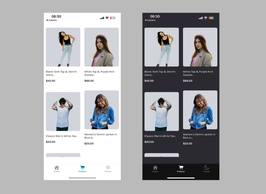
In this article, we’re going to attempt to recreate the e-commerce user interface below using NativeWind and core React Native components. We’ll revise core Tailwind CSS styling concepts like hover effects, fonts, dark mode, and responsive design. We’ll also see how to set up custom fonts, use familiar Tailwind classes, and explore concepts like responsive design and dark mode.
The project assets, including the images and the product data, can all be found in this GitHub repository.
One of the first things I do when starting a new project that uses Tailwind is to tweak some settings in the config file to match the design system. In our case, we can start by adding custom fonts, brand colors, and setting up dark mode. Nativewind adds some default font family class names:
import { platformSelect } from "nativewind/theme"
module.exports = {
  theme: {
    fontFamily: {
      sans: platformSelect({
        android: 'san-serif',
        ios: 'system font',
        web: 'ui-sans-serif, system-ui, -apple-system, BlinkMacSystemFont, "Segoe UI", Roboto, "Helvetica Neue", Arial, "Noto Sans", sans-serif, "Apple Color Emoji", "Segoe UI Emoji", "Segoe UI Symbol", "Noto Color Emoji"'
      }),
      serif: platformSelect({
        android: 'serif',
        ios: 'Georgia'
        web: 'ui-serif, Georgia, Cambria, "Times New Roman", Times, serif'
      }),
      mono: platformSelect({
        android: 'mono',
        ios: 'Courier New'
        web: 'ui-monospace, SFMono-Regular, Menlo, Monaco, Consolas, "Liberation Mono", "Courier New", monospace'
      }),
    }
  }
}
We can override these with our custom fonts. I’ve downloaded the Karla from Google Fonts, which you’ll find here in the repository. You will also need to install the expo-font package if you don’t already have it:
npm install expo-font
Next, load the fonts into your app:
// app/_layout.tsx
import { DarkTheme, DefaultTheme, ThemeProvider } from '@react-navigation/native'
import { useFonts } from 'expo-font'
import { Stack } from 'expo-router'
import { StatusBar } from 'expo-status-bar'
import 'react-native-reanimated'
import '../global.css'
import { useColorScheme } from '@/hooks/use-color-scheme'

export const unstable_settings = {
  anchor: '(tabs)',
}

export default function RootLayout() {
  const colorScheme = useColorScheme()
  const [fontsLoaded] = useFonts({
    Karla: require('../assets/fonts/Karla-VariableFont.ttf'),
    'Karla-Italic': require('../assets/fonts/Karla-Italic-VariableFont.ttf'),
  })

  if (!fontsLoaded) {
    return null
  }

  return (
    <ThemeProvider value={colorScheme === 'dark' ? DarkTheme : DefaultTheme}>
      <Stack>
        <Stack.Screen name='(tabs)' options={{ headerShown: false }} />
        <Stack.Screen name='modal' options={{ presentation: 'modal', title: 'Modal' }} />
      </Stack>
      <StatusBar style='auto' />
    </ThemeProvider>
  )
}
Now you can override the default font and use it in your app as you wish:
/** @type {import('tailwindcss').Config} */
const { platformSelect } = require('nativewind/theme')

module.exports = {
  content: ['./App.{js,jsx,ts,tsx}', './app/**/*.{js,jsx,ts,tsx}', './components/**/*.{js,jsx,ts,tsx}'],
  presets: [require('nativewind/preset')],
  theme: {
    extend: {
      fontFamily: {
        sans: platformSelect({
          android: 'Karla',
          ios: 'Karla',
          web: '"Karla", ui-sans-serif, system-ui, -apple-system, BlinkMacSystemFont, "Segoe UI", Roboto, "Helvetica Neue", Arial, "Noto Sans", sans-serif',
        }),
        serif: platformSelect({
          android: 'serif',
          ios: 'Georgia',
          web: 'ui-serif, Georgia, Cambria, "Times New Roman", Times, serif',
        }),
        mono: platformSelect({
          android: 'mono',
          ios: 'Courier New',
          web: 'ui-monospace, SFMono-Regular, Menlo, Monaco, Consolas, "Liberation Mono", "Courier New", monospace',
        }),
      },
      colors: {
        'off-white': {
          DEFAULT: '#E3E3E3',
        },
        dark: {
          DEFAULT: '#1C1C1E',
        },
        'soft-dark': {
          DEFAULT: '#2A2A2F',
        },
      },
    },
  },
  nativewind: {
    inlineNativeRem: 16,
  },
  plugins: [],
}

<Text className='font-sans text-2xl'>Custom font!</Text>
The layout we’re recreating uses two columns, so start by setting up the screen container that everything will sit inside. In Expo Router, each tab screen lives in its own file under app/(tabs), and the tab navigation is defined in app/(tabs)/_layout.tsx.
For this demo, we’ll replace the Explore screen with a new Product screen. Create a new file at app/(tabs)/product.tsx, which will hold a full-height container for the product grid.
// app/(tabs)/product.tsx
import ProductList from '@/components/product-list'
import { SafeAreaView } from 'react-native-safe-area-context'

export default function ProductScreen() {
  return (
    <SafeAreaView className='flex-1 bg-white dark:bg-soft-dark'>
      <ProductList />
    </SafeAreaView>
  )
}
flex-1 makes the screen fill the entire device height, the background stays consistent across light and dark mode, and SafeAreaView keeps content away from notches and the iOS status area.
With the screen set, the next step is registering this component in our tab layout. Update app/(tabs)_layout.tsx:
// app/(tabs)_layout.tsx
import { Tabs } from 'expo-router'
import React from 'react'
import { HapticTab } from '@/components/haptic-tab'
import { IconSymbol } from '@/components/ui/icon-symbol'
import { Colors } from '@/constants/theme'

export default function TabLayout() {
  return (
    <Tabs
      screenOptions={{
        tabBarActiveTintColor: Colors[colorScheme ?? 'light'].tint,
        headerShown: false,
        tabBarButton: HapticTab,
      }}
    >
      <Tabs.Screen
        name='index'
        options={{
          title: 'Home',
          tabBarIcon: ({ color }) => <IconSymbol size={28} name='house.fill' color={color} animate={false} />,
        }}
      />
      <Tabs.Screen
        name='product'
        options={{
          title: 'Product',
          tabBarIcon: ({ color }) => <IconSymbol size={28} name='cart.fill' color={color} animate={false} />,
        }}
      />
    </Tabs>
  )
}
Now we can start working on the two-column layout by creating the ProductList component. This component will use React Native’s FlatList, which is optimized for large lists with features like windowed rendering, lazy loading, pull-to-refresh, and smooth scrolling.
// components/product-list.tsx
import { products } from '@/data/products'
import { Dimensions, FlatList } from 'react-native'
import Product from './product'

const numColumns = 2
const screen_width = Dimensions.get('window').width
const column_width = screen_width / numColumns

export default function ProductList() {
  return (
    <View className='flex-1 bg-white dark:bg-soft-dark'>
      <FlatList
        data={products}
        numColumns={numColumns}
        renderItem={(product_data) => {
          return (
            <Product
              image_url={product_data.item.image_url}
              name={product_data.item.name}
              price={product_data.item.price}
              column_width={column_width}
            />
          )
        }}
        keyExtractor={(item) => {
          return item.key.toString()
        }}
      />
    </View>
  )
}
At first glance, it feels natural to reach for Tailwind responsive classes to build this grid. But NativeWind’s default breakpoints aren’t tailored for mobile yet, so those utilities won’t give you the adaptive behavior you’d expect on different device sizes.
To keep the grid consistent, we calculate the column width manually using React Native’s Dimensions API:
Product so every card snaps cleanly into the grid
If you want to go deeper into building adaptive layouts in React Native, check out this post.
Now, here’s the Product component:
// components/product.tsx
import { Image, ImageSourcePropType, Text, View } from 'react-native'

export default function Product({
  image_url,
  name,
  price,
  column_width,
}: {
  image_url: ImageSourcePropType
  name: string
  price: number
  column_width: number
}) {
  return (
    <View style={{ width: column_width }} className="justify-center p-3">
      <Image
        className="m-5 mx-auto h-56 w-full rounded-lg bg-gray-300 object-cover"
        source={image_url}
      />
      <Text className="text-dark font-sans mb-3 dark:text-white">
        {name.substring(0, 30) + '...'}
      </Text>
      <Text className="text-dark font-sans text-base font-bold dark:text-white">
        ${price}.00
      </Text>
    </View>
  )
}
The product data lives in a separate file available at data/products.ts. This structure keeps the screen clean while making the layout easy to scale, no matter the device’s width.
NativeWind supports Tailwind dark mode styling practices seamlessly, allowing you to style your app based on your users’ preferences. With the useColorScheme hook and the dark: variant selector provided by NativeWind, you can easily write dark mode classes in your React Native application.
The hook returns the current color scheme and methods to set or toggle the color scheme manually between light and dark modes:
import { useColorScheme } from "nativewind";

function MyComponent() {
  const { colorScheme, setColorScheme, toggleColorScheme } = useColorScheme();

  console.log(colorScheme) // 'light' | 'dark' | undefined
  setColorScheme('dark')
  toggleColorScheme() // changes colorScheme to opposite of its current value

  return (
    {/* ... */}
  );
}
However, using the useColorScheme directly from NativeWind conflicts with the custom use-color-scheme.ts hook that Expo generates, since that one wraps React Native’s built-in useColorScheme hook. To avoid the type clash, we’ll update the custom hook instead:
import { useColorScheme as useNativeWindColorScheme } from 'nativewind'

export function useColorScheme() {
  const { colorScheme, setColorScheme, toggleColorScheme } =
    useNativeWindColorScheme()

  return {
    colorScheme,
    setColorScheme,
    toggleColorScheme,
  }
}
This custom hook now wraps NativeWind’s implementation, giving us a clean, reusable interface across our entire app.
Let’s test the hook by adding a new tab that works as a theme-toggle button. Start by adding a Theme tab to the layout like this:
// app/(tabs)/_layout.tsx
import { Tabs } from 'expo-router'
import React from 'react'
import { MoonIcon, SunIcon } from 'react-native-heroicons/outline'
import { HapticTab } from '@/components/haptic-tab'
import { IconSymbol } from '@/components/ui/icon-symbol'
import { Colors } from '@/constants/theme'
import { useColorScheme } from '@/hooks/use-color-scheme'

export default function TabLayout() {
  const { colorScheme, toggleColorScheme } = useColorScheme()
  return (
    <Tabs
      screenOptions={{
        tabBarActiveTintColor: Colors[colorScheme ?? 'light'].tint,
        headerShown: false,
        tabBarButton: HapticTab,
      }}
    >
      <Tabs.Screen
        name='index'
        options={{
          title: 'Home',
          tabBarIcon: ({ color }) => <IconSymbol size={28} name='house.fill' color={color} animate={false} />,
        }}
      />
      <Tabs.Screen
        name='product'
        options={{
          title: 'Product',
          tabBarIcon: ({ color }) => <IconSymbol size={28} name='paperplane.fill' color={color} animate={false} />,
        }}
      />
      <Tabs.Screen
        name='theme'
        options={{
          title: 'Theme',
          tabBarIcon: ({ color }) =>
            colorScheme === 'light' ? <SunIcon color={color} size={28} /> : <MoonIcon color={color} size={28} />,
          tabBarButton: HapticTab,
        }}
        listeners={{
          tabPress: (e) => {
            e.preventDefault()
            toggleColorScheme()
          },
        }}
      />
    </Tabs>
  )
}
You’ll also need to add a file called theme.tsx inside the (tabs) folder. This prevents the expo-router from throwing an error. Just put this inside it:
import { View } from 'react-native';

export default function Theme() {
  return <View />;
}
Also, notice the last tab uses a listeners prop. Normally, tabs act as links that change the screen, but here we block that default navigation and turn it into a button that toggles between light and dark mode using toggleColorScheme. We also read the value of colorScheme to render the right icons.
Let’s apply dark mode classes throughout our app. We’ll start with the Product component:
// components/product.tsx
import { View, Text, Image, ImageSourcePropType } from 'react-native'

export default function Product({
  image_url,
  name,
  price,
  column_width
}: {
  image_url: ImageSourcePropType
  name: string
  price: number
  column_width: number
}) {
  return (
    <View style={{ width: column_width }} className='justify-center p-3'>
      <Image
        className='m-5 h-56 w-full mx-auto object-cover bg-gray-300 rounded-lg'
        source={image_url}
      />
      <Text className='text-dark dark:text-white mb-3 font-sans'>
        {name.substring(0, 30) + '...'}
      </Text>
      <Text className='text-dark dark:text-white font-bold text-base font-sans'>{`$${price}.00`}</Text>
    </View>
  )
}
Notice how we use the dark: variant to apply white text color in dark mode while keeping dark text in light mode.
Next, we’ll update the root layout to apply dark mode classes to the parent View and make the StatusBar responsive to the color scheme. Since our custom hook returns an object, we need to destructure the colorScheme value:
// app/_layout.tsx
import { DarkTheme, DefaultTheme, ThemeProvider } from '@react-navigation/native'
import { useFonts } from 'expo-font'
import { Stack } from 'expo-router'
import { StatusBar } from 'expo-status-bar'
import 'react-native-reanimated'
import '../global.css'

import { useColorScheme } from '@/hooks/use-color-scheme'

export default function RootLayout() {
  const { colorScheme } = useColorScheme()

  const [fontsLoaded] = useFonts({
    Karla: require('../assets/fonts/Karla-VariableFont.ttf'),
    'Karla-Italic': require('../assets/fonts/Karla-Italic-VariableFont.ttf'),
  })

  if (!fontsLoaded) {
    return null
  }

  return (
    <ThemeProvider value={colorScheme === 'dark' ? DarkTheme : DefaultTheme}>
      <Stack>
        <Stack.Screen name='(tabs)' options={{ headerShown: false }} />
        <Stack.Screen name='modal' options={{ presentation: 'modal', title: 'Modal' }} />
      </Stack>
      <StatusBar style='auto' />
    </ThemeProvider>
  )
}
If you have other hooks that depend on the color scheme, you’ll need to update them to destructure the value from our custom hook. For example, in hooks/use-theme-color.ts:
import { Colors } from '@/constants/theme'
import { useColorScheme } from '@/hooks/use-color-scheme'

export function useThemeColor(
  props: { light?: string; dark?: string },
  colorName: keyof typeof Colors.light & keyof typeof Colors.dark
) {
  const { colorScheme } = useColorScheme()
  const theme = colorScheme ?? 'light'
  const colorFromProps = props[theme]

  if (colorFromProps) {
    return colorFromProps
  } else {
    return Colors[theme][colorName]
  }
}
With these changes in place, your entire application now has a consistent, type-safe way to handle dark mode using NativeWind’s styling system.
NativeWind brings Tailwind’s workflow to mobile, but there are still a few limits compared to building for the web.
Here are some things to keep in mind:
FlatList uses columnWrapperStyle, which you must set with the style prop. NativeWind cannot reach everything through classes, so you will still mix classes with plain React Native stylesstyled() or custom parent modifiers. These are gone in v4. If your project uses older patterns, you will need to update themNativeWind is improving fast, but you should still expect some gaps when coming from a full Tailwind web mindset.
NativeWind v5 is now in preview. It builds on v4 and v4.1 and focuses on a cleaner setup, better performance, and better consistency with Tailwind on the web.
Here are the promises from the team:
jsxImportSource approach and aims to work with fewer manual steps across Expo, React Native CLI, and web targetsNativeWind makes it much easier to bring Tailwind’s utility-first workflow to React Native. It handles the translation work behind the scenes so the classes you’d normally write on the web map are clean to native styles. Check out NativeWind’s official documentation for more information.

LogRocket's Galileo AI watches sessions for you and and surfaces the technical and usability issues holding back your React Native apps.
LogRocket also helps you increase conversion rates and product usage by showing you exactly how users are interacting with your app. LogRocket's product analytics features surface the reasons why users don't complete a particular flow or don't adopt a new feature.
Start proactively monitoring your React Native apps — try LogRocket for free.

Learn how to protect full-stack projects from NPM supply chain attacks with a practical security checklist.

Explore 15 essential MCP servers for web developers to enhance AI workflows with tools, data, and automation.

Learn how contrast-color() automatically picks accessible text colors using native CSS, without JavaScript.

Learn how to build a harness-style AI workflow using Claude Code with specialized Dev, QE, and Ops subagents, gated handoffs, MCP telemetry, and LEARNING.md.
Would you be interested in joining LogRocket's developer community?
Join LogRocket’s Content Advisory Board. You’ll help inform the type of content we create and get access to exclusive meetups, social accreditation, and swag.
Sign up now

 Learn more →
