Editor’s Note: This post was reviewed for accuracy on 6 March 2023. If you’re interested in learning more about Anime.js, see how it compares to other popular JavaScript animation libraries.
Animations are an excellent way to set your website a step above the rest. You can use animations like imaginative object motion and seamless page transitions to capture the attention of your users and amaze them with rich, engaging experiences that make a fantastic first impression.
There are many JavaScript animation libraries that can help us achieve this. One such library is Anime.js, which is among the best and fastest JavaScript animation libraries out there.
In this article, we’ll explore the Anime.js library and use it to add some basic animation to an example website. We will cover:
Let’s jump right in!
Anime.js is a lightweight library with over 43k stars on GitHub that animates CSS attributes, DOM elements, and SVG on a webpage. Creating site animations is an easy process with Anime.js.
This library possesses a built-in staggering system that generates ripples and reduces the complexity of overlapping animations. You can use it to create simple and complex animation effects of your choice, synchronize multiple instances and control all animation features.
There are a lot of different properties we need to be aware of while working with Anime.js. Let’s explore some below.
Targets refer to the element or elements we want to animate. These could be CSS selectors such as a div, class, or id, DOM nodes or node arrays, or simple JavaScript objects. It is also possible to use a combination of the aforementioned in an array.
Properties specify which visual aspects of an element should be animated, such as its color, size, or position. We can define the properties to be animated using the following types of data:
color or font-sizerotate or scalevalue attribute of an input elementpoints attribute of a circle elementIt is important not to confuse property parameters with properties in Anime.js. While properties refer to the visual aspects of an element that we want to animate, property parameters are settings that we define for the properties, controlling how the animation should behave.
Examples of property parameters include the duration of the animation, a delay before the animation starts, and the easing function to use. See a full list of Anime.js property parameters in the documentation.
Property parameters in Anime.js behave in similar ways as compared to standard parameters in other animation tools and libraries. However, the exact property parameters used in Anime.js are specific to this tool and may not be used in the same way in other tools.
Animation parameters in Anime.js are used to control the direction, loop, and autoplay behavior of the animation before and after it plays:
direction specifies whether the animation should play forward or backwardloop specifies the number of times the animation should repeat, or if it should loop indefinitelyautoplay determines whether the animation should start automatically when it is createdLike property parameters, animation parameters in Anime.js are similar to standard parameters used in other animation tools and libraries, but may not be used in the same way in other tools.
You can set up Anime.js by downloading the library directly, installing it with an npm command, or via a CDN.
If you are downloading the library from the Anime.js website, include the Anime.js JavaScript file in your HTML code, like so:
<script src="path/to/anime.min.js"></script>
The Node Package Manager (npm) is another option. If you use npm, the script will be located in node modules/animejs/lib/anime.min.js. See the install command below:
$ npm install animejs --save
Another option is to utilize the most recent release of the library provided on a CDN:
<script src="https://cdnjs.cloudflare.com/ajax/libs/animejs/3.2.1/anime.min.js">
Once you have the library set up, you can start using it in your project right away. Let’s explore how to do so by applying animations to an example website.
There are many reasons why Anime.js is such a popular library. To start with, it is quite simple to use. Everything is based on a single function call, and you only need to feed parameters into it, which is incredibly convenient.
Anime.js also has great documentation. You can see examples for each of the different animations available through this library that show you the code, how it works, and what it accomplishes through interactive animation visuals.
Finally, this library comes with an excellent learning curve. Anime.js is not challenging to learn at all! You can look at the documentation and come up with a nice animation of your choice if you have a basic understanding of CSS and JavaScript.
Let’s see an animation example just see how it works.
Let’s create a file called index.html and add the following code :
<!DOCTYPE html>
<html lang="en">
  <head>
    <meta charset="UTF-8" />
    <meta http-equiv="X-UA-Compatible" content="IE=edge" />
    <meta name="viewport" content="width=device-width, initial-scale=1.0" />
    <link rel="stylesheet" href="style.css" />
    <title>Anime App</title>
  </head>
  <body>
    <div class="box purple"></div>
    <div class="box green"></div>
    <div class="box black"></div>
    <div class="box grey"></div>
    <script src="https://cdnjs.cloudflare.com/ajax/libs/animejs/3.2.1/anime.min.js"></script>
    <script src="main.js"></script>
  </body>
</html>
In the code above, we inserted the Anime.js CDN link into our HTML. We also built four divs to represent our boxes, which we will style in CSS. This code block also includes a link to the main.js script, where we’ll write the code for animating these boxes.
Next, create a file called style.css and paste the following:
.box{

    position: relative;
    width: 100px;
    height: 100px;
    margin: 4px;
    display: inline-block;
}
.purple{background-color: purple;}
.green{background-color: green;}
.black{background-color: black;}
.grey{background-color: grey;}
In the code above, we have given each box a width of 100px and a height of 100px, as well as a margin of 4px and a display property set to inline-block. We also assigned different colors to each box.
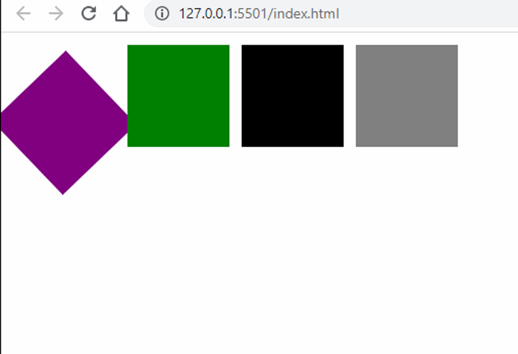
Now it’s time to use Anime.js to animate these boxes. Create a file called main.js and paste the following:
anime({
  targets: "div.box",
  translateY: [
    { value: 200, duration: 500 },
    { value: 0, duration: 800 },
  ],
  rotate: {
    value: "1turn",
    easing: "easeInOutSine",
  },
  delay: function (el, i, l) {
    return i * 1000;
  },
  loop: true,
});
Using Anime.js, we created a function anime() that takes in the configuration objects. Inside the function, we specified the target — i.e., what we want to animate. In this case, we want to animate our CSS selector called div.box.
We also set the properties of the translateY property. We are using translateY because we want our boxes to move down, a movement that takes place on the y-axis. If we were moving left or right, then it would be on the x-axis.
If you notice, our translateY property contains an array of two objects. This is because we want two movements for our box — first to go down, then go back up. So, the first value in our array is for our boxes to move down, while the other is for the boxes to return up to their normal position.
The value in the array depicts how far we want it to go, while the duration depicts how long we want it to happen, which is usually in milliseconds.
We also added rotational movement by setting our rotate value to 1turn. We also set the easing property to easeInOut. Think of easing as the way an object starts and stops.
Since we want our boxes to move down one at a time and not together, we needed to set a delay. The delay property uses a function that takes in the element, iteration, and total targets. We take the iteration and multiply it by the total targets, which should help us achieve the animation we want.
Finally, we added a loop property. We set the loop to true so our animation can restart once it is done.
Here’s the result:
Let’s look at a more detailed example, this time using Anime.js to create background animation for a website.
Basic familiarity with CSS and JavaScript is required to get started with this project. You may choose whichever method you’d like to set up Anime.js. I’ll use the CDN URL, the same way I did in the previous example.
Our project structure will still be like before — we are going to have three files named index.html, style.css, and main.js.
Navigate into the folder created for this project. Create a file called index.html and paste this:
<!DOCTYPE html>
<html lang="en">
  <head>
    <meta charset="UTF-8" />
    <meta http-equiv="X-UA-Compatible" content="IE=edge" />
    <meta name="viewport" content="width=device-width, initial-scale=1.0" />
    <link rel="stylesheet" href="style.css" />
    <script
      src="https://cdnjs.cloudflare.com/ajax/libs/animejs/3.2.0/anime.min.js"
      type="text/javascript"
    ></script>
    <title>background animation</title>
  </head>
  <body>
    <div class="container">
      <h1>
        <span>Welcome to </span><br />
        logrocket blog
      </h1>
    </div>
    <script src="main.js"></script>
  </body>
</html>
As usual, our HTML contains the link to Anime.js and our main.js file for our animation code. We also created a div called container and added some basic text inside.
Next, we want to create our style.css file and write the following:
* {
  margin: 0;
  padding: 0;
  border: 0;
  outline: 0;
  box-sizing: border-box;
  font-family: 'Open Sans', sans-serif;
}
body {
  position: relative;
  display: -webkit-box;
  display: -ms-flexbox;
  display: flex;
  -webkit-box-pack: center;
  -ms-flex-pack: center;
  justify-content: center;
  -webkit-box-align: center;
  -ms-flex-align: center;
  align-items: center;
  min-height: 100vh;
  overflow: hidden;
  background: #514b55;
}
.container {
  height: 100%;
  width: 100%;
  position: absolute;
  display: -webkit-box;
  display: -ms-flexbox;
  display: flex;
  -webkit-box-pack: center;
  -ms-flex-pack: center;
  justify-content: center;
  -webkit-box-align: center;
  -ms-flex-align: center;
  align-items: center;
}
h1 {
  color: white;
  text-align: center;
  font-size: 9vw;
  z-index: 999;
  font-weight: 600;
  line-height: 0.6em;
  text-transform: uppercase;
}
h1 span {

  font-size: 50px;
  letter-spacing: 0.2em;
  font-weight: bold;
  text-transform: uppercase;
}
.block {
  position: absolute;
  height: 60px;
  width: 60px;
  background: #514b55;
  -webkit-box-shadow: 10px 10px 50px rgba(0, 0, 0, 0.2);
  box-shadow: 10px 10px 50px rgba(0, 0, 0, 0.2);
}
You’ll notice there’s a div called block that we are styling in this file, but which isn’t in our HTML markup. That’s because we’ll create it in our main.js file next.
Let’s create our main.js file now and paste the following in:
const background = document.querySelector(".container");
for (var i = 0; i <= 100; i++) {
  const blocks = document.createElement("div");
  blocks.classList.add("block");
  background.appendChild(blocks);
}
let animateBlocks = () => {
  anime({
    targets: ".block",
    translateX: () => {
      return anime.random(-700, 700);
    },
    translateY: () => {
      return anime.random(-500, 500);
    },
    scale: () => {
      return anime.random(1, 5);
    },
    easing: "linear",
    duration: 3000,
    delay: anime.stagger(10),
    complete: animateBlocks,
  });
};
animateBlocks();
In the code above, we selected our div class container and assigned it to a variable called background variable. We then used the for loop to create 100 div elements, all having the same class named block, and then added these divs to variable background which is representing the container class.
Next, we animated each block, giving us a nice background.
Let’s see our result:

Had fun with that? Let’s switch things up a bit by making significant changes to turn this background animation into an animated website.
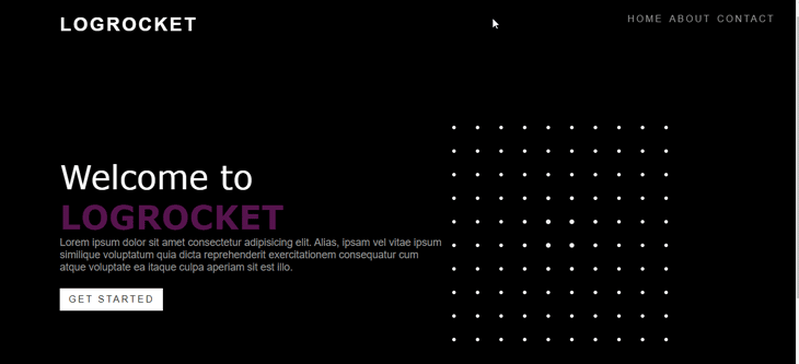
Navigate to the project folder and create an index.html file. Paste the following into the file:
<!DOCTYPE html>
<html lang="en">
  <head>
    <meta charset="UTF-8" />
    <meta http-equiv="X-UA-Compatible" content="IE=edge" />
    <meta name="viewport" content="width=device-width, initial-scale=1.0" />
    <link rel="stylesheet" href="style.css" />
    <script
      src="https://cdnjs.cloudflare.com/ajax/libs/animejs/3.2.0/anime.min.js"
      type="text/javascript"
    ></script>
    <title>Document</title>
  </head>
  <body>
    <header>
      <a href="#" class="logo">logo</a>
      <ul>
        <li><a href="#">Home</a></li>
        <li><a href="#">About</a></li>
        <li><a href="#">contact</a></li>
      </ul>
    </header>
    <section>
      <div class="content">
        <h2>Welcome to <b>LOGROCKET</b></h2>
        <p>
          Lorem ipsum dolor sit amet consectetur adipisicing elit. Alias, ipsam
          vel vitae ipsum similique voluptatum quia dicta reprehenderit
          exercitationem consequatur cum atque voluptate ea itaque culpa aperiam
          sit est illo.
        </p>
        <a href="#" class="btn">Get started</a>
      </div>
      <div class="container"></div>
    </section>
    <script src="main.js"></script>
  </body>
</html>
The code above sets up a simple example website with a logo, three navigation pages, a page title, some dummy content, and a button that says Get started.
Next up is the styling. Create a style.css file and copy this in:
*{
    margin: 0;
    padding: 0;
    font-family: sans-serif;
}
body{
    min-height: 100vh;
    background: rgb(0, 0, 0);
}
header{
    position: fixed;
    padding: 30px 100px;
    width: 90%;
    display: flex;
    justify-content: space-between;
}
header .logo{
  color: #fff;
  font-size: 2em;
  text-decoration: none;
  text-transform: uppercase;
  font-weight: 700;
  letter-spacing: 0.1em;
}
header ul{
    display: flex;
    gap: 10px;
}
header ul li{
     list-style: none;
}
header ul li a{
    text-decoration: none;
    color: #999;
    text-transform: uppercase;
    letter-spacing: 0.2em;
    transition: 0.5s;
}
header ul li a:hover,a.active{
    color: #fff;
}
section{
    display: flex;
    justify-content: space-between;
    align-items: center;
    min-height: 100vh;
    padding: 100px;
    gap: 100px;
}
section .content{
    max-width: 700px;
}
section .content h2{
    font-size: 3.5em;
    color: #fff;
    font-weight: 500;
    font-family: Verdana, Geneva, Tahoma, sans-serif;
}
section .content h2 b{
    color: rgb(87, 21, 78);
    font-family: Verdana, Geneva, Tahoma, sans-serif;
}
section .content p{
    color: #999;
    font-size: 1.1em;
}
section .content .btn{
 padding: 10px 15px;
 background: #fff;
 color: #222;
 text-decoration: none;
 text-transform: uppercase;
 font-weight: 500;
 display: inline-block;
 margin-top: 25px;
 letter-spacing: 0.2em;
}
section .content .btn:hover{
    letter-spacing: 0.4em;
}
section .container{
    position: relative;
    right: 100px;
    min-width: 400px;
    width: 400px;
    height: 400px;
    display: flex;
    justify-content: center;
    align-items: center;
    flex-wrap: wrap;
}
.element{
    position: relative;
    width: 40px;
    height: 40px;
    background: #fff;
    scale: 0.75;

}
In the CSS above, we are giving styles to our header and the nav links using position: fixed to make them static.
We also applied styling and positioning to our button and page content, configured custom fonts, and set a display color. We used the hover property for our button by increasing the line-spacing when it is hovered upon.
Then, for our .container and .element, we used the position: relative property to avoid affecting our layout.
Lastly, let’s create our main.js file:
let container = document.querySelector(".container");
for (let i = 1; i <= 100; i++) {
  let squares = document.createElement("div");
  squares.classList.add("element");
  container.appendChild(circle);
}
let animation = anime.timeline({
  targets: ".element",
  easing: "easeInOutExpo",
  loop: true,
  delay: anime.stagger(80, { grid: [10, 10], from: "center" }),
});
animation
  .add({
    scale: 0,
    rotate: "-45deg",
    borderTopLeftRadius: "0%",
    opacity: "0",
  })
  .add({
    borderRadius: 50,
  })
  .add({
    scale: 1,
    opacity: 1,
    rotateZ: "360deg",
  })
  .add({
    scale: 0.2,
    opacity: 1,
  })
  .add({
    opacity: 0,
    scale: 1,
    rotate: "100deg",
  });
Just like in our animated background example, we created a div — which we called .element — through the for loop. This is because we are creating hundreds of iterations of this div to represent our squares for our animation.
After creating these iterations, we used Anime.js codes to animate them. We targeted the element div and gave values to the delay, easing, and loop property parameters and animation parameters like the delay, easing, and loop.
Here’s our result:
This article introduced Anime.js, explored some of its properties used for animation, and discussed why this library makes a great choice. We also looked at how we can use it to create animations with just minimal code. Try it out for yourself and let me know what you think!
There’s no doubt that frontends are getting more complex. As you add new JavaScript libraries and other dependencies to your app, you’ll need more visibility to ensure your users don’t run into unknown issues.
LogRocket is a frontend application monitoring solution that lets you replay JavaScript errors as if they happened in your own browser so you can react to bugs more effectively.
LogRocket works perfectly with any app, regardless of framework, and has plugins to log additional context from Redux, Vuex, and @ngrx/store. Instead of guessing why problems happen, you can aggregate and report on what state your application was in when an issue occurred. LogRocket also monitors your app’s performance, reporting metrics like client CPU load, client memory usage, and more.
Build confidently — start monitoring for free.

We built the same app in TanStack Start RSC and Next.js RSC. TanStack shipped 40% less JS and built 4x faster — but Next.js is still the safer production bet.

From RSC vulnerabilities and the Vercel breach to TypeScript 7.0 Beta and AI agents — the nine frontend storylines that defined H1 2026, ranked.

AI tools generate working React code fast, but miss race conditions, empty states, debouncing, and accessibility. Here’s how to catch bugs before production.

Learn how to use Gemini CLI subagents to delegate frontend, backend, testing, and docs tasks to specialized agents with guardrails and clear ownership.
Hey there, want to help make our blog better?
Join LogRocket’s Content Advisory Board. You’ll help inform the type of content we create and get access to exclusive meetups, social accreditation, and swag.
Sign up now

 Learn more →
