Every mobile operating system offers an inbuilt UI toolkit that contains various widgets, which are usually not very customizable. Flutter comes with a flexible widget system that implements the Material Design specification and motivates mobile app developers to create futuristic, minimal UIs.

Unlike platform-specific UI widgets, Flutter offers many customizable widget choices for each generic requirement, so building your Flutter app according to your unique design sketch is easy. One of these is the ExpansionPanel widget, which helps us to create expandable/collapsible lists.
We can add several ExpansionPanel widgets inside one ExpansionPanelList widget to create expandable/collapsible lists in our Flutter apps. These widgets have an expand/collapse icon-button for users to show/hide additional content. Flutter developers typically use a separate details screen to display large content segments for particular list items (i.e., displaying product details).
The ExpansionPanel widget helps developers show small- and medium-sized content segments for each list item without a need for screen navigation. In UI/UX specifications, this UI element can be called Accordion, Expandable, or Collapsible.
In this tutorial, I will explain how to use and customize the ExpansionPanel widget with practical examples. Also, we will compare it with the ExpansionTile widget that offers similar features.
Jump ahead:
ExpansionPanel tutorial
ExpansionPanel widget’s UI
ExpansionPanel vs. ExpansionTileExpansionPanel tutorialLet’s create a new Flutter project to work with the ExpansionPanel widget. You can also use this example code in your existing Flutter projects.
If you are new to Flutter, install Flutter development tools according to the official Flutter installation guide. You can run the upcoming examples on Google Chrome, a physical mobile device, or an emulator/simulator. In this tutorial, I will use Chrome to preview the example app.
First, create a new Flutter app with the following command:
flutter create expansionpanel_example
cd expansionpanel_example
Enter the flutter run command to make sure that everything works fine.
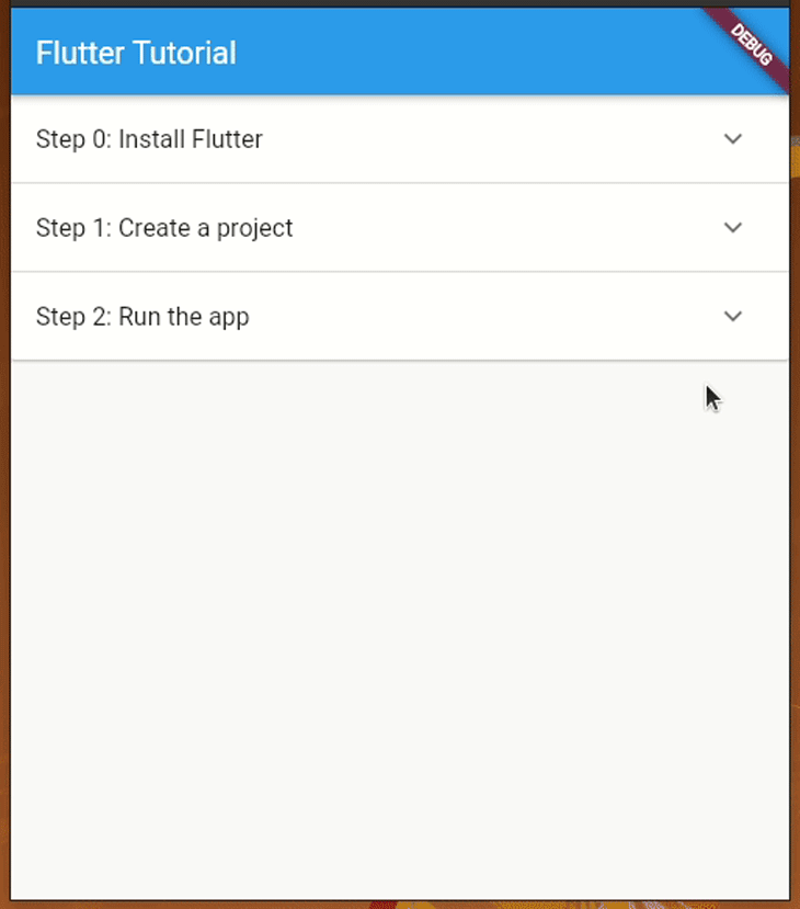
ExpansionPanel with ExpansionPanelListLet’s create a simple guide page for creating a Flutter app with several ExpansionPanel widgets and a ExpansionPanelList widget. The user can tap on a particular step to expand it and see more details.
In most scenarios, we typically load data to the app frontend via a backend web service with an asynchronous function, but for our tutorial, we’ll render hardcoded data from a synchronous function to get started with ExpansionPanel quickly.
Add the following code to your main.dart file:
import 'package:flutter/material.dart';

void main() => runApp(const MyApp());

class MyApp extends StatelessWidget {
  const MyApp({Key? key}) : super(key: key);
  static const String _title = 'Flutter Tutorial';
  @override
  Widget build(BuildContext context) {
    return MaterialApp(
      title: _title,
      home: Scaffold(
        appBar: AppBar(title: const Text(_title)),
        body: const Steps(),
      ),
    );
  }
}

class Step {
  Step(
    this.title,
    this.body,
    [this.isExpanded = false]
  );
  String title;
  String body;
  bool isExpanded;
}

List<Step> getSteps() {
  return [
    Step('Step 0: Install Flutter', 'Install Flutter development tools according to the official documentation.'),
    Step('Step 1: Create a project', 'Open your terminal, run `flutter create <project_name>` to create a new project.'),
    Step('Step 2: Run the app', 'Change your terminal directory to the project directory, enter `flutter run`.'),
  ];
}

class Steps extends StatefulWidget {
  const Steps({Key? key}) : super(key: key);
  @override
  State<Steps> createState() => _StepsState();
}

class _StepsState extends State<Steps> {
  final List<Step> _steps = getSteps();
  @override
  Widget build(BuildContext context) {
    return SingleChildScrollView(
      child: Container(
        child: _renderSteps(),
      ),
    );
  }
  Widget _renderSteps() {
    return ExpansionPanelList(
      expansionCallback: (int index, bool isExpanded) {
        setState(() {
          _steps[index].isExpanded = !isExpanded;
        });
      },
      children: _steps.map<ExpansionPanel>((Step step) {
        return ExpansionPanel(
          headerBuilder: (BuildContext context, bool isExpanded) {
            return ListTile(
              title: Text(step.title),
            );
          },
          body: ListTile(
            title: Text(step.body),
          ),
          isExpanded: step.isExpanded,
        );
      }).toList(),
    );
  }
}
Notice the following facts about the above example code:
Steps widget is responsible for rendering the entire expandable list on the screengetSteps synchronous function returns all hardcoded steps as instances of the Item class, and the _steps widget state variable holds all items as a Dart ListExpansionPanelList class:
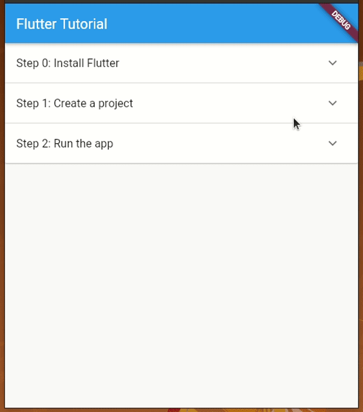
children to set all ExpansionPanel instances by converting the _steps listexpansionCallback to update the _steps list based on the recent user interaction with the expand/collapse buttonListTile class rather than simply using Text to display a well-styled Material listRun the above code. You will see steps to create a Flutter project, as shown in the following preview:
Test the app by adding more steps, or try to generate some dynamic data with the List.generate factory constructor.
If you need to load data from your web backend, you can wrap the ExpansionPanelList widget with FutureBuilder as usual:
import 'package:flutter/material.dart';

void main() => runApp(const MyApp());

class MyApp extends StatelessWidget {
  const MyApp({Key? key}) : super(key: key);
  static const String _title = 'Flutter Tutorial';
  @override
  Widget build(BuildContext context) {
    return MaterialApp(
      title: _title,
      home: Scaffold(
        appBar: AppBar(title: const Text(_title)),
        body: const Steps(),
      ),
    );
  }
}

class Step {
  Step(
    this.title,
    this.body,
    [this.isExpanded = false]
  );
  String title;
  String body;
  bool isExpanded;
}

Future<List<Step>> getSteps() async {
  var _items = [
    Step('Step 0: Install Flutter', 'Install Flutter development tools according to the official documentation.'),
    Step('Step 1: Create a project', 'Open your terminal, run `flutter create <project_name>` to create a new project.'),
    Step('Step 2: Run the app', 'Change your terminal directory to the project directory, enter `flutter run`.'),
  ];
  return Future<List<Step>>.delayed(const Duration(seconds: 2), () => _items);
}

class Steps extends StatelessWidget {
  const Steps({Key? key}) : super(key: key);
  @override
  Widget build(BuildContext context) {
    return SingleChildScrollView(
      child: Container(
        child: FutureBuilder<List<Step>>(
          future: getSteps(),
          builder: (BuildContext context, AsyncSnapshot<List<Step>> snapshot) {
            if(snapshot.hasData) {
              return StepList(steps: snapshot.data ?? []);
            }
            else {
              return Center(
                child: Padding(
                  padding: EdgeInsets.all(16),
                  child: CircularProgressIndicator(),
                ),
              );
            }
          }
        ),
      ),
    );
  }
}

class StepList extends StatefulWidget {
  final List<Step> steps;
  const StepList({Key? key, required this.steps}) : super(key: key);
  @override
  State<StepList> createState() => _StepListState(steps: steps);
}

class _StepListState extends State<StepList> {
  final List<Step> _steps;
  _StepListState({required List<Step> steps}) : _steps = steps;
  @override
  Widget build(BuildContext context) {
    return ExpansionPanelList(
      expansionCallback: (int index, bool isExpanded) {
        setState(() {
          _steps[index].isExpanded = !isExpanded;
        });
      },
      children: _steps.map<ExpansionPanel>((Step step) {
        return ExpansionPanel(
          headerBuilder: (BuildContext context, bool isExpanded) {
            return ListTile(
              title: Text(step.title),
            );
          },
          body: ListTile(
            title: Text(step.body),
          ),
          isExpanded: step.isExpanded,
        );
      }).toList(),
    );
  }
}
We made three updates to the previous source code, as explained below:
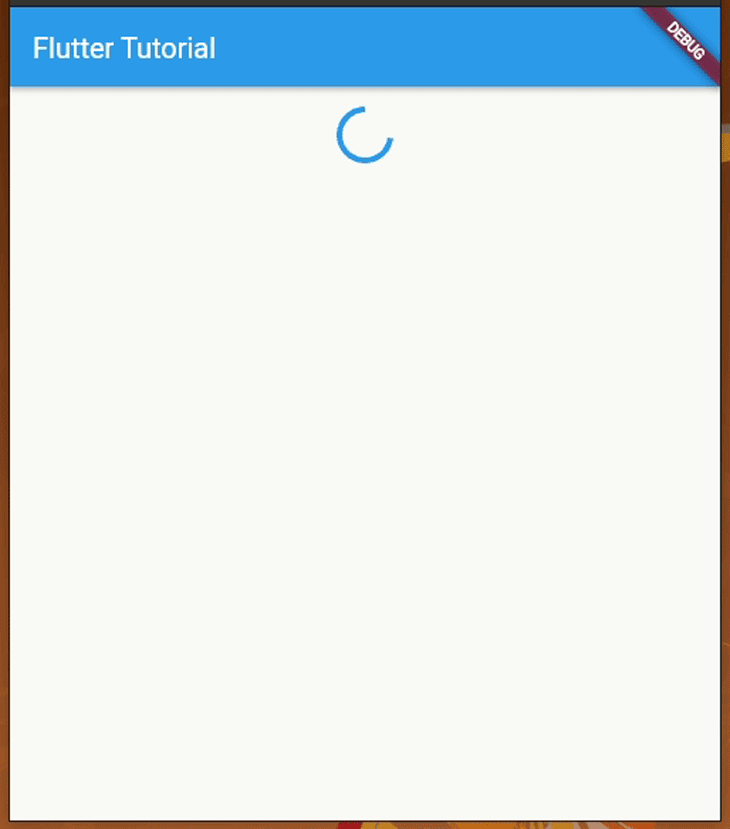
getSteps function asynchronous with an artificial delay, so now you can even fetch data for the expandable list from a web service via your favorite networking client library (i.e., Dio)FutureBuilder by creating a second widget called StepList, which uses conditional rendering to display a circular loading animation during the artificial network latencySteps widget stateless since we don’t hold any data in the state thereRun the above code — you will see the expandable list after a two-second delay:
Using either of these two approaches, you can offer solutions for any situation where you need to use the ExpansionPanel widget.
Now, let’s study the features that the ExpansionPanel offers! In the upcoming examples, we will update the synchronous version because its implementation is minimal compared to the asynchronous one. Copy the first example source code to your main.dart file again and get ready to continue with the tutorial.
ExpansionPanel widget’s UIWhen you use ExpansionPanel along with ListTile, you will get a user-friendly expandable list as we saw in previous examples. You can customize it according to your personal preference or app theme. For example, you change elements’ background color, as follows:
return ExpansionPanel(
  //.....
  //...
  backgroundColor: const Color(0xffeeeeff),
);
You can change the expandable list’s divider color, as shown in the following code snippet:
return ExpansionPanelList(
  dividerColor: Colors.teal,
  //....
  //...
It’s also possible to set a custom padding for the header. Look at the following example:
return ExpansionPanelList(
  expandedHeaderPadding: EdgeInsets.all(6),
  //....
  //...
The following _renderSteps method implementation uses the above parameters to apply several UI customizations.
Widget _renderSteps() {
    return ExpansionPanelList(
      dividerColor: Colors.teal,
      expandedHeaderPadding: EdgeInsets.all(0),
      expansionCallback: (int index, bool isExpanded) {
        setState(() {
          _steps[index].isExpanded = !isExpanded;
        });
      },
      children: _steps.map<ExpansionPanel>((Step step) {
        return ExpansionPanel(
          backgroundColor: const Color(0xffeeeeff),
          headerBuilder: (BuildContext context, bool isExpanded) {
            return ListTile(
              title: Text(step.title),
            );
          },
          body: ListTile(
            title: Text(step.body),
          ),
          isExpanded: step.isExpanded,
        );
      }).toList(),
    );
  }
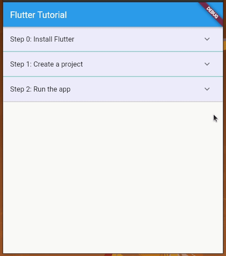
Now, you will see a customized expandable list UI, as shown in the following preview:
ExpansionPanel’s animation and touch feedbackThe Flutter widget system lets you change the speed of ExpansionPanel’s animation. For example, you can slow down its animation by extending the animation duration as follows:
return ExpansionPanelList(
  animationDuration: const Duration(milliseconds: 1500),
  //....
  //...
The ExpansionPanel widget opens/closes the content section only if users tap on the right side icon button, but users can do the same action by tapping on the entire header section if you use the following setup:
return ExpansionPanel(
  canTapOnHeader: true,
  //...
  //..
This configuration is a good user experience improvement if your app users typically use small-screen devices — they don’t need to tap right on the small expand/collapse icon button to activate the expand/collapse action.
ExpansionPanel based on widget stateIn previous examples, we used the isExpanded class variable in the Step class, but we didn’t explicitly set a value for it from the getSteps function. All we got was expansion panels collapsed, initially.
We can set an initial value for the ExpansionPanel class’s isExpanded parameter to set an auto-expanded item. Use the following synchronous getSteps function implementation:
List<Step> getSteps() {
  return [
    Step('Step 0: Install Flutter',
        'Install Flutter development tools according to the official documentation.',
        true),
    Step('Step 1: Create a project', 'Open your terminal, run `flutter create <project_name>` to create a new project.'),
    Step('Step 2: Run the app', 'Change your terminal directory to the project directory, enter `flutter run`.'),
  ];
}
Here, we set true for isExpanded in the first list element. Find the following code line in the _renderSteps method:
isExpanded: step.isExpanded,
The above line passes the isExpanded from the Step instance to the ExpansionPanel, so now we can see the first panel gets auto-expanded initially:

Similarly, you can even control initially-opened panels from your web backends!
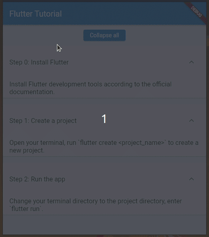
Have you ever noticed, that in some apps, we can expand/collapse all expandable segments at once, with one button? This feature is helpful if users need to read all hidden content without tapping on each expansion panel. Use the following build method implementation for _StepsState:
@override
  Widget build(BuildContext context) {
    return SingleChildScrollView(
      child: Column(
        children: <Widget>[
          Padding(
            padding: EdgeInsets.all(12),
            child: ElevatedButton(
              child: const Text('Expand all'),
              onPressed: () {
                setState(() {
                  for(int i = 0; i < _steps.length; i++) {
                    _steps[i].isExpanded = true;
                  }
                });
              },
            ),
          ),
          _renderSteps()
        ],
      ),
    );
  }
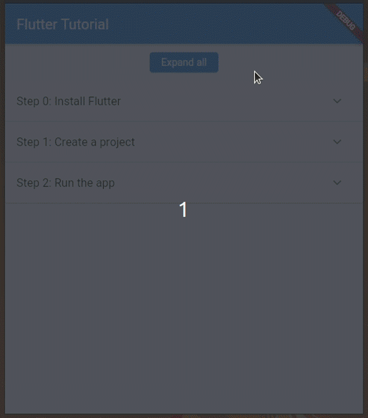
Here, we created a button to expand all panels at once. The setState method call sets isExpanded as true for all list item instances, so once you tap on the button, all steps get expanded as follows:
Similarly, you can implement a button to collapse all panels by setting the isExpanded parameter to false:
_steps[i].isExpanded = false;
ExpansionPanelRadioThe default ExpansionPanelList widget behaves like a group of checkboxes, so when we tap on one panel, that particular panel gets expanded and we have to click it again to collapse it.
But what if we need to build an expandable list that behaves like a group of radio buttons? We can only keep one panel expanded, like with the checkboxes group.
As a solution, you might think about writing some custom logic to update the _steps list the way we implemented expand/collapse all features, but the Flutter widget system actually offers inbuilt ExpansionPanelRadio for this requirement.
Use the following code for the _renderSteps function implementation:
Widget _renderSteps() {
    return ExpansionPanelList.radio(
      children: _steps.map<ExpansionPanelRadio>((Step step) {
        return ExpansionPanelRadio(
          headerBuilder: (BuildContext context, bool isExpanded) {
            return ListTile(
              title: Text(step.title),
            );
          },
          body: ListTile(
            title: Text(step.body),
          ),
          value: step.title
        );
      }).toList(),
    );
  }
Here, we used the ExpansionPanelRadio widget with the ExpansionPanelList.radio constructor. The ExpansionPanelRadio widget doesn’t accept the isExpanded parameter as ExpansionPanel does; instead, it accepts a unique value with the value parameter. Also, we don’t need to call setState from expansionCallback, since the Flutter framework offers an inbuilt implementation to automatically collapse open panels once the user opens another.
Once you use the above code snippet, you will see the following result:
If you need to open a particular panel initially, you can do it with the unique identifier you added with the value parameter, as shown below:
return ExpansionPanelList.radio(
  initialOpenPanelValue: 'Step 0: Install Flutter',
  //....
  //...
Note that here we used the item title string as the unique value for demonstration purposes. For production apps, make sure to use a better unique value like a product identifier.
In most applications, using one level for expansion panels is enough, such as in our previous examples. But when you develop complex apps (i.e., desktop apps) with Flutter, sometimes you need to add nested expansion panels.
The Flutter widget system is so flexible that it lets you create nested expansion panels. But, how can we define a model to hold data for one expansion panel?
We can indeed use a recursive definition for the Step class as follows:
class Step {
  Step(
    this.title,
    this.body,
    [this.subSteps = const <Step>[]]
  );
  String title;
  String body;
  List<Step> subSteps;
}
Now, we can render a nested expansion panel set by using the subSteps list. The following example code adds another step to our Flutter tutorial app with two sub-steps:
import 'package:flutter/material.dart';

void main() => runApp(const MyApp());

class MyApp extends StatelessWidget {
  const MyApp({Key? key}) : super(key: key);
  static const String _title = 'Flutter Tutorial';
  @override
  Widget build(BuildContext context) {
    return MaterialApp(
      title: _title,
      home: Scaffold(
        appBar: AppBar(title: const Text(_title)),
        body: const Steps(),
      ),
    );
  }
}

class Step {
  Step(
    this.title,
    this.body,
    [this.subSteps = const <Step>[]]
  );
  String title;
  String body;
  List<Step> subSteps;
}

List<Step> getSteps() {
  return [
    Step('Step 0: Install Flutter', 'Install Flutter development tools according to the official documentation.'),
    Step('Step 1: Create a project', 'Open your terminal, run `flutter create <project_name>` to create a new project.'),
    Step('Step 2: Run the app', 'Change your terminal directory to the project directory, enter `flutter run`.'),
    Step('Step 3: Build your app', 'Select a tutorial:', [
      Step('Developing a to-do app', 'Add a link to the tutorial video'),
      Step('Developing a 2-D game', 'Add a link to the tutorial video'),
    ]),
  ];
}

class Steps extends StatefulWidget {
  const Steps({Key? key}) : super(key: key);
  @override
  State<Steps> createState() => _StepsState();
}

class _StepsState extends State<Steps> {
  final List<Step> _steps = getSteps();
  @override
  Widget build(BuildContext context) {
    return SingleChildScrollView(
      child: Container(
          child: _renderSteps(_steps)
      ),
    );
  }

  Widget _renderSteps(List<Step> steps) {
    return ExpansionPanelList.radio(
      children: steps.map<ExpansionPanelRadio>((Step step) {
        return ExpansionPanelRadio(
          headerBuilder: (BuildContext context, bool isExpanded) {
            return ListTile(
              title: Text(step.title),
            );
          },
          body: ListTile(
            title: Text(step.body),
            subtitle: _renderSteps(step.subSteps)
          ),
          value: step.title
        );
      }).toList(),
    );
  }
}
Here, we call the _renderSteps method recursively with step.subSteps for rendering nested expansion panels. Once you run the above code, you will see sub-steps for the last step, as shown below:
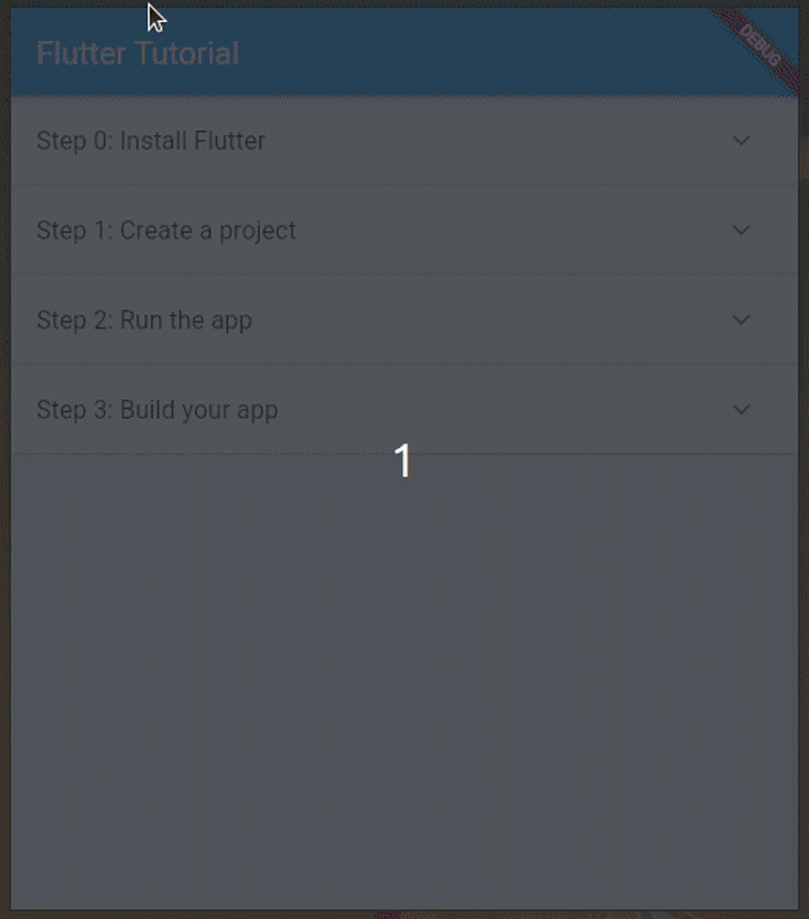
The above example renders only two levels of nested expansion panels, but the recursive method supports more, so how can you modify the getSteps method source for displaying three expansion levels? You can easily add another expansion level by passing your sub-steps for the Developing a to-do app step.
ExpansionPanel vs. ExpansionTileWe’ve tested all of the features that ExpansionPanel offers. Next, let’s compare it with a similar widget and discuss when you need to use each. Look at the following table that compares ExpansionPanel with ExpansionTile:
| Comparison factor | ExpansionPanel |
ExpansionTile |
|---|---|---|
| Recommended parent widget | ExpansionPanelList only |
ListView, Column, Drawer, or any container-type widget that can hold single or multiple widgets |
| The supported way of adding content/body | Accepts a single widget (typically a ListTile) via the body parameter |
Accepts multiple widgets (typically ListTiles) via the children parameter |
| Pre-defined styling | Doesn’t offer pre-defined styling for the header and content — the developer has to use a ListTile widget for implementing an expansion list according to the Material specification. It also renders an arrow icon that is not customizable. |
Offers pre-defined styling for the header by letting developers set a title and subtitle, since this widget works as an extension of ListTile |
| Supported UI customizations | Offers the header builder function for dynamic rendering based on the expansion state. Unable to customize the arrow icon, but the default icon (ExpandIcon) adheres to the Material specification. |
Able to set custom expansion icons, change the icon position, and add leading/trailing widgets |
| Rendering with asynchronous data sources | Possible with a FutureBuilder instance, as usual |
Possible with a FutureBuilder instance, as usual |
According to the above comparison, we can understand that the ExpansionPanel is more like a content widget that users can expand/collapse, so we can use it, for example, to display more details about a particular product without having to navigate to a second screen. Also, you may simplify a complex app screen by grouping widgets with the ExpansionPanelRadio widget and showing a single group of widgets at a time.
On the other hand, ExpansionTile is a widget suitable for creating sublists because you can directly use multiple ListTiles in the children parameter. For example, you may implement a settings panel or submenu with the ExpansionTile widget. See the flutter_settings_screens implementation to learn more about implementing settings panels with ExpansionTile.
In this tutorial, we learned how to use the ExpansionPanel widget in Flutter by modifying a practical example based on various requirements. You can use this widget to create expandable details sections according to the Material Design specification.
ExpansionPanel fulfills the generic UI requirements of adding an expandable list, but as we noticed in the comparison section, it has some limitations compared to the ExpansionTile. However, it adheres to the Material specification, so typically we don’t need advanced customizations for ExpansionPanel since it offers a great, developer-friendly expandable list design along with ListTile.
If you face limitations with ExpansionPanel or ExpansionTile, you can check the flutter-expandable community package. It offers the combined features of both ExpansionPanel and ExpansionTile in a more flexible way.
Flutter offers hundreds of inbuilt widgets, and the Flutter development team strives to improve existing widgets according to developer feedback, so they can introduce new features or improvements that may result in deprecating alternative, community-based widgets. Therefore, using native widgets like ExpansionPanel and ExpansionTile makes your app stable and compliant with the Material Design specification.
Try implementing your next app prototype’s expandable list with ExpansionPanel!
Install LogRocket via npm or script tag. LogRocket.init() must be called client-side, not
server-side
$ npm i --save logrocket

// Code:

import LogRocket from 'logrocket';
LogRocket.init('app/id');
// Add to your HTML:

<script src="https://cdn.lr-ingest.com/LogRocket.min.js"></script>
<script>window.LogRocket && window.LogRocket.init('app/id');</script>

Enabled React Compiler v1.0 on a production Next.js app. Here’s every warning, breakage, and silent opt-out I documented — and what actually worked.

We built the same app in TanStack Start RSC and Next.js RSC. TanStack shipped 40% less JS and built 4x faster — but Next.js is still the safer production bet.

From RSC vulnerabilities and the Vercel breach to TypeScript 7.0 Beta and AI agents — the nine frontend storylines that defined H1 2026, ranked.

AI tools generate working React code fast, but miss race conditions, empty states, debouncing, and accessibility. Here’s how to catch bugs before production.
Would you be interested in joining LogRocket's developer community?
Join LogRocket’s Content Advisory Board. You’ll help inform the type of content we create and get access to exclusive meetups, social accreditation, and swag.
Sign up now

 Learn more →
