The Replay is a weekly newsletter for dev and engineering leaders.
Delivered once a week, it's your curated guide to the most important conversations around frontend dev, emerging AI tools, and the state of modern software.
In my recent article on the min, max, and clamp functions in CSS, I went a little bit into calculations in CSS and how they could be used in places where we wouldn’t normally expect to see them — for example, dynamically setting HSL colors. But there is an evident drawback to calculations in CSS, and that is the lack of dynamic values we can input to our calculations.

As an example, I showed using the min and max functions inside the hsl function
hsl(min( 180, 190, 150), max(75%, 50%; 100%), 50%)
After which, I noted that this doesn’t give us anything we couldn’t get by simply doing the calculation in our head and writing:
hsl(150, 100%, 50%)
Unless we find some way of bringing in values that we could not realistically know already, then using these functions adds unnecessary complexity. This is, of course, why we see them used in such cases as font sizes or width properties.
These have a variety of ways to specify values that we do not know at the time of writing our styles — values related to percentages or the size of the screen, or defined in units of measure that are by their nature determined only when the browser needs them (units like em, for example).
But as it happens, there are a number of ways to dynamically determine values at render time rather than at write time. This article will provide an overview of a few of these methods and show how we can use them to perform calculations in places we might not otherwise think to use them.
As a general rule, CSS variables will be the most commonly used way to provide dynamic values to a CSS function, so most of the article will focus on this. The values of CSS variables can be changed in various ways; in the original article, I showed them being changed in a media query:
See the Pen
Min,Max with HSL media query by Bryan Rasmussen (@bryanrasmussen)
on CodePen.
More about that later.
I also showed them being changed by JavaScript:
See the Pen
Min,Max with HSL JavaScript updating by Bryan Rasmussen (@bryanrasmussen)
on CodePen.
But there are lots of other ways that we can change the value of CSS variables. In the rest of these examples, I will focus on ways supported by at least three different browsers.
The most obvious way to change a variable’s value is by setting different values using different selectors — in other words, allowing us to set variable values in the same ways we normally set property values.
One powerful technique of using CSS variables is to provide switch variables, which Ana Tudor covers in her articles “DRY Switching with CSS Variables: The Difference of One Declaration” and “Logical Operations with CSS Variables.”
Basically, this method works by having a variable that has two possible values — 1 or 0 — which functions as a sort of switch (think light switch). 1 indicates the switch is on, and 0 indicates it’s off.
It works by using these variables in mathematical operations. So for example, if we want to either rotate or not rotate an element by 30 degrees, we would say calc(i * 30deg). If calc is 0, nothing happens; if it is 1, the element is then rotated by 30 degrees.
But of course, once we have these variable names available, we can create powerful logical operations that can be done directly within CSS with no need for any JavaScript.
It is obvious that we can set variable values within a particular selector, but this obvious fact enables a lot of complicated things that are probably not so obvious without giving thought to the implications Obviously, I think I might end up using the word “obvious” a lot in this article.
Facebook recently made some changes to how they wrote and structured CSS in which they used this method of changing variables within a class. Quoting from the article:
“CSS variables are defined under a class, and when that class is applied to a DOM element, its values are applied to the styles within its DOM subtree. This lets us combine the themes into a single stylesheet, meaning toggling different themes doesn’t require reloading the page, different pages can have different themes without downloading additional CSS, and different products can use different themes side by side on the same page.

“This made the performance impact of a theme proportional to the size of the color palette rather than to the size or complexity of the component library. A single atomic CSS bundle also includes the dark mode implementation.”
But there are many potential selectors out there other than just the obvious usage of classes and IDs. Let’s look closer at these.
If we can change variables using classes, and thus change our inputs by using the rules of CSS inheritance, it follows that we can do the same thing using pseudo-classes.
Here’s a simple example of changing the variable value using a hover state:
See the Pen
hover variable change by Bryan Rasmussen (@bryanrasmussen)
on CodePen.
Unfortunately, any change we do must be done in the context of the changed element, so it is not possible to change a variable in one subtree and have it affect a separate part of the DOM — for example, here:
See the Pen
hover variable change 2 by Bryan Rasmussen (@bryanrasmussen)
on CodePen.
Here, the hover event sets the --box-background variable to a firebrick red:
.example:hover {
--size: 3rem;
--box-background: hsl(0, 100%, 59%);
}
But because the element with the .box class is not within the .example class:
<div class="example">Example</div>
<div class="box">Box</div>
The actual element within the .box class will retain a black background. If we change it so that is a descendant of .example, however, as here:
See the Pen
hover variable change 3 by Bryan Rasmussen (@bryanrasmussen)
on CodePen.
<div class="example">Example <div class="box">Box</div> </div>
Then the background changes to red when .example is hovered.
Though there are a number of types of pseudo-classes, I’m just going to focus on pseudo classes that will allow us to do more interesting things with css variables.
These let us select based on the language or script directionality. Where language is concerned, this can be determined by a combination of the lang attribute and the meta element.
Theoretically, language can also be determined by the Content-Language HTTP header, but if someone saves our page locally, styling would then be altered. As a general rule to get the best results, the language should be set with the lang attribute.
As the name implies, these are pseudo-classes related to locations. Generally, these relate to elements that link to locations — an element that can have different styling based on whether it is in a hover or active state, for example, or if the link has already been visited.
But there is a pseudo-class in the location category that I don’t often see used: the target pseudo-class, which allows us to style a part of the page that is the currently active target. In other words, if we have a link that leads to a part of the page, we can style that part of the page when the link is clicked.
See an example below:
See the Pen
target pseudo selector by Bryan Rasmussen (@bryanrasmussen)
on CodePen.
These are probably the most widely used pseudo-classes, with most people using hover, active, and focus classes.
Where focus is concerned, there is another pseudo-class that is very interesting in the context of setting variables: the focus-within pseudo-class.
Here is our previous target pseudo-class turned into a focus-within:
See the Pen
focus-within pseudo-selector by Bryan Rasmussen (@bryanrasmussen)
on CodePen.
Thus, the change of the box background to green and the text to black happens when a user clicks on the link, giving it focus.
Take this a bit further with this example:
See the Pen
focus-within pseudo-selector 2 by Bryan Rasmussen (@bryanrasmussen)
on CodePen.
To see it in action, first click on the Example link. We will see the two boxes change color, as the link has focus. Then if we press the tab key, this should move the focus to the link again — again making the two boxes the same green color — due to this code:
.example:focus-within {
--box-background: hsl(90, 100%, 49%);
--box-color: hsl(0, 0%, 2%);
}
Then press tab again, move focus to the button — same behavior as before.
Then press the tab key again. Now we have tabbed to the div with the class focusableDiv with a tabindex="0". The second box has a green background with black text because it is still getting the focus-within variables set as shown above, but the focusableDiv is white with black text because it uses the focus pseudo-class like this:
.focusableDiv:focus {
--box-background: #fff;
--box-color: hsl(0, 0%, 2%);
}
We won’t be looking at the input pseudo-classes or the tree-structural pseudo-classes here, as I think most people know those well enough.
When using a media query to change variables, we have to take the scope of our variable into account. If we want to change the variables globally, it is best to use the ::root selector.
Normally when a media query is used to change variables, the query is based on changes in screen size and, as such, are mainly useful in making determinations as to how big elements on the screen should be, or how much distance there should be between them. There are other media queries that also generally relate to the screen size — for example, the aspect-ratio and orientation queries.
There are queries that relate to the media itself, e.g., whether it’s for print. There are also a number of different media queries that might be used to set the values of variables related to device colors.
As a general rule, however, these color rules are not as useful in practice as their CanIuse pages might indicate.
@media (color) ruleThe color media query can be used to test the number of bits per color component (red, green, blue) of the output device, or if any color at all is available.

@media (color-gamut) ruleThe color-gamut media query can be used to test the approximate range of colors that are supported by the user agent and the output device.

Note that this does not work in Firefox.
@media (monochrome) ruleThe monochrome media query can be used to test the number of bits per pixel in the monochrome frame buffer of the output device.

I’ve made a little CodePen to tell users what settings they have (except it does not work in Firefox for the color-gamut query):
See the Pen
color media queries checks by Bryan Rasmussen (@bryanrasmussen)
on CodePen.
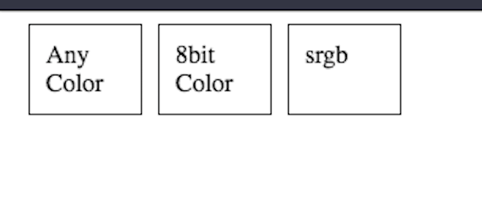
So on my old Macbook Air on Chrome, it shows me:

Which is basically what we would expect on an old Macbook Air. Unfortunately, this is also what it tells me on my Touch Lux 4.
In the monochrome devices I have tested on — a friend’s Nook, a Pocketbook Touch Lux 4, and an old Kindle — the monochrome media query has not worked.
One thing that does work is the prefers-color-scheme media query
@media: prefers-color-scheme ruleThe prefers-color-scheme media query is used to detect whether the user has requested the system use a light or dark color theme.

Here’s an example using it:
See the Pen
Dark And Light Mode HSL by Bryan Rasmussen (@bryanrasmussen)
on CodePen.
If we have the default light color scheme, we should see something like this

If you are wondering how to turn on a dark color scheme, the method varies from browser to browser as well as OS, so you should probably look up your particular device to figure it out.
For example, in Chrome on my Mac, the path seems to include going through the DevTools, whereas for Chrome on my Android tablet, I can do it in Settings -> Theme. In Firefox, it is probably most sure to open about:config, type ui.systemUsesDarkTheme, and set it to be 1.
Whatever method you choose, afterwards, you might need to restart your browser or at least open a new tab to see the change take effect. I’m using the ui.systemUsesDarkTheme method on Firefox, and here’s how the above styling looks on mine:

@supports queriesThe @supports CSS rule allows us to change variables based on specific support for features of the CSS spec in the browser.
Obviously the @supports query is more useful for just setting variables that we will be using in the properties we’re checking. Similar to media queries, the same provisos about scope apply here — so, obviously, you would set the variables on the ::root selector
The CSS cascade is sometimes problematic for developers to control. Personally, I have never found it so, but I have to acknowledge the reality that there are lots of bugs and developer time wasted dealing with colliding styles.
In the following example, the value of the variable is written out via a counter to the content property, and that value is set by multiple selectors, which have the same context as the selector setting the value.
See the Pen
cascade and switch variables by Bryan Rasmussen (@bryanrasmussen)
on CodePen.
The value written out in the content is 4, based on this particular selector in the middle of the CodePen CSS panel (using the dreaded !important for pedagogical purposes).
div > div {
--pos: 4 !important;
}
Consider also the following:
See the Pen
cascade and switch variables 2 by Bryan Rasmussen (@bryanrasmussen)
on CodePen.
Here, the value in content is 3.
Our markup is:
<div class="example">
<div class="switcher _pos4 _pos3 _pos2"></div>
</div>
And our CSS setting the variable value is:
._pos2 {
--pos: 2;
}
._pos4 {
--pos: 4;
}
._pos3 {
--pos: 3;
}
Given the rules of the CSS cascade, the pos variable will take that which is defined in the last class in the stylesheet, and thus we output the number 3 — even though our class _pos3 came in the middle of our classes in the class attribute.
Of course, when a rule is more specific, it will take precedence, as seen here:
See the Pen
cascade and switch variables 3 by Bryan Rasmussen (@bryanrasmussen)
on CodePen.
The value output to content is 2, achieved by changing:
._pos2 {
--pos: 2;
}
To the more specific:
.example ._pos2 {
--pos: 2;
}
Considering developers often have problems controlling the cascade in large CSS codebases, different guidelines have been made for organizing CSS — specifically OOCSS, BEM, and SMACSS.
I won’t discuss these various methodologies further other than to point out they were not developed with the goal of helping developers maintain and use classes that set and override CSS variables. Thus, they’re not helpful for handling collisions that can happen with the previously discussed switch variables technique or similarly variable-heavy solutions like the Facebook redesign.
Finally, some functions that we can use in CSS, like clamp, min, max, or different color functions like hsl, might tempt us to use very atomic variables (which I have not gone into here).
If set by a particular selector, atomic variables can be particularly hard to debug when a descendant element is using that variable in a way we did not expect. When combined with atomic variables meant for doing more advanced calculations, the cascade can be much more problematic than when just using it with setting actual properties of elements.
Aside from the dangers we might run into with the cascade, there are other problems we may run into with changing variable values. The problem is that changing a variable does not work in the same way as changing a property.
Let us assume you have the following bit of css
.example {
background: black;
background: "howdy";
}
Assuming your build tools let that through for some reason, what would the background color of the .example class be? Obviously, whatever your browser uses for black because "howdy" is a non-valid value and will then be discarded.
Non-valid values can be discarded for properties because we know what valid values for our properties are. Most CSS properties are strongly typed (I said “most” in case I have forgotten something, but even content only takes strings and doesn’t convert 10px to "10px", so I feel pretty confident on this matter).
But CSS variables, by virtue of being usable in any property, are weakly typed, and there is no intrinsic method to keep you from changing your variable from being a color to being a number to being a string other than common sense.
As an example, examine the following CodePen:
See the Pen
attr() variable change by Bryan Rasmussen (@bryanrasmussen)
on CodePen.
We’ll see this has the cascading problem in that the :hover selector is used before the attribute selector, meaning that when you hover the .example element, the --box-background variable will not be reset.
But it also changes the --box-background type with this code:
.example[data-color] {
background: navy;
background: attr(data-color color);
--box-background: attr(data-color color);
}
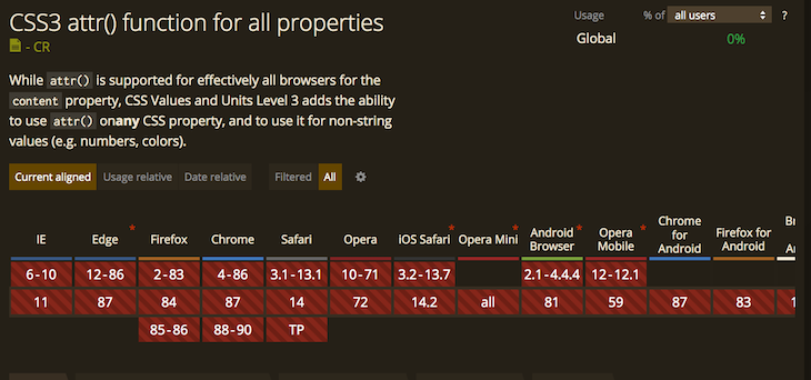
From an HSL color to something currently unsupported as a background value using the attr() function, which only returns a string for use in the content property in pretty much any browser out there:

So what background color is our .box element when the --box-variable is not supported? Nothing.
Now what background color is our .example element that has set the background like so:
background: navy;
background: attr(data-color color);
It’s navy.
Of course, when the attr() function is supported for all properties and not just content, it will be possible to run the code shown above and have the background color of our .box element be green. So, if you’re reading this article from the future — congratulations, you are using a browser that supports using the attr() function for all properties and data types.
Unfortunately, I’m not going to make a suggestion here as to how to organize variables to minimize these problems, as the article is already getting quite big. But the issue should probably be considered if you start developing with more variable manipulation. I intend to go more into possible strategies in a future article for avoiding and fixing exactly these problems.
I hope this has been a useful overview of some ways you can control and change values for properties outside the methods you might normally consider.
As web frontends get increasingly complex, resource-greedy features demand more and more from the browser. If you’re interested in monitoring and tracking client-side CPU usage, memory usage, and more for all of your users in production, try LogRocket.

LogRocket lets you replay user sessions, eliminating guesswork around why bugs happen by showing exactly what users experienced. It captures console logs, errors, network requests, and pixel-perfect DOM recordings — compatible with all frameworks.
LogRocket's Galileo AI watches sessions for you, instantly identifying and explaining user struggles with automated monitoring of your entire product experience.
Modernize how you debug web and mobile apps — start monitoring for free.

When should you move API logic out of Next.js? Learn when Route Handlers stop scaling and how ElysiaJS helps.

Explore how Dokploy streamlines app deployment with Docker, automated builds, and simpler infrastructure compared to traditional CI/CD workflows.

A side-by-side look at Astro and Next.js for content-heavy sites, breaking down performance, JavaScript payload, and when each framework actually makes sense.

AI-generated tests can speed up React testing, but they also create hidden risks. Here’s what broke in a real app.re
Would you be interested in joining LogRocket's developer community?
Join LogRocket’s Content Advisory Board. You’ll help inform the type of content we create and get access to exclusive meetups, social accreditation, and swag.
Sign up now