Editor’s note: This tutorial was last reviewed and updated by Iniubong Obonguko on 6 November 2024.

The most common use cases for drag and drop in React include:
In this tutorial, we’ll focus on several different tools and use cases for implementing drag and drop in React, with a focus on the React DnD library. On a high level, the React DnD part of a project’s code is set up in the following manner:
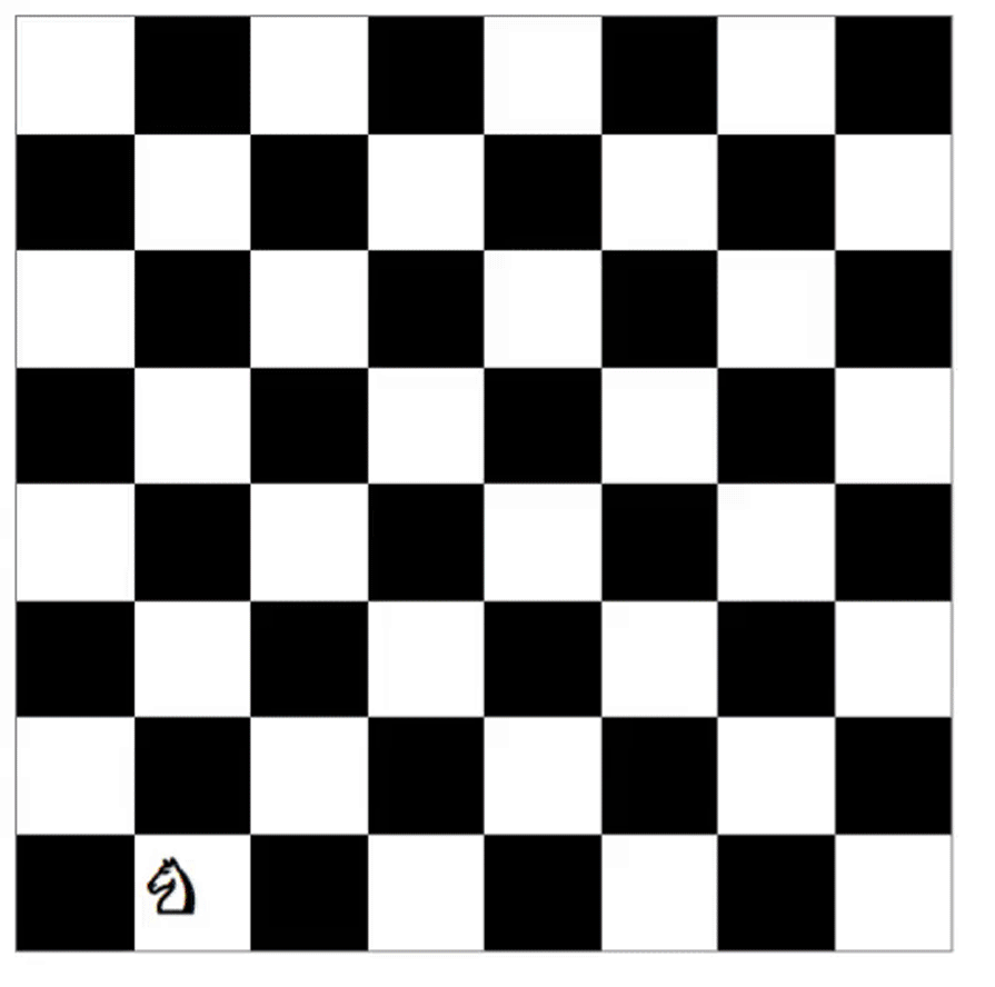
index.js file is the main entry point for the application. It wraps the entire app with the DndProvider component, which is required for React DnD to workGame.js fileKnight.js component uses the useDrag Hook to make it draggable. It also implements a custom drag preview image using the DragPreviewImage component by react-dndBoardSquare component handles the drop logic using the useDrop Hook. It also validates before allowing drops depending on whether the move being made is allowed or notWith React DnD, we can create beautiful apps like the chess app below:
The Replay is a weekly newsletter for dev and engineering leaders.
Delivered once a week, it's your curated guide to the most important conversations around frontend dev, emerging AI tools, and the state of modern software.
React DnD simplifies the implementation of drag-and-drop interactions by providing a set of abstractions and components to handle complex drag-and-drop behavior, including the following features:
useDrag Hook. A drag source defines what can be dragged, how it behaves when being dragged, and what data it carries when being draggeduseDrop Hook. A drop target defines what types of items are acceptable, what happens when an item is dropped, and how it reacts when a draggable item is hovered over the areaDragPreviewImage component provided by React DnD, allowing you to create a visual representation of the dragging itemReact DnD also meets WCAG (Web Content Accessibility Guidelines), so it can be made accessible to users with disabilities, ensuring an inclusive user experience.
In the next section, we’ll build a simple drag-and-drop application to demonstrate React DnD’s functionality.
Before we dive into the drag-and-drop code, we need to first understand how React DnD works.
React DnD can make any element draggable and droppable. To achieve this, React DnD needs to have the references of all droppable items. All elements that are draggable and droppable need to be enclosed inside React DnD’s context provider, which is used to initialize and manage the internal state.
We don’t need to worry too much about how it manages state because React DnD includes easy APIs to expose these states, enabling us to compute and update our local states.
To install React DnD in your React app, run either of the commands below:
yarn add react-dnd react-dnd-html5-backend immutability-helper
//or
npm install react-dnd react-dnd-html5-backend immutability-helper
Keep in mind that this example won’t work until you complete all the steps. Check out the repo for React DnD v16 here.
First, we’ll enclose our ImageList component inside a DnD context provider:
/*
  filename: App.js
*/

import { DndProvider } from "react-dnd";
import {HTML5Backend} from "react-dnd-html5-backend";

function App() {
  ...
  return (
    <main className="App">
      ...
      <DndProvider backend={HTML5Backend}>
        <ImageList images={images} moveImage={moveImage}/>
      <DndProvider>
    </main>
  );
}
Next, import DNDProvider and initialize it with the backend props. This is the variable that helps us choose which API to use for drag and drop.
Now, we need to add the items as draggable and droppable. In our application, both draggable and droppable items are the same. We’ll drag the Image component and drop it onto another Image component, making our job a little easier. To implement this, use the code below:
import React, { useRef } from "react";
// import useDrag and useDrop hooks from react-dnd
import { useDrag, useDrop } from "react-dnd";

const type = "Image"; // Need to pass which type element can be draggable, its a simple string or Symbol. This is like an Unique ID so that the library know what type of element is dragged or dropped on.

const Image = ({ image, index }) => {
  const ref = useRef(null); // Initialize the reference

  // useDrop hook is responsible for handling whether any item gets hovered or dropped on the element
  const [, drop] = useDrop({
    // Accept will make sure only these element type can be droppable on this element
    accept: type,
    hover(item) {
      ...
    }
  });

  // useDrag will be responsible for making an element draggable. It also expose, isDragging method to add any styles while dragging
  const [{ isDragging }, drag] = useDrag(() => ({
    // what type of item this to determine if a drop target accepts it
    type: type,
    // data of the item to be available to the drop methods
    item: { id: image.id, index },
    // method to collect additional data for drop handling like whether is currently being dragged
    collect: (monitor) => {
      return {
        isDragging: monitor.isDragging(),
      };
    },
  }));

  /*
    Initialize drag and drop into the element using its reference.
    Here we initialize both drag and drop on the same element (i.e., Image component)
  */
  drag(drop(ref));

  // Add the reference to the element
  return (
    <div
      ref={ref}
      style={{ opacity: isDragging ? 0 : 1 }}
      className="file-item"
    >
      <img alt={`img - ${image.id}`} src={image.src} className="file-img" />
    </div>
  );
};

const ImageList = ({ images, moveImage }) => {
  const renderImage = (image, index) => {
    return image ? (
      <Image
        image={image}
        index={index}
        key={`${image.id}-image`}
        moveImage={moveImage}
      />
    ): null;
  };
  return <section className="file-list">{images.map(renderImage)}</section>;

export default ImageList;
Now, our images are draggable. But, if we drop an image, it will return to its original position because useDrag and useDrop will handle it until it is dropped. Unless we change our local state, the image will return to its original position.
To update the local state, we need to know the dragged element and the hovered element, which is the element on which the dragged element is hovered. useDrag exposes this information through the hover method:
const [, drop] = useDrop({
    // accept receives a definition of what must be the type of the dragged item to be droppable
    accept: type,
    // This method is called when we hover over an element while dragging
    hover(item) { // item is the dragged element
      if (!ref.current) {
        return;
      }
      const dragIndex = item.index;
      // current element where the dragged element is hovered on
      const hoverIndex = index;
      // If the dragged element is hovered in the same place, then do nothing
      if (dragIndex === hoverIndex) {
        return;
      }
      // If it is dragged around other elements, then move the image and set the state with position changes
      moveImage(dragIndex, hoverIndex);
      /*
        Update the index for dragged item directly to avoid flickering
        when the image was half dragged into the next
      */
      item.index = hoverIndex;
    }
});
The hover method is triggered whenever an element is dragged and hovers over this element. In this way, when we start dragging an element, we get the index of that element and the element we are hovering on. We’ll pass this dragIndex and hoverIndex to update our image’s state.
At this point, you might be wondering why we need to update the state while hovering. Why not update it while dropping? It’s possible to just update the state while dropping. drag-and-drop will work and rearrange the positions, but the UX won’t be good.
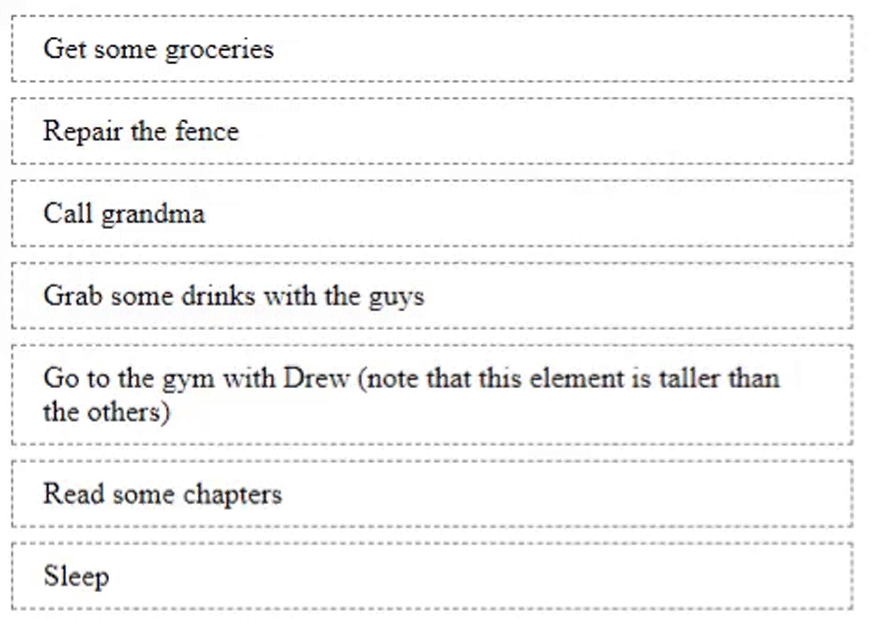
For example, if you drag one image over another image and we immediately change the position, then that will give good feedback to the users who are dragging it. Otherwise, they might not know whether the drag functionality is working until they drop the image in some position. Here’s an example:
Therefore, we should update the state on every hover. While hovering over another image, we set the state and change the positions, and the user will see a nice animation.
So far, we’ve just shown the code for updating the state as moveImage. Now, let’s see the implementation:
/*
  filename: App.js
*/

import update from "immutability-helper";

...

const moveImage = (dragIndex, hoverIndex) => {
    // Get the dragged element
    const draggedImage = images[dragIndex];
    /*
      - copy the dragged image before hovered element (i.e., [hoverIndex, 0, draggedImage])
      - remove the previous reference of dragged element (i.e., [dragIndex, 1])
      - here we are using this update helper method from immutability-helper package
    */
    setImages(
      update(images, {
        $splice: [[dragIndex, 1], [hoverIndex, 0, draggedImage]]
      })
    );
};

// We will pass this function to ImageList and then to Image -> Quite a bit of props drilling, the code can be refactored and place all the state management in ImageList itself to avoid props drilling. It's an exercise for you :)
Now, our app is fully functional on HTML5 onDrag event-supported devices. Unfortunately, it won’t work on touch devices.
As I said before, we can support touch devices using a utility function. It’s not the best solution, but it works. The experience of dragging won’t be great on touch devices — it simply updates, but you won’t feel like you’re dragging. You can also make it clean:
import HTML5Backend from "react-dnd-html5-backend";
import TouchBackend from "react-dnd-touch-backend";

// simple way to check whether the device support touch (it doesn't check all fallback, it supports only modern browsers)
const isTouchDevice = () => {
  if ("ontouchstart" in window) {
    return true;
  }
  return false;
};

// Assigning backend based on touch support on the device
const backendForDND = isTouchDevice() ? TouchBackend : HTML5Backend;

...
return (
  ...
  <DndProvider backend={backendForDND}>
    <ImageList images={images} moveImage={moveImage} />
  </DndProvider>
)
...
react-beautiful-dnd is another popular third-party library for implementing drag-and-drop interactions in React applications, especially when dealing with ordered lists, grids, and other collections of items.
react-beautiful-dnd offers a high-level, declarative API and contains functionalities such as:
If you’d like to read about how to create a drag-and-drop example using react-beautiful-dnd, check out this video tutorial.
React-Grid-Layout is a grid layout system built exclusively for React. Unlike similar systems like Packery and Gridster, React-Grid-Layout is responsive and supports breakpoint layouts, which can be provided by the user or autogenerated.
React-Grid-Layout does not require jQuery. It allows you to create draggable grid items that can be moved within the grid by dragging and dropping into different positions.
React-Draggable is a popular and lightweight React library that allows you to make DOM elements draggable within a specified container.
With this library, you can customize the appearance and behavior of the draggable element, such as setting initial position, containment, and enabling or disabling dragging as needed. It also supports grid-based snapping, allowing you to align the draggable element to a grid or predefined snap points, while also allowing you to specify the boundaries within which the element can be dragged, ensuring it stays within a defined area.
Below is all the code you need to make an element draggable, using the react-draggable package:
<Draggable>
  <div>I am now a draggable div</div>
</Draggable>
The Draggable component also provides some props that allow for customizing features such as:
defaultPosition: Sets the initial x and y coordinates of the draggable elementbounds: Used to restrict the movement of the draggable object within a specified boundaryhandle: Defines the selector that would be used as the drag handlegrid: Used to control how many pixels an element snaps to when being draggedonStop: A callback function that is executed when the dragging stops. It returns data such as the node element (node), the final x and y position, and the distances moved in both x and y directions (deltaX, deltaY)
 <Draggable
    defaultPosition={{ x: 0, y: 0 }}
    grid={[25, 25]}
    bounds="parent"
    handle=".handle"
    onStop={(e, data) => console.log("Stopped at:", data.x, data.y)}
    >
    <div>I am now a draggable div</div>
  </Draggable>
Below is a practical example of React Draggable being put to use. Here’s the link to the demo and code:
react-smooth-dnd is a popular third-party library for adding smooth and visually pleasing drag-and-drop interactions to your React applications. It builds upon the core features of React DnD and provides a higher-level API that simplifies the implementation of drag-and-drop behavior with smooth animations and transitions.
react-smooth-dnd is particularly useful when you want to create lists with smooth reordering animations or when you need to implement drag-and-drop interactions in a visually appealing manner.
The examples above cover the basic implementation of drag-and-drop functionalities, but there are more advanced drag-and-drop features in React. Here are a few:
Drag and clone: This feature creates a duplicate of an item in place after it is dragged. This leaves the original item in place, enabling actions like creating duplicates or maintaining a reference to the original.
There’s no built-in support for this feature out of the box with React DnD, so if you want to implement it, it’s best you use react-beautiful-dnd, which has a built-in drag and clone feature that can be easily implemented with the code below:
import { DragDropContext, Droppable, Draggable } from 'react-beautiful-dnd';

// ...

<DragDropContext onDragEnd={handleDragEnd}>
  <Droppable droppableId="list">
    {(provided) => (
      <ul {...provided.droppableProps} ref={provided.innerRef}>
        {items.map((item, index) => (
          <Draggable key={item.id} draggableId={item.id} index={index}>
            {(provided, snapshot) => (
              <div
                ref={provided.innerRef}
                {...provided.draggableProps}
                {...provided.dragHandleProps}
                style={{
                  background: snapshot.isDragging ? 'lightblue' : 'white',
                  ...provided.draggableProps.style,
                }}
              >
                {item.content}
              </div>
            )}
          </Draggable>
        ))}
        {provided.placeholder}
      </ul>
    )}
  </Droppable>
</DragDropContext>
Custom animations: You can apply custom animations during drag-and-drop actions, including smooth transitions, visual effects, or transformations to enhance the user experience.
react-beautiful-dnd, in particular, provides the flexibility to incorporate animations and transitions directly into your drag-and-drop components, making it a powerful tool for creating visually appealing drag-and-drop interactions.
Complex hierarchies: This is the ability to manage and manipulate structured data in a hierarchical or tree-like manner through drag-and-drop interactions. In drag-and-drop operations, complex hierarchies intuitively convey the intended changes, such as promoting or demoting items, changing parent-child relationships, and altering the order of items.
Drag-and-drop operations in React projects may seem a bit complicated from afar, but with the help of third-party libraries, we’ve successfully shown a simple yet powerful demo for dragging and dropping files and reordering those files.
We just scratched the surface of what React is capable of in terms of drag-and-drop functionality, as there are more exhaustive features you can implement using drag-and-drop libraries. Your true limit is your creativity. Feel free to share with us what you’ve built with it in the comment section below.
Install LogRocket via npm or script tag. LogRocket.init() must be called client-side, not
server-side
$ npm i --save logrocket

// Code:

import LogRocket from 'logrocket';
LogRocket.init('app/id');
// Add to your HTML:

<script src="https://cdn.lr-ingest.com/LogRocket.min.js"></script>
<script>window.LogRocket && window.LogRocket.init('app/id');</script>

TSRX adds first-class control flow, conditional hooks, and scoped styles to React via a TypeScript compiler extension — no new framework required.

Learn how to build a full React Native auth system using Better Auth and Expo — with email/password login, Google OAuth, session persistence, and protected routes.

Compare the top AI development tools and models of June 2026. View updated rankings, feature breakdowns, and find the best fit for you.

Learn how Bloom filters reduce database lookups for username availability checks while preserving correctness at scale.
Would you be interested in joining LogRocket's developer community?
Join LogRocket’s Content Advisory Board. You’ll help inform the type of content we create and get access to exclusive meetups, social accreditation, and swag.
Sign up now

 Learn more →
