Editor’s note: This article was last updated by Vijit Ail on 2 May 2023 to include the latest features of React Native Paper 5.0, including the SegmentedButtons, Tooltip, and Drawer.CollapsedItem components.

React Native Paper is a popular component library for building React Native apps. It provides a solution for developers who want to create visually appealing applications with minimal design skills. This tutorial will explore how to use React Native Paper to quickly develop a good-looking Minimum Viable Product (MVP) for your app. By leveraging the library’s components and customization options, we can focus on programming the core functionality and validate the feasibility of our concept.
Jump ahead:
React Native Paper helps us build a nice UI with the implementation of widely used design principles developed by Google. By providing a set of customizable components with good theming support, we can build an MVP in little to no time.
In order to show some of React Native Paper’s capabilities, I’ve created a simple application called “Crypto Info.” Note that I am using Expo in this tutorial, and the whole application code is available here on GitHub.
As always, we’ll begin by installing the library with our package manager of choice (I use Yarn here): yarn add react-native-paper.
If your app was made by a React Native CLI, you also need to add SVG icons to the project:
yarn add react-native-vector-icons
react-native link react-native-vector-icons
If you’re building your MVP with Expo (like I do in this example ), you can omit this step.
Now, add the Babel plugin to your babel.config.js file for production environment, so it should look something like this:
module.exports = {
  presets: ['module:metro-react-native-babel-preset'],
  env: {
    production: {
      plugins: ['react-native-paper/babel'],
    },
  },
};
Most of the time, we won’t use every component from the library we’re importing. Adding this plugin helps us reduce the React Native Paper package size in the bundled production app because it only bundles with components we actually use.
We also need to install react-native-safe-area-context for handling safe area:
yarn add react-native-safe-area-context
In order to start using the package, we have to do some minimal setup first. In the App.js file, add the following code:
import { AppLoading } from 'expo'
import { Platform, StatusBar, StyleSheet, View } from 'react-native'
import { Ionicons } from '@expo/vector-icons'
import { DefaultTheme, DarkTheme, Provider as PaperProvider } from 'react-native-paper'
import { StoreProvider, Store } from './Store'

const styles = StyleSheet.create({
  container: {
    flex: 1,
  },
})

function App() {
  return (
    <View style={styles.container}>
      {Platform.OS === 'ios' && <StatusBar barStyle="default" />}
      <StoreProvider>
        <Store.Consumer>
          { (value) => {
            const { isDarkModeOn } = value[0]
            return (
              <PaperProvider theme={isDarkModeOn ? DarkTheme : DefaultTheme}>
                <AppNavigator theme={isDarkModeOn ? 'dark' : 'light'} />
              </PaperProvider>
            )
          }}
        </Store.Consumer>
      </StoreProvider>
    </View>
  )
}
For easier setup, I am using context instead of redux for state management inside this app. Inside a Store.Consumer component, I render the app based on context value. The value of isDarkModeOn is a Boolean determining the current state of theme being used. This setup is necessary if you want to dynamically change the color theme later. You can also use it with Redux — the setup is very similar.
Then, inside renderProps, I return a PaperProvider wrapper for the whole application, whose child is the AppNavigator component.
The AppNavigator component theme is also dynamically changed by the same context value, but the default theme used in a navigation library like react-navigation is its own theme, not the paper theme. This is why, later, we’ll have to do a bit more setup in order to make use of DefaultTheme and DarkTheme colors inside our navigation components.
The PaperProvider wrapper receives a single theme prop based on context value — it’s either DefaultTheme or DarkTheme. To get things set up more quickly, I use the built-in DefaultTheme and DarkTheme in this tutorial. The themes can be customized or completely overridden.
After this setup, we can start building our app and make use of all of React Native Paper’s features.
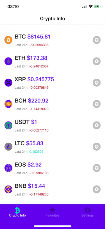
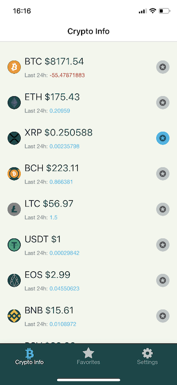
For the purpose of this article, I’ve built a simple app called Crypto Info, which consists of three screens. It connects to the CoinGecko API in order to get the necessary information about cryptocurrency data.
HomeScreen displays a list of cryptocurrencies with basic information about each one of them. FavoritesScreen displays a list of our favorite cryptocurrencies for easier navigation to those that interest us most. SettingsScreen is a screen with a single setting: a theme switch component. In this part of the article, we’ll focus on the usage of React Native Paper in each screen.
HomeScreenHomeScreen is a function component that returns a list of cryptocurrencies available on the CoinGecko API. It receives a theme prop, which is available through the withTheme wrapper from React Native Paper. This allows us to make use of the theme set inside the PaperProvider:
import React from 'react'
import { View, FlatList } from 'react-native'
import { get } from 'lodash';
import { withTheme,
  Title,
  Caption,
  Divider,
  Avatar,
  Surface,
  Button,
  DarkTheme,
  DefaultTheme,
} from 'react-native-paper'

function HomeScreen({ theme }) {
 // There's more code inside this component which will be explained later.
 return (
    <View style={[styles.container, { backgroundColor: theme.colors.surface }]}>
      <Portal>
        <Modal
          visible={isModalVisible}
          contentContainerStyle={styles.modalContent}
          dissmisable
          onDismiss={() => setModalVisibility(false)}
        >
          {renderModalContent()}
        </Modal>
      </Portal>
      <FlatList
        style={styles.flatListContainer}
        data={coins}
        extraData={coins}
        ItemSeparatorComponent={renderItemSeparator}
        ListFooterComponent={renderFooter}
        renderItem={renderItem}
        initialNumToRender={20}
        keyExtractor={keyExtractor}
        onEndReached={fetchMoreCoins}
        onEndReachedThreshold={0.2}
        contentContainerStyle={styles.contentContainer}
      />
    </View>
  )
}
HomeScreen.js contains the contents of a container View, which receives a color from the theme props, and then I pass it to the backgroundColor of this container element. Inside the View container, there’s a FlatList component, which receives data coins fetched from the API.
How to correctly fetch data and pass it to the global context store is a topic for another article. In this one, I’ll focus on the render functions of this FlatList component.
renderItemSeparatorThe renderItemSeparator function renders a Divider component from React Native Paper, which is a separator that groups contents in lists and page layouts:
const renderItemSeparator = () => <Divider style={styles.divider} />
renderFooterThe renderFooter function renders a Button component, which receives a state isLoading bool and shows up a loading spinner whenever the new contents on the list are being added:
const renderFooter = () => isLoading && <Button style={styles.footer} loading={isLoading} />
renderItemThe renderItem function receives an item argument, which holds data for a single item from the API data:
const renderItem = (item) => {
    const image = get(item, 'item.image')
    const priceChange24h = get(item, 'item.price_change_24h')
    const currentPrice = get(item, 'item.current_price')
    const symbol = get(item, 'item.symbol')
    return (
      <TouchableOpacity
        onPress={() => getCurrentItemInfo(item)}
        style={styles.surfaceContainer}
      >
        <Surface style={styles.surface}>
          <Avatar.Image style={styles.avatar} size={28} source={{ uri: image && image }} />
          <View style={styles.infoContainer}>
            <View style={styles.sectionContainer}>
              <Title
                numberOfLines={1}
                style={styles.coinName}
              >
                {symbol }
              </Title>
              <Title style={{ color: colors.primary }}>
                {' $'}
                {currentPrice}
              </Title>
            </View>
            <View style={styles.sectionContainer}>
              <Caption>Last 24h: </Caption>
              <Caption
                style={{ color: priceChange24h < 0 ? colors.error : colors.accent }}
              >
                {priceChange24h}
              </Caption>
            </View>
          </View>
          <TouchableOpacity hitSlop={{ x: 10, y: 10 }} onPress={() => handleFavorites(item)}>
            <Avatar.Icon
              size={28}
              icon="stars"
              style={[
                styles.avatar,
                { backgroundColor: isFavorited(item) ? colors.accent : colors.disabled },
              ]}
            />
          </TouchableOpacity>
        </Surface>
      </TouchableOpacity>
    )
  }
Inside the renderItem function, we build the single item, which looks like this:


This single item contains elements from React Native Paper, like Avatar.Image for logo, Title text element for symbol, current_price, Caption element for smaller text under the price, and Avatar.Icon for the star icon button to add the item to favorites.
When we press on the item, we open a Modal component containing more data about a certain currency. Thanks to the Portal component from React Native Paper, we can now easily add a modal component to our app because Portal renders a component that should appear above other elements:
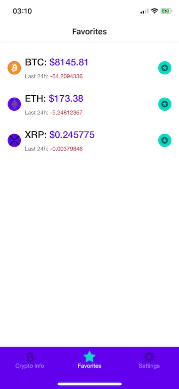
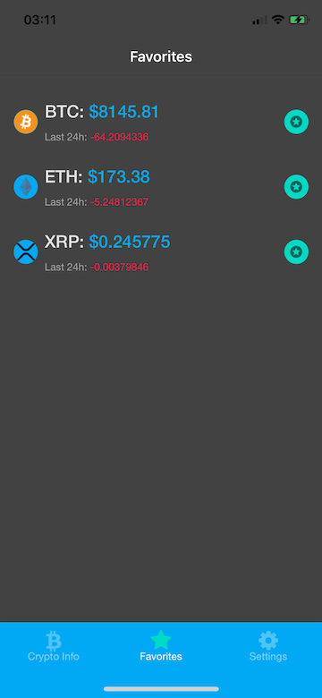
FavoritesScreenFavoritesScreen contains all the elements we starred on the previous screen. It contains all the same elements as the HomeScreen:
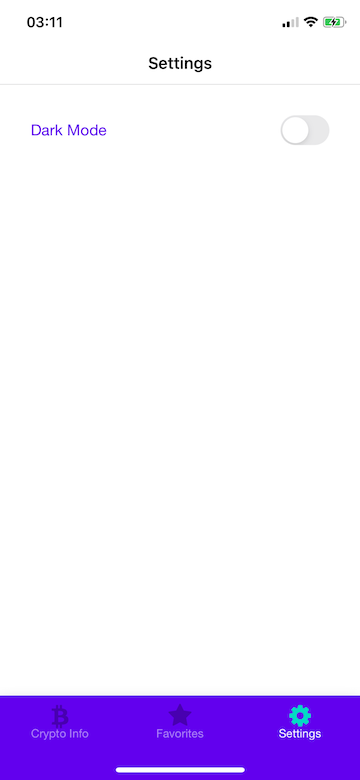
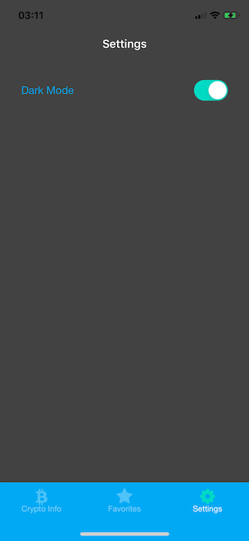
SettingsScreenSettingsScreen contains only one setting at this moment, which is a Switch component:
import React from 'react'
import { View, StyleSheet } from 'react-native'
import { Switch, Subheading, withTheme, DarkTheme, DefaultTheme } from 'react-native-paper'
import { themePropTypes } from '../constants/propTypes'
import { useStateValue } from '../Store'
const styles = StyleSheet.create({
  container: {
    flex: 1,
    elevation: 2,
    padding: 16,
  },
  row: {
    flexDirection: 'row',
    alignItems: 'center',
    justifyContent: 'space-between',
    paddingTop: 16,
    paddingHorizontal: 16,
    width: '100%',
  },
})
function SettingsScreen({ theme }) {
  const { colors } = theme
  const [state, dispatch] = useStateValue()
  const { isDarkModeOn } = state
  const handleThemeChange = () => dispatch({
    type: 'TOGGLE_THEME',
    payload: !isDarkModeOn,
  })
  return (
    <View style={[styles.container, { backgroundColor: colors.surface }]}>
      <View style={styles.row}>
        <Subheading style={{ color: colors.primary }}>Dark Mode</Subheading>
        <Switch value={isDarkModeOn} onValueChange={handleThemeChange} />
      </View>
    </View>
  )
}
export default withTheme(SettingsScreen)
When users press on the Switch component, it dispatches an action to the context store to switch the currently used theme in the whole app.
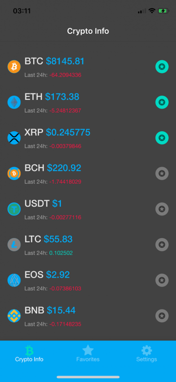
React Native Paper supports theming through the PaperProvider component, which, by default, will apply DefaultTheme to the app (light-mode in Crypto Info). Thanks to this component, every component from the library will automatically receive styles from the actual theme passed to the provider.
Custom components can receive the theme props after wrapping them up in the withTheme higher-order component function from the library. In this example app, I make use of DefaultTheme and DarkTheme from the library, but we can provide our own custom theme; those are the elements that live inside the theme object:
- dark (boolean): whether this is a dark theme or light theme.
- roundness (number): roundness of common elements, such as buttons.
- colors (object): various colors used throughout different elements.
    - primary - primary color for your app, usually your brand color.
    - accent - secondary color for your app which complements the primary color.
    - background - background color for pages, such as lists.
    - surface - background color for elements containing content, such as cards.
    - text - text color for content.
    - disabled - color for disabled elements.
    - placeholder - color for placeholder text, such as input placeholder.
    - backdrop - color for backdrops of various components such as modals.
- fonts (object): various fonts used throughout different elements.
    - regular
    - medium
    - light
    - thin
If you want to have fun with customizing your app theme, there’s a great website called https://coolors.co that can help you choose colors. Here’s a simple custom theme I came up with in a few minutes:
 const customTheme = {
    dark: false,
    roundness: 4,
    colors: {
      primary: '#034748',
      accent: '#11B5E4',
      background: '#F1F7ED',
      surface: '#F1F7ED',
      text: '#001021',
      error: '#B71F0E',
      disabled: '#BEC6C6',
      placeholder: '#1481BA',
      backdrop: '#001021',
    },
    fonts: {
      regular: 'Helvetica Neue',
      medium: 'Helvetica Neue Light',
    },
  }
Now, the app looks like this:
React Native Paper 5.0 introduces several new components and features that make creating beautiful and functional apps easier using Material Design 3 (i.e., Material You). Let’s take a closer look at some of these new components.
SegmentedButtonsThe SegmentedButtons component is a refined version of the ToggleButton component and allows you to select options, switch views, or sort elements. It supports single and multi-select variants and provides many customization options:
...
const [filterValue, setFilterValue] = useState("ALL_USERS");

...
<SegmentedButtons
  value={filterValue}
  onValueChange={setFilterValue}
  buttons={[
    { value: "ALL_USERS", label: "All Users" },
    { value: "FRIENDS", label: "Friends" },
  ]}
/>
TooltipThe Tooltip component is displayed upon tapping and holding a screen element or component. It provides an informative text label for an element, such as a description of its role. This component was missing in the previous library versions, and its addition is a significant improvement for both Material Design systems:
<Tooltip title="Search User">
  <IconButton icon="account-search-outline" />
</Tooltip>
Drawer.CollapsedItemDrawer.CollapsedItem is a new side navigation component that can be used within Drawer, and represents a route as an action item with an icon and optional label. It helps improve navigation and organization within your app:
...
const [activeItem, setActiveItem] = useState("users");

const items = [
  {
    label: "Users List",
    unfocusedIcon: "account-group-outline",
    focusedIcon: "account-group",
    key: "users",
  },
  {
    label: "Profile",
    unfocusedIcon: "account-outline",
    focusedIcon: "account",
    key: "profile",
  },
];

...
{items.map((item) => (
  <Drawer.CollapsedItem
    {...item}
    key={item.key}
    active={item.key === activeItem}
    onPress={() => setActiveItem(item.key)}
  />
))}
When using React Native Paper, you may want to use custom icons different from the default MaterialCommunityIcons. You can import your desired custom icons and pass them to the settings prop within the PaperProvider component to achieve this.
Here’s an example of how you can use custom icons in React Native Paper. First, you need to import the custom icon library. In this example, we’ll import the FontAwesome icon library using the react-native-vector-icons package:
import FontAwesomeIcon from 'react-native-vector-icons/FontAwesome';
Next, within the PaperProvider component, you can specify the custom icon by passing it as a function to the icon property in the settings prop:
<PaperProvider
  settings={{
    icon: (props) => <FontAwesomeIcon {...props} />,
  }}
>
  {/* Your app content goes here */}
</PaperProvider>
The above code uses the FontAwesomeIcon component as our custom icon. The props parameter is passed to the custom icon component, allowing you to customize the icon’s appearance and behavior.
By configuring the icon property in the settings prop of PaperProvider, you can easily replace the default MaterialCommunityIcons with your desired custom icons throughout the React Native Paper components.
Using custom icons in React Native Paper allows you to incorporate your preferred icon sets and achieve a personalized and consistent visual style in your app.
React Native Paper is a powerful and versatile library that streamlines the development of React Native apps, providing a wide range of components with clean and customizable UI. The latest version, React Native Paper 5.0, introduces exciting new components like SegmentedButtons, Tooltip, and Drawer.CollapsedItem, expanding the toolkit for building modern and visually appealing interfaces.
Additionally, you can further personalize your app’s design by utilizing custom icons and seamlessly integrating your preferred icon sets. With its developer-friendly approach and flexibility, React Native Paper empowers you to bring your app ideas to life efficiently, even without extensive design skills.

LogRocket's Galileo AI watches sessions for you and and surfaces the technical and usability issues holding back your React Native apps.
LogRocket also helps you increase conversion rates and product usage by showing you exactly how users are interacting with your app. LogRocket's product analytics features surface the reasons why users don't complete a particular flow or don't adopt a new feature.
Start proactively monitoring your React Native apps — try LogRocket for free.
Hey there, want to help make our blog better?
Join LogRocket’s Content Advisory Board. You’ll help inform the type of content we create and get access to exclusive meetups, social accreditation, and swag.
Sign up now
This guide explores how to use Anthropic’s Claude 4 models, including Opus 4 and Sonnet 4, to build AI-powered applications.

Which AI frontend dev tool reigns supreme in July 2025? Check out our power rankings and use our interactive comparison tool to find out.
Learn how OpenAPI can automate API client generation to save time, reduce bugs, and streamline how your frontend app talks to backend APIs.

Discover how the Interface Segregation Principle (ISP) keeps your code lean, modular, and maintainable using real-world analogies and practical examples.

 Learn more →

One Reply to "Designing a custom UI using React Native Paper"
I find your article best on the internet keep it up.