The Replay is a weekly newsletter for dev and engineering leaders.
Delivered once a week, it's your curated guide to the most important conversations around frontend dev, emerging AI tools, and the state of modern software.
A design system is more than just a UI kit; it’s a collection of design tokens, practices, and reusable components that keeps things consistent for your design and product teams. It accomplishes a consistent look and feel across products that can enhance creativity and productivity.

Design systems also work as a common language for teams, and establish guidelines and gather design resources from the beginning of a project.
Creating a design system in the early stages of a project speeds up the design and coding process, integrates all the people involved, and improves product consistency. A design system must be a comprehensive, flexible, and scalable single source of truth.
Style Dictionary is a system that allows you to define styles once, in a way for any platform or language to consume. It provides a single place to create and edit your styles, and a single command exports these rules to all the places we need them – iOS, Android, CSS, JS, HTML, sketch files, style documentation, and more.
Style Dictionary aims to solve the errors, roadblocks, and workflow inefficiencies that exist when multidisciplinary teams of designers, developers, PMs, and others try to have consistent and up-to-date style documentation.
In this article, we will learn about the benefits of using a design system as a team, how design systems work, and look at how to use Style Dictionary to make the process quick and easy.
While developing design systems can take a considerable amount of time and resources, this investment pays off in the long run. Let’s look at some of the benefits of using a consistent design system while working on a larger team project.
First, design systems promote consistency, and ensure we have consistent styles and behaviors across all our products.
The second benefit of design systems is promoting a shorter time to market. Design systems will always improve speed, quality, and consistency in the long run. Increased development speed means fewer people can do more, and we can ship to market faster.
Third is maintainability and continuous improvement. The centralized nature of design systems makes maintaining products effortless. Also, fixes and improvements in the design system instantly propagate to all products.
Fourth is team uniformity and collaboration. Design systems are built by the joint effort of different teams in an organization, from developers, designers, product leads, and more. This makes team collaboration easier and helps members make better decisions by establishing a more organized workflow. It also increases autonomy and speeds up both development and testing, and makes the onboarding process for new team members faster.
Finally, design systems create a defined a memorable brand identity. The guidelines and rules defined for visuals, brand markers, and even tone can communicate a specific feeling and identity behind the products brands ship. Consistent behavior and appearance in a brand’s products give customers a stronger sense of trust and connection with the brand.
Design tokens are the style values of UI elements such as typography, colors, breakpoints, spacings, shadows, animations, border radius, and more — represented as data.
Tokens are building blocks of the design system. They represent all the individual attributes of a design system.
Tokens replace static values, such as hex codes for color, with self-explanatory names.
If our brand’s primary color is #276EE5, we can create the following design token to reflect that styling decision: primary-color: #276EE5. The token’s name is primary-color, and its value is #276EE5.
Design tokens are directly integrated into our component libraries and UI kits. They ensure that the same style values are used across design files and code.
There are three types of design tokens:
First are global tokens, which can be used globally or consumed by other tokens. They are not tied to a specific use case, e.g., blue-100: #2680eb.
Second are alias tokens. Alias tokens relate to a specific context or purpose. These are not generic tokens; rather, they are tokens for a use case that might be outlined in their name. They are effective when a value with a single intent will appear in multiple places, e.g., primary-cta-background-color: #133.
Third are component-specific tokens, which represent the properties associated with a component, e.g., card-background-color: #132a3b.
Now that we have a background on design systems, let’s jump in to creating our own design system using Style Dictionary.
We can install Style Dictionary either using the CLI or as a npm dependency.
To use the CLI, run the command below:
npm install -g style-dictionary
Run the command below to install as a dependency:
npm install -D style-dictionary
Then create a directory, and run the command below:
style-dictionary init basic
This command will copy the example files set up in the example folder of Style Dictionary’s repo.
The CLI gives us a build folder containing different formats of the design token for the different platforms where we want to use them. There are also tokens, color, and size specifications alongside a config.json file. Let’s breakdown the CLI’s output.
The build folder contains the token’s output for the different formats and platforms where we want to use the styles. As of this writing, there are 15 predefined platforms.
The color folder contains two files, base.json, and font.json.
The base.json file contains some base color definitions, which you can see here:
{
  "color": {
    "base": {
      "gray": {
        "light" : { "value": "#CCCCCC" },
        "medium": { "value": "#999999" },
        "dark"  : { "value": "#111111" }
      },
      "red": { "value": "#FF0000" },
      "green": { "value": "#00FF00" }
    }
  }
}
The font.json file contains the color styles for different font sizes:
{
  "color": {
    "font": {
      "base"     : { "value": "{color.base.red.value}" },
      "secondary": { "value": "{color.base.green.value}" },
      "tertiary" : { "value": "{color.base.gray.light.value}" }
    }
  }
}
The sizes folder contains a font.json file that holds the style definitions for different font sizes:
{
  "size": {
    "font": {
      "small" : {
        "value": "0.75",
        "comment": "the small size of the font"
      },
      "medium": {
        "value": "1",
        "comment": "the medium size of the font"
      },
      "large" : {
        "value": "2",
        "comment": "the large size of the font"
      },
      "base"  : {
        "value": "{size.font.medium.value}",
        "comment": "the base size of the font"
      }
    }
  }
}
Finally, we have the config.json file. Style Dictionary is configuration-driven. The configuration lets Style Dictionary’s build system know where to find the design tokens and how to transform and format the tokens to generate output files.
Say we have three buttons with different background colors. Let’s see how we can use Style Dictionary to define the design tokens and handle the output delivery.

For this example, we want a CSS output, so that is the only format we define in the configuration. However, we can define several output formats:
{
  "source": ["tokens/**/*.json"],
  "platforms": {
    "css": {
      "transformGroup": "css",
      "buildPath": "build/css/",
      "files": [
        {
          "destination": "_variables.css",
          "format": "css/variables"
        }
      ]
    }
  }
}
We create a button.json file and define the tokens for the buttons there. Note that we are free to structure tokens as we like:
{
  "color": {
    "button": {
      "background": {
        "primary": {
          "value": "red",
          "comment": "the primary buttons's background color"
        },
        "secondary": { "value": "green" },
        "tertiary": { "value": "blue" }
      }
    }
  }
}
There are three buttons — primary, secondary and tertiary — so we create three tokens for each button.
We can add comments to the tokens for documentation purposes. Here, we added a comment to the primary button’s token.
Having defined the tokens, we need to get the CSS output. To do that, we need to run the build command in our terminal. This will transform the tokens and generate the CSS asset.
style-dictionary build
We now have the CSS output for the button token:
/**
 * Do not edit directly
 * Generated on Tue, 05 Apr 2022 05:52:57 GMT
 */

:root {
  --color-button-background-primary: #ff0000; /* the primary buttons's background color */
  --color-button-background-secondary: #008000;
  --color-button-background-tertiary: #0000ff;
}
Here, we can see that the comment is included in the output.
With this, we can import the variables into our main stylesheet and start using them in our applications.
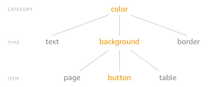
Style Dictionary recommends using the Category/Type/Item (CTI) structure for our tokens.

However, we are free to structure tokens however we want. For example, we could restructure the button tokens like so:
{
  "button": {
    "color": {
      "background": {
        "primary": { "value": "red" },
        "secondary": { "value": "green" },
        "tertiary": { "value": "blue" }
      }
    }
  }
}
The asset variable names will change to reflect the new structure:
:root {
  --button-color-background-primary: red;
  --button-color-background-secondary: green;
  --button-color-background-tertiary: blue;
}
There is an interactive playground where we can play around with and edit JSON tokens. The playground is a great way to get more familiar with Style Dictionary and how it works.
A design system will help you and your team have a consistent, robust, flexible, and accessible product.
One of Style Dictionary’s greatest selling points is that it stays platform and technology agnostic in its setup, yet enables us to target several platforms and formats.
In this article, we have learned about Style Dictionary and how it enables us manage design tokens and transforms them into platform and format-specific outputs.
Install LogRocket via npm or script tag. LogRocket.init() must be called client-side, not
server-side
$ npm i --save logrocket

// Code:

import LogRocket from 'logrocket';
LogRocket.init('app/id');
// Add to your HTML:

<script src="https://cdn.lr-ingest.com/LogRocket.min.js"></script>
<script>window.LogRocket && window.LogRocket.init('app/id');</script>

AI-generated tests can speed up React testing, but they also create hidden risks. Here’s what broke in a real app.re

Why the future of DX might come from the web platform itself, not more tools or frameworks.

A hands-on test of Claude Code Review across real PRs, breaking down what it flagged, what slipped through, and how the pipeline actually performs in practice.

CSS art once made frontend feel playful and accessible. Here’s why it faded as the web became more practical and prestige-driven.
Would you be interested in joining LogRocket's developer community?
Join LogRocket’s Content Advisory Board. You’ll help inform the type of content we create and get access to exclusive meetups, social accreditation, and swag.
Sign up now