
Data visualization is the process of representing information in charts, pictures, etc. There are a host of JavaScript libraries that help to represent data, the most popular of which are React and D3.js. These libraries are powerful and regarded as the best data visualization framework by some — but the D3 syntax can be confusing.

In this article, we will take you on a data visualization journey using React and Ant Design. Implemented as a React UI library, Ant Design is a collection of high-quality components for building rich, interactive user interfaces.
For proper follow-through with this article, the reader should have intermediate knowledge on the following:
In this article, we aim to show you the following:
Let’s get on with it!
The Replay is a weekly newsletter for dev and engineering leaders.
Delivered once a week, it's your curated guide to the most important conversations around frontend dev, emerging AI tools, and the state of modern software.
To begin, we will create a React app using the Node package manager (npm). To do this, we will need to follow the steps below.
First, download Node.js, if you haven’t already. On successful installation of Node, we will open our terminal in Visual Studio Code to create our React folder. Follow the steps below:
cd to our preferred directorymy-apps is our React folder namenpx create-react-app my-apps
After installing the Node modules, type cd my-apps on the terminal and start our React app by inputting the command npm start.
On implementation of the above, our React app should look like the below:
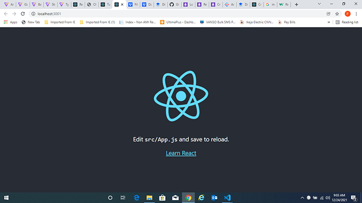
After creating our React folder, in some cases, Ant Design is missing from the modules. The easiest way to add Ant Design is by typing npm install command in our terminal to install all of the necessary modules.
If we have an existing Node module folder, we will type yarn add antd to add the Ant Design module into our Node module folder. We will then need to add the Ant Design chart library into our @antdesign folder using the following command:
yarn add @ant-design/charts
@ant-design/charts is the library that will help us develop the charts we need for our analysis. Since we are working on flowcharts, we will need to import the flowchart library as well:
yarn add @ant-design/flowchart
Together with react-dom and react, Ant Design’s flowchart also relies on antd icons, @ant-design/icons, and lodash. To achieve this, we need to install both packages into our application:
yarn add lodash
yarn add @ant-design/icons
With all this done, our project should now run smoothly. Here is an image of our app folder structure:

Our package.json file in general should have the following files available in it:
"dependencies": { "@ant-design/icons": "^4.6.0", "antd": "^4.6.3", "lodash": "^4.17.20", "react": ">=16.8.4", "react-dom": ">=16.8.4" }
Next, we will create a sub-folder called components in our src folder. This folder will contain a JavaScript file for our flowcharts. We can use import or require statements to start.
First, we will import the necessary CSS file by adding the code below to our App.js file:
import "@ant - design/flowchart/dist/index.css";
Note! Without importing the CSS, the flowchart widgets will be out of proportion and irresponsive.
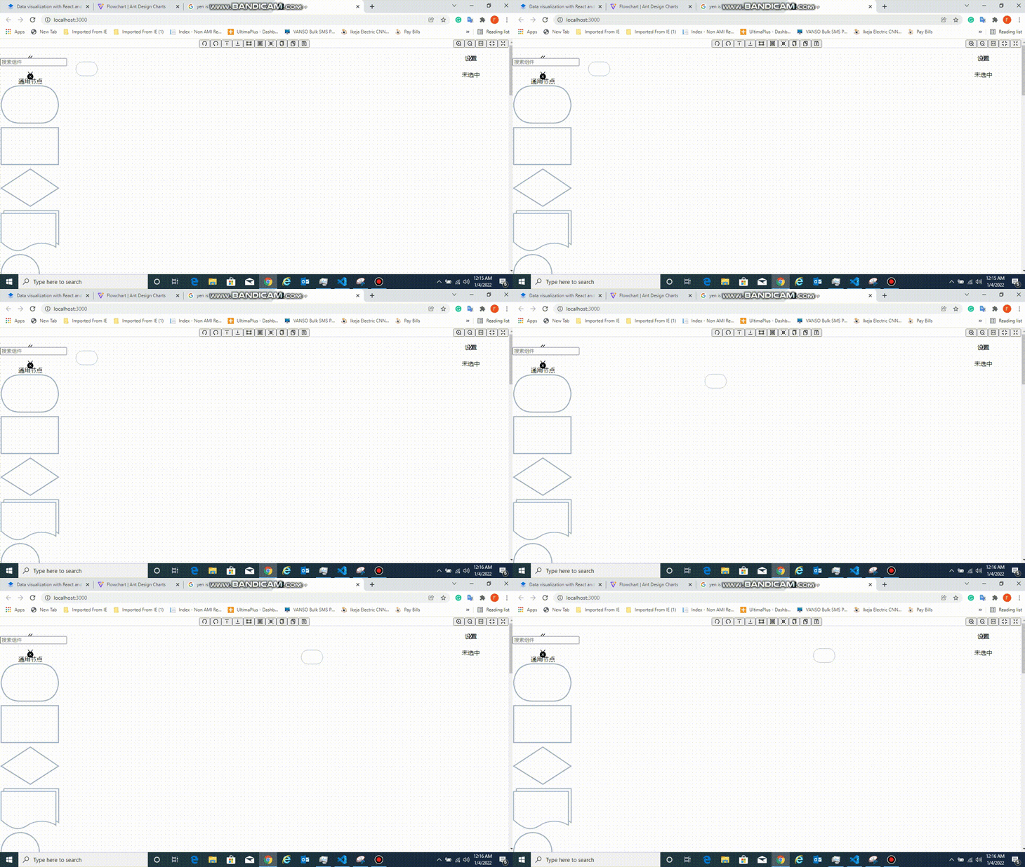
Now, we can import our flowcharts (and other charts) into the App.js file.
For our flowchart, we will create a React component in a new file called flowchart.js. This file will house our flowchart component, which will in turn hold the dataset for our code.
import React from 'react';
import ReactDOM from 'react-dom';
import { Flowchart } from '@ant-design/charts';
const SampleFlowchart = () => {
 return (
  <>

  </>
 );
};
export default SampleFlowchart;
In the code snippet above, we imported react, react-dom, and Flowchart from the Ant Design chart library. Next, we create our SampleFlowChart component and export it as the default, using React’s functional component rendering mechanism.
<div style={{ height: 600 }}>
  <Flowchart
    onSave={(d) => {
      console.log(d, JSON.stringify(d));
    }}
    toolbarPanelProps={{
      position: {
        top: 0,
        left: 0,
        right: 0,
      },
    }}
    scaleToolbarPanelProps={{
      layout: 'horizontal',
      position: {
        right: 0,
        top: -40,
      },
      style: {
        background: 'transparent',
      },
    }}
    canvasProps={{
      position: {
        top: 40,
        left: 0,
        right: 0,
        bottom: 0,
      },
    }}
    nodePanelProps={{
      position: { width: 160, top: 40, bottom: 0, left: 0 },
    }}
    detailPanelProps={{
      position: { width: 200, top: 40, bottom: 0, right: 0 },
    }}
  />
</div>
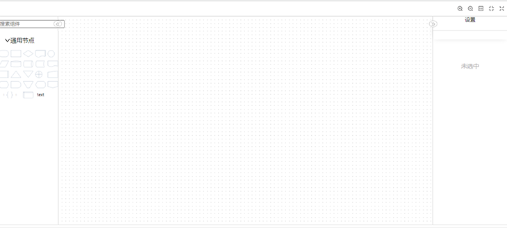
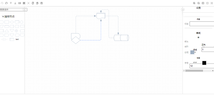
Inserting the code above will display our flowchart dashboard, populated with the necessary widgets to create a flowchart diagram for any application flow. You can decide to use any of these structures, including a parallelogram, an oval, or even a diamond.
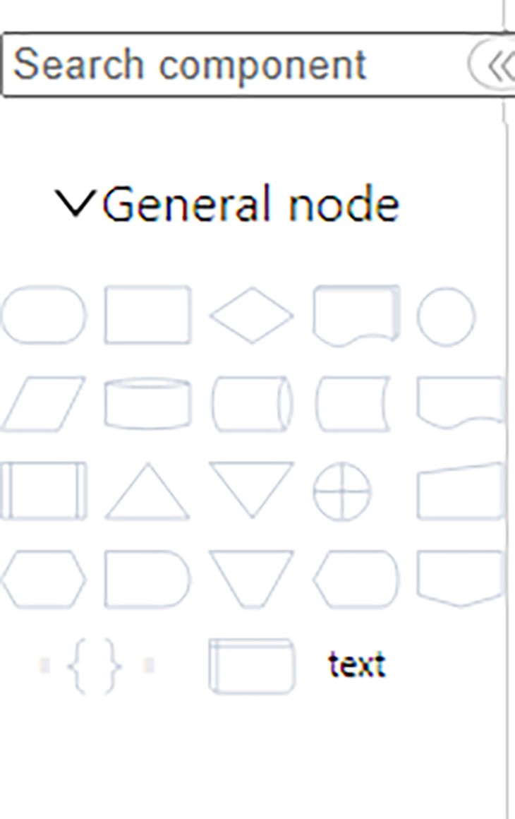
Since Antd is a Chinese-based framework, the text on the interface is in Chinese. Do not be alarmed! There is a way around it. You will install the Google Translate free plugin extension in your browser. Specify Google to translate the website and you should be good to go.
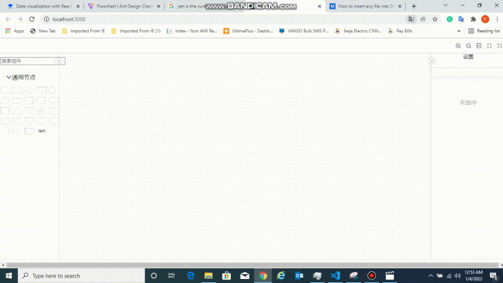
The Flowchart widget creates the panel dashboard that is displayed on the browser:
onSave={(d) => {
    console.log(d, JSON.stringify(d));
}}
Any time we save our updates, this logs the dataset generated from our designs to the console. These datasets can be shared with anyone to regenerate the flowchart map.
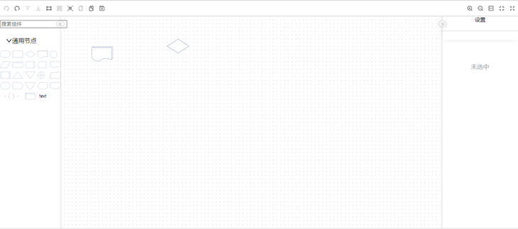
toolbarPanelProps={{
          position: {
            top: 0,
            left: 0,
            right: 0,
  },
}}
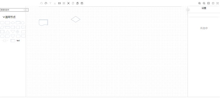
The above snippet sets the position of the toolbar of the interface. By altering the values, we can change the positioning of the toolbar.
scaleToolbarPanelProps={{
          layout: 'horizontal',
          position: {
            right: 0,
            top: -40,
          },
          style: {
            background: 'transparent',
          },
        }}
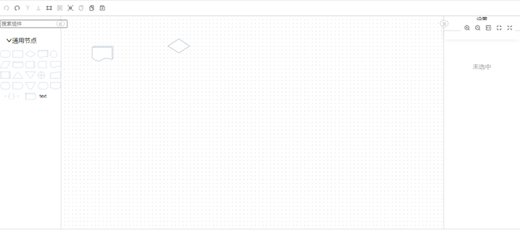
The above positions the fit-to-screen, fullscreen, and zoom in/zoom out buttons on the top-right of the screen. Changing the values specifies where we want to position each button on the dashboard.

canvasProps={{
          position: {
            top: 40,
            left: 0,
            right: 0,
            bottom: 0,
          },
        }}
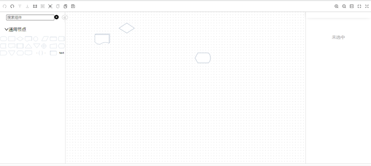
These props handle the positioning of the central canvas on the screen, where you can drag and drop widgets from the sidebar to display them.
nodePanelProps={{
          position: { width: 160, top: 40, bottom: 0, left: 0 },
        }}
        detailPanelProps={{
          position: { width: 200, top: 40, bottom: 0, right: 0 },
        }}
These props handle the panels on either side of the screen. The nodepanelprops handle the nodes housed in the left panel. On the other side, the right panel shows the details of the highlighted widget.

There is a default data property of the flowchart widget. This data property takes in the value of the object, and each object has two properties: nodes and edges. Both of these properties are arrays of all the nodes present in the application.
The data obtained from the onSave function call is then displayed in the interface.
Hence, the final code will be:
import React from 'react';
import ReactDOM from 'react-dom';
import { Flowchart } from '@ant-design/charts';

const SampleFlowchart = () => {
  return (
    <div style={{ height: 600 }}>
      <Flowchart
        onSave={(d) => {
          console.log(d, JSON.stringify(d));
        }}
        toolbarPanelProps={{
          position: {
            top: 0,
            left: 0,
            right: 0,
          },
        }}
        scaleToolbarPanelProps={{
          layout: 'horizontal',
          position: {
            right: 0,
            top: -40,
          },
          style: {
            background: 'transparent',
          },
        }}
        canvasProps={{
          position: {
            top: 40,
            left: 0,
            right: 0,
            bottom: 0,
          },
        }}
        nodePanelProps={{
          position: { width: 160, top: 40, bottom: 0, left: 0 },
        }}
        detailPanelProps={{
          position: { width: 200, top: 40, bottom: 0, right: 0 },
        }}
      />
    </div>
  );
};
export default SampleFlowchart;
For our multiline chart, we will create a new file to house it as a component. Let’s name the file multiline.js.
Here is the full code we’ll paste in that file:
import React, { useState, useEffect } from 'react';
import ReactDOM from 'react-dom';
import { Line } from '@ant-design/charts';

const SampleMultiLine = () => {
  const data = [
    {
      "year": "2010",
      "value": 3107,
      "category": "Cars"
    },
    {
      "year": "2010",
      "value": 3812,
      "category": "Buses"
    },
    {
      "year": "2010",
      "value": 1696,
      "category": "Bikes"
    },
    {
      "year": "2010",
      "value": 446,
      "category": "train"
    },
    {
      "year": "2010",
      "value": 67,
      "category": "Walk"
    },
    {
      "year": "2011",
      "value": 3134,
      "category": "Cars"
    },
    {
      "year": "2011",
      "value": 4055,
      "category": "Buses"
    },
    {
      "year": "2011",
      "value": 1756,
      "category": "Bikes"
    },
    {
      "year": "2011",
      "value": 494,
      "category": "train"
    },
    {
      "year": "2011",
      "value": 64,
      "category": "Walk"
    },
    {
      "year": "2012",
      "value": 3200,
      "category": "Cars"
    },
    {
      "year": "2012",
      "value": 4106,
      "category": "Buses"
    },
    {
      "year": "2012",
      "value": 1783,
      "category": "Bikes"
    },
    {
      "year": "2012",
      "value": 519,
      "category": "train"
    },
    {
      "year": "2012",
      "value": 65,
      "category": "Walk"
    },
    {
      "year": "2013",
      "value": 3220,
      "category": "Cars"
    },
    {
      "year": "2013",
      "value": 4126,
      "category": "Buses"
    },
    {
      "year": "2013",
      "value": 1806,
      "category": "Bikes"
    },
    {
      "year": "2013",
      "value": 554,
      "category": "train"
    },
    {
      "year": "2013",
      "value": 68,
      "category": "Walk"
    },
    {
      "year": "2014",
      "value": 3280,
      "category": "Cars"
    },
    {
      "year": "2014",
      "value": 4117,
      "category": "Buses"
    },
    {
      "year": "2014",
      "value": 1823,
      "category": "Bikes"
    },
    {
      "year": "2014",
      "value": 568,
      "category": "train"
    },
    {
      "year": "2014",
      "value": 68,
      "category": "Walk"
    }
  ];


  const config = {
    data,
    xField: 'year',
    yField: 'value',
    seriesField: 'category',
    xAxis: {
      type: 'time',
    },
    yAxis: {
      label: {
        formatter: (v) => `${v}`.replace(/\d{1,3}(?=(\d{3})+$)/g, (s) => `${s},`),
      },
    },
  };
  return <Line {...config} />;
};
export default SampleMultiLine;
As in our previous example, the code above imports react, react-dom, and the Ant Design line chart provided by the library.
We will explain the code snippets below separately, as each is a focal point in our project.
Snippet 1:
const SampleMultiLine = () => {
  return (
      <>
      </>
  );
};
export default SampleMultiLine;
Snippet 2:
const config = { data, xField: 'year', yField: 'value', seriesField: 'category', xAxis: { type: 'time', }, yAxis: { label: { formatter: (v) => ${v}.replace(/\d{1,3}(?=(\d{3})+$)/g, (s) => ${s},), }, }, };
Each one describes the various configurations of our multiline graph. There are two important things to note here:
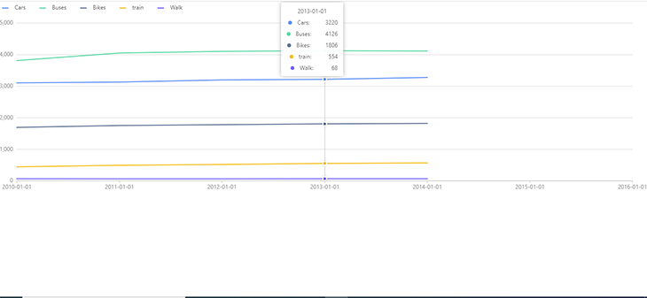
data propertyxField property takes in the key values in our dataset, which we want to display on our x-axisSo for every different/unique value for the property category in our dataset, the chart will create a new line to represent it in the chart.
For the xAxis and yAxis properties of our config variable, we specify a string to identify what type of value is represented.
Once you implement the above, our multiline chart should display as follows:
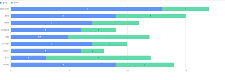
A stacked bar chart is a segmented graph used to compare parts of a whole. For our stacked bar chart, we’ll create a JavaScript file called stackedbar.js and add the following code:
import React, { useState, useEffect } from 'react';
import ReactDOM from 'react-dom';
import { Bar } from '@ant-design/charts';
const DemoBar = () => {
  const data = [
    {
      instrument: 'drums',
      value: 5,
      type: 'boys',
    },
    {
      instrument: 'bass',
      value: 9,
      type: 'boys',
    },
    {
      instrument: 'ukelele',
      value: 2,
      type: 'boys',
    },
    {
      instrument: 'cymbals',
      value: 3,
      type: 'boys',
    },
    {
      instrument: 'lead',
      value: 7,
      type: 'boys',
    },
    {
      instrument: 'keyboard',
      value: 3,
      type: 'boys',
    },
    {
      instrument: 'violin',
      value: 4,
      type: 'boys',
    },
    {
      instrument: 'cello',
      value: 6,
      type: 'boys',
    },
    {
      instrument: 'accordion',
      value: 4,
      type: 'boys',
    },
    {
      instrument: 'drums',
      value: 9,
      type: 'girls',
    },
    {
      instrument: 'bass',
      value: 3,
      type: 'girls',
    },
    {
      instrument: 'ukelele',
      value: 6,
      type: 'girls',
    },
    {
      instrument: 'cymbals',
      value: 7,
      type: 'girls',
    },
    {
      instrument: 'lead',
      value: 4.9,
      type: 'girls',
    },
    {
      instrument: 'keyboard',
      value: 6,
      type: 'girls',
    },
    {
      instrument: 'violin',
      value: 7,
      type: 'girls',
    },
    {
      instrument: 'cello',
      value: 9,
      type: 'girls',
    },
    {
      instrument: 'accordion',
      value: 13,
      type: 'girls',
    },
  ];
  const config = {
    data: data.reverse(),
    isStack: true,
    xField: 'value',
    yField: 'instrument'
  };
  return <Bar {...config} />;
};
export default DemoBar;
The dataset above shows how many students play each of the instruments listed, and our chart will show how many girls and boys play each instrument.
The major code keywords in the stacked bar chart are the same ones we explained in the other charts above. Thus, there’s no need to delve into it.
In this tutorial, we have shown you the versatility of Ant Design in data representation. Here is a link to the full code snippet. Happy visualization!
Install LogRocket via npm or script tag. LogRocket.init() must be called client-side, not
server-side
$ npm i --save logrocket

// Code:

import LogRocket from 'logrocket';
LogRocket.init('app/id');
// Add to your HTML:

<script src="https://cdn.lr-ingest.com/LogRocket.min.js"></script>
<script>window.LogRocket && window.LogRocket.init('app/id');</script>

Write agent-friendly API documentation with OpenAPI, clear schemas, workflow guidance, and llms.txt for safer AI automation.

Local AI proxy tutorial for detecting, masking, and rehydrating PII before prompts reach cloud LLMs.

Learn how Graph RAG uses connected knowledge structures to improve retrieval beyond simple text similarity.

Learn how sibling-index() enables clean, JavaScript-free stagger animations using native CSS.
Hey there, want to help make our blog better?
Join LogRocket’s Content Advisory Board. You’ll help inform the type of content we create and get access to exclusive meetups, social accreditation, and swag.
Sign up now