Before the introduction of the mask-image property in CSS, developers had to use other techniques to create masking effects on the web. One common method was to use a transparent PNG image as a “mask” and apply it to an element using the background-image property. This would allow the element to take on the transparency of the PNG image, effectively masking out the parts of the element that corresponded to transparent areas of the image.
Another method was to use the clip property. The clip property allows you to specify a rectangle or a shape that defines the visible area of an element. The clip-path property specifies a clipping area around an element.
All of these techniques technically work, but they have limitations and are less flexible and powerful than the mask-image property. The mask-image property allows you to use any image or scaleable vector file as a mask and specifies how the mask should be applied to the element. clip-path is similar to mask-image, but limits you to basic shapes and polygons.
In this article, we’ll explore the capabilities of the mask-image property and demonstrate how it can be used to create visually striking effects on the web.
To understand the examples in this article, you should have a basic understanding of CSS and its properties.
Jump ahead:
mask-image property?mask-image property work?
mask-image property
mask-image property?The mask-image property is used to apply a mask to an element. A mask is an image or an SVG that is used to fully or partially hide an element. When the mask is superimposed over the element, the parts of the element that correspond to transparent areas of the mask are no longer visible.
The mask-image property can be used to create a wide range of visual effects on webpages. Here are a few examples of what you can do with the mask-image property:
Here’s a practical example of how you can use the mask-image property in CSS:
<html lang="en">
<head>
<style>
.container {
display: flex;
place-items: center;
justify-content: center;
height: 100vh;
}
.my-element {
width: 200px;
height: 142px;
margin-left: 50px;
mask-image: url(./mask.svg);
mask-size: contain;
mask-repeat: no-repeat;
}
</style>
</head>
<body>
<div class="container">
<h1>This is a page title</h1>
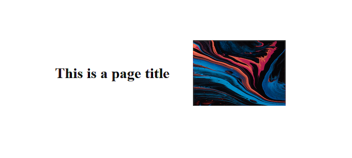
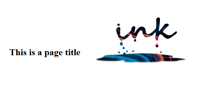
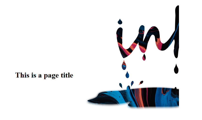
<img src="/image.jpg" alt="abstract art image" class="my-element" />
</div>
</body>
</html>
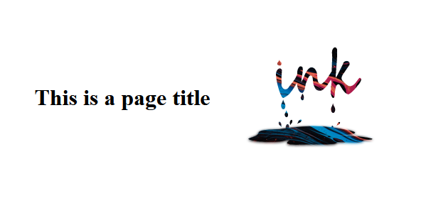
In this example, the mask-image property is applied to the image element with the class my-element, and the mask is specified using a URL of a mask file. This example uses an SVG file, but you could also specify a PNG image file.
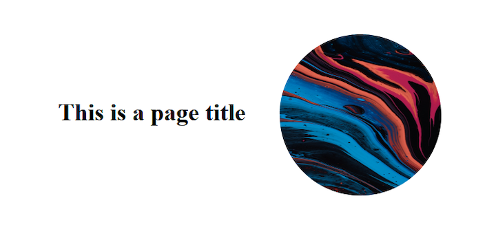
Here’s the webpage before applying the mask-image property:
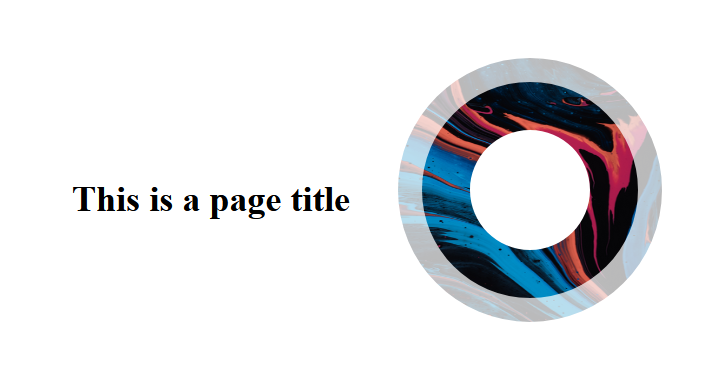
Here’s the same webpage after applying the mask-image property:
mask-image property work?As you may have observed in the previous example, the mask-image property is only one aspect of the masking process in CSS. Several other masking-related properties can be used to control how the mask is applied to the element, such as mask-mode, mask-size, mask-repeat, and mask-composite.
Let’s take a look!
mask-modeThe mask-mode property specifies how the mask layer image is combined with the element it is applied to. It specifies whether the layer image is treated as a luminance mask or an alpha mask.
The mask-mode property can have one of the following values:
alpha: Uses the mask image’s level of transparency to determine how much of the element’s content is visible; this is the default valueluminance: Uses the mask image’s level of brightness to determine how much of the element’s content is visiblematch-source: Indicates that the mask layer image will be composited with the element using the same compositing rules as the element itself. This means that if the element has an opacity property set, the mask image will also be composited with the element using that same level of opacityHere’s an example of how to use the mask-mode property:
.my-element {
 width: 200px;
 height: 142px;
 margin-left: 50px;
 mask-image: url(./mask.svg);
 mask-size: contain;
 mask-repeat: no-repeat;
 Mask-mode: luminance;
 }
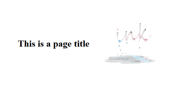
In this example, the mask-mode property specifies that the mask image will be composited with the element using the luminance channel of the mask image.
Here’s our sample webpage after applying the mask-mode property:
mask-sizeThe mask-size property is used to specify the size of the mask image. It can be used to specify a specific width and height, or it can be set to cover, contain, or auto in order to preserve the mask image’s intrinsic ratio.
Here’s an example of how to use the mask-size property in CSS:
.my-element {
 width: 400px;
 height: 242px;
 margin-left: 50px;
 Mask-image: url(./mask.svg);
 mask-size: 320px 160px;
 mask-repeat: no-repeat;
 }
This will set the size of the mask image to 320px wide and 160px high.
You can also specify percentages for mask-size. When the mask-size property is set to 100% it makes the image cover the entire mask image.
Here’s an example where the mask-size property, is set to 50%:
mask-repeatThe mask-repeat property is used to set how the mask image is repeated (tiled) within the mask positioning area. The property takes two values, one for the horizontal repeat and one for the vertical repeat.
The values are as follows:
repeatrepeat-xrepeat-yno-repeatHere’s an example of how the mask-repeat property can be used:
.my-element {
 width: 600px;
 height: 242px;
 margin-left: 50px;
 Mask-image: url(./mask.svg);
 mask-size: 200px 100px;
 mask-repeat: repeat-y;
 }
In this example, the mask-image layer will be repeated vertically (but not horizontally) within the mask positioning area:
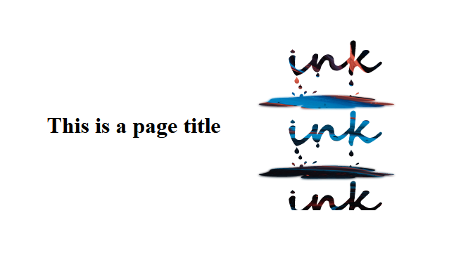
If you include a second repeat-x value in the mask-repeat property, the output would look like this:
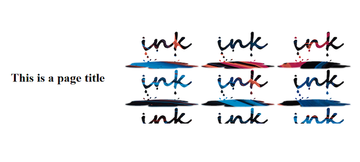
In this case, the mask-image layer is tiled both vertically and horizontally within the designated area.
You can also specify a custom repeat value by using the space keyword and providing a length value. For example:
.img {
 width: 600px;
 height: 242px;
 margin-left: 50px;
 Mask-image: url(./ink_drip.svg);
 mask-size: 200px 100px;
 mask-repeat: space 10px;
 }
This will also repeat the mask horizontally and vertically, but with a space of 10px between each repetition.
mask-compositeThe mask-composite property is an especially versatile feature. It allows you to control how the mask-image is merged with the element it is masking, as well as how multiple mask images with different shapes are combined into a single image. This property provides a wide range of possibilities for creating visually striking effects for your webpages.
Here’s an example of how to use the mask-composite property:
 .my-element {
 width: 200px;
 height: 142px;
 mask-image: url(./circle.svg), url(./cross.svg);
 mask-size: contain;
 mask-repeat: no-repeat;
 mask-composite: add;
 }
When working with multiple mask images, it is important to understand the distinction between the source and destination layers. In this context, the source layer is the mask-image to which the mask-composite property is applied (in this case, circle.svg), while the destination layers are all the mask images below it (e.g., cross.svg). This concept is crucial to understanding how the mask-composite property functions.
The mask-composite property can take one of the following values:
add: Indicates that the mask layers will be composited using the add compositing operation, which places the source over the destination. In other words, it places the first mask layer over the rest; this is the default value. In the below example, the circle.svg mask is placed over the cross.svg mask: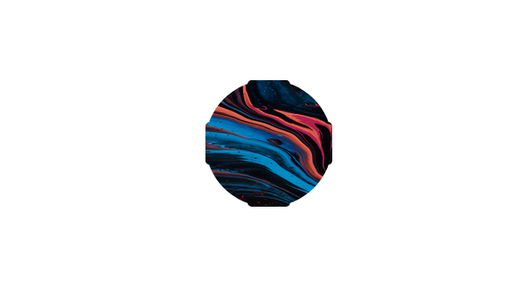
subtract: Places the source where it falls outside the destination layer. In other words, it subtracts the destination layer region that overlaps the source, like so: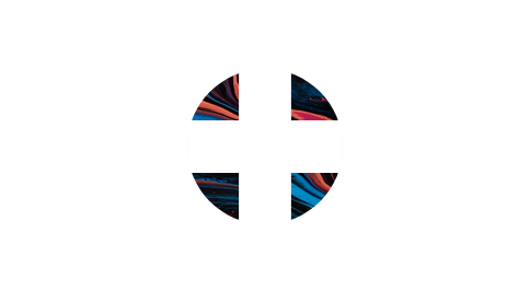
intersect: Replaces the destination with portions of the source that overlaps the destination. In other words, the final composition is a region of the destination that overlaps the source: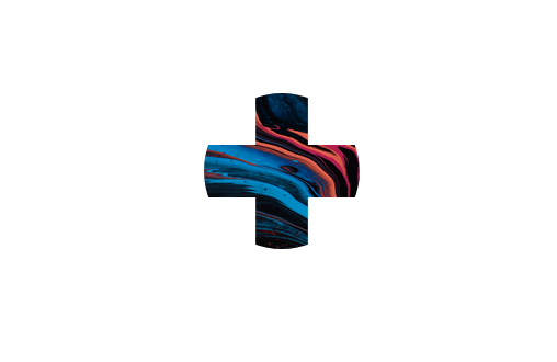
exclude: Combines the non-overlapping regions of the source and the destination into one image, like so: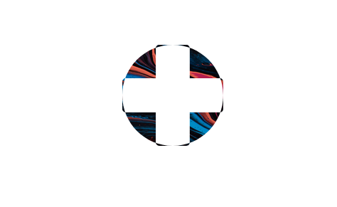
mask-image propertySimilar to the CSS background-image, the mask-image property not only accepts an image file as its value, it also accepts values such as linear gradients and repeated patterns. This allows for even more flexibility and creativity when designing webpage elements.
Let’s take a look at how to use a CSS gradient to mask an image. Here we’ll replace the URL of the mask-image property and we’ll set one part of the gradient to transparent. We’ll take a look at both a linear-gradient and a radial-gradient.
Let’s start off with a linear-gradient:
.container img{
  mask-image: linear-gradient(to top, transparent, #000);
  -webkit-mask-image: linear-gradient(to top, transparent, #000);;
}
In this example, the mask-image property is set to a linear gradient that goes from transparent at the bottom to black at the top. This creates a gradient mask that gradually transitions from transparent to opaque and can be used to create a variety of visual effects:
See the Pen
Linear gradient CSS mask-image by david4473 ()
on CodePen.
Now, let’s try using a radial-gradient:
.container img{
  mask-image: radial-gradient(circle, transparent 30%, #000);
  -webkit-mask-image: radial-gradient(circle, transparent 30%, #000);
}
Here’s the result:
See the Pen
Radial gradient CSS mask-image by david4473 ()
on CodePen.
You can also swap the position of the colors to switch things up, like so:
.container img{
  mask-image: radial-gradient(circle,#000, transparent 50%);
  -webkit-mask-image: radial-gradient(circle, #000, transparent 50%);
}
Here’s the result, showing the radial-gradient effect with swapped colors:
See the Pen
Radial gradient mask-image transparent by david4473 ()
on CodePen.
As mentioned previously, the mask-image mask layer can be an SVG or PNG image file. If you’d like, you can also create your own scaleable vector graphic shape.
To create an SVG mask, you’ll first need to create the shape using the SVG HTML element. Within the SVG, you’ll have a mask element with an ID:
 <svg width="0" height="0" viewBox="0 0 400 400">
      <mask id="mask">
        <circle fill="#fff" cx="250" cy="250" r="200"/>
      </mask>
</svg>
This mask ID is what you’ll use as the reference for the mask-image:
.container img{
  mask-image: url(#mask);
  -webkit-mask-image: url(#mask);
}
You’ll get the following result; it’s a rather dull circle:
The SVGs must be black and white, because when the mask-image is applied the white portions will be visible (will be filled in) and the black parts will be hidden (will become transparent). If you add any other color besides black or white, the mask will become translucent with a tint of that color.
With this new information, let’s spice up the above circle.
Add a smaller circle with fill color set to black, which makes the mask a ring. You can also add a stroke around the larger, exterior circle:
<svg width="0" height="0" viewBox="0 0 400 400">
      <mask id="mask">
        <circle fill="#fff" cx="250" cy="250" r="200"
        stroke="#553c9a" stroke-width="40px"/>
        <circle fill="#000" cx="250" cy="250" r="100" />
      </mask>
</svg>
Here’s the result, an SVG mask as a ring surrounded by a translucent border:
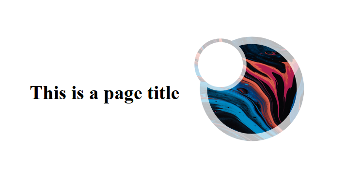
You can also change the position of the SVGs or combine different shapes:
You’ve seen how to use the mask-image property to mask images in different ways. Try out different shapes and see what you can come up with. You could use the mask-image property to create really cool backgrounds for webpages.
To learn how to animate SVGs with CSS, check out this tutorial.
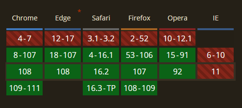
It’s important to note that the CSS mask-image property is not fully supported in all web browsers. It is supported in modern browsers such as Google Chrome, Mozilla Firefox, Opera, and Microsoft Edge, but it is not supported in older versions of these browsers or in Internet Explorer:
You can use vendor prefixes to ensure that your mask-image styles are applied in as many browsers as possible. For example, you can use the following code to ensure that your mask-image styles are applied in all modern browsers:
.my-element {
 -webkit-mask-image: url(mask.png);
 -moz-mask-image: url(mask.png);
 -ms-mask-image: url(mask.png);
 mask-image: url(mask.png);
 }
By using vendor prefixes and feature detection, you can ensure that your mask-image styles are applied as widely as possible while providing fallback styling or functionality for browsers that do not support the property.
In this article, we investigated how to apply a mask layer image to an element using the mask-image property. We examined controlling how the mask layer is composited with the element using the mask-mode and mask-composite properties.
By now, you should understand how to use the mask-image property and its corresponding values to create a wide range of visual effects on your webpages.
Go ahead, flex your creative muscles! See what interesting effects you can produce using mask-image!
As web frontends get increasingly complex, resource-greedy features demand more and more from the browser. If you’re interested in monitoring and tracking client-side CPU usage, memory usage, and more for all of your users in production, try LogRocket.

LogRocket lets you replay user sessions, eliminating guesswork around why bugs happen by showing exactly what users experienced. It captures console logs, errors, network requests, and pixel-perfect DOM recordings — compatible with all frameworks.
LogRocket's Galileo AI watches sessions for you, instantly identifying and explaining user struggles with automated monitoring of your entire product experience.
Modernize how you debug web and mobile apps — start monitoring for free.
Would you be interested in joining LogRocket's developer community?
Join LogRocket’s Content Advisory Board. You’ll help inform the type of content we create and get access to exclusive meetups, social accreditation, and swag.
Sign up now
Discover how to use Gemini CLI, Google’s new open-source AI agent that brings Gemini directly to your terminal.

This article explores several proven patterns for writing safer, cleaner, and more readable code in React and TypeScript.
A breakdown of the wrapper and container CSS classes, how they’re used in real-world code, and when it makes sense to use one over the other.

This guide walks you through creating a web UI for an AI agent that browses, clicks, and extracts info from websites powered by Stagehand and Gemini.

 Learn more →
