If you’ve been building websites for a while, you probably have some established opinions about CSS. It’s the obvious choice for design and layout, but once things get more interactive than a basic animation, most developers instinctively reach for JavaScript. However, thanks to an ever-evolving platform, “CSS for design and JavaScript for interactivity” no longer has to be the default when building features for the web.
Modern CSS is now powerful enough to handle complex animations and user interactions that used to require custom scripts. In this article, we’ll explore some of the latest features landing in CSS and how they can simplify your development workflow while still giving you the level of interactivity you’re used to with JavaScript.
Imagine a world where you can build fully customizable <select> elements without writing any JavaScript, or create a scrollable carousel with interactive markers without calculating scrollLeft or wiring up multiple event listeners. That’s exactly what’s becoming possible with these new CSS features, and it’s definitely something to look forward to.
Let’s take a look at some of these latest features and how we can implement them in our codebase.
Note: Most of these features are very new and still rolling out across browsers, so they aren’t suited for production use just yet. For a deeper dive into how these features work, check out the CSS Wrapped 2025 article from the Chrome DevRel team:
| Feature | What it does |
|---|---|
appearance: base-select |
Opts a <select> into the new customizable mode so you can style it and its picker without losing native behavior. |
select::picker(select) |
A pseudo-element representing the dropdown surface of a customizable <select> that you can style (shadows, borders, spacing). |
selectedcontent |
Styles the selected option shown in a select field |
::scroll-button() |
A generated button for scrollable containers that scrolls left or right when clicked. |
::scroll-marker |
A generated element paired with each scroll item that a browser can use as a pagination dot or visual indicator. |
::scroll-marker-group |
A container for the generated scroll markers so they can be styled/placed (e.g., bottom center). |
scroll-target-group |
An attribute you can apply to a container of links so CSS can match the link whose target is currently in view (:target-current). |
:target-current |
A selector that matches a link (or other targetable element) whose target (ID anchor) is currently the scroll-active element. |
container-type: scroll-state |
Enables scroll state queries on an element, letting CSS react to whether a scroll container is in a specific snapped or stuck state. |
@container scroll-state(snapped: x) |
A container query that applies styles when the container is in a “snapped” scroll position on the x-axis. |
sibling-index() |
Returns the 1-based position of an element among its siblings, useful for dynamic delays and layout rules. |
sibling-count() |
Returns the total number of sibling elements, useful for count-based layouts or proportional styling. |
attr() |
A typed attr() function call that reads an attribute as a color for use in properties like background-color. |
@starting-style |
A container query-like block used when defining styles at the start of a transition or animation sequence (experimental syntax). |
Now let’s take a look at a real-world use case with some of these new features.
This is a feature I’ve honestly been anticipating for years, so let’s see how it works in practice. The <select> element is the browser’s built-in solution for an accessible dropdown, but styling it has always been limited. If you wanted to do anything more advanced than adjusting padding or changing colors, you’d typically end up building a fully custom dropdown with extra markup, JavaScript handlers, and all the complexity that comes with trying to mimic native behavior.
Customizable selects let you combine the best of both worlds: the native accessibility and semantics of a real <select> with the kind of styling flexibility we previously only got from JavaScript-powered components.
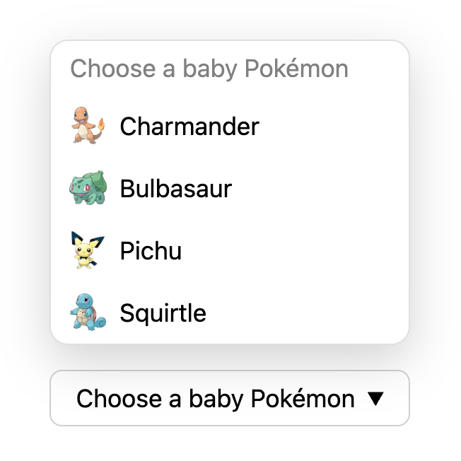
In the demo below, we’ll use three newer CSS features to build a Pokémon selector that:
<select> for semantics and accessibility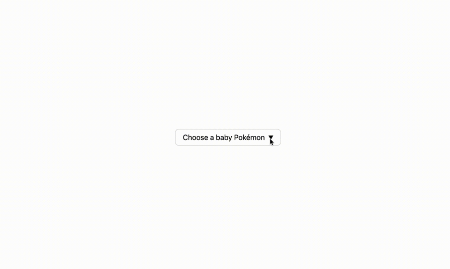
Note: these features require Chrome 135+:
See the Pen
Customizable HTML select by Jemima (@Jemimaabu)
on CodePen.
All of this is done with a single <select> element and a few data-* attributes. The interactivity comes from these features: appearance: base-select (plus the select picker), tree counting functions, and typed attr().
appearance: base-select and the select pickerThe first step is switching the control into its customizable mode:
select,
select::picker(select) {
  appearance: base-select;
}
appearance: base-select opts your <select> into the new customizable rendering model, which also makes it a solid progressive enhancement approach. Browsers that don’t support it will simply ignore the property and render the select normally.
Once you’ve opted in, the ::picker(select) pseudo-element represents the dropdown surface itself, so you can style it like any other UI panel:
select::picker(select) {
  margin-block-end: 1em;
  border-radius: 12px;
  border: 1px solid #e0e0e0;
  box-shadow: 0 10px 30px rgba(0, 0, 0, 0.18);
}
With customizable selects, the browser handles a lot of the complexity of dropdowns for you, including:
 |
 |
<select>.<option>, like icons, additional labels, or structured content.These are things you would normally have to script manually when building a custom dropdown, but here they come straight from the platform.
Another major advantage is the built-in progressive enhancement model. If a browser doesn’t support customizable selects yet, the user simply gets the regular native <select> element. Nothing breaks. There’s no polyfill required and no need to maintain two versions of the component.
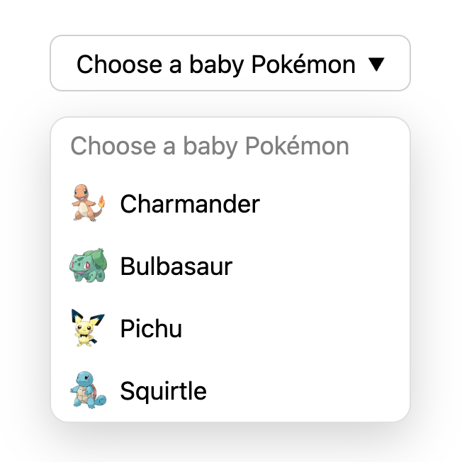
sibling-index()Next, we add animation. When the dropdown opens, each option slides in from the side with a small delay. Instead of manually assigning an index to every option, we can use a tree counting function:
option {
  transition:
    opacity 0.25s ease,
    translate 0.5s ease;
  transition-delay: calc(0.2s * (sibling-index() - 1));

  @starting-style {
    opacity: 0;
    translate: 30px 0;
  }
}
sibling-index() gives you the 1-based position of an element among its siblings. That means the first visible option gets a delay of 0.2s * (1 - 1),which is 0s. The next is 0.2s, then 0.4s, and so on.
If you add or remove options later, the animation still looks correct because the timing is calculated dynamically instead of being hard-coded in the markup.
Before tree-counting functions, achieving the same staggered effect in CSS was usually much clunkier. You either had to hard code delays with a long list of :nth-child() selectors, or manually add an --index custom property to every item in your HTML. Both approaches worked, but they got noisy fast, and they were easy to forget to update when the list changed.
attr() for data driven stylingFinally, the demo uses the typed attr() function to keep visual details in data-* attributes.
The attr() function has been baseline available for a while. But until recently, it was only reliably usable for the content property.
With the newer typed version of attr(), we can start using attribute values in more places in CSS, as long as we tell the browser what type to expect.
In this demo, each option includes a data-bg-color attribute that defines its hover background color, and we read that value directly in CSS:
//HTML
<option data-bg-color="#F8C9A0" value="charmander">

//CSS
option {
  background-color: attr(data-bg-color color, transparent);
}
Because we’re explicitly treating the attribute as a color, the browser parses it correctly, and we can safely provide a fallback value if the attribute is missing. The result is a more data-driven styling approach: you can tweak theme colors in your HTML without touching the CSS.
Together, appearance: base-select, the select picker, tree counting functions, and typed attr() make it possible to build a rich, animated dropdown that is still fundamentally a real <select> element. So you can have the customizations you want while still keeping native behavior and built-in accessibility features.
In comparison, here’s what a similar dropdown built using JavaScript would look like (spoiler: it’s roughly 150+ lines of JavaScript to achieve a close-enough example of what we’ve built with CSS 🥴):
See the Pen
Custom Select with JavaScript by Jemima (@Jemimaabu)
on CodePen.
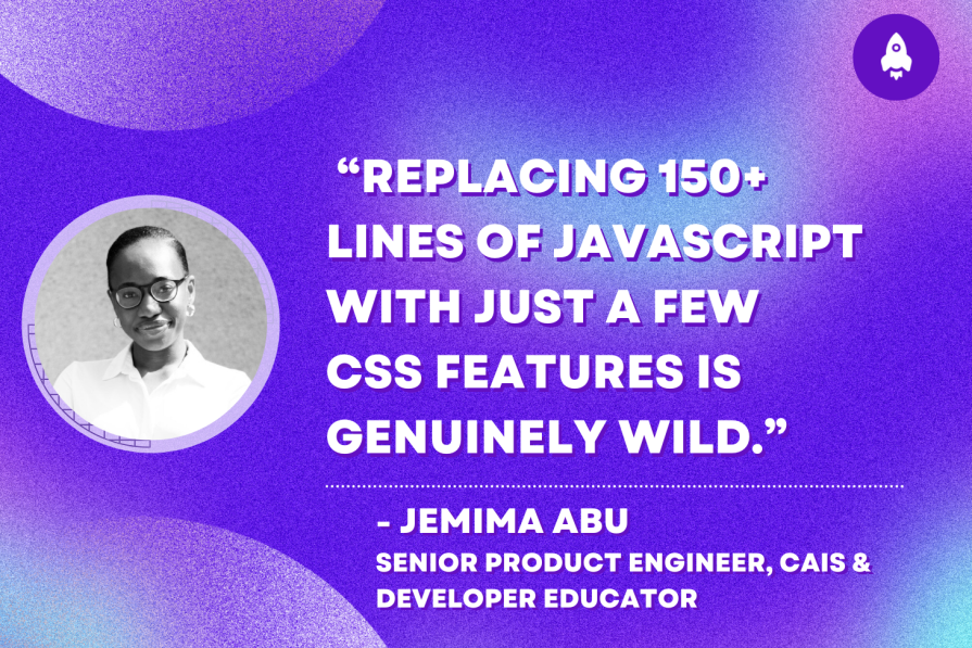
For me, this demo shows the most exciting part about where CSS is heading. Replacing 150+ lines of JavaScript with just a few CSS features is genuinely wild. We’re able to achieve the same amount of complexity that we’ve always had, but now it’s a lot less work to do so.
When the platform provides defaults like keyboard navigation, focus handling, and sensible positioning behavior, we can spend more time on improving existing components (instead of rebuilding the same interaction patterns in every codebase or installing a new library every time).
This also feels especially relevant in the age of AI. The simpler and more declarative these features are, the less likely an agent is to over-engineer a solution or invent behavior you didn’t ask for.
If you want to start taking advantage of these features as they land, here’s what I’d recommend:
And personally, if it means I get to write less code while CSS does all the heavy lifting, I’m very on board with that.
As web frontends get increasingly complex, resource-greedy features demand more and more from the browser. If you’re interested in monitoring and tracking client-side CPU usage, memory usage, and more for all of your users in production, try LogRocket.

LogRocket lets you replay user sessions, eliminating guesswork around why bugs happen by showing exactly what users experienced. It captures console logs, errors, network requests, and pixel-perfect DOM recordings — compatible with all frameworks.
LogRocket's Galileo AI watches sessions for you, instantly identifying and explaining user struggles with automated monitoring of your entire product experience.
Modernize how you debug web and mobile apps — start monitoring for free.

Explore why npm dependencies are a major supply chain security risk and how to protect JavaScript apps from compromised packages and transitive threats.

Enabled React Compiler v1.0 on a production Next.js app. Here’s every warning, breakage, and silent opt-out I documented — and what actually worked.

We built the same app in TanStack Start RSC and Next.js RSC. TanStack shipped 40% less JS and built 4x faster — but Next.js is still the safer production bet.

From RSC vulnerabilities and the Vercel breach to TypeScript 7.0 Beta and AI agents — the nine frontend storylines that defined H1 2026, ranked.
Hey there, want to help make our blog better?
Join LogRocket’s Content Advisory Board. You’ll help inform the type of content we create and get access to exclusive meetups, social accreditation, and swag.
Sign up now

 Learn more →
