If you have never heard of toast messages before, please check out the video below, which shows a short demo of the project that we’re going to build together in this tutorial.
In short, a toast message is a notification that shows up at the top of your display for a brief period of time, and after that, it will disappear again.
In this tutorial, we’ll go through the process of creating such a toast message from scratch in React Native using the React Native Animated library! React Native is a JavaScript-based framework, which makes it pretty easy to build cross-platform (iOS and Android) mobile applications. Feel free to check out the React Native docs for further information.
I used the Expo framework to develop this small project. If you want to use Expo, too, and haven’t installed it yet, you can add the Expo client as follows:
$ npm install --global expo-cli
The below code should generally also work for you if you don’t want to use Expo. The only Expo-specific thing here are the expo/vector-icons, which will only be available when using Expo. But that’s no problem, a fine alternative are the React Native Vector Icons!
Apart from that, basic knowledge of JavaScript and React Native will help you to easily follow this tutorial. If you want to follow along more closely, you can find the whole project on my GitHub.
Without further ado, let’s dive into the actual code! First, go to the directory where you want to store your project. Inside this directory, run expo init my-project in order to initialize the Expo project. You can replace “my-project” with whatever name you like.
Then, go to the newly created directory with cd my-project and run expo start to start the development server. Expo lets you decide what kind of device you want to work with; the device I used in the demo and the video above is an iPhone 12 Pro Max.
Here is a short overview of the terminal commands:
# cd into the directory where to store your project
 $ cd dir

# initialize the expo project
$ expo init my-project

# navigate inside the newly created project
$ cd my-project

# run the development server
$ expo start
I usually add some custom directories to the initially generated project directory. In this particular case, we only need the screens folder, where we’ll store our Home.js file. This is all we need to add to the initial structure because we only have one screen. The toast message will be coded in that screen, so we don’t even need a component directory. Of course, you could also outsource the code from Home.js to its own component file.
Like I mentioned in the intro of this article, we will use a library called React Native Animated, which will help us to easily perform smooth animations.
The general idea behind this whole project follows these steps:
This whole process can be achieved using React Native Animated. Below, you can find the first part of the code we’ll write to implement this behavior:
// Home.js
import React, { useRef, useState } from "react";
import {
  StyleSheet,
  Text,
  View,
  Animated,
  Button,
  TouchableOpacity,
  Dimensions,
} from "react-native";
import { AntDesign, Entypo } from "@expo/vector-icons";


const Home = () => {
  const windowHeight = Dimensions.get("window").height;
  const popAnim = useRef(new Animated.Value(windowHeight * -1)).current;

  const popIn = () => {
    Animated.timing(popAnim, {
      toValue: windowHeight * 0.35 * -1,
      duration: 300,
      useNativeDriver: true,
    }).start(popOut());
  };

  const popOut = () => {
    setTimeout(() => {
      Animated.timing(popAnim, {
        toValue: windowHeight * -1,
        duration: 300,
        useNativeDriver: true,
      }).start();
    }, 2000);
  };

  const instantPopOut = () => {
    Animated.timing(popAnim, {
      toValue: windowHeight * -1,
      duration: 150,
      useNativeDriver: true,
    }).start();
  };

  );
};
export default Home;
In line 15, we get the actual display height of the device using the Dimensions library from React Native. This will ensure that the positioning of our toast message will be rendered dynamically according to the actual display size.
In line 16, we define the initial position popAnim of our toast message with:
const popAnim = useRef(new Animated.Value(windowHeight * -1)).current;
We are using the useRef Hook because React Native Animated tells us not to modify the Animated.value directly, but instead use the useRef Hook in order to create a mutable object.
You’ll also notice that we are initializing Animated.value with the negative of the current display height. The reason for this is that, initially, we don’t want to see the toast message. With (windowHeight * -1), the toast message will be displayed above the actual viewport for now.
In the functions below, we will define the values and speed at which popAnim should change in certain cases. In line 18, we declare the popIn function. Like the name indicates, this function handles how the toast message will show up.
const popIn = () => {
    Animated.timing(popAnim, {
      toValue: windowHeight * 0.35 * -1,
      duration: 300,
      useNativeDriver: true,
    }).start(popOut());
  };
Above, in line 2, we call the timing() method, which ends up only animating our popAnim value along a timed easing curve. With toValue, you can tell Animated at which value to stop the animation, and with duration, you determine the duration of the animation.
In our case, we want the toast message to display at the top of the screen within 300 milliseconds. We also want to set useNativeDriver to true in order to use the native code to perform the animation. In our small example, this option will not have any effects on our animation.
Finally, in line 6, we call the start method on our timing method in order to actually start the animation. Within the start method, a callback function can be called once the animation is done. In this case, we want to call the popOut function!
const popOut = () => {
    setTimeout(() => {
      Animated.timing(popAnim, {
        toValue: windowHeight * -1,
        duration: 300,
        useNativeDriver: true,
      }).start();
    }, 2000);
  };
This looks quite similar to the popIn function, except for three things:
toValue property to windowHeight * -1 again, which will move the toast message outside our viewport againsetTimeOut function, so that the toast message doesn’t vanish immediately but is instead visible for two secondsstart methodInside the toast message, we will have a close button, which also needs an animation function. Since I’m building this from scratch, I called it instantPopOut.
const instantPopOut = () => {
    Animated.timing(popAnim, {
      toValue: windowHeight * -1,
      duration: 150,
      useNativeDriver: true,
    }).start();
  };
It is almost the same code as in the popOut function, only that we don’t need a setTimeOut function here because once the close button is tapped, we want the toast message to vanish immediately.
And this section is actually the hardest part of this project. What’s left is relatively easy — now, we only need to code the actual UI for the two buttons and the toast message.
First of all, we’re going to code the buttons, which will trigger the toast message to appear. This part will contain two buttons:
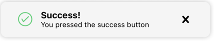
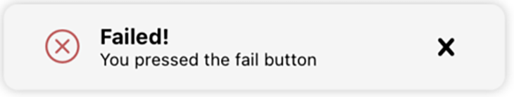
See the screenshots below.
<Button
    title="Success Message"
    onPress={() => {
      setStatus("success");
      popIn();
    }}
    style={{ marginTop: 30 }}
></Button>

<Button
    title="Fail Message"
    onPress={() => {
      setStatus("fail");
      popIn();
    }}
      style={{ marginTop: 30 }}
></Button>
If you take a look at the code snippet above, you’ll notice that the buttons look quite similar. Only the titles and the status in lines 4 and 13 are different. When you tap the first button with the title “Success Message”, the status will be set to Success; otherwise, it will be set to Fail.
We’ll come back to this status in a moment, when we’re coding the toast message. Before we get into that, we need to call the popIn() function in both cases.
And now, let’s move on to the interesting part of the UI: the actual toast message!
<Animated.View
    style={[
      styles.toastContainer,
      {
        transform: [{ translateY: popAnim }],
      },
    ]}
  >
    <View style={styles.toastRow}>
      <AntDesign
        name={status === "success" ? "checkcircleo" : "closecircleo"}
        size={24}
        color={status === "success" ? successColor : failColor}
      />

      <View style={styles.toastText}>
        <Text style={{ fontWeight: "bold", fontSize: 15 }}>
          {status === "success" ? successHeader : failHeader}
        </Text>
        <Text style={{ fontSize: 12 }}>
          {status === "success" ? successMessage : failMessage}
        </Text>
      </View>

      <TouchableOpacity onPress={instantPopOut}>
        <Entypo name="cross" size={24} color="black" />
      </TouchableOpacity>

    </View>
</Animated.View>
In the code snippet above, you can see that the entire toast message is wrapped in an Animated.View. Try to think of this as an ordinary View element, except that you can run animations on it.
In lines 2-7, you can see that I assigned an array of styles to this Animated.View. The first one, styles.toastContainer, is an ordinary React Native stylesheet reference.
The second one, though — { transform: [{ translateY: popAnim }] } — is the interesting part here. Transforms accept tons of transformation objects like rotate, scale, or translate (like in this case).
More specifically, we want to transform this Animated.View along the y-axis and use popAnim as the value in this transformation. Remember that this is the Animated.Value, which will change according to the rules in the popIn and popOut functions.
In the lines 9-29, we define the actual toast message. The first component of this toast message is an AntDesign icon, which will be rendered conditionally depending on the value of our state success.
The following line will achieve that if the status is set to success, and a check icon will be rendered:
name={status === "success" ? "checkcircleo" : "closecircleo"}
Otherwise, a cross icon is rendered. The same logic is applied to the color of the icons (line 13), the header text of the toast message (line 18) and the actual message inside this container (line 21). The constants, which we are referring to in these lines, can be found in the snippet below.
const successColor = "#6dcf81";
const successHeader = "Success!";
const successMessage = "You pressed the success button";

const failColor = "#bf6060";
const failHeader = "Failed!";
const failMessage = "You pressed the fail button";
The only part here, which always will be rendered the same way, is the close icon. By clicking this icon, the code onPress={instantPopOut} will ensure that the instantPop function will be triggered.
And that’s it! All the code snippets can be summarized as following:
// Home.js
import React, { useRef, useState } from "react";
import {
  StyleSheet,
  Text,
  View,
  Animated,
  Button,
  TouchableOpacity,
  Dimensions,
} from "react-native";
import { AntDesign, Entypo } from "@expo/vector-icons";

const Home = () => {
  const windowHeight = Dimensions.get("window").height;
  const [status, setStatus] = useState(null);
  const popAnim = useRef(new Animated.Value(windowHeight * -1)).current;
  const successColor = "#6dcf81";
  const successHeader = "Success!";
  const successMessage = "You pressed the success button";
  const failColor = "#bf6060";
  const failHeader = "Failed!";
  const failMessage = "You pressed the fail button";

  const popIn = () => {
    Animated.timing(popAnim, {
      toValue: windowHeight * 0.35 * -1,
      duration: 300,
      useNativeDriver: true,
    }).start(popOut());
  };

  const popOut = () => {
    setTimeout(() => {
      Animated.timing(popAnim, {
        toValue: windowHeight * -1,
        duration: 300,
        useNativeDriver: true,
      }).start();
    }, 10000);
  };

  const instantPopOut = () => {
    Animated.timing(popAnim, {
      toValue: windowHeight * -1,
      duration: 150,
      useNativeDriver: true,
    }).start();
  };

  return (
    <View>
      <Animated.View
        style={[
          styles.toastContainer,
          {
            transform: [{ translateY: popAnim }],
          },
        ]}
      >
        <View style={styles.toastRow}>
          <AntDesign
            name={status === "success" ? "checkcircleo" : "closecircleo"}
            size={24}
            color={status === "success" ? successColor : failColor}
          />
          <View style={styles.toastText}>
            <Text style={{ fontWeight: "bold", fontSize: 15 }}>
              {status === "success" ? successHeader : failHeader}
            </Text>
            <Text style={{ fontSize: 12 }}>
              {status === "success" ? successMessage : failMessage}
            </Text>
          </View>
          <TouchableOpacity onPress={instantPopOut}>
            <Entypo name="cross" size={24} color="black" />
          </TouchableOpacity>
        </View>
      </Animated.View>

      <Button
        title="Success Message"
        onPress={() => {
          setStatus("success");
          popIn();
        }}
        style={{ marginTop: 30 }}
      ></Button>

      <Button
        title="Fail Message"
        onPress={() => {
          setStatus("fail");
          popIn();
        }}
        style={{ marginTop: 30 }}
      ></Button>

    </View>
  );
};
export default Home;
const styles = StyleSheet.create({
  toastContainer: {
    height: 60,
    width: 350,
    backgroundColor: "#f5f5f5",
    justifyContent: "center",
    alignItems: "center",
    borderRadius: 10,
    shadowColor: "#000",
    shadowOffset: {
      width: 0,
      height: 2,
    },
    shadowOpacity: 0.25,
    shadowRadius: 3.84,
    elevation: 5,
  },
  toastRow: {
    width: "90%",
    flexDirection: "row",
    alignItems: "center",
    justifyContent: "space-evenly",
  },
  toastText: {
    width: "70%",
    padding: 2,
  },
});
The last thing, you will need to do is to import the Home.js file to the App.js file like in the code snippet below:
// App.js
import React from 'react';
import { StyleSheet, Text, View, SafeAreaView } from 'react-native';
import Home from './screens/Home';

export default function App() {
  return (
    <SafeAreaView style={styles.container}>
      <Home />
    </SafeAreaView>
  );
}

const styles = StyleSheet.create({
  container: {
    flex: 1,
    backgroundColor: '#fff',
    alignItems: 'center',
    justifyContent: 'center',
  },
});
In this blog post, we created a toast message from scratch. We didn’t use any external libraries — the only thing we needed was the React Native Animated library. Additionally, the toast message was rendered conditionally depending on whether we want to see a success or fail message.
The source code for the whole project can be found on my GitHub. I hope you found this tutorial helpful!

LogRocket's Galileo AI watches sessions for you and and surfaces the technical and usability issues holding back your React Native apps.
LogRocket also helps you increase conversion rates and product usage by showing you exactly how users are interacting with your app. LogRocket's product analytics features surface the reasons why users don't complete a particular flow or don't adopt a new feature.
Start proactively monitoring your React Native apps — try LogRocket for free.

Learn how to protect full-stack projects from NPM supply chain attacks with a practical security checklist.

Explore 15 essential MCP servers for web developers to enhance AI workflows with tools, data, and automation.

Learn how contrast-color() automatically picks accessible text colors using native CSS, without JavaScript.

Learn how to build a harness-style AI workflow using Claude Code with specialized Dev, QE, and Ops subagents, gated handoffs, MCP telemetry, and LEARNING.md.
Hey there, want to help make our blog better?
Join LogRocket’s Content Advisory Board. You’ll help inform the type of content we create and get access to exclusive meetups, social accreditation, and swag.
Sign up now

 Learn more →
