
In this tutorial, we will cover the basics of creating and using ListView in Flutter.

The Replay is a weekly newsletter for dev and engineering leaders.
Delivered once a week, it's your curated guide to the most important conversations around frontend dev, emerging AI tools, and the state of modern software.
ListView in FlutterFlutter is a mobile UI toolkit and open-source SDK by Google. It is written in Dart, a programming language also developed by Google.
Flutter is used to develop mobile web apps, like native apps for iOS and Android or desktop apps for Linux, macOS, Windows, and ChromeOS. It is a complete SDK, meaning it provides devs everything they need to build applications: a rendering engine, UI components, testing frameworks, tooling, a router, and more.
What makes Flutter special is the ability to “write once, deploy anywhere.” It is also very easy to get acquainted with, regardless of your background in mobile, desktop, or web development.
Flutter also has tons of control and flexibility. For example, an Android app written in Flutter can be compiled to build a desktop or an iOS app; you don’t have to write a new project from scratch when you want to build your app for different devices. This functionality helps companies as well, because there is no need for separate teams (e.g., web, iOS, Android) on a single project because one project will compile across any major device.
I love using Flutter and can personally tell you the framework is awesome. A lot can be accomplished with just a few lines of code, and the routing system, security, tooling, and testing have been abstracted away by the framework, making my work very easy.
ListView?ListView is used to group several items in an array and display them in a scrollable list. The list can be scrolled vertically, horizontally, or displayed in a grid:
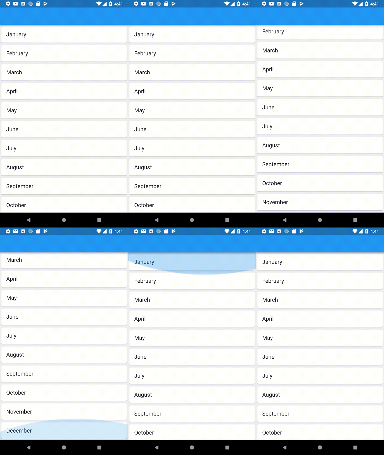
ListViews are common in UI frameworks, and are one of the most popular UI widgets in the world. In fact, any mobile app or project must use ListView in some capacity. ListViews are used in Android, iOS, web apps, Django, and other frameworks, where they perform the same work but sometimes under a different name.
ListView has recently become very sophisticated. For example, Android has RecyclerView that extends from the basic ListView widget with more complex and powerful controls and features.
ListView can be optimized using many different tricks, and customized to suit your project’s specific needs. We will walk through these options in the sections below.
To begin, we need to scaffold a Flutter app. These are the initial steps on how to set up flutter and get it working on macOS. You can follow Flutter’s installation guide for other systems here.
The first step is to install Android Studio or Xcode for the platform for which you want to develop. In this tutorial, I will be developing for Android. Then, follow these steps:
$ cd ~/desiredfolder
$ unzip ~/Downloads/fluttermacos2.0.2-stable.zip
$ export PATH="$PATH:DIRTOYOUR_FLUTTER/flutter/bin"
flutter doctor in your terminalThis command will download the Flutter SDK and run diagnostics to determine if everything is good to go. At the end of the run, you may have this result:
[!] Android Studio (version 4.1)
    ✗ Flutter plugin not installed; this adds Flutter specific functionality.
    ✗ Dart plugin not installed; this adds Dart specific functionality.
[!] Connected device
    ! No devices available
! Doctor found issues in 4 categories.
If you don’t have Flutter and Dart plugins in your Android Studio, all you need to do is:
Now, we need to run the Android Virtual Manager. To do that click on the AVD Manager icon in the top-right section of Android Studio. A dialog will appear with a default AVD device. On the Actions tab, click on the run icon.
Now, go back to your terminal, and scaffold a Flutter project:
flutter create myapp
This will create a Flutter project with folder name myapp. I suggest you open the folder with VS Code (as long as you install Dart and Flutter plugins as well) so developing in it becomes easier.
Run the Flutter project:
flutter run
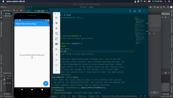
You will see the Flutter being run on the AVD:
We will work on the main.dart file in lib folder:
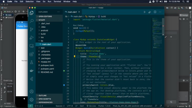
In our main.dart, we see this:
void main() {
  runApp(MyApp());
}
class MyApp extends StatelessWidget {
  // This widget is the root of your application.
  @override
  Widget build(BuildContext context) {
    return MaterialApp(
      title: 'Flutter Demo',
      theme: ThemeData(
        primarySwatch: Colors.blue,
        visualDensity: VisualDensity.adaptivePlatformDensity,
      ),
      home: MyHomePage(title: 'Flutter Demo Home Page'),
    );
  }
}
The main function is the entry point of our app. Note that it calls the runApp passing in the MyApp instance, which is a widget.
Looking at MyApp, you can see it’s a stateless widget (meaning it holds no local state). Everything in Flutter is a widget, and all widgets must extend the StatelessWidget or StatefulWidget, and must override or implement the build method. The build method must return a widget, which is what will be displayed on the screen.
Now, any widget being passed in the runApp call becomes the root widget.
Here, the MyApp widget returns a MaterialApp widget, which wraps your app to pass Material-Design-specific functionality to all the widgets in the app. The MaterialApp has configurations to be passed in. The title sets the title in the app bar, the theme sets the theme of the display, and the home sets the widget that will be rendered on screen.
We will remove the MyHomePage(...) and replace it with the ListView widget that we will be creating:
class ListViewHome extends StatelessWidget {
  @override
  Widget build(BuildContext context) {
    return ListView(
      padding: const EdgeInsets.all(8),
      children: <Widget>[
        Text('List 1'),
        Text('List 2'),
        Text('List 3'),
      ],
    );
  }
}
Here, we have a ListViewHome widget. Note that in the build method we return a ListView widget; this widget is built-in in Flutter, and will render the array data passed to it serially.
Looking at ListView, see that we called it with padding and children props. The padding sets the padding of the element on its container. children is an array, which contains widgets that will be rendered by ListView.
Here, we are rendering texts. We created Text widgets to pass text we want rendered to them. So, the ListView will render three Text widgets with following text: “List 1,””List 2,” and “List 3.”
Now, we will remove MyHomePage(title: 'Flutter Demo Home Page') from MyApp and add ListViewHome():
void main() {
  runApp(MyApp());
}
class MyApp extends StatelessWidget {
  // This widget is the root of your application.
  @override
  Widget build(BuildContext context) {
    return MaterialApp(
      title: 'Flutter Demo',
      theme: ThemeData(
        primarySwatch: Colors.blue,
        visualDensity: VisualDensity.adaptivePlatformDensity,
      ),
      home: ListViewHome()
    );
  }
}
Save your file, and the Flutter server will reload. Go to your AVD to see the outcome:
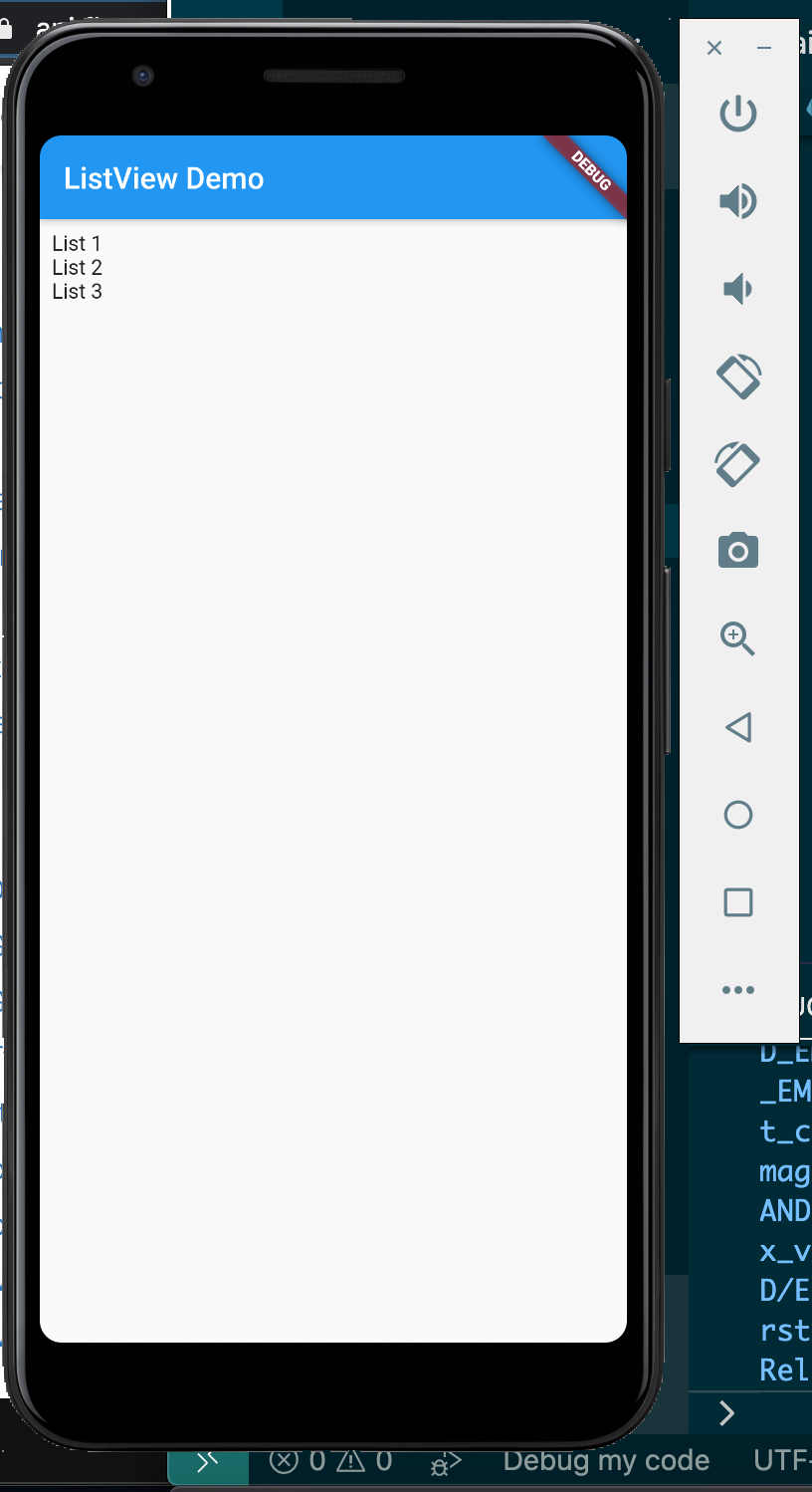
Note how our list of text is rendered. But this is not very appealing, let’s make it more stylish:
class ListViewHome extends StatelessWidget {
  @override
  Widget build(BuildContext context) {
    return ListView(
      padding: const EdgeInsets.all(8),
      children: <Widget>[
        ListTile( title: Text('List 1')),
        ListTile( title: Text('List 2')),
        ListTile( title: Text('List 3')),
      ],
    );
  }
}
Here, we used ListTile widget from Flutter. Let’s see the outcome:

The ListTile widget makes the rendering more pronounced and padded. The text is separated from itself to be more readable and stylish. ListTile is useful for making something like a settings menu page, or for text lists that do not change.
We can also render icons, cards, images, and custom widgets with ListView.
ListViewTo use icons in ListView we can use the Icon widget by replacing the Text widget:
class ListViewHome extends StatelessWidget {
  @override
  Widget build(BuildContext context) {
    return ListView(
      padding: const EdgeInsets.all(8),
      children: <Widget>[
        ListTile( title: Icon(Icons.battery_full)),
        ListTile( title: Icon(Icons.anchor)),
        ListTile( title: Icon(Icons.access_alarm)),
        ListTile(title: Icon(Icons.ballot))
      ],
    );
  }
}
The Icon widget renders icons from the Material UI. The Icons class is used to select icons by their name:
![]()
Note how the icons are rendered on the ListView. Let’s display text alongside icons:
class ListViewHome extends StatelessWidget {
  @override
  Widget build(BuildContext context) {
    return ListView(
      padding: const EdgeInsets.all(8),
      children: <Widget>[
        ListTile( title: Text("Battery Full"), leading: Icon(Icons.battery_full)),
        ListTile( title: Text("Anchor"), leading: Icon(Icons.anchor)),
        ListTile( title: Text("Alarm"), leading: Icon(Icons.access_alarm)),
        ListTile( title: Text("Ballot"), leading: Icon(Icons.ballot))
      ],
    );
  }
}
We use the leading prop to make the icon the beginning of each ListTile:
![]()
Icons can also be added to the right of the ListTile:
class ListViewHome extends StatelessWidget {
  @override
  Widget build(BuildContext context) {
    return ListView(
      padding: const EdgeInsets.all(8),
      children: <Widget>[
        ListTile( title: Text("Battery Full"), leading: Icon(Icons.battery_full), trailing: Icon(Icons.star)),
        ListTile( title: Text("Anchor"), leading: Icon(Icons.anchor), trailing: Icon(Icons.star)),
        ListTile( title: Text("Alarm"), leading: Icon(Icons.access_alarm), trailing: Icon(Icons.star)),
        ListTile( title: Text("Ballot"), leading: Icon(Icons.ballot), trailing: Icon(Icons.star))
      ],
    );
  }
}
The trailing prop is used to set widgets to the far right of the ListTile:
![]()
We can add a subtitle in ListView using the subtitle prop:
class ListViewHome extends StatelessWidget {
  @override
  Widget build(BuildContext context) {
    return ListView(
      padding: const EdgeInsets.all(8),
      children: <Widget>[
        ListTile( title: Text("Battery Full"),subtitle: Text("The battery is full."),leading: Icon(Icons.battery_full),trailing: Icon(Icons.star)),
        ListTile( title: Text("Anchor"),subtitle: Text("Lower the anchor."), leading: Icon(Icons.anchor), trailing: Icon(Icons.star)),
        ListTile( title: Text("Alarm"),subtitle: Text("This is the time."), leading: Icon(Icons.access_alarm), trailing: Icon(Icons.star)),
        ListTile( title: Text("Ballot"),subtitle: Text("Cast your vote."), leading: Icon(Icons.ballot), trailing: Icon(Icons.star))
      ],
    );
  }
}
The subtitle text appears below the title text, with a softer color:

ListViewIn Flutter, we can use AssetImage and NetworkImage to render images.
ListView is normally used to display avatars beside each item. Flutter has a CircleAvatar widget to display a user’s profile image, or initials when absent.
Let’s add an image alongside the items in ListView:
class ListViewHome extends StatelessWidget {
  @override
  Widget build(BuildContext context) {
    return ListView(
      padding: const EdgeInsets.all(8),
      children: <Widget>[
        ListTile(
          title: Text("Battery Full"),
          subtitle: Text("The battery is full."),
          leading: CircleAvatar(backgroundImage: AssetImage("assets/js.png")),
          trailing: Icon(Icons.star)),
        ListTile( title: Text("Anchor"),subtitle: Text("Lower the anchor."), leading: CircleAvatar(backgroundImage: AssetImage("assets/react.png")), trailing: Icon(Icons.star)),
        ListTile( title: Text("Alarm"),subtitle: Text("This is the time."), leading:  CircleAvatar(backgroundImage: AssetImage("assets/js.png")), trailing: Icon(Icons.star)),
        ListTile( title: Text("Ballot"),subtitle: Text("Cast your vote."), leading:  CircleAvatar(backgroundImage: AssetImage("assets/react.png")), trailing: Icon(Icons.star))
      ],
    );
  }
}
In the leading prop we add the CircleAvatar widget, so the ListView starts with the image. The backgroundImage prop in the CircleAvatar sets the background image of the widget.
We used the AssetImage widget to load images from the local assets folder. But before we load images from the local directory, we need to add some sections to pubspec.yaml file:
assets:
  - assets/
Now, save your files and the AVD will render the images in a list like so:
![]()
This is ListView rendering images in circular form:
CircleAvatar(
    backgroundImage: AssetImage("assets/react.png"),child: Text('BA'),
)
The child prop value “BA” is displayed when the image is not loaded. You can learn more about CircleAvatar here.
We can load our images from the internet rather than from our local directory using the NetworkImage widget instead of the AssetImage:
class ListViewHome extends StatelessWidget {
  @override
  Widget build(BuildContext context) {
    return ListView(
      padding: const EdgeInsets.all(8),
      children: <Widget>[
        ListTile(
          title: Text("Battery Full"),
          subtitle: Text("The battery is full."),
          leading: CircleAvatar(backgroundImage: NetworkImage("https://images.unsplash.com/photo-1547721064-da6cfb341d50")),
          trailing: Icon(Icons.star)),
        ListTile( title: Text("Anchor"),subtitle: Text("Lower the anchor."), leading: CircleAvatar(backgroundImage: NetworkImage("https://miro.medium.com/fit/c/64/64/1*WSdkXxKtD8m54-1xp75cqQ.jpeg")), trailing: Icon(Icons.star)),
        ListTile( title: Text("Alarm"),subtitle: Text("This is the time."), leading:  CircleAvatar(backgroundImage: NetworkImage("https://miro.medium.com/fit/c/64/64/1*WSdkXxKtD8m54-1xp75cqQ.jpeg")), trailing: Icon(Icons.star)),
        ListTile( title: Text("Ballot"),subtitle: Text("Cast your vote."), leading:  CircleAvatar(backgroundImage: NetworkImage("https://miro.medium.com/fit/c/64/64/1*WSdkXxKtD8m54-1xp75cqQ.jpeg")), trailing: Icon(Icons.star))
      ],
    );
  }
}
Note how we replaced AssetImage with NetworkImage. The NetworkImage takes the URL of the image in its constructor, which makes the NetworkImage widget pull the image from the internet and render it.
For the HTTP request to work we need to add permission <uses-permission android:name="android.permission.INTERNET" /> to our AndroidManifest.xml file:
<manifest xmlns:android="http://schemas.android.com/apk/res/android"
    package="com.example.myapp">
<uses-permission android:name="android.permission.INTERNET" />
    <application ...>
    ...
    </application>
</manifest>
Reload the AVD, stop the Flutter, and start it up again.
We will see the image is fetched and rendered:
![]()
ListViewCards are used to display info in a concise and professional manner alongside a list. You can learn more about cards here.
To use Card in Flutter, we will use the Card widget.
The Card widget has a child prop that lays out a child widget, like this:
Card(child: Text("A card."))
The Card widget renders a Text widget with the text “A card.”
Let’s apply it to ListView so we can render Cards in it:
class ListViewHome extends StatelessWidget {
  @override
  Widget build(BuildContext context) {
    return ListView(
      padding: const EdgeInsets.all(8),
      children: <Widget>[
        Card(child:ListTile(
          title: Text("Battery Full"),
          subtitle: Text("The battery is full."),
          leading: CircleAvatar(backgroundImage: NetworkImage("https://images.unsplash.com/photo-1547721064-da6cfb341d50")),
          trailing: Icon(Icons.star))),
        Card(child:ListTile( title: Text("Anchor"),subtitle: Text("Lower the anchor."), leading: CircleAvatar(backgroundImage: NetworkImage("https://miro.medium.com/fit/c/64/64/1*WSdkXxKtD8m54-1xp75cqQ.jpeg")), trailing: Icon(Icons.star))),
        Card(child:ListTile( title: Text("Alarm"),subtitle: Text("This is the time."), leading:  CircleAvatar(backgroundImage: NetworkImage("https://miro.medium.com/fit/c/64/64/1*WSdkXxKtD8m54-1xp75cqQ.jpeg")), trailing: Icon(Icons.star))),
        Card(child:ListTile( title: Text("Ballot"),subtitle: Text("Cast your vote."), leading:  CircleAvatar(backgroundImage: NetworkImage("https://miro.medium.com/fit/c/64/64/1*WSdkXxKtD8m54-1xp75cqQ.jpeg")), trailing: Icon(Icons.star)))
      ],
    );
  }
}
I enclosed the ListTile widget inside the Card widget. It will render the following:
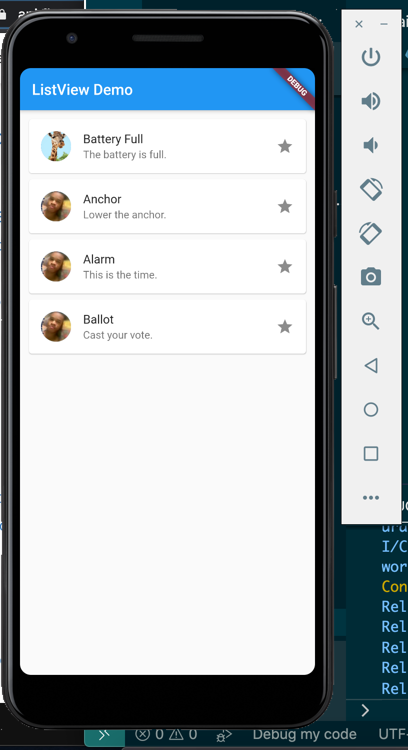
We can use the ListView builder method to achieve the above with a more readable and maintainable approach:
class ListViewHome extends StatelessWidget {
  final titles = ["List 1", "List 2", "List 3"];
  final subtitles = [
    "Here is list 1 subtitle",
    "Here is list 2 subtitle",
    "Here is list 3 subtitle"
  ];
  final icons = [Icons.ac_unit, Icons.access_alarm, Icons.access_time];
  @override
  Widget build(BuildContext context) {
    return ListView.builder(
        itemCount: titles.length,
        itemBuilder: (context, index) {
          return Card(
              child: ListTile(
                  title: Text(titles[index]),
                  subtitle: Text(subtitles[index]),
                  leading: CircleAvatar(
                      backgroundImage: NetworkImage(
                          "https://images.unsplash.com/photo-1547721064-da6cfb341d50")),
                  trailing: Icon(icons[index])));
        });
  }
}
ListView uses the builder method to build the list. I set the template of each list in the itemBuilder prop, and the number of the list in the itemCount prop.
The itemBuilder function returns the template. Note how it returns a Card widget with the ListTile, the same as our above example. See that the title, subtitle, and icon content is picked from the titles, subtitles, icons, and arrays respectively:

Using itemBuilder is better because it makes the ListView creation very flexible and dynamic.
We can place a line between list items using the ListView.separated() method:
class ListViewHome extends StatelessWidget {
  final titles = ["List 1", "List 2", "List 3"];
  final subtitles = [
    "Here is list 1 subtitle",
    "Here is list 2 subtitle",
    "Here is list 3 subtitle"
  ];
  final icons = [Icons.ac_unit, Icons.access_alarm, Icons.access_time];
  @override
  Widget build(BuildContext context) {
    return ListView.separated(
      separatorBuilder: (BuildContext context, int index) => const Divider(),
        itemCount: titles.length,
        itemBuilder: (context, index) {
          return Card(
              child: ListTile(
                  title: Text(titles[index]),
                  subtitle: Text(subtitles[index]),
                  leading: CircleAvatar(
                      backgroundImage: NetworkImage(
                          "https://images.unsplash.com/photo-1547721064-da6cfb341d50")),
                  trailing: Icon(icons[index])));
        });
  }
}
The only difference between our previous example and this is the separated() method and the separatorBuilder prop.
It will turn out like this:
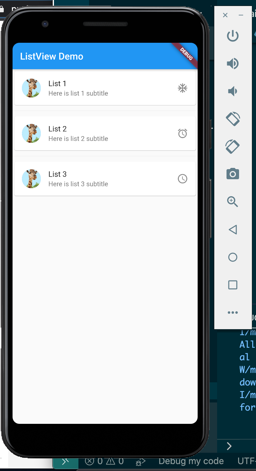
ListViewListView allows us to style and customize our list items to our taste.
To do so, we will discard ListTile. There are many widgets we can use to create our custom list items, but the most popular is the Container widget:
class ListViewHome extends StatelessWidget {
  @override
  Widget build(BuildContext context) {
    return ListView(
      padding: const EdgeInsets.all(8),
      children: <Widget>[
        Container(
          height: 50,
          color: Colors.orange[600],
          child: const Center(child: Text('List 1')),
        ),
        Container(
          height: 50,
          color: Colors.red[500],
          child: const Center(child: Text('List 2')),
        ),
        Container(
          height: 50,
          color: Colors.blue[500],
          child: const Center(child: Text('List 3')),
        ),
      ],
    );
  }
}
We use Container to render custom styles, just like div in HTML.
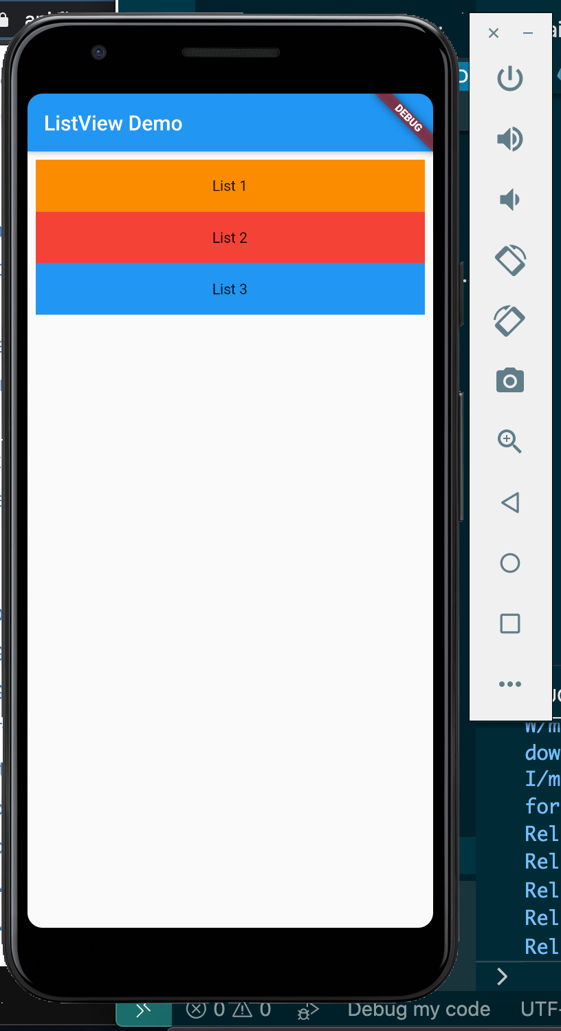
In the above code, we passed in an array of four Containers to ListView. Each item in the array is a Container widget.
In each Container widget, we use the height property to set the height of the container and the color prop to set the background color. The child prop contains a single widget that will be rendered by the container.
In the child prop, we are using the Center widget to center the content in the middle of the container, while the child prop in the Center widget renders text.
See the result:
ListViewWe can add a touch event to the items in our ListView. The touch event is attached to a touch handler, so when an item in the ListView is touched or pressed, the handler is executed. This is similar to the events we register in HTML/JS apps:
class ListViewHome extends StatelessWidget {
  final titles = ["List 1", "List 2", "List 3"];
  final subtitles = [
    "Here is list 1 subtitle",
    "Here is list 2 subtitle",
    "Here is list 3 subtitle"
  ];
  final icons = [Icons.ac_unit, Icons.access_alarm, Icons.access_time];
  @override
  Widget build(BuildContext context) {
    return ListView.builder(
        itemCount: titles.length,
        itemBuilder: (context, index) {
          return Card(
              child: ListTile(
                  onTap: () {
                    Scaffold.of(context).showSnackBar(SnackBar(
                      content: Text(titles[index] + ' pressed!'),
                    ));
                  },
                  title: Text(titles[index]),
                  subtitle: Text(subtitles[index]),
                  leading: CircleAvatar(
                      backgroundImage: NetworkImage(
                          "https://images.unsplash.com/photo-1547721064-da6cfb341d50")),
                  trailing: Icon(icons[index])));
        });
  }
}
Note that we added an onTap function prop to the ListTile with a function handler attached to it. This listens for the touch event in the ListView item, so whenever the list item is touched or pressed the function handler is executed. This displays a Snackbar when run, showing the “title” of the list item touched:
We can also add or remove items from ListView. To do that, we have to make our widget a stateful widget.
We can make ListViewHome a state widget by extending the class State.
A stateful widget will extend StatefulWidget class, and in its createState method call ListViewHome:
class ListViewHomeLayout extends StatefulWidget {
@override
      ListViewHome createState() {
        return new ListViewHome();
      }
}
class ListViewHome extends State<ListViewHomeLayout> {
  List<String> titles = ["List 1", "List 2", "List 3"];
  final subtitles = [
    "Here is list 1 subtitle",
    "Here is list 2 subtitle",
    "Here is list 3 subtitle"
  ];
  final icons = [Icons.ac_unit, Icons.access_alarm, Icons.access_time];
  @override
  Widget build(BuildContext context) {
    return ListView.builder(
        itemCount: titles.length,
        itemBuilder: (context, index) {
          return Card(
              child: ListTile(
                  onTap: () {
                  setState(() {
                    titles.add('List' + (titles.length+1).toString());
                    subtitles.add('Here is list' + (titles.length+1).toString() + ' subtitle');
                    icons.add(Icons.zoom_out_sharp);
                  });
                    Scaffold.of(context).showSnackBar(SnackBar(
                      content: Text(titles[index] + ' pressed!'),
                    ));
                  },
                  title: Text(titles[index]),
                  subtitle: Text(subtitles[index]),
                  leading: CircleAvatar(
                      backgroundImage: NetworkImage(
                          "https://images.unsplash.com/photo-1547721064-da6cfb341d50")),
                  trailing: Icon(icons[index])));
        });
  }
}
Now, we will change the body prop in MyApp to render ListViewHomeLayout():
body: ListViewHomeLayout())
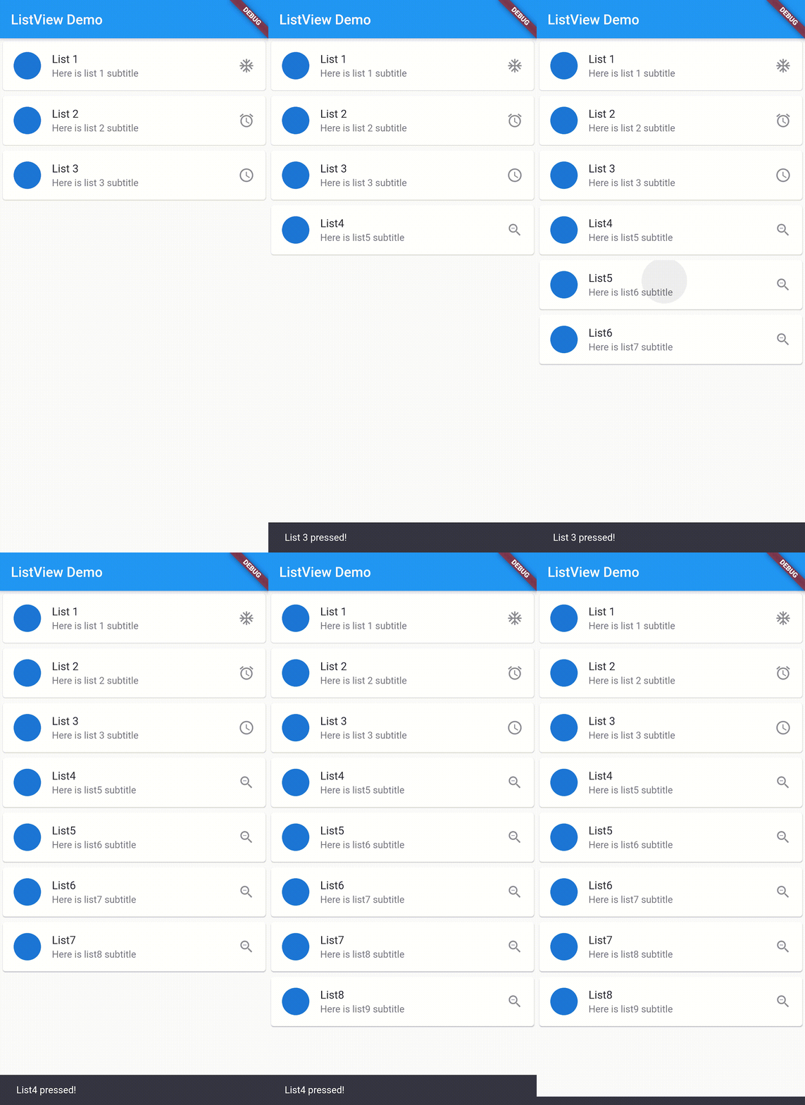
In the ListViewHome, look inside the onTap handler. We can use the setState method to add items to the titles, subtitles, and icons arrays. This will cause the ListView to re-render and the UI is updated with the latest item added:
We covered a lot on ListViews here!
We began with Flutter, how it works and how useful it is. Then, we covered how to download the Flutter SDK, export it, and configure your Android Studio for Flutter development. Next, we saw how to scaffold and run Flutter.
We then learned how to create a ListView, including different methods of creating instances of ListView statically and dynamically. We learned how to add separate lines in each item, how to register touch events in the list items, and how to add items to the ListView using Stateful widgets.
I hope you enjoyed reading this article as much as I did writing it, and learned some useful tricks to using ListView in your next project.
Flutter in Action — Eric Windmill
Install LogRocket via npm or script tag. LogRocket.init() must be called client-side, not
server-side
$ npm i --save logrocket

// Code:

import LogRocket from 'logrocket';
LogRocket.init('app/id');
// Add to your HTML:

<script src="https://cdn.lr-ingest.com/LogRocket.min.js"></script>
<script>window.LogRocket && window.LogRocket.init('app/id');</script>

Learn how Vite+ unifies Vite, Vitest, Oxlint, Oxfmt, Rolldown, and Node.js management in one CLI.

AI companies are buying developer tools as coding agents turn runtimes, package managers, and linters into strategic infrastructure.

Learn how AI-assisted development governance uses rules, agents, hooks, and protocols to help AI coding tools produce safer, more consistent code.

A step-by-step guide to building your first MCP server using Node.js, covering core concepts, tool design, and upgrading from file storage to MySQL.
Would you be interested in joining LogRocket's developer community?
Join LogRocket’s Content Advisory Board. You’ll help inform the type of content we create and get access to exclusive meetups, social accreditation, and swag.
Sign up now