The COLRv1 font format is a new and exciting development in digital typography. Chrome, Edge, and Firefox now support it without requiring you to enable experimental features. The fonts encoded under COLRv1 are generally called “color fonts” because of their coloring capabilities.

CSS can bring color to web fonts, but color fonts offer more than just colored text. This article delves into how color fonts operate and how they can be utilized and customized in web design. We will cover:
The Replay is a weekly newsletter for dev and engineering leaders.
Delivered once a week, it's your curated guide to the most important conversations around frontend dev, emerging AI tools, and the state of modern software.
Color fonts are web fonts that come with integrated, customizable color palettes. COLRv1 is a format for vector fonts that resulted from the collaboration between Google Fonts and Blink, with the support of Microsoft and other organizations.
Although other font formats exist for creating color fonts, such as SVG, CBDT/CBLC, and SBIX, each with unique encoding methods and capabilities, COLRv1 is considered the contemporary and most efficient method for developing color fonts.
The COLRv1 format presents an improvement over its predecessor, COLRv0. The COLRv0 format’s primary limitation was due to its reliance on bitmap technology, which resulted in large file sizes. Jump ahead to read more about COLRv1 and COLRv0.
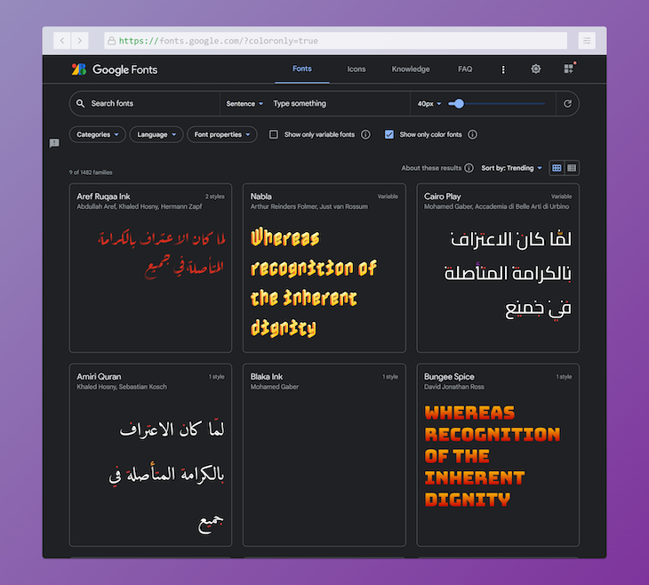
Color fonts are a recent innovation in typography and are not yet widely available in font libraries. The Google Fonts library, however, offers a collection of color fonts that have their own built-in color palettes, independent of the color property in CSS:

The Bungee Google Font showcases a signboard-style effect and comes with a single color palette, serving as a simple example of what a color font appears to be.
Check the “Show only color fonts” checkbox for quicker access to the color fonts available on the Google Fonts website or check out this list of all the COLRv1-base Google Fonts.
Another example of where COLRv1 is currently in use is in material two-tone icons. Two-tone icons use an additional lighter or darker variation of the primary color to draw more attention to important symbols. This is another example of the capabilities of color fonts:
![]()
COLRv0 used bitmap techniques like CBDT and CBLC for font glyph representation, which resulted in blurry images when scaled or in large file sizes.
While the OpenType-SVG font format does enable you to encode color vector graphics as SVG artwork, it is not space-efficient. Additionally, the complexity of working with this font format makes it difficult to implement or integrate with existing font concepts.
The COLRv1 format solves the limitations of COLRv0 and OpenType-SVG and enhances overall font quality through vector-based rasterization of glyphs. This algorithm uses a directed acyclic graph of paint operations and allows font designers to efficiently reuse glyphs, gradients, and shapes, eliminating the need for constant re-encoding.
By discussing the benefits of COLRv1 in the last section, we have essentially outlined its main features as well. Nonetheless, let us delve deeper into its key attributes and how they bring value to both users and font creators.
As discussed earlier, COLRv1 color fonts have inbuilt color palettes that we can adjust to match the desired look and feel of our projects. This gives designers more control over the overall appearance of their text.
COLRv1 uses vector-based rasterization to provide high-quality rendering. This ensures that glyphs retain their sharpness and clarity at all sizes.
Unlike COLRv0 fonts, COLRv1 fonts are more lightweight and do not bloat file sizes. This makes them ideal for use on the web and in other contexts where file size is a concern.
You can easily assign a color font to any element using CSS in the same way as you would with a regular font. By default, the applied font will take on the colors from its default palette. Here’s an example:
h1 {
  font-family: "Bungee", sans-serif;
}
You can see the output of the above code in this CodePen:
See the Pen COLRv1 Fonts w/ CSS: A basic demo by Rahul C (@_rahul)
on CodePen.
If you wish to select a different palette, you can use the @font-palette-values directive and specify the base-palette property. Naming the directive is as simple and straightforward as using CSS custom properties:
@font-palette-values --nabla-2 {
  font-family: "Nabla";
  base-palette: 2;
}
To apply the new palette values, simply add the font-palette property to the element and include the previously defined directive:
h1 {
  font-family: "Nabla", sans-serif;
  font-palette: --nabla-2;
}
The below demonstrates how the default color palette looks alongside a color palette variation of Nabla, another Color Font from the Google Fonts library:
See the Pen COLRv1 Fonts w/ multiple palettes by Rahul C (@_rahul)
on CodePen.
Additionally, you can customize the colors of a given palette using the override-colors property, as demonstrated below:
@font-palette-values --custom-palette {
  font-family: 'Bungee Spice';
  override-colors: 0 #00c, 1 #39c;
}
The demonstration below utilizes the override-colors property to alter the only palette supported by the Bungee Spice Font. Observe the difference between the default palette colors and the modified colors by commenting out the override-colors property:
See the Pen Overriding palette colors in COLRv1 Fonts w/ CSS by Rahul C (@_rahul)
on CodePen.
It is important to note that both the base-palette and override-colors properties can only be used within the @font-palette-values directive.
Implementing color fonts for dark mode is effortless, as the process is similar to that of setting up regular elements. The only distinction is the utilization of color font CSS properties. Here is a brief CSS code snippet to provide a clearer illustration:
@font-palette-values --custom-palette {
  font-family: 'Bungee Spice';
  override-colors: 0 hsl(0 55% 55%), 1 hsl(0 15% 15%);
}

@media (prefers-color-scheme: dark) {
  @font-palette-values --custom-palette {
    font-family: 'Bungee Spice';
    override-colors: 0 hsl(0 65% 65%), 1 hsl(0 85% 85%);
  }
}
You can see the output below:
See the Pen COLRv1 Fonts in Light/Dark Modes by Rahul C (@_rahul)
on CodePen.
If you previously utilized the prefers-color-scheme media feature to automatically switch color schemes based on the device’s color mode, then this process should be relatively straightforward. Verify the above implementation by enabling and disabling the dark mode on your device.
If you choose not to use the prefers-color-scheme feature for automatic dark mode activation, you can specify different color states as demonstrated below and utilize simple JavaScript to toggle between these states upon clicking a button or toggling a checkbox:
@font-palette-values --custom-palette {
  font-family: 'Bungee Spice';
  override-colors: 0 hsl(0 55% 55%), 1 hsl(0 15% 15%);
}

.is-dark {
  @font-palette-values --custom-palette {
    font-family: 'Bungee Spice';
    override-colors: 0 hsl(0 65% 65%), 1 hsl(0 85% 85%);
  }
}
Switching between these states with JavaScript is a relatively simple task that can be considered a minor assignment.
I also have an interactive demo for you that demonstrates how you can use JavaScript to switch color states as the font’s color palette changes. Note that I’ve used a different background for each palette color to make things look more balanced, colorwise.
Try using the range slider in the demo below to see it in action:
See the Pen Interactive demo of COLRv1 Fonts w/ multiple palettes by Rahul C (@_rahul)
on CodePen.
Unfortunately, the availability of color fonts is still limited, and the options available may not align with your user interface requirements.
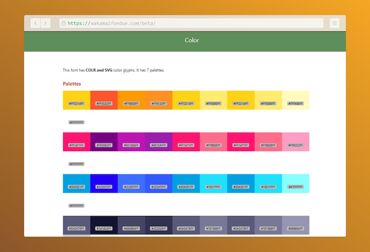
Additionally, the lack of information about available color palettes from various font libraries makes it necessary to invest extra time and effort to find this information, often through the use of tools like Wakamai Fondue:

Currently, it is not possible to theme color fonts with CSS custom properties, as color font properties in CSS do not support custom properties. For example, you can’t follow the approach below to theme custom fonts for now:
:root {
  --font-hue: 180;
}

@font-palette-values --my-color-font-palette {
  font-family: 'My Color Font';
  /*
   * We can't do something like below, as Custom Font CSS
   * properties don't support CSS custom properties as
   * values yet.
   */
  override-colors:
    0 hsl(var(--font-hue) 65% 65%), 1 hsl(var(--font-hue) 85% 85%);
}
Also, popular graphic tools such as Figma and Adobe XD do not offer support for color fonts as of this writing. However, it is anticipated that they will include this functionality in the near future.
Browser support for COLRv1 is on the rise, as previously mentioned, with solid support already present in Chrome, Edge, and Firefox. Additionally, it is expected to be compatible with Safari in the near future.
In this article, we explored the COLRv1 font format, its superiority over COLRv0, its features, and its application on the web for custom CSS typography. Through various demonstrations, we have seen the power of color fonts and their ability to be customized to meet design needs.
Although there are some limitations, the advancement of the format is expected to resolve these issues in the future.
I hope this discussion has provided valuable insights and sparked further interest in color fonts. If you have any further questions, comments, or suggestions, please don’t hesitate to share them with us. Thank you for reading!
As web frontends get increasingly complex, resource-greedy features demand more and more from the browser. If you’re interested in monitoring and tracking client-side CPU usage, memory usage, and more for all of your users in production, try LogRocket.

LogRocket lets you replay user sessions, eliminating guesswork around why bugs happen by showing exactly what users experienced. It captures console logs, errors, network requests, and pixel-perfect DOM recordings — compatible with all frameworks.
LogRocket's Galileo AI watches sessions for you, instantly identifying and explaining user struggles with automated monitoring of your entire product experience.
Modernize how you debug web and mobile apps — start monitoring for free.

Write agent-friendly API documentation with OpenAPI, clear schemas, workflow guidance, and llms.txt for safer AI automation.

Local AI proxy tutorial for detecting, masking, and rehydrating PII before prompts reach cloud LLMs.

Learn how Graph RAG uses connected knowledge structures to improve retrieval beyond simple text similarity.

Learn how sibling-index() enables clean, JavaScript-free stagger animations using native CSS.
Hey there, want to help make our blog better?
Join LogRocket’s Content Advisory Board. You’ll help inform the type of content we create and get access to exclusive meetups, social accreditation, and swag.
Sign up now