The availability of media features that enable developers to check and respect user preferences is an example of just one of the ways that CSS continues to evolve.
The prefers-color-scheme media feature detects dark and light mode preferences, while prefers-reduced-motion checks if the user has animations disabled on their operating system. There are many options like this available, although some have more browser support than others.
In this article, we’ll focus on a media feature that is gaining support, and that I believe has great potential to customize user experience and improve accessibility: prefers-contrast. We’ll investigate how this media feature can be used and discuss why it’s important to provide users with options to control website contrast.
We’ll also discuss the limitations of prefers-contrast and the different contrast considerations you’ll need to keep in mind before implementing it in your project. Finally, we’ll integrate everything with JavaScript to create a contrast theme selector that can be used even if an operating system does not support high- or low-contrast settings.
Jump ahead:
prefers-contrast?
prefers-contrast
prefers-contrast?A media feature is a type of media query that is used to check a device’s specific characteristics and settings. It helps detect the presence or value of many expressions, such as prefers-color-scheme and prefers-reduced-motion. There are many media features, including some very obscure ones; for a full list, check out the list of existing media features on MDN.
The prefers-contrast media feature helps to detect if a user’s operating system has a specific contrast setting that should be reflected on the browser. This media query has four values:
no-preference: checks if there is no preference activemore: checks if the device has an active option that increases contrastless: checks if the device has an active option that reduces contrastcustom: checks if the device has an option that lets the user adjust the colors. This will match with the color pallet the user has chosen for Windows high-contrast mode and the forced-colors: active media featureLet’s investigate these media features by looking at an example. We’ll create a button with a focus style, and add different styles if the user has higher or lower contrast options selected on their device:
:root {
  --button-bg: #693FAB;
  --button-text: whitesmoke;
  --outline-style: solid;
  --font-weight: 400;
}

.button {
  padding: 0.5em 1.5em;
  font-size: 2rem;
  border: 2px solid transparent;
  background-color: var(--button-bg);
  color: var(--button-text);
  font-weight: var(--font-weight);
  font-family: 'Roboto', sans-serif;
}

.button:focus-visible {
  outline: 3px var(--outline-style) var(--button-bg);
  outline-offset: 3px;
}
For a higher contrast setting, we’ll change the background color to a darker purple and increase the font weight to make it easier to read. We’ll accomplish this by changing the custom properties we used on :root:
@media screen and (prefers-contrast: more) {
  :root {
    --button-bg: #472b73;
    --font-weight: 500;
  }
}
For a lower contrast setting, we’ll change the background to a lighter shade of purple, choose a lighter font weight, and change the outline style to dashed:
@media screen and (prefers-contrast: less) {
  :root {
    --button-bg: #835bc2;
    --outline-style: dashed;
    --font-weight: 300;
  }
}
There are a couple of ways to see the changes we implemented. One option is to go to your operating system settings and change a contrast option. We’ll talk more about this option later in the article.
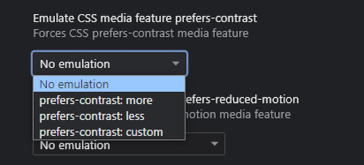
For now, we’ll use Google DevTools to check our changes. Open DevTools and click the Rendering tab. Next, choose one of the following options:
Or
Either of the above options will bring you to the Emulate CSS media feature prefers-contrast menu. From here, you can select the contrast setting you want to emulate:
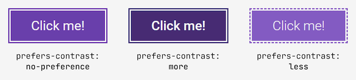
Here’s how our buttons look in different contrast settings:
By now, you should have a better understanding of how the prefers-contrast media feature works. Next, let’s discuss why contrast is important and how to choose an appropriate color combination to create an appropriate contrast theme.
Color contrast, or the difference in the perceived brightness of two colors, is a very important part of design and accessibility. If the contrast between the text and background is too low, it can create serious readability issues.
WCAG 2.0 introduced a contrast guide to help designers and developers determine if a contrast is adequate and make good choices when picking colors. This contrast algorithm creates a value between 1 and 21; the higher the ratio, the greater the contrast between colors.
WCAG also created two success criteria, SC 1.4.3 – Contrast (Minimum) (Level AA) and SC 1.4.6 – Contrast (Enhanced) (Level AAA), to provide designers and developers with a contrast ratio to determine if a color combination is accessible.
According to SC 1.4.3 (AA level projects), the minimum contrast for text is 4.5:1 for regular text and 3:1 for larger text (the equivalent of 18px). SC 1.4.6 (AAA level projects) increases those requirements to 7:1 for regular text and 4.5:1 for larger text.
WCAG provides minimum contrast requirements but doesn’t provide guidance about maximum contrast. To determine a maximum value, we first need to understand why different people have different contrast requirements.
It’s not hard to understand why a contrast ratio below 4.5:1 is problematic: people with low vision may struggle to read a website’s content. It’s also easy to understand why a higher requirement exists on SC 1.4.6: AA contrast requirements are not sufficient for some visual disabilities, so it makes sense to have a success criterion with a higher threshold for people with more severe visual impairments.
You might think that higher contrast is always better, but sometimes too much contrast can lead to poor user experience. Here are a few examples:
A contrast ratio that is too high can be harmful for some users, but there’s no clear consensus as to the maximum contrast ratio that we should consider. Fortunately, I found a good rule of thumb from the wonderful A11y Slack Community.
There’s a GitHub issue in the WCAG’s repository that quotes a Human Factors Design Standard (HFDS) guide that makes the following mention about contrast:
8.2.5.6.12 Character contrast. For optimum legibility, character contrast should be between 6:1 and 10:1. [Source: National Air Traffic Services, 1999]
This maximum contrast ratio of 10:1 is roughly equivalent to a 15:1 ratio for WCAG standards, giving us a good rule of thumb to use for maximum contrast. This guideline is not a definitive answer, but it gives us a good starting point for thinking about a maximum contrast ratio.
To summarize, maintaining a minimum contrast ratio of 4.5:1 and a maximum contrast value of 15:1 is a good starting reference for most projects.
prefers-contrastThe prefers-contrast media feature is useful for implementing high- and low-contrast options for websites, but as of this writing, it is not fully supported. The implementation of the prefers-contrast media feature is quite recent, and some implementation details need to be considered before adding it to production.
According to caniuse.com, all major browsers accept prefers-contrast, but as the implementation is quite recent, we can’t rely on every user having their browser updated to the last version. This is where progressive enhancement comes into play. We can create a high- and low-contrast theme with prefers-contrast. If the user’s browser doesn’t support this media feature, they won’t be able to use it, but they will still see a good base experience.
Let’s circle back to an issue we touched on previously: understanding how operating systems handle contrast settings.
TetraLogical published an article, Meeting WCAG Level AAA, that discusses creating a theme with higher contrast using prefers-contrast. The article demonstrates how to activate a higher contrast with different operating systems. Here’s a summary of the findings:
prefers-contrastprefers-contrast: no-preferenceprefers-contrast: moreThere are two more caveats to keep in mind. First, when you add a rule under the prefers-contrast: more media feature, it will affect Windows high-contrast mode as well.
There’s an important catch here. Under this mode, the options added in prefers-contrast: more will be visible, but Windows high-contrast mode will automatically replace your website colors with a predetermined set of colors. This means that your color changes will not be visible, but changes in any CSS property that is not overwritten by Windows high-contrast mode will still be displayed.
To better understand this, let’s take another look at our button example. When a high-contrast theme is active, the button has a larger font weight:
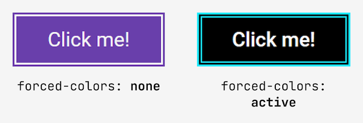
As you can see, in Windows high-contrast mode, the font-weight property we changed under the prefers-contrast: more media feature is visible. This is something we need to be aware of, because many people who use Windows high-contrast mode would also use a high-contrast theme.
We want to be sure that any change that we add under prefers-contrast: more does not affect Windows high-contrast mode. We’ll come back to this later in this article.
The second caveat is that as of this writing, there is no way to set a low-contrast setting in an operating system. But, since low-contrast themes are helpful for multiple disabilities, I think it would be worth creating a solution for this.
What if we could offer a high-and low-contrast theme that respects user settings, but can be used even if their browser or operating system does not support it? This is where we can use JavaScript to enhance the user experience; let’s take a closer look.
Here’s the final version of the contrast theme selector project that we’ll create:
See the Pen
Contrast theme selector by Cristian Diaz(@ItsCrisDiaz)
on CodePen.
To get started, let’s review the requirements of this contrast theme selector:
As a next step, let’s define the project’s base colors. We’ll keep this demo simple by using only three or four colors for background, text, brand color, and accent.
We’ll need to keep our minimum and maximum contrast values in mind. After some testing, I decided to go with the following colors:
| Custom property | prefers-contrast: no-preference |
prefers-contrast: more |
prefers-contrast: less |
|---|---|---|---|
--body-bg |
#e6e6e6 | #f2f2f2 | #e6e6e6 |
--body-text |
#333333 | #1f1f1f | #4d4d4d |
--brand-color |
#961d1d | #5b0b0b | #c12525 |
--brand-accent |
#f5f5f5 | #fcfcfc | #e6e6e6 |
If you want to check on the level of contrast between those colors, check out the EightShapes Contrast Grid. I used this tool to create a view of the different color contrast with all possible combinations.
Here are the combinations we’ll use for this project:
--body-bg with --body-text,--body-bg with --brand-color, and--brand-color with --brand-accentFor the main theme, let’s use a contrast around 10:1 between the text and background. Then, we’ll increase the value to be as close as 15:1 as possible for the high-contrast theme.
For the low-contrast theme, the value will be close to 7:1. To see each contrast combination, check out the Contrast Grid tool for the default theme, high-contrast theme, and low-contrast theme.
Color is not the only tool we can use to affect the perceived contrast, we can also adjust font weight. While WCAG doesn’t mention this, the weight of font bolding can affect perceived lightness. We can use this in tandem with our color changes to provide a better user experience.
Keep in mind that this is just an illustrative example; it has not been tested with real users. Actual design choices should consider real users. When you work on features like this, be sure to test them with people with disabilities and compensate them appropriately.
Here are the font weights I selected for titles, text, and links:
| Custom property | prefers-contrast: no-preference |
prefers-contrast: more |
prefers-contrast: less |
|---|---|---|---|
--title-font-weight |
600 | 800 | 500 |
--body-font-weight |
400 | 500 | 300 |
--link-font-weight |
400 | 600 | 400 |
I decided to use a dashed outline for the low-contrast setting. A dashed outline will theoretically cover less area, and this may provide a better experience for people who use a low-contrast setting.
Now that we’ve defined the colors and font weights, let’s add our custom properties to our project. We’ll start with the default settings:
:root {
  --body-bg: #e6e6e6;
  --body-text: #333333;
  --brand-color: #961d1d;
  --brand-accent: #f5f5f5;
  --title-font-weight: 600;
  --body-font-weight: 400;
  --link-font-weight: var(--body-font-weight);
}
Now, let’s add the high- and low-contrast settings:
@media screen and (prefers-contrast: more) and (forced-colors: none) {
  :root {
    --body-bg: #f2f2f2;
    --body-text: #1f1f1f;
    --brand-color: #5b0b0b;
    --brand-accent: #fcfcfc;
    --title-font-weight: 800;
    --body-font-weight: 500;
    --link-font-weight: 600;
  }
}

@media screen and (prefers-contrast: less) {
  :root {
    --body-bg: #e6e6e6;
    --body-text: #4d4d4d;
    --brand-color: #c12525;
    --brand-accent: #e6e6e6;
    --title-font-weight: 500;
    --body-font-weight: 300;
    --link-font-weight: 400;
    --outline-style: dashed; /* This custom property affects the :focus-visible global rule to create focus styles */
  }
}
In the above prefers-contrast: more example, I added an extra media feature to the mix: forced-colors: none. This will enable us to create a high-contrast theme that does not affect Windows high-contrast mode.
Before we start adding JavaScript to the mix, we’ll need to consider how users will interact with the selector to change the theme. I think the best way to approach the HTML semantics of our selector is to use a radio group.
This allows us to store values to use with JavaScript to change the themes. It also has screen reader and keyboard accessibility baked in by default, and in general, I think it’s a pretty intuitive way for users to display this kind of interaction.
Here are the semantics of the radio group:
<fieldset id="theme-toggler">
  <legend>Contrast</legend>
  <div class="switcher">
    <div class="label-container">
      <input type="radio" id="system" value="system" name="contrast">
      <label for="system">System</label>
    </div>
    <div class="label-container">
      <input type="radio" id="more" value="more" name="contrast">
      <label for="more">More contrast</label>
    </div>
    <div class="label-container">
      <input type="radio" id="less" value="less" name="contrast">
      <label for="less">Less contrast</label>
    </div>
  </div>
</fieldset>
Specifying the same name value for all inputs will ensure that only one of them can be selected. My approach here is to change the custom properties by adding a data attribute to the <html> tag, depending on which input has been selected.
We’ll need to add those changes in our CSS as well, by copying and pasting the rules we added in the (prefers-contrast: more) and (forced-colors: none) and (prefers-contrast: less) media features to the respective attribute selector, like so:
:root[data-contrast-theme="more"] {
  --body-bg: #f2f2f2;
  --body-text: #1f1f1f;
  --brand-color: #5b0b0b;
  --brand-accent: #fcfcfc;
  --title-font-weight: 800;
  --body-font-weight: 500;
  --link-font-weight: 600;
}

:root[data-contrast-theme="less"] {
  --body-bg: #e6e6e6;
  --body-text: #4d4d4d;
  --brand-color: #c12525;
  --brand-accent: #e6e6e6;
  --title-font-weight: 500;
  --body-font-weight: 300;
  --link-font-weight: 400;
  --outline-style: dashed;
}
To handle the theme changes with JavaScript, we first need to store a couple of elements: the <html> tag and the <fieldset> where our inputs are contained. Next, we’ll store an array with all the possible inputs:
const HTML = document.querySelector("html");
const CONTRAST_SELECTOR = document.querySelector("#theme-toggler");

const radioElements = [  ...CONTRAST_SELECTOR.querySelectorAll('input[type="radio"]')
];
My idea is to add the data-contrast-theme attribute to the <html> tag. When the input is checked, the value inside the attribute will be the same as the corresponding input used as the value attribute:
radioElements.forEach((element) =>
  element.addEventListener("change", () => {
    if (element.checked) {
      HTML.setAttribute("data-contrast-theme", element.value);
    }
  })
);
I destructured the radioElements node list so that it is easier to add the change event listener with the forEach method.
With that, our theme selector is completely functional! Now, let’s take a look at how to store the user’s selected value.
localStorage to remember user preferencesWe can use localStorage to remember user preferences. To create this functionality, we first need to come back to our change event listeners and store the value attribute in local storage.
We can accomplish this by adding another line of code to call localStorage and store the value attribute in the storage object using the setItem() method:
radioElements.forEach((element) =>
  element.addEventListener("change", () => {
    if (element.checked) {
      localStorage.setItem("contrast-theme", element.value);
      HTML.setAttribute("data-contrast-theme", element.value);
    }
  })
);
Finally, we’ll need to create a function that executes when the site loads to check if there is a value stored in localStorage. If there is a stored value, we’ll need to check the corresponding input, and if it doesn’t, we need to check the “System” input.
We can do this by using the getItem() method. Because each radio button has the same value in the id attribute as the one that is being stored, we can use it with a literal template to find the correct input:
const getSystemTheme = () => {
  const storedContrast = localStorage.getItem("contrast-theme");

  if (storedContrast) {
    CONTRAST_SELECTOR.querySelector(`#${storedContrast}`).click();
  } else {
    CONTRAST_SELECTOR.querySelector("#system").click();
  }
};

getSystemTheme();
And we’re done! We created a contrast theme selector that initially uses prefers-contrast for the devices and browsers that accept it and then improved the experience with JavaScript to give the user control over how they want to experience the site.
Contrast is a very important topic in terms of accessibility. The prefers-contrast media feature can help us create sites that adapt to the needs of different users.
As of this writing, prefers-contrast is not perfect, mostly in terms of operating system support. For now, we can use this media feature in tandem with JavaScript to give disabled users control over the experience they need.
Before applying any of these approaches in production, it is highly advisable to test them and gather feedback from a number of people with disabilities to ensure you are providing a good user experience.
Debugging code is always a tedious task. But the more you understand your errors, the easier it is to fix them.
LogRocket allows you to understand these errors in new and unique ways. Our frontend monitoring solution tracks user engagement with your JavaScript frontends to give you the ability to see exactly what the user did that led to an error.
LogRocket records console logs, page load times, stack traces, slow network requests/responses with headers + bodies, browser metadata, and custom logs. Understanding the impact of your JavaScript code will never be easier!
From RSC vulnerabilities and the Vercel breach to TypeScript 7.0 Beta and AI agents — the nine frontend storylines that defined H1 2026, ranked.

AI tools generate working React code fast, but miss race conditions, empty states, debouncing, and accessibility. Here’s how to catch bugs before production.

Learn how to use Gemini CLI subagents to delegate frontend, backend, testing, and docs tasks to specialized agents with guardrails and clear ownership.
Learn how next-browser gives AI agents runtime context for debugging Next.js apps, including React props, hydration, PPR, forms, and performance.
Would you be interested in joining LogRocket's developer community?
Join LogRocket’s Content Advisory Board. You’ll help inform the type of content we create and get access to exclusive meetups, social accreditation, and swag.
Sign up now