React.js has an ever-growing community that often comes up with a lot of different solutions. With a community like this, library integrations, UI elements, and solutions to development issues are often available as components.

One such feature that most web applications rely on and is often used in a customized manner is known as a modal. It helps to make the user interface more convenient. This type of component appears on top of other UI components. It can be used as a pop up where a piece of particular information is shown that requires a call to action from its user, without navigating to another page.
In this article, we are going to take a look at some of the best modal components out there in the React community that can help you build better user interfaces. We are going to make a list of components on what features or customizations these components provide.
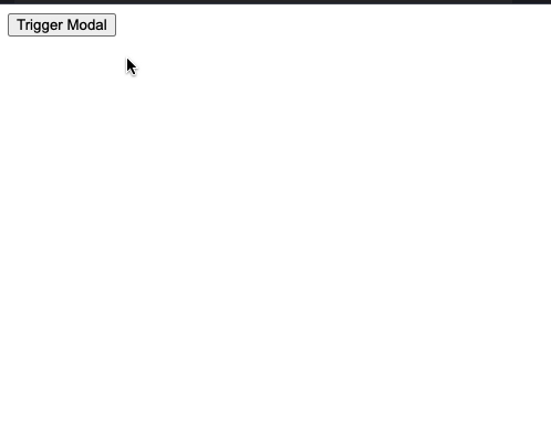
Maintained by the React.js community, this is one of the most popular modal components available to be used in React applications. It offers a fully customizable modal component with easy-to-use features. You can resize the modal component as per your requirements with the application of responsive design. It can be positioned according to the design requirements and can be styled using inline styles or classNames. It also supports the implementation of transitions using CSS classes, on opening and closing the modal. Using transitions helps to provide a smoother user experience.
One of the major reasons for this component’s popularity is because it is developed and currently maintained with accessibility in mind. It aims to be fully accessible and supports WAI-ARIA to use assistive technologies such as screen readers.
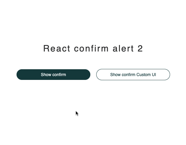
The react-confirm-alert is a modal component for web applications. It has an extensible list of props to customize the styling and the behavior of the modal component. It has a small API as compared to some of the components listed in this post. However, its smaller API does have the most necessary configurable options of a modal component. It can also be configured as a parent component and accepts other React components as children. It doesn’t support accessibility by default so you will have to add your configuration options. One way is to extend this component. This modal component makes work easier for use cases where an alert type dialog box has to be used.
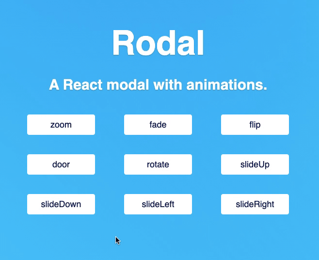
Rodal is one of the few modal components that exist in the React community and is open-source with a focus on animations. It supports various types of animations out of the box. It offers a list of props that are more inclined towards supporting a variety of animated behavior. This modal component comes with nine different animation types:
Apart from supporting various animation types, as a developer, you can control the behavior of handling actions when an animation ends. You can also merge a mixture of animation types when a modal is opened or closed. It provides two props called enterAnimation and leaveAnimation that accepts the type of animation. For each animation type, duration in milliseconds is provided to control the timings of the overall action.
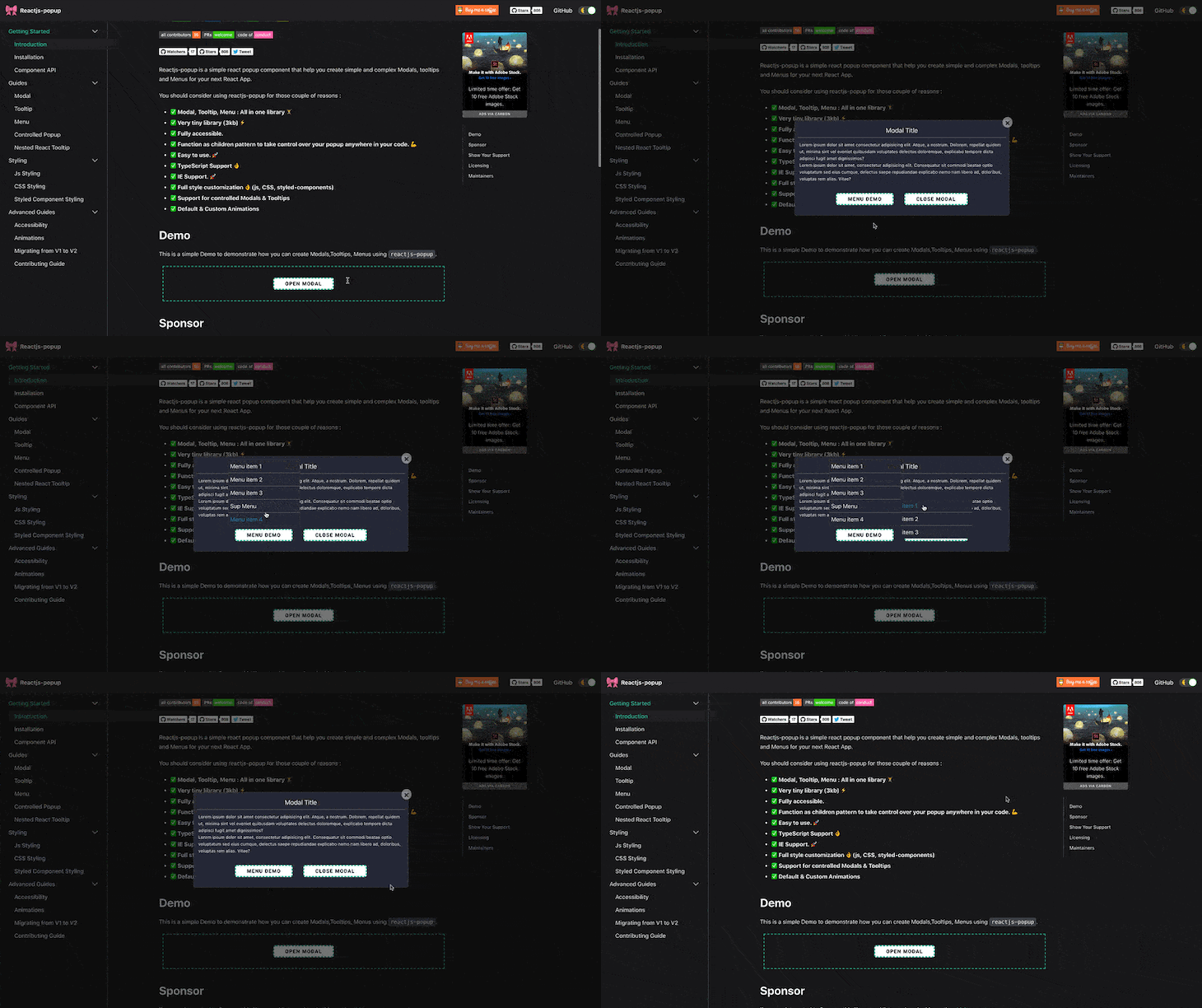
It is a simple React popup component that helps you create simple and complex modals, tooltips, and menus for your next React app. It is one of the more advanced and well-maintained modal components. It has support for TypeScript, inline styles, styling with classNames and with styled-components, a CSS-in-JS library, and animations. As a library, it is also has a tiny bundle size of just 3kB.
There are two types of modal components offered by this library:
From v2 this library also supports accessibility and follows WAI-ARIA specification guideline on how to build a modal component that supports accessible technologies such as screen readers. It has support for animations. The recommended way to add animation to a custom modal component is to use CSS classes and keyframes. Do note that this library only supports animation on the opening of the modal component.
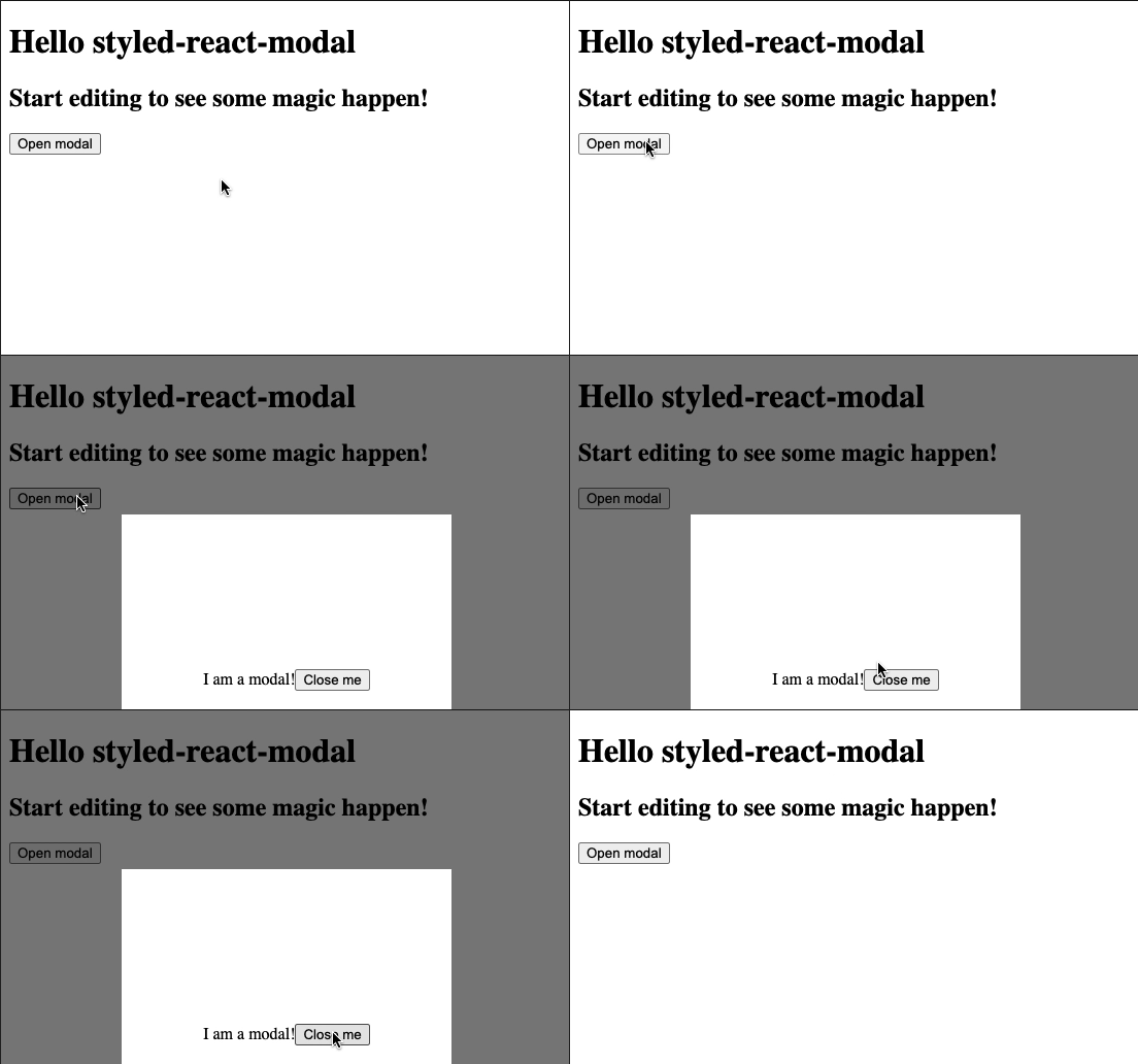
Styled React Modal is built with and based on the styled-components library. If your web application is already using a CSS-in-JS library such as styled-components, emotion.js, or Chakra UI, then this modal component would be a good fit. It uses the latest React 16.x features such as Hooks. It has a concise and easy to use API. It provides functions that can be called to trigger further actions before a modal is opened or after a modal is closed. It also supports dismissing the modal component when an escape key is pressed from the keyboard.
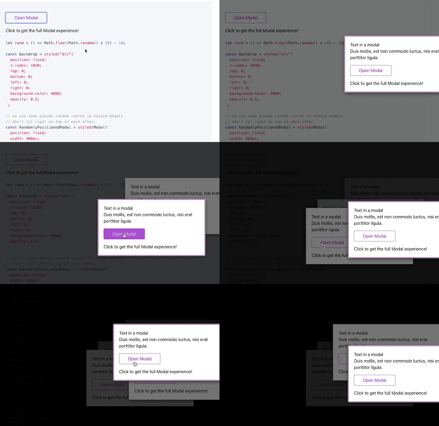
react-overlays is a toolkit for creating functional overlays, tooltips, dropdowns, and modal components. These components offered by the toolkit are meant to be integrated with other UI libraries and frameworks. By default, these components are style-agnostic and do not come with any CSS. To use them, you have to provide your own styles, which is an advantage and makes their usage flexible.
The modal component supports a backdrop to disable the interaction of the modal by default. It supports accessibility by following up ARIA guidelines and adds appropriate ARIA roles. Animations are supported and controlled by this component with the help of another component called <Transition />.
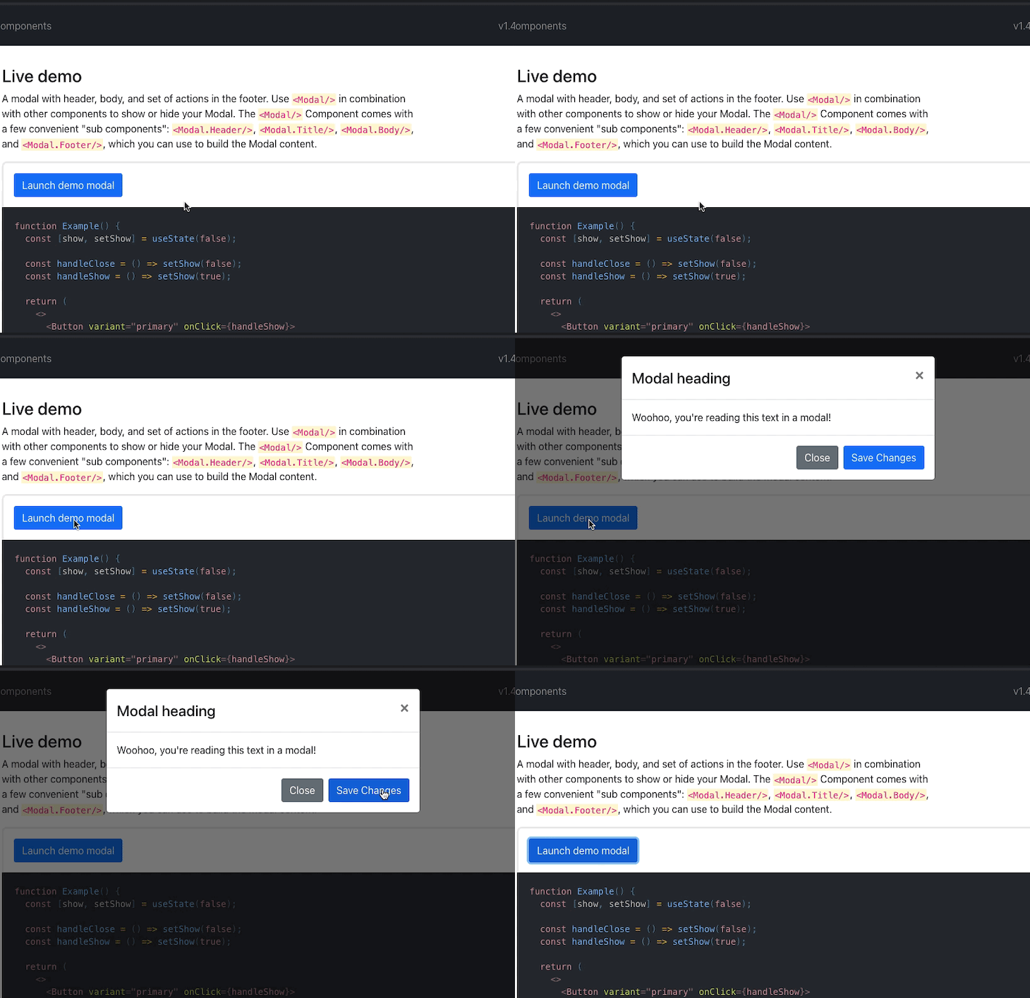
react-bootstrap is a complete UI library that consists of components that are written in JavaScript from scratch. These components can be easily used and extended in a React app. Modal is one of the components that this library offers with an easy to use API. Using a modal component in your React app can be used to display lightboxes, user notifications, or completely custom content. There is no support for nested modals with this UI library, however, if that is a requirement, you can use react-overlays.
Unlike the vanilla Bootstrap library, this UI library has support for autoFocus on a modal component. It has a default slide and fade animation that can be configured such that the modal component can be used without the animation. Support for accessibility features is there since the whole library is implemented with accessibility in mind. The end result is a set of accessible components that are not available in vanilla Bootstrap.

Many end-users expect that when they click a video in a React app, instead of getting redirected to a new web page or the original source of the video website, the video is played on the same web page. Without navigating to a different web page and disturbing the flow of the user’s visit, displaying a video in a modal component is a great way to improve the user experience.
react-modal-video is a component utility that allows you to render and display videos inside a modal component. By default, it supports videos from various sources such as YouTube, Vimeo, Youku, custom resources. The API of this component has configurable options for native video playback functionalities for each of the resource types that can be used to provide a native experience. The modal component also supports animation transition and is accessible for keyboard navigation and screen readers.
The open-source libraries included in the list are either based on personal experience or those which are actively maintained. The motive of these UI component libraries is to let you represent the data in a modal component as well as encounter a good developer experience along the way of building your React app. Some of the integrations provided by these libraries are hard to implement from scratch considering the cost of development.
If you are familiar with any other modal component library in the React ecosystem that is not mentioned in this post, leave its link in the comment section below and tell us why you like it.
Install LogRocket via npm or script tag. LogRocket.init() must be called client-side, not
server-side
$ npm i --save logrocket

// Code:

import LogRocket from 'logrocket';
LogRocket.init('app/id');
// Add to your HTML:

<script src="https://cdn.lr-ingest.com/LogRocket.min.js"></script>
<script>window.LogRocket && window.LogRocket.init('app/id');</script>
Hey there, want to help make our blog better?
Join LogRocket’s Content Advisory Board. You’ll help inform the type of content we create and get access to exclusive meetups, social accreditation, and swag.
Sign up now
Get to know RxJS features, benefits, and more to help you understand what it is, how it works, and why you should use it.

Explore how to effectively break down a monolithic application into microservices using feature flags and Flagsmith.

Native dialog and popover elements have their own well-defined roles in modern-day frontend web development. Dialog elements are known to […]

LlamaIndex provides tools for ingesting, processing, and implementing complex query workflows that combine data access with LLM prompting.