Building responsive screen layouts means writing a single piece of code that responds to various changes in the device’s layout, so the app displays its UI according to the screen size and shape of the device.
In this article, we will explore Expanded and Flexible widgets in Flutter for screen responsiveness.
Due to Flutter’s cross-platform, single codebase ability, it is essential to understand screen management to prevent problems like the flex overflow errors or bad user interface design.
We will also design a demo of Expanded and Flexible widgets, and describe their properties and how to use them in a Flutter application.
The Replay is a weekly newsletter for dev and engineering leaders.
Delivered once a week, it's your curated guide to the most important conversations around frontend dev, emerging AI tools, and the state of modern software.
To understand and follow along with this tutorial, you should have the following:
In Flutter, a container is a parent widget containing multiple child widgets. It manages them through width, height, background color, and padding, among other descriptors. Basically, a container is a box into which we can pass content.
There are two reasons why creating a responsive screen layout in Flutter using containers for content is not advisable.
First is a RenderFlex overflow. This is one of the most frequently encountered Flutter framework errors; when it happens, you’ll see yellow and black stripes indicating the area of overflow in the app UI, in addition to the error message in the debug console.
“Content undersize for large screens” is simply a UI error in which the content is too small or too large for a particular screen due to Flutters’ flexibility.
Both of these problems can be resolved using Flexible or Expanded widgets, providing a better UI and dev experience.
The Expanded widget is a single child widget, meaning that only one child can be assigned to it. For better optimization, it is used in a row or columns.
Properties of the Expanded widget include the child widget and the flex widget.
The child widget is placed inside an Expanded widget, which can take in rows and columns. Flex is used to distribute the contents of the child widget unevenly.
In the code below, we use the Expanded widget with flex set to 1, and a regular container showing the effect of the Expanded widget and its properties:
Expanded(
 flex: 1,
 child: Container(
 color: Colors.red,
 ),
),
Flexible widgets are pretty similar to Expanded widgets, but the significant difference is in their properties. The Flexible widget is used to adjust the child’s content location within the screen.
Properties of Flexible widget include fit and flex.
Fit controls how the property fills the available space. It has two options: FlexFit.Tight, which sets it to fill the available space, and FlexFit.loose, which fills the remaining available space of the child widget.
Like in the Expanded widget, flex is used to distribute the contents of the child widget unevenly.
The code below uses a Flexible widget with the flex set to 1, fit as FlexFit.loose, and a child container with a regular feature:
Flexible(
   flex: 1,
   fit: FlexFit.loose,
   child: Container(
   height: 100,
    decoration: BoxDecoration(
      borderRadius: BorderRadius.circular(15),
      color: Colors.deepOrange[400],
      ),
    child:Icon(Icons.backpack),
 ),
),
In this demo, we will create a sample Flutter app with a layout for content displayed in rows and columns.
Here’s a gif showcasing the demo app we will build in this post:
Let’s start with creating a Flutter project directory; enter the following command into your terminal:
mkdir FlutterApps
Next, create a Flutter project:
flutter create sample_app
Now, open the Flutter project in any code editor of your choice.
Paste the following code into the main.dart file. We start by creating a stateful widget called homepage.
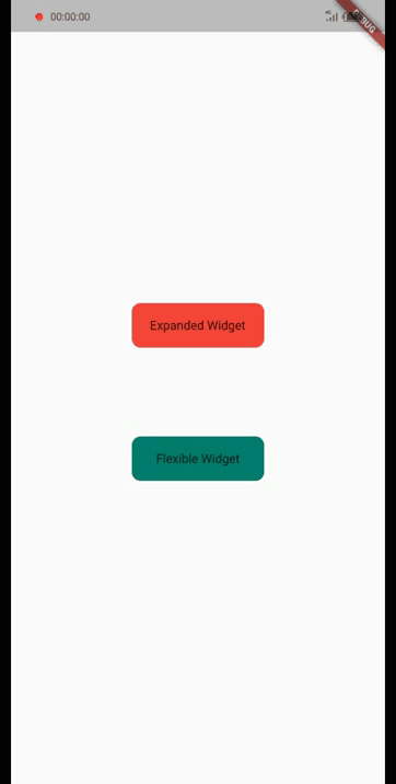
Inside homepage, we will create two buttons that direct us to two different screens to see the difference in using Expanded and Flexible widgets in screen layout:
Scaffold(
  body: Center(
    child:
      Column(mainAxisAlignment: MainAxisAlignment.center, children: [
 GestureDetector(
  onTap: () {
   Navigator.push(
    context,
    MaterialPageRoute(
     builder: (context) => ExpandedWidget(),
    ),
   );
  },
  child: Container(
    height: 50,
    width: 150,
    decoration: BoxDecoration(
      borderRadius: BorderRadius.circular(10), color: Colors.red),
    child: Center(child: Text("Expanded Widget"))),
 ),
 SizedBox(height: 100),
 GestureDetector(
  onTap: () {
   Navigator.push(
    context,
    MaterialPageRoute(
     builder: (context) => FlexibleWidget(),
    ),
   );
  },
  child: Container(
    height: 50,
    width: 150,
    decoration: BoxDecoration(
      borderRadius: BorderRadius.circular(10),
      color: Colors.teal[700]),
    child: Center(child: Text("Flexible Widget"))),
 )
])));
The buttons created are simple containers with some decoration, color, and text widgets wrapped up with a gesture detector, enabling us to use the onTap property to route to ExpandedWidget() and FlexibleWidget() screens.
Start with creating a file called expanded.dart:
touch expanded.dart
Next, paste the following code into the file. In the code, we created a stateless widget to write our examples using the flex property:
class ExpandedWidget extends StatelessWidget {
 const ExpandedWidget({Key? key}) : super(key: key);
 @override
 Widget build(BuildContext context) {
  return Scaffold(
    appBar: AppBar(
     leading: GestureDetector(
       onTap: () {
        Navigator.pop(context);
       },
       child: Icon(Icons.arrow_back_ios_new)),
    ),
    body: Padding(
     padding: const EdgeInsets.symmetric(horizontal: 15),
     child: Column(
      mainAxisAlignment: MainAxisAlignment.spaceAround,
      children: [
       Column(
        children: [
         Text("With Flex"),
         Container(
          height: 100,
          child: Row(
           children: [
            Expanded(
             flex: 1,
             child: Container(
              color: Colors.red,
             ),
            ),
            Expanded(
             flex: 2,
             child: Container(
              color: Colors.deepOrange[400],
             ),
            ),
            Expanded(
             flex: 3,
             child: Container(
              color: Colors.purpleAccent,
             ),
            )
           ],
          ),
         ),
        ],
       ),
       Column(
        children: [
         Text("Without Flex"),
         Container(
          height: 100,
          child: Row(
           children: [
            Expanded(
             child: Container(
              color: Colors.red,
             ),
            ),
            Expanded(
             child: Container(
              color: Colors.deepOrange[400],
             ),
            ),
            Expanded(
             child: Container(
              color: Colors.purpleAccent,
             ),
            )
           ],
          ),
         ),
        ],
       ),
      ],
     ),
    ));
 }
}
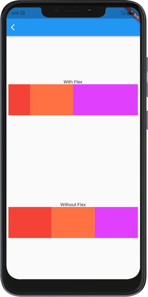
First, we return a scaffold so that we can use the appbar and body properties. Next, in the appbar, we created a back button so we can return to the previous screen.
Moving on to the body, we use two columns, one at the top and another at the button spacing them out; in each column, we have a text describing if it’s with or without flex. Under it, we created a row using three Expanded widgets with or without flex and a container assigning different colors.
The image below shows the layout with and without flex applied:
Start by creating a file called flexible.dart:
touch flexible.dart
Next, paste the following code into the file:
class FlexibleWidget extends StatelessWidget {
 const FlexibleWidget({Key? key}) : super(key: key);
 @override
 Widget build(BuildContext context) {
  return Scaffold(
   appBar: AppBar(
    leading: GestureDetector(
      onTap: () {
       Navigator.pop(context);
      },
      child: Icon(Icons.arrow_back_ios_new)),
   ),
   body: Padding(
    padding: const EdgeInsets.symmetric(horizontal: 10),
    child: Column(
     mainAxisAlignment: MainAxisAlignment.spaceAround,
     children: [
      Column(
       children: [
        Text("Flexfit.loose"),
        Row(
         mainAxisAlignment:MainAxisAlignment.center,
         children: [
          Flexible(
           flex: 1,
           fit: FlexFit.loose,
           child: Container(
            height: 100,
            decoration: BoxDecoration(
             borderRadius: BorderRadius.circular(15),
             color: Colors.deepOrange[400],
            ),
            child:Icon(Icons.backpack),
           ),
          ),
          SizedBox(
           width: 10,
          ),
          Flexible(
           flex: 1,
           fit: FlexFit.loose,
           child: Container(
            height: 100,
            decoration: BoxDecoration(
             borderRadius: BorderRadius.circular(15),
             color: Colors.deepOrange[400],
            ),
            child:Icon(Icons.backpack),
           ),
          )
         ],
        )
       ],
      ),
      Column(
       children: [
        Text("Flexfit.tight"),
        Row(
         children: [
          Flexible(
           flex: 1,
           fit: FlexFit.tight,
           child: Container(
             height: 100,
           decoration: BoxDecoration(
            borderRadius: BorderRadius.circular(15),
              color: Colors.purpleAccent,
           ),
           child:Icon(Icons.backpack),
           ),
          ),
          SizedBox(
           width: 10,
          ),
          Flexible(
           flex: 1,
           fit: FlexFit.tight,
           child: Container(
             height: 100,
            decoration: BoxDecoration(
             borderRadius: BorderRadius.circular(15),
             color: Colors.purpleAccent,
            ),
            child:Icon(Icons.backpack),
           ),
          )
         ],
        )
       ],
      )
     ],
    ),
   ),
  );
 }
}
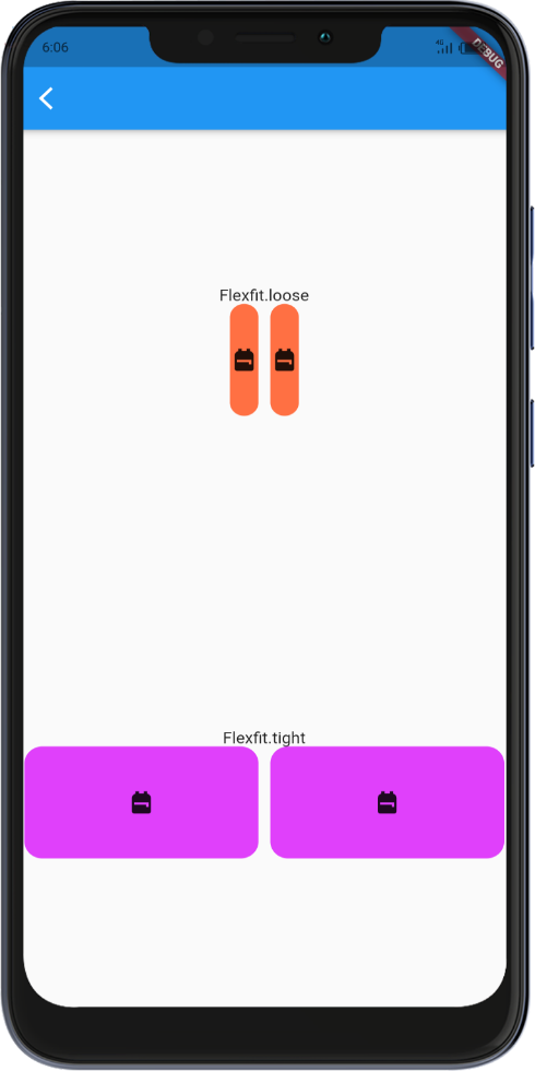
In the code, we created a stateless widget, FlexibleWidget. Inside it, we created two rows with Flexible widget content. In the first row, we use flexfit.loose, and in the second, we use flexfit.tight. With that, the icon will fill the available space provided by the child.
The image below shows the layout with flexfit.loose using the bare minimum space provided by the child and flexfit.tight filling the available space provided by the child.
Like I pointed out earlier, the major difference between these widgets lies in their properties. The Expanded widget only has child and flex properties, which could be a limitation if misused. In contrast, the Flexible widget has more properties; that makes the usage flexible, hence the name.
In this article, we learned about responsive screen layout using Expanded and Flexible widgets. We started by covering potential problems bound to occur when using containers to create a responsive screen layout, then introduced the solutions: the Expanded and Flexible widgets. We covered their properties, similarities, differences, and most importantly, a hands-on example. I hope this post was helpful. Note there is no learning without practice, so make sure to keep practicing.
Install LogRocket via npm or script tag. LogRocket.init() must be called client-side, not
server-side
$ npm i --save logrocket

// Code:

import LogRocket from 'logrocket';
LogRocket.init('app/id');
// Add to your HTML:

<script src="https://cdn.lr-ingest.com/LogRocket.min.js"></script>
<script>window.LogRocket && window.LogRocket.init('app/id');</script>

Learn about TypeScript v6’s breaking changes, new ES2025 features, and deprecated options. A complete migration guide from v5 to prepare for v7.
Learn how Vite+ unifies Vite, Vitest, Oxlint, Oxfmt, Rolldown, and Node.js management in one CLI.
AI companies are buying developer tools as coding agents turn runtimes, package managers, and linters into strategic infrastructure.
Learn how AI-assisted development governance uses rules, agents, hooks, and protocols to help AI coding tools produce safer, more consistent code.
Hey there, want to help make our blog better?
Join LogRocket’s Content Advisory Board. You’ll help inform the type of content we create and get access to exclusive meetups, social accreditation, and swag.
Sign up now

 Learn more →
