You know Tinder, right? If you haven’t been living under a rock for the past several years, you must have heard about this fantastic dating app. You’ve swiped right on dozens of potential love interests and made commitments to the ones you liked the most.

And now we’ll learn how to develop a dating app that’s similar to Tinder using Flutter. This article is for readers who have already done some development in Flutter and have intermediate experience.
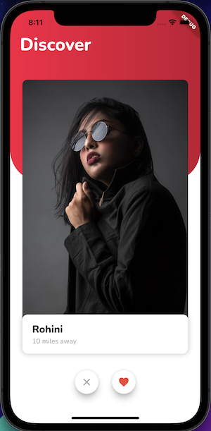
So, by the end of this article, this is what our dating app will look like 😍:
These are some key classes and widgets that we’ll mix and match to develop what we want:
And here’s what we’ll cover:
The app is simple: you swipe right to like and left to dislike. As you can see in the screenshot above, we have a red arc background with the title and a stack of cards for different profiles above it. In addition, under the cards are like and dislike buttons that we can use instead of swiping.
Let’s split this UI into two widgets:
BackgroundCurveWidget — This is the red arc gradient widget in the backgroundCardsStackWidget — This widget will contain the stack of cards along with like and dislike buttonsBelow is the code for BackgroundCurveWidget:
class BackgroudCurveWidget extends StatelessWidget {
  const BackgroudCurveWidget({Key? key}) : super(key: key);

  @override
  Widget build(BuildContext context) {
    return Container(
      width: double.infinity,
      height: 350,
      decoration: const ShapeDecoration(
        shape: RoundedRectangleBorder(
          borderRadius: BorderRadius.only(
            bottomLeft: Radius.circular(64),
            bottomRight: Radius.circular(64),
          ),
        ),
        gradient: LinearGradient(
          colors: <Color>[
            Color(0xFFFD0E42),
            Color(0xFFC30F31),
          ],
        ),
      ),
      child: const Padding(
        padding: EdgeInsets.only(top: 46.0, left: 20.0),
        child: Text(
          'Discover',
          style: TextStyle(
            fontFamily: 'Nunito',
            fontWeight: FontWeight.w800,
            color: Colors.white,
            fontSize: 36,
          ),
        ),
      ),
    );
  }
}
Note: We’re using custom fonts, and you can learn more about implementing custom fonts here.
The BackgroundCurvedWidget is a simple widget that consists of a Container with ShapeDecoration that curves the bottom left and right corners and uses a red linear gradient color as a background.
Now that we have BackgoundCurveWidget, we’ll put it in a Stack widget along with the CardsStackWidget that we’ll be creating going forward:
class MyApp extends StatelessWidget {
  const MyApp({Key? key}) : super(key: key);

  @override
  Widget build(BuildContext context) {
    return MaterialApp(
      home: Scaffold(
        backgroundColor: Colors.white,
        body: Stack(
          children: const [
            BackgroudCurveWidget(),
            CardsStackWidget(),
          ],
        ),
      ),
    );
  }
}
To proceed ahead, we must create the profile cards first that CardStacksWidget will be holding. The profile card, as seen in the previous screenshot, includes a vertical image as well as the person’s name and distance.
We’ll create a model class that will hold all the information required by the profile card:
class Profile {
  const Profile({
    required this.name,
    required this.distance,
    required this.imageAsset,
  });
  final String name;
  final String distance;
  final String imageAsset;
}
This is how we’ll implement the ProfileCard for CardsStackWidget now that we have our model class ready for the profile:
class ProfileCard extends StatelessWidget {
  const ProfileCard({Key? key, required this.profile}) : super(key: key);
  final Profile profile;

  @override
  Widget build(BuildContext context) {
    return Container(
      height: 580,
      width: 340,
      padding: const EdgeInsets.symmetric(vertical: 10),
      child: Stack(
        children: [
          Positioned.fill(
            child: ClipRRect(
              borderRadius: BorderRadius.circular(10),
              child: Image.asset(
                profile.imageAsset,
                fit: BoxFit.fitHeight,
              ),
            ),
          ),
          Positioned(
            bottom: 0,
            child: Container(
              height: 80,
              width: 340,
              decoration: ShapeDecoration(
                color: Colors.white,
                shape: RoundedRectangleBorder(
                  borderRadius: BorderRadius.circular(10),
                ),
                shadows: <BoxShadow>[
                  BoxShadow(
                    color: Colors.black.withOpacity(0.05),
                    blurRadius: 8,
                  ),
                ],
              ),
              child: Padding(
                padding: const EdgeInsets.only(left: 20),
                child: Column(
                  crossAxisAlignment: CrossAxisAlignment.start,
                  mainAxisAlignment: MainAxisAlignment.center,
                  children: [
                    Text(
                      profile.name,
                      style: const TextStyle(
                        fontFamily: 'Nunito',
                        fontWeight: FontWeight.w800,
                        fontSize: 21,
                      ),
                    ),
                    Text(
                      profile.distance,
                      style: const TextStyle(
                        fontFamily: 'Nunito',
                        fontWeight: FontWeight.w400,
                        fontSize: 14,
                        color: Colors.grey,
                      ),
                    ),
                  ],
                ),
              ),
            ),
          ),
        ],
      ),
    );
  }
}
The code for ProfileCard is made up of a Stack widget that contains an image. This image fills the Stack using Positioned.fill and another Positioned widget at the bottom, which is a Container having a rounded border and holding title and distance texts for the ProfileCard.
Now that our ProfileCard is complete, we must go on to the next step, which is to build a draggable widget that can be swiped left or right, much like the Tinder app. We also want this widget to show a tag indicating if the user likes or dislikes swiping profile cards, so the user can view additional information.
ProfileCard draggableBefore diving deep into the code, let’s have a look at the ValueNotifier, ValueListenableBuilder, and Draggable widget in general because you’ll need to have a good grasp of these to comprehend the code that makes up our DragWidget.
ChangeNotifier that can only hold a single valueValueNotifier as a property and rebuilds itself when the value of the ValueNotifier gets updated or changedDragTarget that again is a widget; it accepts a Draggable widget. Every Draggable widget carries some data that gets transferred to DragTarget when it accepts the dropped widgetNote: we’re declaring an enum named
Swipein this way.
enum Swipe { left, right, none }
Let us now move to see what our DragWidget code looks like:
class DragWidget extends StatefulWidget {
  const DragWidget({
    Key? key,
    required this.profile,
    required this.index,
  }) : super(key: key);
  final Profile profile;
  final int index;

  @override
  State<DragWidget> createState() => _DragWidgetState();
}

class _DragWidgetState extends State<DragWidget> {
  ValueNotifier<Swipe> swipeNotifier = ValueNotifier(Swipe.none);

  @override
  Widget build(BuildContext context) {
    return Center(
      child: Draggable<int>(
        // Data is the value this Draggable stores.
        data: widget.index,
        feedback: Material(
          color: Colors.transparent,
          child: ValueListenableBuilder(
            valueListenable: swipeNotifier,
            builder: (context, swipe, _) {
              return RotationTransition(
                turns: swipe != Swipe.none
                    ? swipe == Swipe.left
                        ? const AlwaysStoppedAnimation(-15 / 360)
                        : const AlwaysStoppedAnimation(15 / 360)
                    : const AlwaysStoppedAnimation(0),
                child: Stack(
                  children: [
                    ProfileCard(profile: widget.profile),
                    swipe != Swipe.none
                        ? swipe == Swipe.right
                            ? Positioned(
                                top: 40,
                                left: 20,
                                child: Transform.rotate(
                                  angle: 12,
                                  child: TagWidget(
                                    text: 'LIKE',
                                    color: Colors.green[400]!,
                                  ),
                                ),
                              )
                            : Positioned(
                                top: 50,
                                right: 24,
                                child: Transform.rotate(
                                  angle: -12,
                                  child: TagWidget(
                                    text: 'DISLIKE',
                                    color: Colors.red[400]!,
                                  ),
                                ),
                              )
                        : const SizedBox.shrink(),
                  ],
                ),
              );
            },
          ),
        ),
        onDragUpdate: (DragUpdateDetails dragUpdateDetails) {
                    // When Draggable widget is dragged right
          if (dragUpdateDetails.delta.dx > 0 &&
              dragUpdateDetails.globalPosition.dx >
                  MediaQuery.of(context).size.width / 2) {
            swipeNotifier.value = Swipe.right;
          }
          // When Draggable widget is dragged left
          if (dragUpdateDetails.delta.dx < 0 &&
              dragUpdateDetails.globalPosition.dx <
                  MediaQuery.of(context).size.width / 2) {
            swipeNotifier.value = Swipe.left;
          }
        },
        onDragEnd: (drag) {
          swipeNotifier.value = Swipe.none;
        },

        childWhenDragging: Container(
          color: Colors.transparent,
        ),

        child: ProfileCard(profile: widget.profile),
      ),
    );
  }
}
This is how the DragTarget widget works:
DragWidget: profile and index. The Profile object has all of the information that should appear on the ProfileCard, while the index object contains the card’s index, which is passed as a data parameter to the Draggable widget. This data will be transferred if the user drags and drops the DragWidget to DragTarget.Draggable widget is taking two properties: onDragUpdate and onDragEnd:
Draggable is dragged, this method is called. We verify whether the card was dragged left or right in this callback function and then update the swipeNotifier value, which rebuilds our ValueListenableBuilderswipeNotifer value in this callbackDraggable widget takes three widgets as properties: child, feedback, and childWhenDragging:
child — When the Draggable widget is not being dragged in any direction and is now at a resting position, this widget is displayed. And we are passing the ProfileCard widget to the child property so that this will be the default UIfeedback — When a drag is in progress, this widget appears. The feedback property is given a ValueListenableBuilder, which rebuilds itself whenever the value of swipeNotifier is changed ValueListenableBuilder returns a RotationTransition widget, which rotates itself based on the swipeNotifer‘s value. A Stack widget with ProfileCard and a TagWidget are children of RotationTransition. When the widget is dragged left or right, the TagWidget displays the like and dislike tag text above the ProfileCard widgetchildWhileDragging — This widget will appear instead of the child when a drag is in progress. In our scenario, the childWhenDragging property is given a transparent Container, which makes the child invisible when the feedback widget appearsThis is the code for TagWidget that we’re using in DragWidget to show like and dislike text on top of a ProfileCard:
class TagWidget extends StatelessWidget {
  const TagWidget({
    Key? key,
    required this.text,
    required this.color,
  }) : super(key: key);
  final String text;
  final Color color;

  @override
  Widget build(BuildContext context) {
    return Container(
      padding: const EdgeInsets.symmetric(horizontal: 12),
      decoration: ShapeDecoration(
        shape: RoundedRectangleBorder(
          borderRadius: BorderRadius.circular(10),
          side: BorderSide(
            color: color,
            width: 4,
          ),
        ),
      ),
      child: Text(
        text,
        style: TextStyle(
          color: color,
          fontSize: 36,
        ),
      ),
    );
  }
}
Congratulations on making it this far and creating a dragged-and-rotated profile card. We’ll learn how to construct a stack of cards that can be dropped to a DragTarget in the next step.
DragTargetOur DragWidget had only two parameters before. Now, we’re declaring swipeNotifier within the CardsStackWidget and we’ll pass it to the DragWidget. As a result of the change, the DragWidget‘s Stateful class looks like this:
class DragWidget extends StatefulWidget {
  const DragWidget(
      {Key? key,
      required this.profile,
      required this.index,
      required this.swipeNotifier})
      : super(key: key);
  final Profile profile;
  final int index;
  final ValueNotifier<Swipe> swipeNotifier;

  @override
  State<DragWidget> createState() => _DragWidgetState();
}
Now that we’ve done the necessary changes to DragWidget, it’s time to look at the CardsStackWidget code:
class CardsStackWidget extends StatefulWidget {
  const CardsStackWidget({Key? key}) : super(key: key);

  @override
  State<CardsStackWidget> createState() => _CardsStackWidgetState();
}

class _CardsStackWidgetState extends State<CardsStackWidget> {
  List<Profile> dragabbleItems = [
    const Profile(
        name: 'Rohini',
        distance: '10 miles away',
        imageAsset: 'assets/images/avatar_1.png'),
    const Profile(
        name: 'Rohini',
        distance: '10 miles away',
        imageAsset: 'assets/images/avatar_2.png'),
    const Profile(
        name: 'Rohini',
        distance: '10 miles away',
        imageAsset: 'assets/images/avatar_3.png'),
    const Profile(
        name: 'Rohini',
        distance: '10 miles away',
        imageAsset: 'assets/images/avatar_4.png'),
    const Profile(
        name: 'Rohini',
        distance: '10 miles away',
        imageAsset: 'assets/images/avatar_5.png'),
  ];

  ValueNotifier<Swipe> swipeNotifier = ValueNotifier(Swipe.none);

  @override
  Widget build(BuildContext context) {
    return Stack(
      clipBehavior: Clip.none,
      children: [
        ClipRRect(
          borderRadius: BorderRadius.circular(10),
          child: ValueListenableBuilder(
            valueListenable: swipeNotifier,
            builder: (context, swipe, _) => Stack(
              clipBehavior: Clip.none,
              alignment: Alignment.center,
              children: List.generate(dragabbleItems.length, (index) {
                return DragWidget(
                  profile: dragabbleItems[index],
                  index: index,
                  swipeNotifier: swipeNotifier,
                );
              }),
            ),
          ),
        ),
        Positioned(
          left: 0,
          child: DragTarget<int>(
            builder: (
              BuildContext context,
              List<dynamic> accepted,
              List<dynamic> rejected,
            ) {
              return IgnorePointer(
                child: Container(
                  height: 700.0,
                  width: 80.0,
                  color: Colors.transparent,
                ),
              );
            },
            onAccept: (int index) {
              setState(() {
                dragabbleItems.removeAt(index);
              });
            },
          ),
        ),
        Positioned(
          right: 0,
          child: DragTarget<int>(
            builder: (
              BuildContext context,
              List<dynamic> accepted,
              List<dynamic> rejected,
            ) {
              return IgnorePointer(
                child: Container(
                  height: 700.0,
                  width: 80.0,
                  color: Colors.transparent,
                ),
              );
            },
            onAccept: (int index) {
              setState(() {
                dragabbleItems.removeAt(index);
              });
            },
          ),
        ),
      ],
    );
  }
}
As you can see, we’ve used a Stack with three children yet again; let’s have a look at each one individually:
Stack with a list of DragWidgets inside a ValueListenableBuilder to rebuild or refresh the children when the top widget is dragged and dropped to a DragTargetDragTarget, is positioned to the left, which accepts a Draggable widget when it is dropped inside the DragTargetDragTarget that is positioned to the right and receives a Draggable widget when it is dropped inside itWe have wrapped the transparent Container inside DragTarget with IgnorePointer so that we can pass the gestures to the underlying Draggable widget. Also, when the DragTarget accepts a draggable widget, then we are calling setState and removing the children from draggableItems at the given index.
Up until now, we’ve created a stack of widgets that can be dragged and dropped to like and dislike; the only thing left is to create the two action buttons at the bottom of the screen. Instead of swiping the cards, the user can tap these two action buttons to like and dislike.
We’ll see how to make the action buttons at the bottom of the screen in the next section.
The action button will be a straightforward widget showing an icon with a circular border, creating a left or right swipe when they are tapped on.
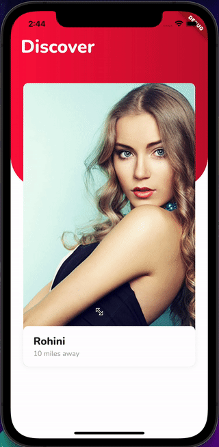
This is what we have to achieve:
This is how our ActionButtonWidget looks:
class ActionButtonWidget extends StatelessWidget {
  const ActionButtonWidget(
      {Key? key, required this.onPressed, required this.icon})
      : super(key: key);
  final VoidCallback onPressed;
  final Icon icon;

  @override
  Widget build(BuildContext context) {
    return Material(
      shape: const CircleBorder(),
      child: Card(
        elevation: 10,
        shape: RoundedRectangleBorder(
          borderRadius: BorderRadius.circular(35.0),
        ),
        child: IconButton(onPressed: onPressed, icon: icon),
      ),
    );
  }
}
The ActionButtonWidget requires an icon and a VoidCallback function that will be invoked when the user hits the button, as seen in the above code.
To make use of the ActionButtonWidget and let our cards swipe left or right whenever we push these buttons, we’ll need to make some changes to CardsStackWidget.
These are the few changes we’ll need to do in order to finish the app:
AnimationController that adds a listener. This listener removes the last element from draggableItems, resets the animation, and sets the swipeNotifier value to Swipe.none:
late final AnimationController _animationController;

  @override
  void initState() {
    super.initState();
    _animationController = AnimationController(
      duration: const Duration(milliseconds: 500),
      vsync: this,
    );
    _animationController.addStatusListener((status) {
      if (status == AnimationStatus.completed) {
        draggableItems.removeLast();
        _animationController.reset();
 swipeNotifier.value = Swipe.none;
  }
});
}
ActionButtonWidgets as children that we’ll position using the Positioned widget. Inside onPressed, we set the swipeNotifier value and call _animationController.forward() to start the animation:
Positioned(
          bottom: 10,
          left: 0,
          right: 0,
          child: Padding(
            padding: const EdgeInsets.only(bottom: 46.0),
            child: Row(
              mainAxisAlignment: MainAxisAlignment.center,
              children: [
                ActionButtonWidget(
                  onPressed: () {
                    swipeNotifier.value = Swipe.left;
                    _animationController.forward();
                  },
                  icon: const Icon(
                    Icons.close,
                    color: Colors.grey,
                  ),
                ),
                const SizedBox(width: 20),
                ActionButtonWidget(
                  onPressed: () {
                    swipeNotifier.value = Swipe.right;
                    _animationController.forward();
                  },
                  icon: const Icon(
                    Icons.favorite,
                    color: Colors.red,
                  ),
                ),
              ],
            ),
          ),
        ),
ValueListenableBuilder to have a list of children in which the last element will use PositionedTransition and RotationTransition in order to make a swipe animation with rotation:ValueListenableBuilder(
valueListenable: swipeNotifier,
builder: (context, swipe, _) => Stack(
clipBehavior: Clip.none,
alignment: Alignment.center,
children: List.generate(draggableItems.length, (index) {
if (index == draggableItems.length - 1) {
return PositionedTransition(
rect: RelativeRectTween(
begin: RelativeRect.fromSize(
const Rect.fromLTWH(0, 0, 580, 340),
const Size(580, 340)),
end: RelativeRect.fromSize(
Rect.fromLTWH(
swipe != Swipe.none
? swipe == Swipe.left
? -300
: 300
: 0,
0,
580,
340),
const Size(580, 340)),
).animate(CurvedAnimation(
parent: _animationController,
curve: Curves.easeInOut,
)),
child: RotationTransition(
turns: Tween<double>(
begin: 0,
end: swipe != Swipe.none
? swipe == Swipe.left
? -0.1 * 0.3
: 0.1 * 0.3
: 0.0)
.animate(
CurvedAnimation(
parent: _animationController,
curve:
const Interval(0, 0.4, curve: Curves.easeInOut),
),
),
child: DragWidget(
profile: draggableItems[index],
index: index,
swipeNotifier: swipeNotifier,
isLastCard: true,
),
),
);
} else {
return DragWidget(
profile: draggableItems[index],
index: index,
swipeNotifier: swipeNotifier,
);
}
}),
),
),
If you look closely at the code, you’ll see that we’ve added a new argument to the last card stack, namely isLastCard. This tells DragWidget to display like and dislike tags when we use action buttons instead of swiping the cards.
As we’re passing a new argument isLastCard, we need to make some required changes to the DragWidget. These are the two changes that must be made:
isLastCard in DragWidgetchild parameter of the Draggable widget to show like and dislike text when we click the action buttons because we aren’t swiping the cards. As a result, feedback will no longer be visible and we will have to modify the child to show tagsHere’s DragWidget with the necessary modifications:
class DragWidget extends StatefulWidget {
  const DragWidget({
    Key? key,
    required this.profile,
    required this.index,
    required this.swipeNotifier,
    this.isLastCard = false,
  }) : super(key: key);
  final Profile profile;
  final int index;
  final ValueNotifier<Swipe> swipeNotifier;
  final bool isLastCard;

  @override
  State<DragWidget> createState() => _DragWidgetState();
}

class _DragWidgetState extends State<DragWidget> {
  @override
  Widget build(BuildContext context) {
    return Center(
      child: Draggable<int>(
        // Data is the value this Draggable stores.
        data: widget.index,
        feedback: Material(
          color: Colors.transparent,
          child: ValueListenableBuilder(
            valueListenable: widget.swipeNotifier,
            builder: (context, swipe, _) {
              return RotationTransition(
                turns: widget.swipeNotifier.value != Swipe.none
                    ? widget.swipeNotifier.value == Swipe.left
                        ? const AlwaysStoppedAnimation(-15 / 360)
                        : const AlwaysStoppedAnimation(15 / 360)
                    : const AlwaysStoppedAnimation(0),
                child: Stack(
                  children: [
                    ProfileCard(profile: widget.profile),
                    widget.swipeNotifier.value != Swipe.none
                        ? widget.swipeNotifier.value == Swipe.right
                            ? Positioned(
                                top: 40,
                                left: 20,
                                child: Transform.rotate(
                                  angle: 12,
                                  child: TagWidget(
                                    text: 'LIKE',
                                    color: Colors.green[400]!,
                                  ),
                                ),
                              )
                            : Positioned(
                                top: 50,
                                right: 24,
                                child: Transform.rotate(
                                  angle: -12,
                                  child: TagWidget(
                                    text: 'DISLIKE',
                                    color: Colors.red[400]!,
                                  ),
                                ),
                              )
                        : const SizedBox.shrink(),
                  ],
                ),
              );
            },
          ),
        ),
        onDragUpdate: (DragUpdateDetails dragUpdateDetails) {
          if (dragUpdateDetails.delta.dx > 0 &&
              dragUpdateDetails.globalPosition.dx >
                  MediaQuery.of(context).size.width / 2) {
            widget.swipeNotifier.value = Swipe.right;
          }
          if (dragUpdateDetails.delta.dx < 0 &&
              dragUpdateDetails.globalPosition.dx <
                  MediaQuery.of(context).size.width / 2) {
            widget.swipeNotifier.value = Swipe.left;
          }
        },
        onDragEnd: (drag) {
          widget.swipeNotifier.value = Swipe.none;
        },

        childWhenDragging: Container(
          color: Colors.transparent,
        ),

        //This will be visible when we press action button
        child: ValueListenableBuilder(
            valueListenable: widget.swipeNotifier,
            builder: (BuildContext context, Swipe swipe, Widget? child) {
              return Stack(
                children: [
                  ProfileCard(profile: widget.profile),
                  // heck if this is the last card and Swipe is not equal to Swipe.none
                  swipe != Swipe.none && widget.isLastCard
                      ? swipe == Swipe.right
                          ? Positioned(
                              top: 40,
                              left: 20,
                              child: Transform.rotate(
                                angle: 12,
                                child: TagWidget(
                                  text: 'LIKE',
                                  color: Colors.green[400]!,
                                ),
                              ),
                            )
                          : Positioned(
                              top: 50,
                              right: 24,
                              child: Transform.rotate(
                                angle: -12,
                                child: TagWidget(
                                  text: 'DISLIKE',
                                  color: Colors.red[400]!,
                                ),
                              ),
                            )
                      : const SizedBox.shrink(),
                ],
              );
            }),
      ),
    );
  }
}
This is how our updated CardsStackWidget code appears after making all of the modifications discussed above along with the DragWidget changes:
class CardsStackWidget extends StatefulWidget {
  const CardsStackWidget({Key? key}) : super(key: key);

  @override
  State<CardsStackWidget> createState() => _CardsStackWidgetState();
}

class _CardsStackWidgetState extends State<CardsStackWidget>
    with SingleTickerProviderStateMixin {
  List<Profile> draggableItems = [
    const Profile(
        name: 'Rohini',
        distance: '10 miles away',
        imageAsset: 'assets/images/avatar_1.png'),
    const Profile(
        name: 'Rohini',
        distance: '10 miles away',
        imageAsset: 'assets/images/avatar_2.png'),
    const Profile(
        name: 'Rohini',
        distance: '10 miles away',
        imageAsset: 'assets/images/avatar_3.png'),
    const Profile(
        name: 'Rohini',
        distance: '10 miles away',
        imageAsset: 'assets/images/avatar_4.png'),
    const Profile(
        name: 'Rohini',
        distance: '10 miles away',
        imageAsset: 'assets/images/avatar_5.png'),
  ];

  ValueNotifier<Swipe> swipeNotifier = ValueNotifier(Swipe.none);
  late final AnimationController _animationController;

  @override
  void initState() {
    super.initState();
    _animationController = AnimationController(
      duration: const Duration(milliseconds: 500),
      vsync: this,
    );
    _animationController.addStatusListener((status) {
      if (status == AnimationStatus.completed) {
        draggableItems.removeLast();
        _animationController.reset();

        swipeNotifier.value = Swipe.none;
      }
    });
  }

  @override
  Widget build(BuildContext context) {
    return Stack(
      clipBehavior: Clip.none,
      children: [
        ClipRRect(
          borderRadius: BorderRadius.circular(10),
          child: ValueListenableBuilder(
            valueListenable: swipeNotifier,
            builder: (context, swipe, _) => Stack(
              clipBehavior: Clip.none,
              alignment: Alignment.center,
              children: List.generate(draggableItems.length, (index) {
                if (index == draggableItems.length - 1) {
                  return PositionedTransition(
                    rect: RelativeRectTween(
                      begin: RelativeRect.fromSize(
                          const Rect.fromLTWH(0, 0, 580, 340),
                          const Size(580, 340)),
                      end: RelativeRect.fromSize(
                          Rect.fromLTWH(
                              swipe != Swipe.none
                                  ? swipe == Swipe.left
                                      ? -300
                                      : 300
                                  : 0,
                              0,
                              580,
                              340),
                          const Size(580, 340)),
                    ).animate(CurvedAnimation(
                      parent: _animationController,
                      curve: Curves.easeInOut,
                    )),
                    child: RotationTransition(
                      turns: Tween<double>(
                              begin: 0,
                              end: swipe != Swipe.none
                                  ? swipe == Swipe.left
                                      ? -0.1 * 0.3
                                      : 0.1 * 0.3
                                  : 0.0)
                          .animate(
                        CurvedAnimation(
                          parent: _animationController,
                          curve:
                              const Interval(0, 0.4, curve: Curves.easeInOut),
                        ),
                      ),
                      child: DragWidget(
                        profile: draggableItems[index],
                        index: index,
                        swipeNotifier: swipeNotifier,
                        isLastCard: true,
                      ),
                    ),
                  );
                } else {
                  return DragWidget(
                    profile: draggableItems[index],
                    index: index,
                    swipeNotifier: swipeNotifier,
                  );
                }
              }),
            ),
          ),
        ),
        Positioned(
          bottom: 10,
          left: 0,
          right: 0,
          child: Padding(
            padding: const EdgeInsets.only(bottom: 46.0),
            child: Row(
              mainAxisAlignment: MainAxisAlignment.center,
              children: [
                ActionButtonWidget(
                  onPressed: () {
                    swipeNotifier.value = Swipe.left;
                    _animationController.forward();
                  },
                  icon: const Icon(
                    Icons.close,
                    color: Colors.grey,
                  ),
                ),
                const SizedBox(width: 20),
                ActionButtonWidget(
                  onPressed: () {
                    swipeNotifier.value = Swipe.right;
                    _animationController.forward();
                  },
                  icon: const Icon(
                    Icons.favorite,
                    color: Colors.red,
                  ),
                ),
              ],
            ),
          ),
        ),
        Positioned(
          left: 0,
          child: DragTarget<int>(
            builder: (
              BuildContext context,
              List<dynamic> accepted,
              List<dynamic> rejected,
            ) {
              return IgnorePointer(
                child: Container(
                  height: 700.0,
                  width: 80.0,
                  color: Colors.transparent,
                ),
              );
            },
            onAccept: (int index) {
              setState(() {
                draggableItems.removeAt(index);
              });
            },
          ),
        ),
        Positioned(
          right: 0,
          child: DragTarget<int>(
            builder: (
              BuildContext context,
              List<dynamic> accepted,
              List<dynamic> rejected,
            ) {
              return IgnorePointer(
                child: Container(
                  height: 700.0,
                  width: 80.0,
                  color: Colors.transparent,
                ),
              );
            },
            onAccept: (int index) {
              setState(() {
                draggableItems.removeAt(index);
              });
            },
          ),
        ),
      ],
    );
  }
}
Hurray! Here it is, our all-in-one dating app completed. 🤝
In this tutorial, you learned how to make your very own dating app with awesome animation gestures. I hope you continue to explore new things.
Now that we have everything cooked and ready, all you have to do now is run the application and enjoy.
Check out the complete source code on GitHub.👈
Good luck! Happy Fluttering!
If you have any questions, feel free to post them. Any feedback is welcome.
Install LogRocket via npm or script tag. LogRocket.init() must be called client-side, not
server-side
$ npm i --save logrocket

// Code:

import LogRocket from 'logrocket';
LogRocket.init('app/id');
// Add to your HTML:

<script src="https://cdn.lr-ingest.com/LogRocket.min.js"></script>
<script>window.LogRocket && window.LogRocket.init('app/id');</script>

A guide for using JWT authentication to prevent basic security issues while understanding the shortcomings of JWTs.

Discover how to build, render, and automate product demo videos with Remotion, replacing traditional screen recordings with reusable React code.

Chrome’s Modern Web Guidance embeds modern web platform skills into AI coding agents, helping them choose native HTML, CSS, and browser APIs over legacy patterns.

Learn how to use Fallow to analyze AI-generated code, detect dead code, duplicate logic, and complexity issues, and integrate automated code quality checks into your AI-assisted development workflow.
Would you be interested in joining LogRocket's developer community?
Join LogRocket’s Content Advisory Board. You’ll help inform the type of content we create and get access to exclusive meetups, social accreditation, and swag.
Sign up now

 Learn more →
