A recurring challenge when collecting user data is formatting answer choices so that a question’s instructions are implicit to the user. A radio button is a graphical UI element that presents a predefined list of mutually exclusive answer choices, solving the problem through its design.
Radio buttons are frequently brief and easy to scan, making them a great choice for mobile applications. In Flutter, the default radio button doesn’t maintain any state. Instead, it invokes the onChange callback function each time an option is selected.
In this tutorial, we’ll build a simple radio button using the built-in method from Flutter, then build our own Flutter widget for customizing a radio button. To follow along with this tutorial, you’ll need:
Let’s get started!
First, we’ll set up a new Flutter project. Navigate into your work directory, then copy and paste the code below:
flutter create radio_button_app
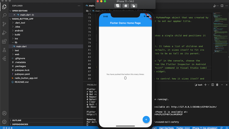
Once initialization is complete, open either your Android emulator or iOS Simulator. Navigate into the stripe_app folder and run the app with the command below:
cd radio_button_app && flutter run
Your app should look similar to the screenshot below, indicating that your app installation was successful:
First, let’s build a radio button using Flutter Material Components widgets. Import the package by adding the code below to the top of the main.dart file:
import 'package:flutter/material.dart';
Next, we need to create a stateless widget, which is immutable, allowing us to build other apps on top of it. Let’s create a stateless widget called MyApp, which will act as the root widget and hold our application’s scaffold. Add the code below to main.dart:
void main() => runApp(const MyApp());

class MyApp extends StatelessWidget {
  const MyApp({Key key}) : super(key: key);
  static const String _title = 'Radio buttons';

  @override
  Widget build(BuildContext context) {
    return MaterialApp(
      title: _title,
      debugShowCheckedModeBanner: false,
      theme: ThemeData(
        primaryColor: Colors.black,
        accentColor: Colors.black,
        ),
      home: Scaffold(
        appBar: AppBar(title: const Text(_title)),
        body: const Center(
          child: MyStatefulWidget(),
        ),
      ),
    );
  }
}
In the code above, we pass the MyApp widget to the runApp function, making it the root of the widget tree:
void main() => runApp(const MyApp());
The MyApp widget does not hold any state. Therefore, to build components that are mutable or stateful widgets like the radio button, we’ll need to create a stateful widget and pass it to the root widget as a child:
child: MyStatefulWidget(),
Next, let’s create MyStatefulWidget by adding the code below to main.dart:
class MyStatefulWidget extends StatefulWidget {
  const MyStatefulWidget({Key key}) : super(key: key);
  @override
  State<MyStatefulWidget> createState() => _MyStatefulWidgetState();
}
MyStatefulWidget depends on a private state, which is triggered by createState, an immediately invoked function (IIF). As a result, MyStatefulWidget calls the _MyStatefulWidgetState private state.
To establish the _MyStatefulWidgetState private state, let’s add the code below to our main.dart file:
class _MyStatefulWidgetState extends State<MyStatefulWidget> {
  Pet _pet = Pet.dog;

  @override
  Widget build(BuildContext context) {

    return Column(

      children: <Widget>[
        ListTile(
          title: const Text('Dog'),
          leading: Radio<Pet>(
            fillColor: MaterialStateColor.resolveWith((states) => Colors.green),
            focusColor: MaterialStateColor.resolveWith((states) => Colors.green),
            value: Pet.dog,
            groupValue: _pet,
            onChanged: (Pet value) {
              setState(() {
                _pet = value;
              });
            },
          ),
        ),
        ListTile(
          title: const Text('Cart'),
          leading: Radio<Pet>(
            fillColor: MaterialStateColor.resolveWith((states) => Colors.green),
            value: Pet.cat,
            groupValue: _pet,
            onChanged: (Pet value) {
              setState(() {
                _pet = value;
              });
            },
          ),
        ),
      ],
    );
  }
}
In this example, we’ll create a simple radion button that asks a user to select between cat or dog. First, we set the value of Pet to Pet.dog, which is an enum declared in the global context of main.dart:
enum Pet { dog, cat }
You can add the code for the enum value anywhere in main.dart as long as it is accessible via the global context.
Each radio button is built with the ListTile material class, allowing for a combination of text, icons, and buttons.
The value of each selected option is passed to the groupValue, which is maintained by MyStatefulWidget. Whenever a radio button is selected, the button state is updated, changing the value of _pet to the currently selected option.
The full code for this section is below:
import 'package:flutter/material.dart';
void main() => runApp(const MyApp());
/// This is the main application widget.
class MyApp extends StatelessWidget {
  const MyApp({Key key}) : super(key: key);
  static const String _title = 'Radio buttons';

  @override
  Widget build(BuildContext context) {
    return MaterialApp(
      title: _title,
      debugShowCheckedModeBanner: false,
      theme: ThemeData(
        primaryColor: Colors.black,
        accentColor: Colors.black,
        ),
      home: Scaffold(
        appBar: AppBar(title: const Text(_title)),
        body: const Center(
          child: MyStatefulWidget(),
        ),
      ),
    );
  }
}
enum Pet { dog, cat }
/// This is the stateful widget that the main application instantiates.
class MyStatefulWidget extends StatefulWidget {
  const MyStatefulWidget({Key key}) : super(key: key);
  @override
  State<MyStatefulWidget> createState() => _MyStatefulWidgetState();
}
/// This is the private State class that goes with MyStatefulWidget.
class _MyStatefulWidgetState extends State<MyStatefulWidget> {
  Pet _pet = Pet.dog;

  @override
  Widget build(BuildContext context) {

    return Column(

      children: <Widget>[
        ListTile(
          title: const Text('Dog'),
          leading: Radio<Pet>(
            value: Pet.dog,
            groupValue: _pet,
            onChanged: (Pet value) {
              setState(() {
                _pet = value;
              });
            },
          ),
        ),
        ListTile(
          title: const Text('Cart'),
          leading: Radio<Pet>(
            value: Pet.cat,
            groupValue: _pet,
            onChanged: (Pet value) {
              setState(() {
                _pet = value;
              });
            },
          ),
        ),
      ],
    );
  }
}
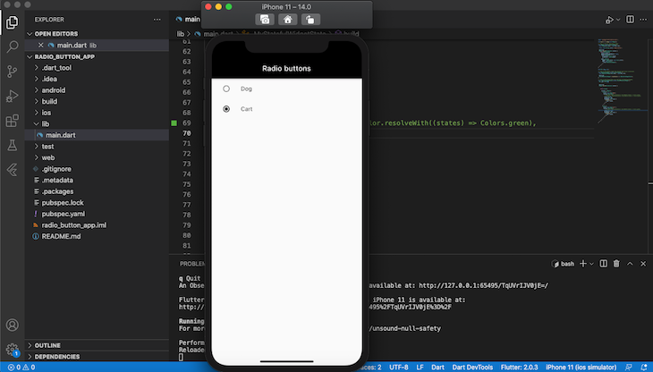
When you run your app, it should look similar to the screenshot below:
Now that we’ve finished building our radio button in Flutter, we can change the look and feel of it using styling properties like activeColor, focusColor, fillColor, and hoverColor.
Let’s update our two ListTile components with the code in between Start copy and End copy:
ListTile(
          title: const Text('Dog'),
          leading: Radio<Pet>(
//Start copy
            fillColor: MaterialStateColor.resolveWith((states) => Colors.green),
            focusColor: MaterialStateColor.resolveWith((states) => Colors.green),
// End copy
            value: Pet.dog,
            groupValue: _pet,
            onChanged: (Pet value) {
              setState(() {
                _pet = value;
              });
            },
          ),
        ),
Now, your app should look like the screenshot below:

Although it is functional, the default radio button may be too simple for your needs depending on the type of application you’re building. Now that we know how to build a radio button using the default Flutter radio widget, let’s build our own custom radio button for more advanced use cases.
First, let’s create our own widget called CustomRadioButton:
int value = 0;
Widget CustomRadioButton(String text, int index){
      return OutlineButton(onPressed: (){
        setState(() {
          value = index;
        });
      },
      child: Text(
        text,
        style: TextStyle(
          color: (value == index) ? Colors.green  : Colors.black,
        ),
      ),
      shape: RoundedRectangleBorder(borderRadius: BorderRadius.circular(10)),
      borderSide: BorderSide(color: (value == index) ? Colors.green  : Colors.black),
      );
  }
In the code above, we build our radio button using OutlineButton, similar to how we used ListStyle in the previous section.
The CustomRadioButton widget has two parameters, text and index. text is the name of the radio, while the index contains the index number of the radio that is currently selected.
When a user selects a button, the value of the index will be updated based on the value set on CustomRadioButton, causing the Radio buttons to re-render with a new state.
Let’s build a radio button that asks a user to select between single, married, or other:
import 'package:flutter/material.dart';
void main() => runApp(const MyApp());
/// This is the main application widget.
class MyApp extends StatelessWidget {
  const MyApp({Key key}) : super(key: key);
  static const String _title = 'Radio buttons';
  @override
  Widget build(BuildContext context) {
    return MaterialApp(
      title: _title,
      debugShowCheckedModeBanner: false,
      theme: ThemeData(
        primaryColor: Colors.black,
        accentColor: Colors.black,
      ),
      home: Scaffold(
        appBar: AppBar(title: const Text(_title)),
        body: const Center(
          child: MyStatefulWidget(),
        ),
      ),
    );
  }
}
/// This is the stateful widget that the main application instantiates.
class MyStatefulWidget extends StatefulWidget {
  const MyStatefulWidget({Key key}) : super(key: key);
  @override
  State<MyStatefulWidget> createState() => _MyStatefulWidgetState();
}
/// This is the private State class that goes with MyStatefulWidget.
class _MyStatefulWidgetState extends State<MyStatefulWidget> {
  int value = 0;
  Widget CustomRadioButton(String text, int index) {
    return OutlineButton(
      onPressed: () {
        setState(() {
          value = index;
        });
      },
      child: Text(
        text,
        style: TextStyle(
          color: (value == index) ? Colors.green : Colors.black,
        ),
      ),
      shape: RoundedRectangleBorder(borderRadius: BorderRadius.circular(10)),
      borderSide:
          BorderSide(color: (value == index) ? Colors.green : Colors.black),
    );
  }
  @override
  Widget build(BuildContext context) {
    return Column(
      children: <Widget>[
        CustomRadioButton("Single", 1),
        CustomRadioButton("Married", 2),
        CustomRadioButton("Other", 3)
      ],
    );
  }
}
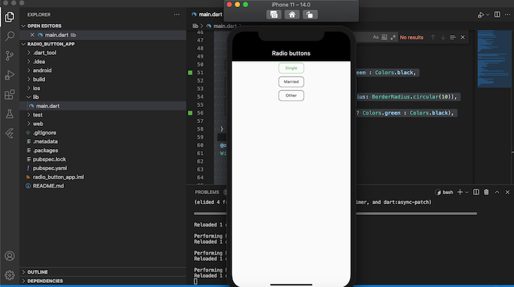
The output of the code above should look similar to the screenshot below:
A radio button is a popular UI element for its simplicity and effectiveness, particularly in mobile applications. In this tutorial, we built a simple radio button using the default Flutter radio button widget, and we built our own widget for customizing and styling a complex radio button. I hope you enjoyed this tutorial!
Install LogRocket via npm or script tag. LogRocket.init() must be called client-side, not
server-side
$ npm i --save logrocket

// Code:

import LogRocket from 'logrocket';
LogRocket.init('app/id');
// Add to your HTML:

<script src="https://cdn.lr-ingest.com/LogRocket.min.js"></script>
<script>window.LogRocket && window.LogRocket.init('app/id');</script>
Would you be interested in joining LogRocket's developer community?
Join LogRocket’s Content Advisory Board. You’ll help inform the type of content we create and get access to exclusive meetups, social accreditation, and swag.
Sign up now
Not sure if low-code is right for your next project? This guide breaks down when to use it, when to avoid it, and how to make the right call.
Compare Firebase Studio, Lovable, and Replit for AI-powered app building. Find the best tool for your project needs.
Discover how to use Gemini CLI, Google’s new open-source AI agent that brings Gemini directly to your terminal.

This article explores several proven patterns for writing safer, cleaner, and more readable code in React and TypeScript.

 Learn more →
