Container queries may represent the most powerful responsive design feature since CSS Grid. In this article, we explore what container queries are and whether they will replace media queries as the primary tool for styling interfaces under changing conditions.

The following diagrams highlight the fundamental difference between the two approaches. With media queries, responsive styles are applied based on the viewport.
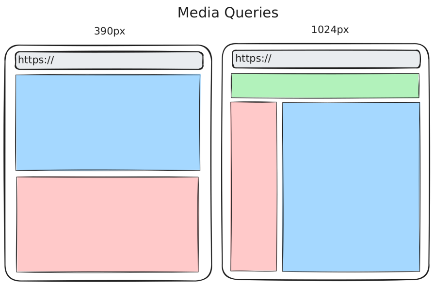
In contrast, with container queries, we can implement responsive behaviour on a fine-grained component level.
There are three variants of container queries: container size queries, container style queries, and container scroll-state queries. The main focus of this article is on container size queries, though. This feature is shipped by all major browsers.
The Replay is a weekly newsletter for dev and engineering leaders.
Delivered once a week, it's your curated guide to the most important conversations around frontend dev, emerging AI tools, and the state of modern software.
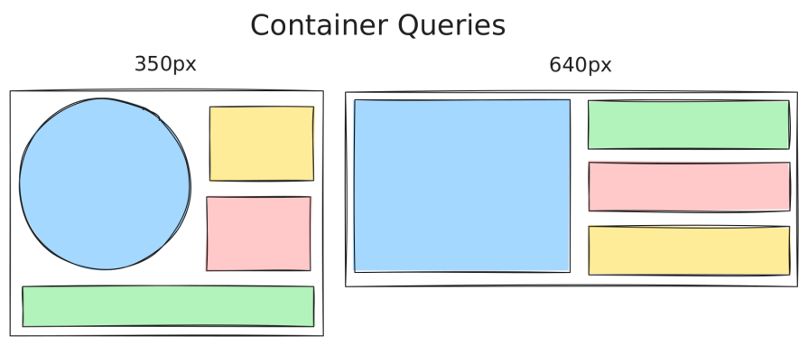
This section gives a quick heads-up on container queries. The concept is that you style an element based on the context of a parent element, which represents the container. With container size queries, the context is the dimensions of a container. On the other hand, with container style queries, you can apply styles to an element when the styles of a container change.
The following animation shows how container size queries can be utilized to adapt the shape of a component based on its container (visualized with a grey background). The context is the size of the container. With container style queries, the context can be whatever style property of the container.
Regarding container size queries, you need to opt in. If you want to style a child element dependent on its parent container, you have to set the so-called containment context on the parent element. This essentially marks the element as a container. This extra step is because of performance reasons.
With the container-type property, you declare an element as a container:
.my-size-container {
    container-type: inline-size;
}
You most likely want to use the value inline-size, which enables you to query a container based on its inline axis. With the introduction of Flexbox, the CSS specification shifted to use logical directions (e.g., inline, block) rather than physical directions (e.g., left, top). This is also the case with container queries. In a horizontal writing mode, you essentially use inline-size to query for the container width.
Let’s quickly discuss the other possible values for container-type:
normal – The default value – the element is not a container. That’s why you need to opt in by setting this property to a different value. It can be used to disable an already used containersize – Establishes a container to be queried in both the inline and block directionsscroll-state – We will look at this later, since this is required to use container scroll-state queriesAnd this is how you can query the declared container regarding dimension changes:
.my-container-child {
    display: flex;
    flex-direction: column;
}
@container (width > 480px) {
    .my-container-child {
        flex-direction: row;
    }
}
The example suggests that this component arranges its elements vertically in a narrow context. If the parent container exceeds 480px, then the layout switches to a horizontal orientation.
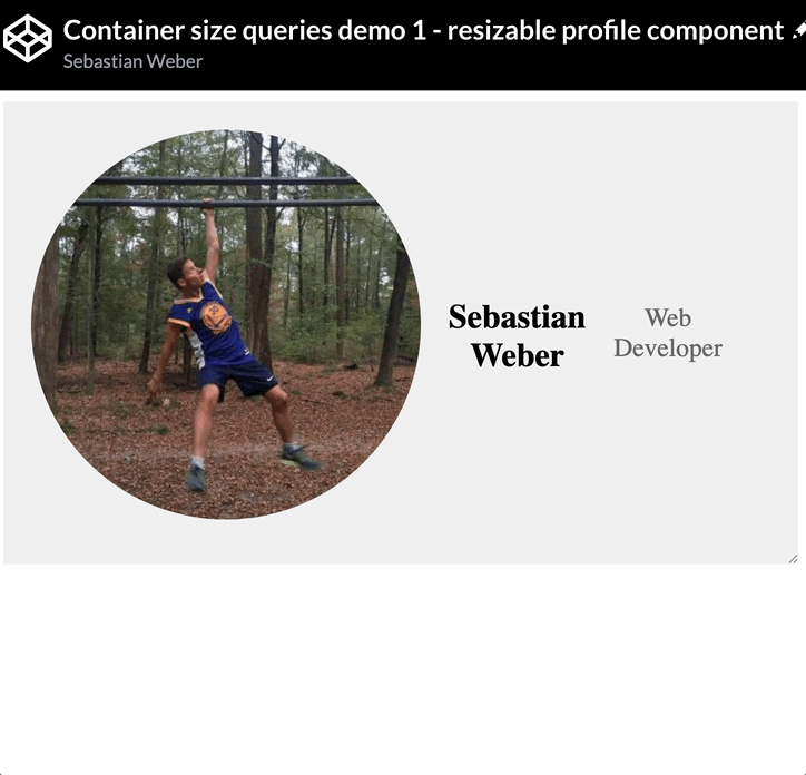
Explore the Codepen that reproduces the earlier animation: a component switches between vertical and horizontal layouts based on its container’s width.
See the Pen
Container size queries demo 1 – resizable profile component by Sebastian Weber (@doppelmutzi)
on CodePen.
Container size queries are a game-changer for component-based design. They fill a long-standing gap by making it possible to build components that are truly layout-agnostic.
Without container size queries, many responsive patterns were either impossible or required brittle workarounds using media queries or JavaScript. Relying on APIs like ResizeObserver can also introduce layout shifts, which negatively impact Lighthouse scores and overall usability.
For simple elements such as buttons, Flexbox with grow and shrink, combined with fluid typography, is often sufficient. For composite components like teasers, however, responsiveness was traditionally limited to reordering internal elements based on viewport breakpoints. While this works in some cases, it falls short of enabling intrinsic web design. When component sizes vary independently of the viewport, media queries alone cannot solve the problem.
The following example shows the same component implemented with media queries and illustrates how awkwardly it adapts to these artificial breakpoints:
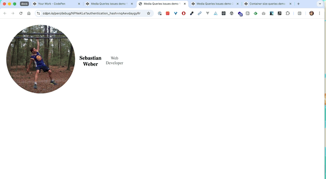
The following Codepen makes it even more obvious that media queries are simply not made for component-based responsive design. Besides the same subpar resize behavior, showing the profile component in its smallest variant in the green sidebar required adding additional context classes and redundant media queries to achieve the result.
See the Pen
Media Queries issues demo 2 – profile components by Sebastian Weber (@doppelmutzi)
on CodePen.
It’s important to note that container size queries are best understood as a complementary pattern to media queries, which still serve important use cases. Media queries remain essential for targeting media types (such as print), device characteristics (like viewport orientation), and user preferences (for example, prefers-color-scheme), all of which are central to inclusive design.
Media queries also continue to make sense for macro-level layouts, such as grid structures that only need to respond to the viewport. For micro-level layouts, however, where individual components need to adapt to their immediate context, container size queries provide a far more appropriate solution.
The following implementation uses container queries to achieve a cleaner approach and a more robust end result.
See the Pen
Container size queries demo 2 – multiple use of profile component by Sebastian Weber (@doppelmutzi)
on CodePen.
Container size queries represent a game-changer in the sense that the usage of media queries for component-based design is obsolete. In the past, you had to introduce a lot of breakpoints, which weren’t stable. Chances were high that these breakpoints had to be adapted whenever the codebase was refactored or extended.
The advantages of container size queries are obvious:
It is advisable to give each container a name so that @container rules are future-proof when additional containers are added or removed. This is mandatory if you use multiple containers in the component tree and you don’t want to measure the nearest container.
.card {
    container-name: card;
    container-type: inline-size;
    section {
        display: flex;
        flex-direction: column;
        /* reference the container by name */
        @container card (min-width: 400px) {
            flex-direction: row;
        }
    }
}
You can also use a shorthand:
.card {
    container: card / inline-size;
}
By the way the container-name property accepts a single name or a list of names.
.card {
    container: molecule card / inline-size;
}
It’s also possible to nest @container rules, as the following (poor) code demonstrates.
@container (width >= 350px) {
  h2 {
      font-weight: bold;
    }
  @container (width < 500px) {
    h2 {
      color: red;
    }
  }
}
The text of the headline is red and bold between container widths of 350px and 499px. If the container is larger than 499px, the headline is bold.
A more common use case is to link the conditions within the query logically. This pattern is known from media queries.
@container (width >= 350px) and (width < 500px) {
    h2 {
        color: red;
    }
}
/* alternative */
@container wide (350px < width < 500px) { /* ... */ }
The next snippet is a preview of style queries, which we will discuss later. It demonstrates that you combine different container query types in one @container rule.
@container (min-width: 300px) and style(--space-between: true) {
    section {
      justify-content: space-between;
    }
}
The container-type property defines the context of the container. We’ve already learned about inline-size, which establishes a container in the inline dimension. In the @container rule, you can use size values like width, min-width, max-width, or inline-size.
With size, you can establish a context in both the inline and block directions. Consequently, you can use the following size features: width, min-width, max-width, height, min-height, max-height, inline-size, or block-size.
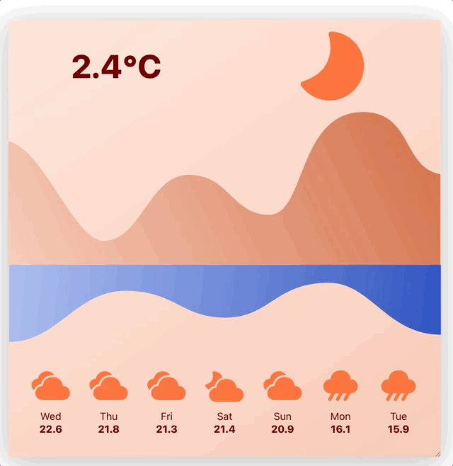
This nice weather widget by Maarten van Hoof impressively demonstrates what is possible with measuring both directions (source on GitHub).
With normal, you can remove the container context of a previously defined container. Since container size queries are an opt-in API, the default value of every HTML element is normal.
Similar to flexbox and grid, container queries come with units specially designed for this purpose. An even more apt comparison is with media queries, because container query units replicate the viewport units, so as an example, the viewport width (vw) pendant is the query container’s width (cqw). Here is a list of container query length units:
cqw – 1% of a query container’s widthcqh – 1% of a query container’s heightcqi – 1% of a query container’s inline sizecqb – 1% of a query container’s block sizecqmin – The smaller value of either cqi or cqbcqmax – The larger value of either cqi or cqbThe principle is similar to that of viewport units; the units are relative to some context, i.e., the container. To create more robust CSS code, I would suggest ignoring cqw and cqh and using cqi and cqb instead. Consequently, the units are relative to the logical direction. You can use values between 1 and 100, where 1cqi is 1% of the container’s width or 100cqb is 100% of the container’s height in a horizontal reading direction.
If you use container query length units but no eligible container exists in the parent tree, the length unit defaults to the corresponding small viewport unit (sv*).
These units add to creating real self-contained components. They can help to implement:
The following snippet shows how clamp can be utilized with container query length units.
.profile {
    padding: clamp(.5rem, 10cqi, 1.5rem);
    .author-name {
        font-size: clamp(14px, 10px + 1.33cqi, 20px);
    }
}
In the following example, the greater value is the inline axis and uses the width for the calculation:

Regarding container size queries, you define the so-called containment context with the aforementioned container-typeproperty. With this knowledge, you better understand the limitations of container queries.
For years, we were told that container (size) queries would not happen because they are impossible to implement. This changed with the invention of the containment API.
With this API, you inform the browser that a component-tree is self-contained. Without that, applying styles to elements based on a container’s size would trigger a recalculation of the container itself, causing an infinite loop. The containment concept is the solution because the container content is no longer included in the calculation of the container size.
This means concrete for the container-type values:
inline-size – The inline size of an element can be computed in isolation, ignoring the childrensize – The size of an element (both dimensions) can be computed in isolation, ignoring the childrenIt’s also the trick that was required to make Container Queries work at all.
As explained by Miriam Suzanne in a Stack Overflow discussion, containment is the key mechanism that makes container queries possible.
The containment APIs lead to some gotchas. Due to performance reasons, you have to define every container with the container-type property, which in turn adds containment to the element. Consequently, using container size queries requires two steps: Defining a container and defining queries on the children of this container. This means, in consequence, that a container cannot query itself – you have to measure an ancestor. This might lead in some scenarios to additional “wrapper” elements, which bloat the markup.
The same is true for container query length units. You cannot measure the element that they are used on. They can only be used on the container’s children. The following Codepen shows some experiments of using container query length units with different values of 1cqi.
See the Pen
Container query length units – experiments by Sebastian Weber (@doppelmutzi)
on CodePen.
Querying the root element might lead to issues. Instead, you should define high-level macro layout elements as containers, such as nav, header, main, and footer.
When using a grid, you shouldn’t use grid items as containers. Instead, you have to add an extra element and declare it as a container.
Speaking of extra elements, if you have an issue with declaring the direct parent of your component as a container, you might find this pattern by Kevin Geary useful:
.component {
  :has(> &) {
    container-type: inline-size;
  }
}
The selector targets the direct parent element of .component. It’s basically the same as:
:has(> .component) {
  container-type: inline-size;
}
Another pitfall is using container size queries in combination with Flexbox. Inspired by a StackOverflow discussion, I created a CodePen to show a common issue – flexbox content collapse, when you don’t add size information to flex items.
See the Pen
Container size queries – flexbox content collapse by Sebastian Weber (@doppelmutzi)
on CodePen.
The codepen reveals that you need to provide either explicit or intrinsic sizing information to prevent content collapse.
You cannot use custom properties inside the queries. The following code does not work, and the browser ignores the query.
article {
  display: flex;
  flex-direction: column;
  /* works @container (min-width: 600px) { ... } */
  /* does not work */
  --tablet-breakpoint: 600px;
  @container (min-width: var(--tablet-breakpoint)) {
    flex-direction: row;
  }
}
Container size queries are great, but there are even more types of container queries. However, there is only limited support yet.
In contrast to container size queries, container style queries do not require an opt-in step. Every element acts as a style container by default.
Container style queries can be used in two primary ways:
By querying custom properties, effectively using them as contextual flags
By querying inherited styles, such as applying styles when a container’s background-color matches a specific value
The following CodePen demonstrates several examples of container style queries.
See the Pen
Container style queries – experiments by Sebastian Weber (@doppelmutzi)
on CodePen.
One can ask what the benefit of using container-style queries with custom properties is.
@container style(--space-between: true) {
    section {
        justify-content: space-between;
    }
}
I believe it’s a better approach than using context classes because of better separation of concerns.
Right now, no browser supports the full-fledged variant of container style queries.
#demo4 {
    background-color: #00bcd4;
    padding: 1rem;


    @container style(background-color: #00bcd4) {
    div {
      color: white;
    }
  }
}
Chrome added support for these scroll-aware container queries at the beginning of 2025. Edge and Opera have caught up so that we have a decent level of availability.
The following snippet shows the syntax with the scroll-state query type stuck. You can also use snapped and scrollable.
.parent {
    container-type: scroll-state;
    /* this is required for type 'stuck' */
    position: sticky;
}
.child {
    @container scroll-state(stuck: top) {
        /* ... */
    }
}
Here is a demo by web.dev that showcases a nice transition with a drop shadow effect on the navigation bar on scrolling.
See the Pen
Sticky State Queries – Nav Shadow On Stuck by web.dev (@web-dot-dev)
on CodePen.
Container scroll-state queries seem to me a perfect use case for progressive enhancement. You can improve UX with them, but build interfaces that are totally usable without them.
You can find more details on the syntax and see practical demos in a previous LogRocket article.
There’s no direct relation between container queries and accessibility. However, it is similar to media queries in the sense that you have to take care that your layout changes do not break keyboard navigation. As described in my last article about screen readers and focus management, users must be able to navigate through your layout in a logical tab order. For sighted users, you have to ensure that content inside your containers remains accessible and readable across all container sizes or style conditions.
Taking extra care for accessibility is particularly important when your container queries cause significant layout changes, especially with transitions. When content changes, you might need aria-live, which marks live regions for dynamic content updates on assistive devices.
Layout shifts should be prevented or smooth enough not to disorient users, e.g., when the user resizes the browser or rotates the device.
The good news is that we have baseline support for container size queries since 2023. Container query length units are also fully supported. It’s awesome that we can now implement pure component-based responsive behavior in real-world projects.
But what about the other two variants of container queries? Things don’t look quite so good yet. Regarding container style queries using custom properties as a condition, it is now up to Firefox to add support. I am optimistic that we will see support land in Firefox in 2026. You can track the status in a GitHub issue.
If you want to apply styles based on the styles of the container, you have to wait until the limited availability across browsers improves. Right now, you can only experiment with it and use this time to think about real-world use cases in the future.
Things look a bit better with container scroll-queries that are already supported by Chrome, Edge, and Opera as of December 2025.
Even without baseline support, you can progressively enhance your project with container query features by leveraging @supports. The following example shows that the scroll-state query is only applied if the browser supports this feature:
.parent {
  container-type: scroll-state;
  position: sticky;
  top: 0px;
  @supports (container-type: scroll-state) {
    > nav {
      @container scroll-state(stuck: top) {
        background: var(--highlight-bg-color);
        color: var(--highlight-color);
      }
    }
  }
}
For years, people demanded container queries as the holy grail. Now they are here – why are they adopted so slowly?
In the 2025 edition of the State of CSS survey, 36% of respondents added @container style queries and 43% added @container scroll-state queries to their reading lists. Actual usage, however, remains low: only 7% reported using style queries and fewer than 1% reported using scroll-state queries. This gap suggests that these features are still relatively unknown or experimental for much of the CSS community, which is not surprising given their limited browser support.
But the big brother of container queries, namely container size queries, was used at least once by 41% of the participants. There is still room for improvement. Awareness increased from 81% in 2024 to 86% in 2025.
When I read reviews, I often noticed that developers were frustrated by container collapse. They will probably need to familiarize themselves with the specifics of the feature and the containment API before it is used regularly in production. I’m optimistic that the adoption rate will continue to rise.
One reason for the slow adoption in the past could be the baseline support. However, almost two years have passed since February 2023, when container size queries became widely available across all major browsers.
Another major factor for fostering a higher adoption rate of container size queries is an adequate design of the frontend implementation workflow. Designers need to utilize their design tools, even when they do not have native container query support, to communicate their design intentions to development. With Figma, it is possible to design component variants, which is an adequate way to communicate the responsive behaviour in a way that front-end developers can implement it with the use of container queries. Frontend devs and designers need to educate each other on this topic. Both groups need to establish a mental shift from viewport-centric design to container-centric design.
In Chrome and Firefox, container queries can be inspected in much the same way as Flexbox and Grid layouts. Open DevTools and navigate to the Elements panel. Elements that are declared as containers are clearly marked, and hovering over them highlights the corresponding container directly in the viewport.
The Chrome engineers explained their debugging feature quite well.
“Media queries on elements” was a long-standing request in the CSS community. In early 2023, that request was finally answered with the widespread availability of container size queries.
Container queries were introduced to address the fundamental limitations of viewport-based responsive design. They enable truly self-contained components whose internal layout adapts based on their container context, not global breakpoints. As a result, components can flow naturally in any layout, whether narrow or wide, without relying on fragile media queries and hard-coded “magic numbers.”
That said, container queries are not a silver bullet. Container style queries are still only partially supported, and there are real limitations and gotchas to be aware of. Overusing container queries can also have performance implications. Used where they make sense, however, they significantly improve CSS maintainability and lead to better UX and usability. They don’t replace media queries, but they complement them in a meaningful way.
The future of responsive design with container queries looks promising. As browser support evolves, container style queries for custom properties may become practical as early as 2026. Styling child elements based on the styles of their parent containers is already on the horizon.
As web frontends get increasingly complex, resource-greedy features demand more and more from the browser. If you’re interested in monitoring and tracking client-side CPU usage, memory usage, and more for all of your users in production, try LogRocket.

LogRocket lets you replay user sessions, eliminating guesswork around why bugs happen by showing exactly what users experienced. It captures console logs, errors, network requests, and pixel-perfect DOM recordings — compatible with all frameworks.
LogRocket's Galileo AI watches sessions for you, instantly identifying and explaining user struggles with automated monitoring of your entire product experience.
Modernize how you debug web and mobile apps — start monitoring for free.

Learn how inline props break React.memo, trigger unnecessary re-renders, and hurt React performance — plus how to fix them.

This article showcases a curated list of open source mobile applications for Flutter that will make your development learning journey faster.

Discover what’s new in The Replay, LogRocket’s newsletter for dev and engineering leaders, in the April 1st issue.
This post walks through a complete six-step image optimization strategy for React apps, demonstrating how the right combination of compression, CDN delivery, modern formats, and caching can slash LCP from 8.8 seconds to just 1.22 seconds.
Hey there, want to help make our blog better?
Join LogRocket’s Content Advisory Board. You’ll help inform the type of content we create and get access to exclusive meetups, social accreditation, and swag.
Sign up now

 Learn more →
