
Editor’s note: This article was last updated 24 January 2023 to reflect updates to several of the chart libraries mentioned, including Apexcharts.

As technology advances, our ability to collect relevant business data is constantly improving. Therefore, data visualization is becoming increasingly important in every organization.
In early web development, programmers had to combine different database records to produce charts and dashboards that anyone could easily understand. However, the introduction of charting libraries addressed this challenge, and nowadays, there are thousands of charting libraries available for JavaScript.
When it comes to building charts, it’s very easy to get excited by a beautiful interface. But getting started with a charting library without understanding all of its features can be greatly detrimental to the developer experience. While most libraries would suffice for a generic application, realistically, we’ll need something tailored to our use case. And, more importantly, we need a reliable charting library that we can build upon.
In this article, we’ll review some of the most popular JavaScript charting libraries, including HighCharts, Chart.js, C3.js, Chartist, Plotly, ApexCharts, and NVD3, helping you to make an informed decision when it comes to implementing one for yourself.
We’ll consider aspects like technical prowess, performance, ease of implementation, customization, compatibility, and aesthetics. In addition, we’ll consider some real scenarios to compare which charting library best suits each, discussing the upsides and drawbacks of each. Let’s get started!
The Replay is a weekly newsletter for dev and engineering leaders.
Delivered once a week, it's your curated guide to the most important conversations around frontend dev, emerging AI tools, and the state of modern software.
Based on SVG technology, HighCharts is a modern charting library with fallbacks for older browsers, making its compatibility strong. As a generic JavaScript library, integrating HighCharts with all of the major web frameworks is very simple.
HighCharts is well rounded and incredibly fully-featured, and I’m a fan of the dynamic charts in particular, which enable the end user to tangibly interact with the data. The documentation on their project website is also very thorough.
Since the first release of Chart.js v2.0 in April 2016, the product has improved markedly. Chart.js v2.0 offers pleasing data animations and transitions, date and time, logarithmic functionality, and the ability to mix different types of data charts together into one.
Chart.js v4.1.1, which is the newest version at the time of writing, offers access to advanced features like scale stacking, making it possible to stack and weigh layout boxes in groups. Chart.js is a much lighter product than HighCharts and doesn’t offer quite as much choice. However, its documentation leaves little to be desired.
C3 is a simple wrapper around the D3.js library. By wrapping D3, we no longer have to write any D3 code. C3 is fast to render, has strong compatibility across browsers, and is very simple to integrate.
The biggest thing to note with this library is the slight lack of functionality. It is not as fully featured as the other leading libraries, and the visualizations themselves are somewhat simple. Charts produced with this library will never win an award for artistic styling, but they are functional and clean. If you’re looking for no-frills, C3 is a decent choice. C3 also offers detailed documentation for what is an inherently simple library.
Chartist, another thoroughly modern, SVG-based library, was built upon the idea that other libraries were simply not offering enough customization options.
The biggest feature is arguably SVG animations in the charts. If you use a modern browser, you can implement CSS 3 animations on SVG attributes that make standard charts much more visually pleasing. You can also implement more extensive animations with SMIL.
Thankfully, Chartist’s looks aren’t just skin deep. Chartist has a solid technological base and is very easy to implement. Within minutes, you can create incredibly impressive, expressive charts that interact easily with any backend data source. Overall, Chartist is great option, but maybe not quite as fully featured as HighCharts. You can check out the website for excellent documentation.
Built on top of D3.js, Plotly is one of the most common libraries used. Visually, Plotly is not as stunning as Chartist, but in terms of technical prowess, Plotly steals the top spot of all the libraries in the article in my opinion.
However, when I included a lot of data, I noticed that Plotly struggled to run on an older machine of mine and actually managed to crash Chrome. That being said, it is a fantastically rich library that has outstanding documentation, including a tutorial for each of the chart types.
Apexcharts is another modern JavaScript charting library that uses a simple API. Apexcharts includes a responsive tooltip, and many developers refer to this tool for its interactive SVG charts for Vue and React.
Apexcharts is free for commercial purposes, MIT-licenced, and it contains extra predefined color themes. Apexcharts stands out for its unique, interactive features, like its smooth interactive animations while changing datasets and dynamic data loading. It also has zooming capabilities and offers great support for Vue, vanilla JavaScript, React, and Angular. It offers charts like bar, donut, pie, line, area, annotation, bubble, and more.
However, one major drawback of Apexcharts is its slow rendering. However, you can fix this by updating the state using a set timeout inside the useEffect Hook.
Apexcharts includes a very extensive user documentation that contains descriptive guides to get you started quickly. The documentation comes with demos and source code that serve as a reference point for first-time users.
As a direct competitor to C3, NVD3 is built upon D3.js. Focusing more around function than form, NVD3 has a solid technical base but is quite sparse in the aesthetics department.
NVD3’s performance is relatively good, and it does offer some basic animations to add visual stimulation to an otherwise fairly plain interface. You can add in data directly from .json files, meaning NVD3 is very easy to integrate with existing data API solutions.
However, my biggest complaint is that their documentation is almost nonexistent, comprising of only samples and not going into depth on customization options.
Now that we’re familiar with a few charting libraries for JavaScript, we’ll review some real scenarios, comparing the charting libraries against each other to determine which comes out on top.
All of these scenarios have been generously provided by colleagues of mine, covering common uses for charting libraries that we all may encounter one day.
One of the most common use cases for charting libraries involves financial data. For our first scenario, we’ll cover something common, tracking stocks. Tracking any financial data is always a complicated task, but even more so when it comes to stocks, shares, and currencies; the sheer amount of data used to populate the charts we see on major financial websites is huge.
When I compared the charting libraries in a stock tracking scenario, there was one clear winner, HighCharts.
HighCharts actually comes with a built-in library created specially for financial data called HighStock. Initially, I thought that a library with a simpler interface would have produced a more clear and performant result due to its relative lightness.
However, after testing the D3 libraries against HighCharts in this financial stocks context, I realized that HighCharts would not only allow me to map an extremely large amount of data with minimal effort, but it would also remain rather performant in comparison to the lighter libraries.
Below is a sample of JSON mapping data that I sourced directly from the Google Stocks API. Although the Google Stocks API is deprecated, this is a very standard data format of simple timestamps and data points, so it’s safe to assume we can utilize it:
/* Oct 2017 */
[1506902400000,154.26,154.45,152.72,153.81],
[1506988800000,154.01,155.09,153.91,154.48],
[1507075200000,153.63,153.86,152.46,153.48],
[1507161600000,154.18,155.44,154.05,155.39],
[1507248000000,154.97,155.49,154.56,155.30],
[1507507200000,155.81,156.73,155.48,155.84],
[1507593600000,156.06,158.00,155.10,155.90]
]);
When we import our JSON data file into HighCharts, it is displayed in a concise and readable manner. Whether you’re part of a large corporation or a small startup, HighCharts would impress anybody looking at your data visualizations. However, HighCharts will need to be licensed if you’re using it in a commercial setting; you can find details of HighCharts licensing here.
You can use HighCharts inside of your React Application, however, in this example, we‘ll use it inside of a basic JavaScript project. To include HighCharts in our project, add the following code snippet to to the header section of our HTML file, as shown in the following screenshot:
<script src="https://code.highcharts.com/highcharts.js"></script>
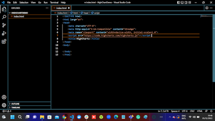
Next, we‘ll create an index.js file and a container where we’ll render our charts:
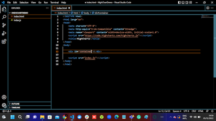
Then, we’ll initialize our HighCharts library by using an event listener, as shown in the code snippets below:
document.addEventListener('DOMContentLoaded', ()=> {
    Highcharts.chart('container', {
    });
});
After successfully including the code snippet above inside our index.js file, we can go ahead and run this on the web browser to receive a similar response to the one below:
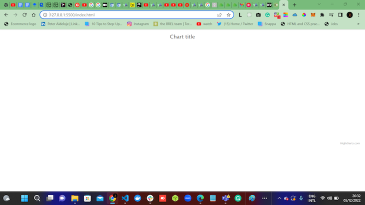
From the image above, we can see the chart title and HighChart.com, which are populated by default from HighCharts.js.
We can now populate our data from JSON mapping data inside our index.js file, as shown below:
document.addEventListener('DOMContentLoaded', ()=> {
    Highcharts.chart('container', {
xAxis: {
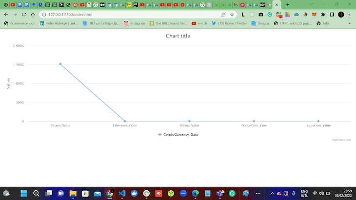
categories: ["Bitcoin_Value", "Ethereum_Value", "Solana_Value", "DodgeCoin_Vaue", "LunoCoin_Value"]
},
series: [{
name: 'CryptoCurrency_Data',
data: [1506902400000, 154.26, 154.45, 152.72, 153.81]
}]
});
});
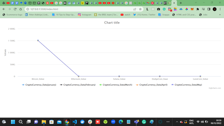
The code snippets above help to visualize our CryptoCurrency_Data on the browser, as shown below:
The code snippets above can also be duplicated to visualize more data. In the code snippet below, we’ll duplicate our code to visualize five data sets:
document.addEventListener('DOMContentLoaded', ()=> {
    Highcharts.chart('container', {
xAxis: {
categories: ["Bitcoin_Value", "Ethereum_Value", "Solana_Value", "DodgeCoin_Vaue", "LunoCoin_Value"]
},
series: [{
name: 'CryptoCurrency_Data(January)',
data: [1506902400000, 154.26, 154.45, 152.72, 153.81]
},
{
    name: 'CryptoCurrency_Data(February)',
    data: [1506988800000,154.01,155.09,153.91,154.48]

},

{
    name: 'CryptoCurrency_Data(March)',
    data: [1507075200000,153.63,153.86,152.46,153.48]

},

{
    name: 'CryptoCurrency_Data(April)',
    data: [1507161600000,154.18,155.44,154.05,155.39]

},

{
    name: 'CryptoCurrency_Data(May)',
    data: [1507248000000,154.97,155.49,154.56,155.30]

}

]
});
});
The result is similar to the screenshot below:
Almost every startup that collects user data on signup needs some kind of dashboard. For instance, if we pretend that we’re an API provider company, we need to be able to offer our customers usable, concise, and most importantly, useful data on their usage of our service.
GitHub offers us commit history charts, SendGrid offers us detailed email usage statistical charts, and Auth0 offers us usage charts on our users. They all have a concise and agreeable way of presenting this data to us, without massively slowing the page down or being too intrusive.
In my last startup, we spent weeks trying out every major JavaScript charting library to find the one that could visualize our data in an aesthetically pleasing way, but also stay performant and be highly customizable.
In this scenario, my choice has to be Chartist.js. Chartist is not only performant, even with lots of data thrown at it, but is also hands-down the most beautiful and visually-pleasing way of presenting one’s data. The creators of Chartist have focused on building a technically-solid product that allows enormous amounts of customization.
Another common scenario is plotting data over a period of time, in a fairly similar way to the financial scenario above, but without the same amount of data.
If we wanted to use HighCharts for plotting time series data, that would be fine. However, if we want to use a library that is lighter, a little easier to implement, and more importantly, free to license, I would very much recommend Plotly.
Built atop of Python and R, Plotly has a very solid technical base. It has API libraries available across most major languages, but we’ll be looking specifically at Plotly JavaScript.
Plotly is very easy to implement, whether you’re simply hard-coding a small amount of data or feeding in a JSON data file as I have, Plotly.js is very performant, clean, and concise. I’m a big fan!
Charting is something that all developers will need to use frequently, so it’s no surprise that there are many great open source charting libraries available for us to choose from.
I’ve worked with all of the libraries I mentioned above, and the scenarios are directly sourced from my own or colleagues’ experience, reflecting some of the obvious ways that we need to implement charting in the real world.
As technology develops, it’s nice to see charts becoming lighter through more performant libraries. A few years ago, implementing data-heavy charting without conflating and slowing down our application was a great struggle. Each of the libraries I mentioned above has very good browser compatibility and fallbacks available for people using legacy browsers.
The libraries built upon D3 have a solid base, but personally, I find them a little bit underwhelming from an aesthetic aspect.
My favorite of the libraries above is definitely Chartist. I’m a huge fan of its beauty and its ease of implementation. I love how performant it is, and it definitely takes my prize for best user experience. Chartist is brilliantly featured and can be adapted to fit into almost any scenario, making it an ideal choice for anyone’s needs, regardless of their data format or situation.
I’m more than happy to chat about charting libraries if you have any questions, and I’d love to hear your stories of implementation. Drop me a line at [email protected].
There’s no doubt that frontends are getting more complex. As you add new JavaScript libraries and other dependencies to your app, you’ll need more visibility to ensure your users don’t run into unknown issues.
LogRocket is a frontend application monitoring solution that lets you replay JavaScript errors as if they happened in your own browser so you can react to bugs more effectively.
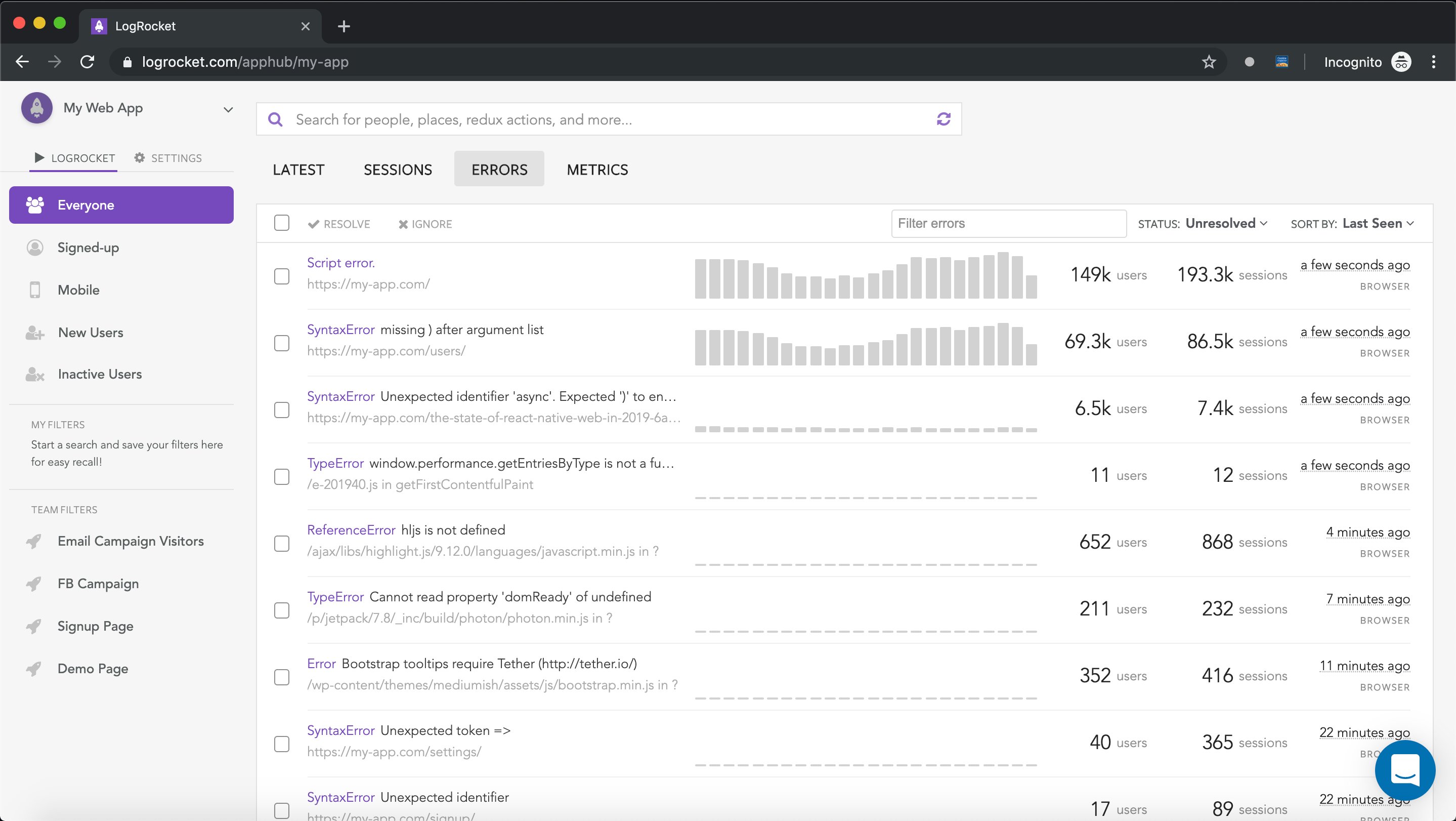
LogRocket works perfectly with any app, regardless of framework, and has plugins to log additional context from Redux, Vuex, and @ngrx/store. Instead of guessing why problems happen, you can aggregate and report on what state your application was in when an issue occurred. LogRocket also monitors your app’s performance, reporting metrics like client CPU load, client memory usage, and more.
Build confidently — start monitoring for free.

A step-by-step guide to building your first MCP server using Node.js, covering core concepts, tool design, and upgrading from file storage to MySQL.

Using security headers in your Next.js apps is a highly effective way to secure websites from common security threats.

A deep dive into April 2026’s AI model and tool rankings. We break down performance, usability, pricing, and real-world capabilities across 50+ features to help you pick the right tools for your development workflow.

A practical guide to Agent Browser CLI. Learn how AI agents navigate, snapshot, and interact with web pages using stable references, enabling efficient automation and exploratory testing.
Hey there, want to help make our blog better?
Join LogRocket’s Content Advisory Board. You’ll help inform the type of content we create and get access to exclusive meetups, social accreditation, and swag.
Sign up now