
Chakra UI is a popular React component library designed to speed up and simplify UI development. It provides a set of customizable and composable components that developers can easily integrate into their React applications.
In today’s frontend landscape, Chakra UI stands out due to its excellent DX and support for building accessible frontend components. You can also use Chakra UI to improve the overall efficiency of your development process.
This adoption guide will provide some background information about Chakra UI. We’ll discuss its pros, cons, key features, and use cases to help you understand what makes this library a great choice for modern applications. Let’s get started.
The Replay is a weekly newsletter for dev and engineering leaders.
Delivered once a week, it's your curated guide to the most important conversations around frontend dev, emerging AI tools, and the state of modern software.
Chakra UI was developed by Segun Adebayo to address the need for a simple component library for React applications. It has gained popularity due to its flexibility, ease of use, and excellent collection of pre-designed components that follow design principles and best practices.
Chakra UI works by offering React components that can be easily incorporated into any application. These components cover a wide range of UI elements, such as buttons, forms, modals, and more.
One notable feature of Chakra UI is its emphasis on style props, allowing for component styling through props. This simplifies the styling process and makes it more intuitive.
[as] propChakra UI provides an amazing user experience and a low learning curve, making it particularly beginner-friendly. There are many reasons why you should use Chakra UI, including:
Despite all these great and compelling reasons to choose Chakra UI, it’s only fair to mention some of its drawbacks. So, now that we’ve discussed what makes Chakra UI great, let’s talk about some of Chakra UI’s cons:
So far, we’ve explored Chakra UI’s background, pros, and cons. Let’s discuss some of its standout features next to give you a clearer picture of its capabilities.
Chakra UI offers a comprehensive set of customizable and composable components. Let’s take a quick look at some of the key aspects of Chakra UI that you should know before getting started.
Chakra UI components are sets of pre-built shapes, widgets, or objects. They are fully customizable and easy to import and use in our application. The Chakra documentation organizes components into different categories:
Let’s look at how Chakra UI’s Stack component works. We can use this layout component to arrange its children’s elements vertically or horizontally and apply spacing between them.
Chakra UI provides developers with three types of Stack components:
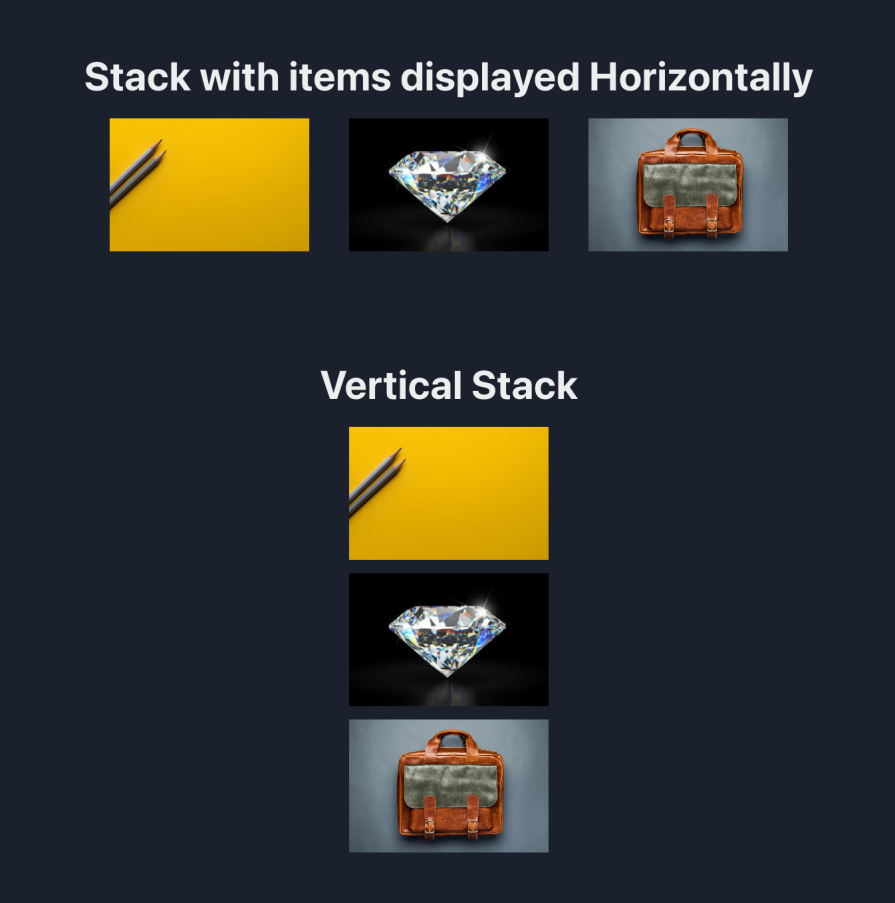
Stack: For laying out stacked items in a specified direction (horizontally or vertically)HStack: For laying out stacked items horizontallyVStack: For laying out stacked items verticallyHere’s an example of how to display items horizontally and vertically with the help of Chakra UI’s Stack components:
import { Stack, Box, Image, VStack, HStack, Heading } from "@chakra-ui/react";

export const App = () => {
  return (
    <Box p={12} textAlign="center">
      <Heading as="h3">Stack with items displayed Horizontally</Heading>
      <Box h={3} />
      <Stack
        direction="row"
        spacing="30px"
        w="100%"
        align="center"
        justify="center"
      >
        <Image h="100" src="https://rb.gy/25527l" />
        <Image h="100" src="https://rb.gy/pdow7u" />
        <Image h="100" src="https://rb.gy/ci9dvg" />
      </Stack>
      <Box h={20} />

      <Heading as="h3">Vertical Stack</Heading>
      <Box h={3} />
      <VStack spacing="10px" textAlign="center">
        <Image h="100" src="https://rb.gy/25527l" />
        <Image h="100" src="https://rb.gy/pdow7u" />
        <Image h="100" src="https://rb.gy/ci9dvg" />
      </VStack>
      <Box h={6} />
    </Box>
  );
};
The Stack component displays items in a vertical direction if the direction prop isn’t specified. Here’s the outcome of our code:
One of Chakra UI’s more exciting features is its out-of-the-box support for theming. Theming enables users to change the color state of the application between light and dark mode, like so:
import { Button, useColorMode, Box } from '@chakra-ui/react'

export const App = () => {
  const { colorMode, toggleColorMode } = useColorMode()

  return (
    <Box p="16">
      <p>The current Theme is: {colorMode} mode.</p>
      <Box h="7" />
      <Button onClick={toggleColorMode}>Change Theme</Button>
    </Box>
  )
}
The code snippet above demonstrates how Chakra UI handles theme changes in an application. Firstly, we imported the useColorMode hook from the @chakra-ui/react library. This hook gives us access to the colorMode state and the toggleColorMode function.
The colorMode state provides us with the current theme data — light or dark — while the toggleColorMode is a function used to toggle between these theme states. Here’s the outcome:
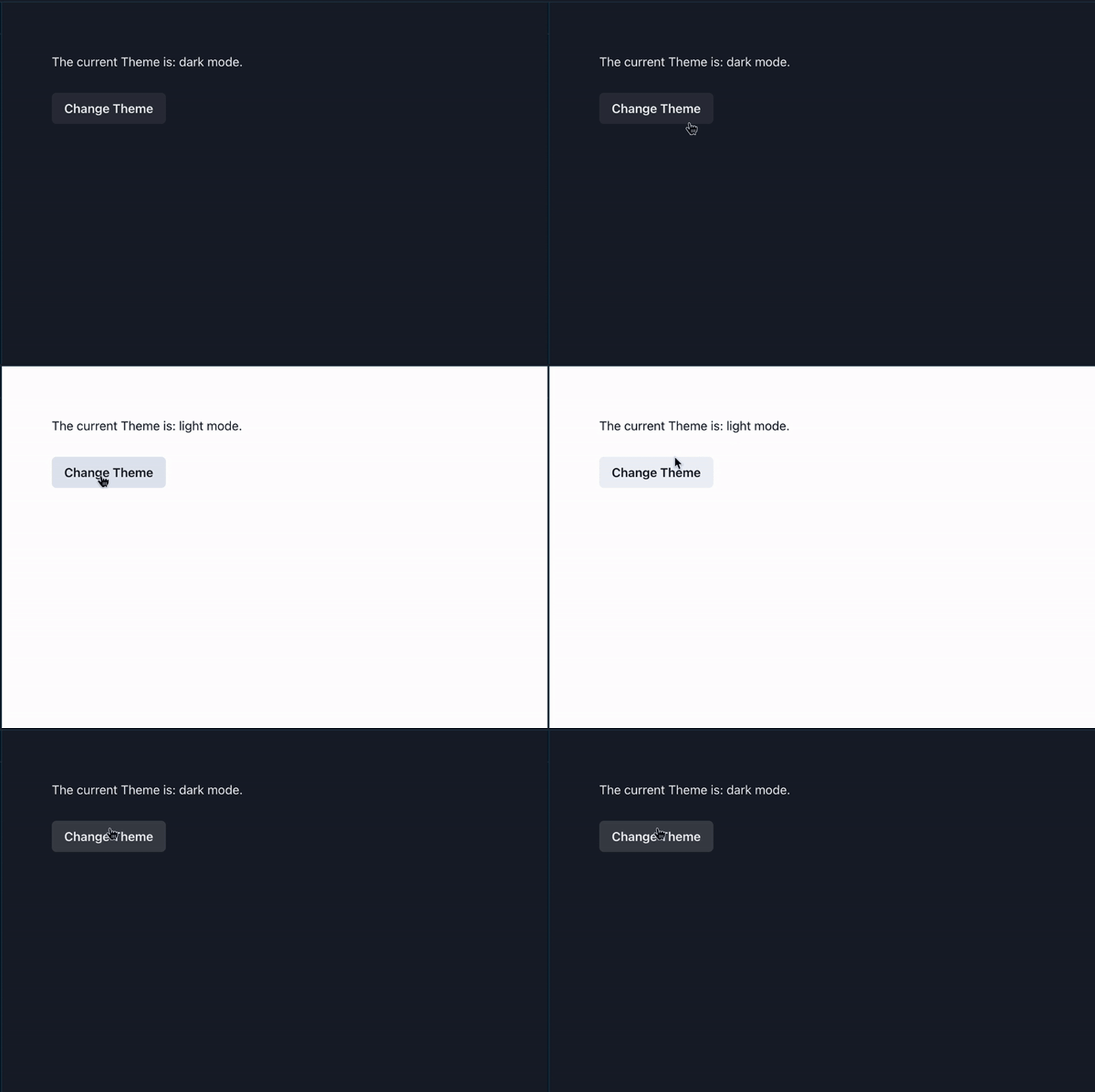
This feature is seamlessly integrated into Chakra UI’s theming system, making it convenient for developers to implement and for users to switch between their preferred color modes.
Another of Chakra UI’s key features is a set of utility-first CSS properties within the library, making styling and customizing components easy. Utility classes eliminate the need to create separate stylesheets to customize components by directly mapping to the CSS properties.
One way to leverage this feature is by using arrays or object notations when creating different breakpoints for responsive styling. Another use case is when specifying pseudo-classes — such as hover, focus, and active — on Chakra UI components without needing to write additional CSS.
Let’s see an example of Chakra UI’s utility-first styling approach:
import { Button, Box, Text } from '@chakra-ui/react'

export const App = () => {
  return (
    <Box p="16">
      {/* Customizing component */}
      <Box p={4} bg="purple.700" color="white">
        <Text fontSize="xl" fontWeight="600">
          This is a styled component using Chakra UI utility classes.
        </Text>
      </Box>

      <Box h="10" />

      {/* Responsive font size and padding */}
      <Box p={[20, 2, 40]} bg="green.900" fontSize={['sm', 'md', 'xl']}>
        This component has responsive padding and font sizes.
      </Box>

      <Box h="10" />

      {/* Pseudo-classes */}
      <Button
        bg="blue.500"
        _hover={{ bg: 'red.500' }}
        _active={{ bg: 'yellow.600' }}
      >
        Click me
      </Button>
    </Box>
  )
}
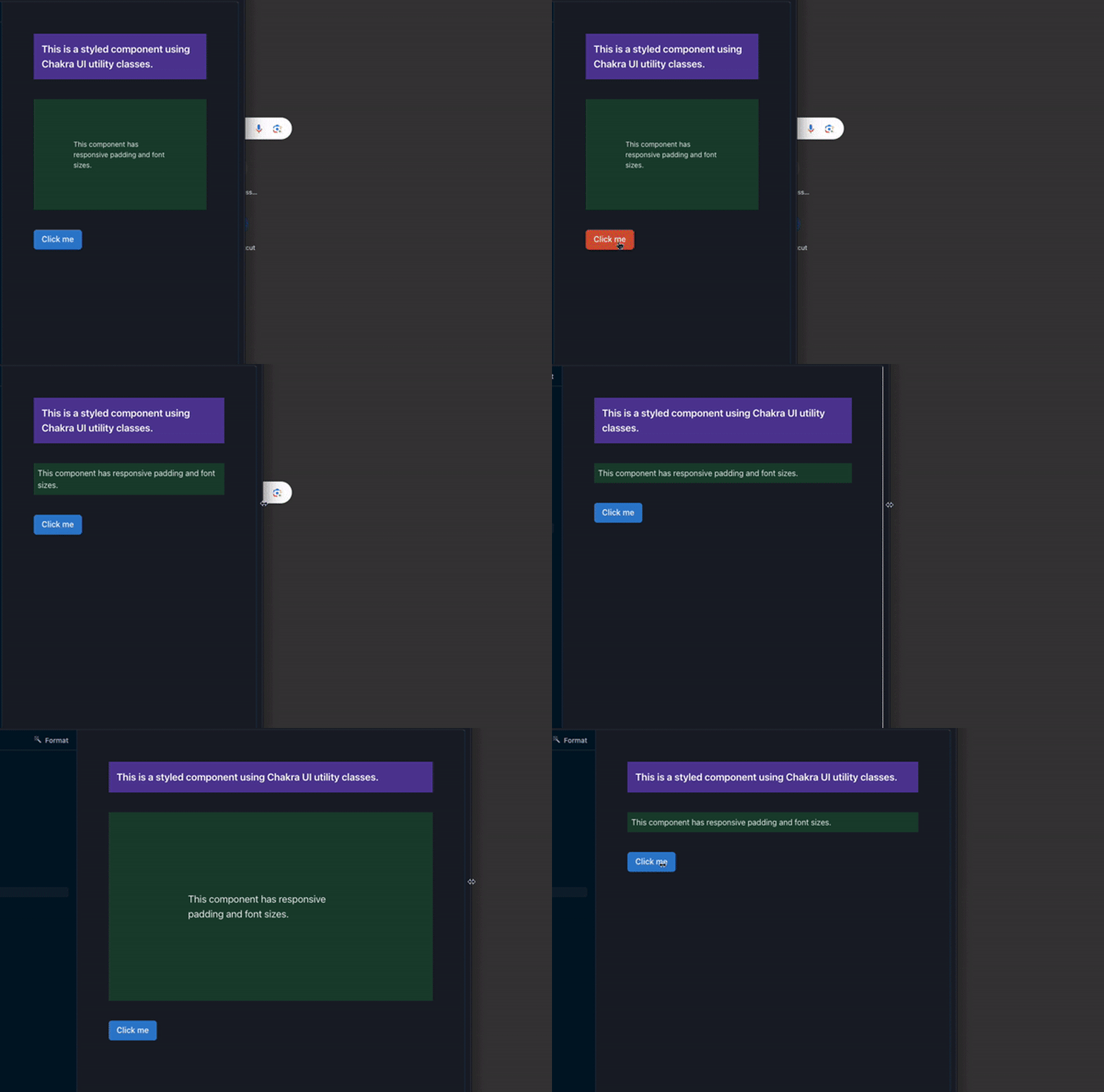
In the code above, we created:
p={[20, 2, 40]}fontSize={['sm', 'md', 'xl']}We also wrote pseudo-classes in Chakra UI by using object annotations, as seen above in the _hover and _active states for the button. The outcome should look like so:
Using custom values in Chakra UI allows us to easily incorporate our preferred values when styling and theming Chakra UI components.
For example, we can extend or replace the default color palette with our preferred custom color palette. This is also applicable to font, typography, sizes, and spacing. Let’s see this in action:
import { Button, extendTheme, Box, ChakraProvider, Text } from '@chakra-ui/react'

const customTheme = extendTheme({
  colors: {
    newColor: {
      500: '#00A67D',
    },
    newFontColor: {
      200: '#011727',
    },
  },
  fonts: {
    heading: 'Helvetica Neue, sans-serif',
    body: 'CustomBodyFont, sans-serif',
  },
  fontSizes: {
    l: '34px',
  },
  sizes: {
    container: '520px',
  },
  space: {
    customPadding: '27px',
  },
})

export const App = () => {
  return (
    <ChakraProvider theme={customTheme}>
      <Box
        p="customPadding"
        maxW="container"
        bg="newColor.500"
        color="newFontColor.200"
      >
        This box has a custom padding, size, font color, and background color.
      </Box>
      <Text fontSize="l" fontFamily="heading">
        This text has a custom font family and font size.
      </Text>
    </ChakraProvider>
  )
}
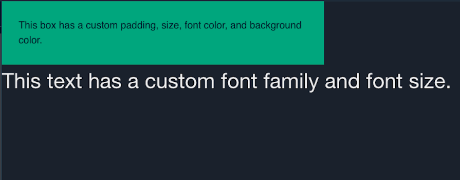
In the code block snippet above, we extended the extendTheme object and made some modifications to it. We added our custom color, font, size, and space, which we later used in our components. You can see the result below:
Chakra UI is a broad React component library that can be used in various practical and business cases. Below are some example scenarios where we can utilize Chakra UI:
You can see some more example use cases in the Chakra UI Showcase.
While Chakra UI is a great UI library, it isn’t the only one out there. When choosing a UI library for your project, it’s important to consider each option’s design principles, features, and more. Let’s see how Chakra UI matches up to three other popular UI libraries:
Here’s a comparison table to further help you evaluate your options:
| Feature | Chakra UI | Material UI | Bootstrap | Tailwind CSS |
|---|---|---|---|---|
| Supported frameworks and libraries | React | React, Vue, Angular, Svelte, Preact, Ember | React, Vue, Angular, Svelte | React, Vue, Angular, Svelte, Preact, Ember, Solid.js, Next.js |
| Community & resources | Active community, good documentation and tutorials | Large community, extensive documentation and tutorials | Massive community, extensive documentation and tutorials | Growing community, growing documentation, tutorials |
| Bundle size | ~48KB minified | ~150KB minified (core), +44KB for Material Icons | ~44KB minified | ~7KB minified |
| Pre-styled components | Yes | Yes | Yes | No |
| Customization options | Yes | Yes | Yes | Yes |
| Focus | Scalable, pre-built components and accessibility | Layout-focused | Pre-built components | Atomic classes |
| Learning curve | Gentle | Gentle | Steeper | Steeper |
| Dark mode | Yes | Yes | Yes | Yes |
Chakra UI has emerged as a highly relevant design library in the frontend ecosystem. Its support for modern design principles, useful features, ease of use, and many other features make it an excellent choice for application development.
In this guide, we took a thorough look at Chakra UI, a React component library that speeds up UI development. We looked at how Chakra UI works, its pros and cons, and some examples of practical use cases. We also compared Chakra UI to other design libraries and their features.
Install LogRocket via npm or script tag. LogRocket.init() must be called client-side, not
server-side
$ npm i --save logrocket

// Code:

import LogRocket from 'logrocket';
LogRocket.init('app/id');
// Add to your HTML:

<script src="https://cdn.lr-ingest.com/LogRocket.min.js"></script>
<script>window.LogRocket && window.LogRocket.init('app/id');</script>

AI companies are buying developer tools as coding agents turn runtimes, package managers, and linters into strategic infrastructure.

Learn how AI-assisted development governance uses rules, agents, hooks, and protocols to help AI coding tools produce safer, more consistent code.

A step-by-step guide to building your first MCP server using Node.js, covering core concepts, tool design, and upgrading from file storage to MySQL.

Using security headers in your Next.js apps is a highly effective way to secure websites from common security threats.
Hey there, want to help make our blog better?
Join LogRocket’s Content Advisory Board. You’ll help inform the type of content we create and get access to exclusive meetups, social accreditation, and swag.
Sign up now