As developers, we often look for tools and ways to enhance our productivity and improve our workflows. Using pre-built UI components is one effective way to achieve this.

In this article, we will look at Franken UI, an open source library of pre-built UI components that takes inspiration from Shadcn UI’s design principles but is built to integrate closely with HTML and UIkit 3. We will provide an in-depth overview of Franken UI, highlighting its unique benefits and features. We will also explore its components and how to use them in our applications.
The Replay is a weekly newsletter for dev and engineering leaders.
Delivered once a week, it's your curated guide to the most important conversations around frontend dev, emerging AI tools, and the state of modern software.
Franken UI is an open source library that provides sets of pre-built UI components built with an HTML-first approach, making them adaptable and easy to integrate into an existing project. It was also developed to be framework-agnostic, meaning that it can be integrated into JavaScript frameworks like Vue, React, or Svelte.
Franken UI is compatible with UIkit 3 and can work as a standalone CSS framework but can be integrated with Tailwind CSS for faster styling and customization.
The design of Franken UI is influenced by shadcn/ui. It aims to provide a solution to developers who are not comfortable using React, Vue, or Svelte by leveraging UIkit for JavaScript and accessibility.
Created by an independent developer, Sveltecult, Franken UI is still relatively new but is gradually gaining popularity among developers. At the time of writing, it has just over 1K GitHub stars.
Franken UI offers a variety of features that you can use to improve your development experience. Below, we will explore some of these features, including hooks, dark mode, theming, multiple reusable components, and more.
Franken UI offers a flexible system for theming that enables developers to create consistent and customizable UIs. It provides customizable theming options through CSS variables and Tailwind CSS utility classes.
Franken UI theming follows a simple convention for color theming, using background and foreground variables, where the background variable is used to apply the background color of the component, and the foreground variable is used for the text color. To apply these themes, for example, you would use classes like text-primary-foreground and bg-primary:
<div class="bg-background text-foreground"></div>
There are many variables available for customization that you can copy and paste into your project:
Card backgrounds:
  - --card: 0 0% 100%;
  - --card-foreground: 222.2 47.4% 11.2%;
Popover backgrounds:
  - --popover: 0 0% 100%;
  - --popover-foreground: 222.2 47.4% 11.2%;
Border colors:
  - --border: 214.3 31.8% 91.4%;
Input borders:
  - --input: 214.3 31.8% 91.4%;
To add new colors, you would update your CSS and tailwind.config.js file:
:root {
  --warning: 38 92% 50%;
  --warning-foreground: 48 96% 89%;
}


// tailwind.config.js
/** @type {import('tailwindcss').Config} */
export default {
  theme: {
    extend: {
      colors: {
        warning: "hsl(var(--warning))",
        "warning-foreground": "hsl(var(--warning-foreground))",
      },
    },
  },
};
You can now use these custom colors in your components:
<div class="bg-warning text-warning-foreground"></div>
Franken UI also offers a variety of themes, including zinc, slate, red, gray, blue, etc. To set a theme, you need to configure the presetQuick() function or use the hooks() and variables() functions to use your desired theme:
// presetQuick function
import presetQuick from "franken-ui/shadcn-ui/preset-quick";

/** @type {import('tailwindcss').Config} */
export default {
  presets: [presetQuick({ theme: "green" })],
};

// hooks and variables
import variables from "franken-ui/shadcn-ui/variables";
import hooks from "franken-ui/shadcn-ui/hooks";

const shadcn = hooks({
  theme: "green",
});

/** @type {import('tailwindcss').Config} */
export default {
  plugins: [
    variables({
      theme: "green",
    }),
  ],
};
Franken UI also supports theme generators, allowing users to create custom themes from scratch. Use tools like ZippyStarter, Oxidus, or https://ui.jln.dev/ to generate a custom theme, then copy the CSS, convert it to an object using https://transform.tools/css-to-js, and then configure Tailwind by updating tailwind.config.js to include your custom palette.
Franken UI supports dark mode by leveraging Tailwind CSS’ dark mode functionality, which its components support using the "class" option. Opting for the presetQuick() function ensures everything is automatically set up for you.
You can create a dark mode switcher by adding JavaScript that toggles themes based on user choices. To implement dark mode in HTML:
Here’s a sample implementation:
<head>
  <script>
    if (
      localStorage.getItem("color-theme") === "dark" ||
      (!("color-theme" in localStorage) &&
        window.matchMedia("(prefers-color-scheme: dark)").matches)
    ) {
      document.documentElement.classList.add("dark");
    } else {
      document.documentElement.classList.remove("dark");
    }
  </script>
</head>
<body>
  <button class="uk-button uk-button-primary">Button</button>
  <button id="theme-toggle">
    <span
      id="theme-toggle-light-icon"
      uk-icon="happy"
      class="dark:hidden"
    ></span>
    <span
      id="theme-toggle-dark-icon"
      uk-icon="star"
      class="hidden dark:block"
    ></span>
  </button>
  <script>
    var themeToggleBtn = document.getElementById("theme-toggle");
    themeToggleBtn.addEventListener("click", function () {
      if (localStorage.getItem("color-theme")) {
        if (localStorage.getItem("color-theme") === "light") {
          document.documentElement.classList.add("dark");
          localStorage.setItem("color-theme", "dark");
        } else {
          document.documentElement.classList.remove("dark");
          localStorage.setItem("color-theme", "light");
        }
      } else {
        if (document.documentElement.classList.contains("dark")) {
          document.documentElement.classList.remove("dark");
          localStorage.setItem("color-theme", "light");
        } else {
          document.documentElement.classList.add("dark");
          localStorage.setItem("color-theme", "dark");
        }
      }
    });
  </script>
</body>
Franken UI provides hooks that help simplify customization by replacing or adding properties to predefined selectors, allowing for global changes without repetitive code. Hooks can be used through the presetQuick function for quick setup or the preset function for more control:
// with presetQuick function
import presetQuick from "franken-ui/shadcn-ui/preset-quick";

/** @type {import('tailwindcss').Config} */
export default {
  presets: [
    presetQuick({
      overrides: {
        accordion: {
          "hook-accordion": {},
          "hook-item": {
            background: "purple",
          },      },
    }),
  ],
};

// with preset function
import preset from "franken-ui/shadcn-ui/preset";
import variables from "franken-ui/shadcn-ui/variables";
import ui from "franken-ui";

/** @type {import('tailwindcss').Config} */
export default {
  presets: [preset],
  plugins: [
    variables(),
    ui({
      components: {
        accordion: {
          "hook-accordion": {},
        },
      },
    }),
  ],
};
You can customize components like accordions and alerts and apply component states like hover or focus by setting properties or using Tailwind’s @apply directive.
You can opt out of shadcn/ui for a custom theme or create custom selectors using hook-misc for additional styling needs. Hooks ensure consistency, reduce build size, and keep HTML code clean.
Franken UI provides a collection of reusable components that can be easily copied and pasted into your project without writing your code from scratch. It has over 70 pre-built components including Form, Card, Modal, Progress, Thumbnav, and examples of how to use them.
Because of its compatibility with the UIkit framework, JavaScript and Franken UI work together to enable dynamic and interactive component use. Components can be initialized in HTML or JavaScript and integrate well with frameworks like Vue.js and React.
To use Franken UI components, add the required JavaScript files to your HTML <head> tag using the CDN, and give components the uk-* or data-uk-* attributes. Use the data-uk-* prefix for React:
<div uk-sticky="offset: 50;"></div>
// React
<div data-uk-sticky="offset: 50;"></div>
Franken UI components also emit events, which allow custom code to be executed.
Before getting started, check out the installation guide for information on installing Franken UI via CDN or npm and other customization setups like theming.
Good! Now let’s explore different Franken UI components.
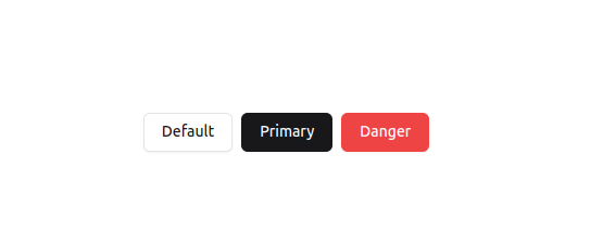
Franken UI provides a range of button components with various styles that are easy to use and customize. To use the button component, apply the .uk-button class to <a> or <button> elements, along with style modifiers like .uk-button-default, .uk-button-primary, or .uk-button-danger:
<button className="uk-button uk-button-default">Default</button>
<button className="uk-button uk-button-primary">Primary</button>
<button className="uk-button uk-button-danger">Danger</button>
Buttons can be adjusted to full width using the .uk-width-1-1 class or Tailwind CSS utility classes. It supports dropdowns and various states like hover, focus, and disabled.
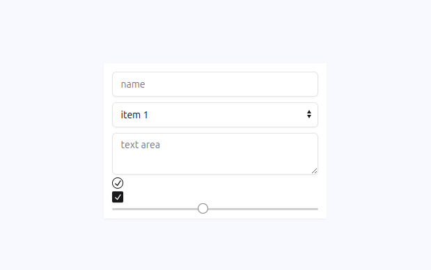
Franken UI offers form components that are used to create functional and aesthetically pleasing forms. Its form elements include text inputs, dropdown menus, text areas, radio buttons, checkboxes, and range sliders, and are built with accessibility in mind, using appropriate ARIA attributes to ensure they are usable by all users:
<form className="grid gap-2 w-80 p-3 shadow-sm bg-white">
  <input className="uk-input" type="text" placeholder="name" />
  <select className="uk-select">
    <option>item 1</option>
    <option>item 2</option>
  </select>
  <textarea className="uk-textarea" placeholder="text area"></textarea>
  <input className="uk-radio" type="radio" />
  <input className="uk-checkbox" type="checkbox" />
  <input className="uk-range" type="range" />
</form>
Franken UI includes form state modifiers, such as danger state and disabled state using the uk-form-danger class and disable attribute, to enhance user experience and it also has style for stacked, horizontal, and grid form layouts. The following is an example of what the stacked layout looks like:
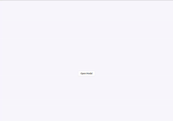
Franken UI provides a modal component that enables developers to create interactive dialog boxes in their applications. The modals can be completely customized with Tailwind CSS classes and other UIkit features.
To create a modal, you need to define the modal structure and use the uk-modal attribute or data-uk-modal for React to enable its functionality:
<button className="uk-button uk-button-default" type="button" data-uk-toggle="target: #modal-example">
  Open Modal
</button>
<div id="modal-example" data-uk-modal>
  <div className="uk-modal-dialog uk-modal-body">
    <h2 className="uk-modal-title">Modal Title</h2>
    <p>This is the content of the modal.</p>
    <p className="uk-text-right">
      <button className="uk-button uk-modal-close" type="button">Close</button>
      <button className="uk-button uk-button-primary" type="button">Save</button>
    </p>
  </div>
</div>
The Franken UI modal component also allows you to define the position of the close button depending on your design requirement. You either position it on the inside or outside of your modal dialog using uk-modal-close-default or uk-modal-close-outside, respectively.
You can modify the modal’s appearance, functionality, and size. For example, to make the modal fit your design requirements, you can change its width, and alignment, add animations, and more.
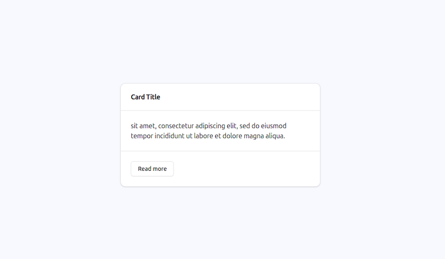
Card componentFranken UI’s Card component is used to create visually appealing layout boxes. It can be defined using the uk-card class, with additional classes like uk-card-body and uk-card-title for padding and titles:
<div className="uk-card uk-card-default w-1/4">
  <div className="uk-card-header">
    <h3 className="uk-card-title">Card Title</h3>
  </div>
  <div className="uk-card-body">
    <p>
       sit amet, consectetur adipiscing elit, sed
        do eiusmod tempor incididunt ut labore et dolore magna aliqua.
    </p>
  </div>
  <div className="uk-card-footer">
    <a href="#" className="uk-button uk-button-default">Read more</a>
  </div>
</div>
The card structure can include a header, body, and footer for effective content organization. Franken UI offers several style modifiers for cards, including uk-card-default for standard style, uk-card-primary for emphasized primary color, uk-card-secondary for secondary background color, and uk-card-danger for destructive background color:
Icon componentFranken UI also provides a versatile and easy-to-use Icon component. The Icon component allows you to integrate SVG icons in your content and can be styled using Tailwind CSS for a consistent design experience. To implement the Franken UI icon, simply add the uk-icon attribute to a <span> or <a> element and specify the desired icon name:
<span uk-icon="icon: happy"></span>

<a href="" uk-icon="star"></a>
The icon option also specifies the icon that will be displayed, with a wide range of icons available in the Franken UI library, covering categories such as apps, devices, storage, brands, editors, directions, and more.
Icons can be resized using the ratio option and styled using CSS or Tailwind CSS to match text color. Various modifiers, like uk-icon-link, uk-icon-button and uk-icon-image, allow for different styles and uses, such as transforming icons to links, creating icon buttons, or scaling background images to icon size:
// link modifier
<a href="" class="uk-icon-link" uk-icon="cart"></a>

// button modifier
<a href="" class="uk-icon-button" uk-icon="sign-out"></a>

// image modifier
<span
    class="uk-icon uk-icon-image"
    style="background-image: url(/images/dark.jpg)">
</span>
In this section, we will build a simple application with an interactive modal, a form with validation, and a responsive navigation bar using some of the Franken UI components.
const Navbar = () => {
  return (
    <nav className="uk-navbar-container " data-uk-navbar>
      <div className="uk-container w-full mx-auto flex">
        <h1 className="uk-navbar-left">
          <a href="#" className="uk-navbar-item uk-logo text-2xl font-bold">
            Logo
          </a>
        </h1>
        <div className="uk-navbar-center">
          <ul className="uk-navbar-nav hidden md:flex space-x-4">
            <li className="uk-active">
              <a href="#" className="text-gray-700 hover:text-gray-900">
                Home
              </a>
            </li>
            <li>
              <a href="#" className="text-gray-700 hover:text-gray-900">
                Features
              </a>
              <div className="uk-navbar-dropdown">
                <ul className="uk-nav uk-navbar-dropdown-nav">
                  <li className="uk-active">
                    <a href="#">Feature 1</a>
                  </li>
                  <li>
                    <a href="#">Feature 2</a>
                  </li>
                  <li>
                    <a href="#">Feature 3</a>
                  </li>
                </ul>
              </div>
            </li>
            <li>
              <a href="#" className="text-gray-700 hover:text-gray-900">
                Pricing
              </a>
            </li>
            <li>
              <a href="#" className="text-gray-700 hover:text-gray-900">
                Contact
              </a>
            </li>
          </ul>
        </div>
        <div className="uk-navbar-right">
          <div className="uk-navbar-nav hidden md:flex space-x-4">
            <button className="uk-button uk-button-primary">Sign in</button>
          </div>
          <button
            className="md:hidden uk-navbar-toggle"
            data-uk-navbar-toggle-icon
          ></button>
          <div className="uk-navbar-dropdown md:hidden">
            <ul className="uk-nav uk-navbar-dropdown-nav">
              <li className="uk-active">
                <a href="#">Home</a>
              </li>
              <li>
                <a href="#">Features</a>
              </li>
              <li>
                <a href="#">Pricing</a>
              </li>
            </ul>
          </div>
        </div>
      </div>
    </nav>
  );
};
export default Navbar;
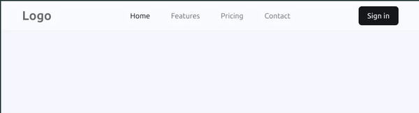
Here is the responsive navbar built with the code above:
// Form.tsx
import React, { useState } from "react";

const Form = () => {
  const [formData, setFormData] = useState({ name: "", message: "" });
  const [errors, setErrors] = useState({ name: "", message: "" });

  const handleChange = (
    event: React.ChangeEvent<HTMLInputElement | HTMLTextAreaElement>,
  ) => {
    const { name, value } = event.target;
    setFormData({ ...formData, [name]: value });
    setErrors({ ...errors, [name]: "" }); // Clear the error message when user starts typing
  };

  const validate = () => {
    let valid = true;
    const newErrors: { name: string; message: string } = {
      name: "",
      message: "",
    };

    if (!formData.name) {
      newErrors.name = "Name is required";
      valid = false;
    }

    if (!formData.message) {
      newErrors.message = "Message is required";
      valid = false;
    }

    setErrors(newErrors);
    return valid;
  };

  const handleSubmit = (event: React.FormEvent<HTMLFormElement>) => {
    event.preventDefault();
    if (validate()) {
      console.log("form submitted");
    }
  };

  return (
    <>
      <form
        onSubmit={handleSubmit}
        className="grid gap-2 w-80 p-3 shadow-sm bg-white"
      >
        <legend className="uk-legend">Example Form</legend>
        <input
          className="uk-input"
          type="text"
          name="name"
          placeholder="Name"
          value={formData.name}
          onChange={handleChange}
        />
        {errors.name && <div className="uk-text-danger">{errors.name}</div>}
        <textarea
          className="uk-textarea"
          name="message"
          placeholder="Leave a message"
          value={formData.message}
          onChange={handleChange}
        ></textarea>
        {errors.message && (
          <div className="uk-text-danger">{errors.message}</div>
        )}
        <div className="uk-margin">
          <button type="submit" className="uk-button uk-button-primary">
            Submit
          </button>
        </div>
      </form>
    </>
  );
};

export default Form;
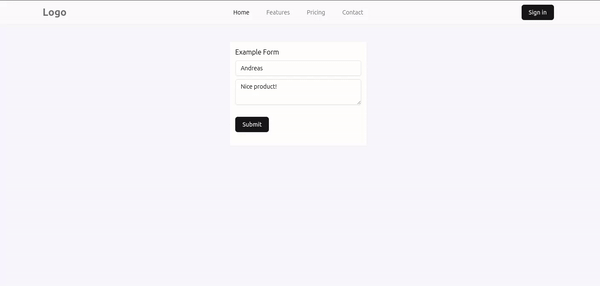
Notice that we are only console logging "form submitted". In the next section, we will look at how to notify the user that the form has been submitted using a Franken UI modal.
Let’s install UIkit into our project to help us with the JavaScript functionality of opening the modal after the form has been submitted:
npm install uikit @types/uikit
Create a Modal file and add the following code below:
// Modal.tsx
const Modal = () => (
  <div id="exampleModal" className="uk-flex-top uk-modal" data-uk-modal>
    <div className="uk-modal-dialog uk-modal-body uk-margin-auto-vertical">
      <h2 className="uk-modal-title">Modal Title</h2>
      <p>Form has been submitted successfully!</p>
      <p className="uk-text-right">
        <button className="uk-button uk-modal-close" type="button">
          Close
        </button>
      </p>
    </div>
  </div>
);
export default Modal;
Import the UIkit and Modal components in your Form component and add them below the form tag. Then update the handleSubmit function to trigger the modal to open after the form has been submitted:
const handleSubmit = (event: React.FormEvent<HTMLFormElement>) => {
  event.preventDefault();
  if (validate()) {
    UIkit.modal("#exampleModal").show();
  }
};
Franken UI and Shadcn UI are both design systems that provide aesthetic and functional UI components, but they have different approaches:
| Franken UI | Shadcn UI | |
|---|---|---|
| Implementation | Framework-agnostic (HTML/CSS) | Framework integration (React, Vue, Svelte) |
| Customization | Low-level (CSS classes, hooks) | Built-in (within framework) |
| Learning curve | Easier (HTML/CSS) | Requires framework knowledge |
| Community support | Smaller community and limited resources | Larger community, quick access to resources, faster development cycles |
| Use case | Small teams, solo developers, framework-independent projects | Rapid development within a framework |
Franken UI stands out as a good alternative to Shadcn UI, offering a comprehensive library of pre-built components that significantly streamline the web development process. Its HTML-first approach, coupled with seamless integration of Tailwind CSS and emphasis on accessibility, ensures that developers can create modern, responsive user interfaces with ease.
Franken UI is still a relatively new UI solution and has been updated with more components and features. Drop a comment on your thoughts about this new tool.

Learn what context rot is, why AI agent sessions degrade over time, and how to fix it with compaction, prompt anchoring, context files, plan files, and RAG.

Learn about TypeScript v6’s breaking changes, new ES2025 features, and deprecated options. A complete migration guide from v5 to prepare for v7.

Learn how Vite+ unifies Vite, Vitest, Oxlint, Oxfmt, Rolldown, and Node.js management in one CLI.

AI companies are buying developer tools as coding agents turn runtimes, package managers, and linters into strategic infrastructure.
Hey there, want to help make our blog better?
Join LogRocket’s Content Advisory Board. You’ll help inform the type of content we create and get access to exclusive meetups, social accreditation, and swag.
Sign up now

 Learn more →
