
When building React apps, it is sometimes advantageous for components to have awareness of their size and position on screen. This is useful both for rendering content initially, but also for components that need to know when their size changes. Some examples of this are:
Some of these behaviors may be achievable with CSS, or by managing window size with the onResize event, but in the interest of building React components that are maximally reusable, it makes sense to encapsulate this logic into the component itself. That way, regardless of where/how the component is used, it will function correctly.
Luckily there are a few excellent libraries that help solve this problem. Here, I’ll give a brief introduction to each and explain when to use it.
react-measure is a helpful library for building size-aware components. It wraps a component and exposes an onResize function that is called with the element’s contentRect (which has bounds and position). This method is called whenever the component’s size or position changes, and can be used to trigger side effects or put the dimensions into state.
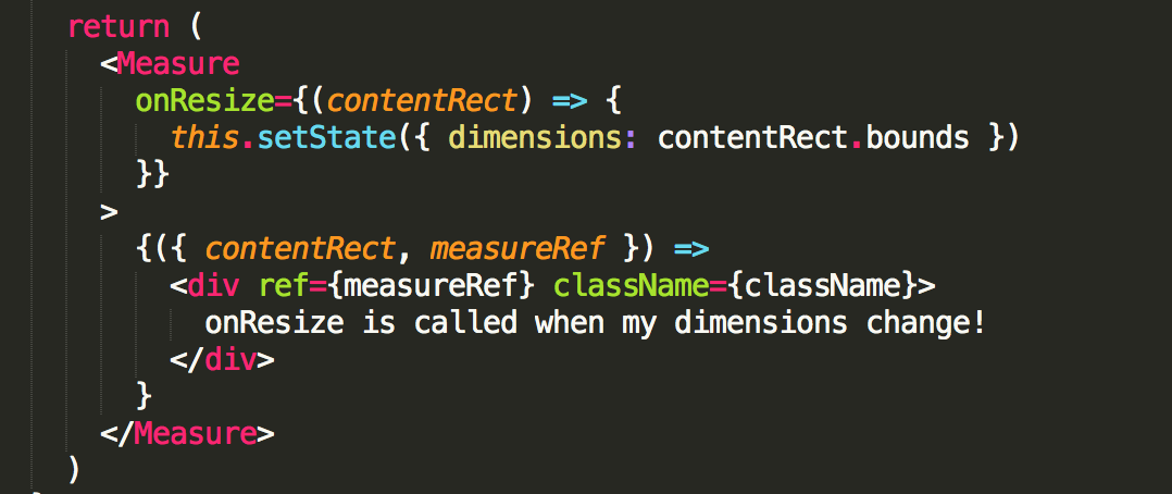
This solves most of the earlier examples but there’s one issue — a chicken and egg problem. When the component renders for the first time, its dimensions aren’t always known since its width/height could be determined by its content. As such, we don’t always know the dimensions in the render function, so it’s not entirely possible for the component to have render logic based on its dimensions.

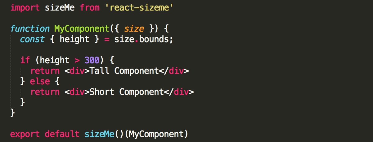
To solve this problem, we turn to a library called react-sizeme. This library is similar to react-measure but uses a clever solution to solve the aforementioned problem.
react-sizeme does an initial, invisible render of the component to measure its size. It does so in a lightweight way that is less intense than doing a full render of the component. Then, when the component renders, the size is known and the component can render properly from the beginning. Thus, the component can have render logic based on its own dimensions!
Using react-sizeme looks like this:
With both of these libraries there are a few caveats to be aware of. The initial render that react-sizeme does to determine the component’s dimensions isn’t free, and does increase the time to visibility of a rendered component. This is not typically noticeable for components that mount once, but with components that mount many times (items in a virtual list, for example) there is a noticeable performance impact. Since react-measure doesn’t do this initial render, it should ideally be used in these cases.
The methods that both libraries use to detect size changes also have a slight latency (~20ms). Usually this feels quite fast, but in practice, I’ve noticed a slight delay in detecting changes which can lead to a component feeling slow.
In general, react-measure has less of a performance impact, so it should be used if possible, but in cases where a component’s initial render depends on its size, then react-sizeme is a good option.
GitHub – souporserious/react-measure: 📏 Compute measurements of a React component.
📏 Compute measurements of a React component. Contribute to souporserious/react-measure development by creating an account on GitHub.

The Replay is a weekly newsletter for dev and engineering leaders.
Delivered once a week, it's your curated guide to the most important conversations around frontend dev, emerging AI tools, and the state of modern software.
 Learn more →
GitHub – ctrlplusb/react-sizeme: Make your React Components aware of their width and height!
Make your React Components aware of their width and height! – ctrlplusb/react-sizeme
Install LogRocket via npm or script tag. LogRocket.init() must be called client-side, not
server-side
$ npm i --save logrocket

// Code:

import LogRocket from 'logrocket';
LogRocket.init('app/id');
// Add to your HTML:

<script src="https://cdn.lr-ingest.com/LogRocket.min.js"></script>
<script>window.LogRocket && window.LogRocket.init('app/id');</script>

A real-world debugging session using Claude to solve a tricky Next.js UI bug, exploring how AI helps, where it struggles, and what actually fixed the issue.

CSS wasn’t built for dynamic UIs. Pretext flips the model by measuring text before rendering, enabling accurate layouts, faster performance, and better control in React apps.

Why do real-time frontends break at scale? Learn how event-driven patterns reduce drift, race conditions, and inconsistent UI state.

Test out Auth.js, Clerk, WorkOS, and Better Auth in Next.js 16 to see which auth library fits your app in 2026.
Hey there, want to help make our blog better?
Join LogRocket’s Content Advisory Board. You’ll help inform the type of content we create and get access to exclusive meetups, social accreditation, and swag.
Sign up now

