The Replay is a weekly newsletter for dev and engineering leaders.
Delivered once a week, it's your curated guide to the most important conversations around frontend dev, emerging AI tools, and the state of modern software.
In this article, you will learn all about widgets and the card class in Flutter, while bringing both together to create a card widget. At the end of this article, you will have a reusable card widget to customize as much as you want.

Building fully functional apps with Flutter can be exciting, because it involves bringing together various components and combining them one at a time to build a complete app. No matter how complex or large a Flutter app is, they all use the basic building blocks referred to as “widgets”.
Widgets form the basis of views and screens in a Flutter app, and appropriately combining the diverse widgets available will give you a beautifully designed screen.
There are two types of Flutter widgets:
Examples of widgets are the center widget (aligns its child or item to the center), row widget (aligns its children in a horizontal format), and column widget (aligns its children vertically). Combining these ready-made widgets makes development easier and faster.
However, there are times when some built-in Widgets do not satisfy an immediate need in an app, and you need to combine one or two. For example, the built-in card widget in Flutter does not fully handle our needs, so we have to join it with other widgets to build our own reusable and fully customizable card widget.
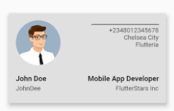
In this tutorial, we will be building a card widget that functions as a business card with an image, job description, and company name.
This can help establish your knowledge of Flutter widgets and also help you see the various techniques you can apply to create a single widget from the combination of others.
Let’s get to it. The first step is to create a new project:
flutter create card_widget
This command creates the files, folders, and everything needed to start a new Flutter project.
Next, we need to create a default MaterialApp. Flutter’s MaterialApp class is a predefined class in a Flutter app. It is the main or core component.
We can access all the other components and widgets provided by the Flutter SDK with the following:
import 'package:flutter/material.dart';
void main() => runApp(MyApp());
class MyApp extends StatelessWidget {
  @override
  Widget build(BuildContext context) {
    return MaterialApp(
      title: 'Material App',
      home: Scaffold(
       body: Text('Material App'),
      ),
    );
  }
}
In the code above, a stateless widget called MyApp is the foundation of the app we will be creating. It returns MaterialApp, which gives us access to various properties and components in material design.
We pass in the title, which is the name we want to call our app (in our case, “Business Card”). We also pass a Scaffold widget to the home property of the MaterialApp.
The Scaffold widget fills up every available space on your mobile device’s display; it provides access to a diverse group of other widgets like the app bar, floating action button, drawers, and so much more.
In the Scaffold widget, we have the body property, which is the space that every other thing apart from the app bar can be placed. We can only pass in a text widget in this default material app with Text('Material App'). We will change it as we move further along in the tutorial.
The next step is to create a new stateless widget. Why are we using a stateless widget? Because none of the properties of the card widget should change during its run time. The color, shape, and details should not change once they have been set in the app.
We will call the stateless widget “BusinessCard.” For now, we pass in an empty Container widget with the code below:
class BusinessCard extends StatelessWidget {
  @override
  Widget build(BuildContext context) {
    return Container();
  }
}
Now, pass in the stateless widget name to the body parameter for the MaterialApp:
import 'package:flutter/material.dart';
void main() => runApp(MyApp());
class MyApp extends StatelessWidget {
  @override
  Widget build(BuildContext context) {
    return MaterialApp(
      title: 'Material App',
      home: Scaffold(
       body: BusinessCard(), // <= the name goes here
      ),
    );
  }
}
In the BusinessCard widget, return the Card class constructor:
class BusinessCard extends StatelessWidget {
  @override
  Widget build(BuildContext context) {
    return Card(); // <== The Card class constructor
  }
}
The Card class provides several properties that can be used to modify the card visuals, like color, shape, border, and position. For example, we can decide to style our card with a green color (Colors.green) or red (Colors.red).
The same goes for the other properties. If we desire the card to have a rounded rectangular shape, we can pass in RoundedRectangularBorder() to the shape parameter, and it gets built that way.
For this article, we will only be making use of the color and elevation properties.
The elevation is used to control the the Z-coordinate of the card and the size of the shadow under the card. Paste the code below to make the card grey with an elevation of 8.0:
  @override
  Widget build(BuildContext context) {
    return Card(
      color: Colors.grey[300],
      elevation: 8.0,
Since the card widget does not have a height and width parameter, we can use the Container widget by passing in the height and width properties:
   child: Container(
        padding: const EdgeInsets.symmetric(vertical: 16, horizontal: 16),
        height: 200,
        width: 350,
        child:  Column(
          children: [],
        ),
At this point, the basic layout of the card has been set. We can pass in the components of the BusinessCard widget into the children block of the Column widget (as seen in the code block above).
For this article, we are using a basic business card layout. More adjustments and styling can be added to your satisfaction.
We start out by creating the components of the Column widget. First, we set the mainAxisAlignment and crossAxisAlignment.
These two parameters for Row and Column widgets are used to set how the children components are arranged vertically and horizontally:
 Column(
          crossAxisAlignment: CrossAxisAlignment.start,
          children: [
            Row(
              mainAxisAlignment: MainAxisAlignment.spaceBetween,
              crossAxisAlignment: CrossAxisAlignment.start,
             children: [],
The MainAxisAlignment.spaceBetween ensures the children are spaced as far back as possible, while the CrossAxisAlignment.start ensures the components start from the top vertically.
Next, we need to pass in the circle avatar. This is a widget Flutter provides for displaying an image either from assets or from the internet.
We will be making use of a random avatar from the internet. Pass the link to the image to the NetworkImage widget:
children: [
                const CircleAvatar(
                  radius: 50, //we give the image a radius of 50
                  backgroundImage: NetworkImage(
                      'https://webstockreview.net/images/male-clipart-professional-man-3.jpg'),
                ),
The next step is to build the Column into which other details we need will be passed in. We use the Text widget for displaying the phone number, city, and organization.
The SizedBox is a widget for introducing spacing into the application. We will be using it to put space in between the texts:
              Column(
                  crossAxisAlignment: CrossAxisAlignment.end,
//CrossAxisAlignment.end ensures the components are aligned from the right to left.
                  children: [
                    Container(
                      margin: const EdgeInsets.only(top: 8),
                      width: 150,
                      color: Colors.black54,
                      height: 2,
                    ),
                    const SizedBox(height: 4),
                    const Text('+2348012345678'),
                    const Text('Chelsea City'),
                    const Text('Flutteria'),
                  ],
                ),
              ],
            ),
            const SizedBox(height: 20),
Next, we create another Row to handle the name, position, and company. They are all texts, so we pass each into a Text widget:
            Row(
              mainAxisAlignment: MainAxisAlignment.spaceBetween,
              crossAxisAlignment: CrossAxisAlignment.start,
              children: [
                Column(
                  crossAxisAlignment: CrossAxisAlignment.start,
                  children: [
                    const Text(
                      'John Doe',
                      style: TextStyle(
                        fontSize: 16,
                        fontWeight: FontWeight.bold,
                      ),
                    ),
                    const SizedBox(height: 4),
                    const Text('JohnDee'),
                  ],
                ),
What we have done in the code block above is created a Row widget, whose function is to align its children in a horizontal format. Because our card is divided into two sections, we use two Column widgets that do the opposite of the Row widget and align their children vertically.
In the first column, we pass in the Text widget, which we used to display the person’s name and nickname (just a little addition):
                const SizedBox(width: 32),
                Column(
                  crossAxisAlignment: CrossAxisAlignment.end,
                  children: [
                    const Text(
                      'Mobile App Developer',
                      style: TextStyle(
                        fontSize: 16,
                        fontWeight: FontWeight.bold,
                      ),
                    ),
                    const SizedBox(height: 4),
                    const Text('FlutterStars Inc'),
                  ],
                )
              ],
            ),
          ],
        ),
We use SizedBox to separate the two Text widgets. SizedBox is a widget that creates a space of a specific size. It may or may not have a child widget or component. Once its height and width has been declared, it is good to go.
We pass it in at a height of four to create a little space between our Text widgets and make it look cleaner and more presentable.
In the second column, we repeat the same thing, passing the job description and company name into the Text widgets. We then used a SizedBox of width 32 to separate the two columns.
Great! We are done creating the basic layout of the BusinessCard widget. Run the command in the code block below inside your terminal to launch the app.
With the combination of the built-in card widget, container, text, row, and column widgets, we have built from scratch a card widget that can be used anywhere in the application by calling its constructor:
flutter run
Below is a screenshot of the card widget fully built and ready for use:

There are quite a number of things the built-in card widget can do. When it is used in combination with other widgets, it comes together to form beautifully designed and completely reusable widgets readily available for use anywhere in the application. Just keep in mind that widgets are building blocks, and the right combination can bring out the best in your app.
Install LogRocket via npm or script tag. LogRocket.init() must be called client-side, not
server-side
$ npm i --save logrocket

// Code:

import LogRocket from 'logrocket';
LogRocket.init('app/id');
// Add to your HTML:

<script src="https://cdn.lr-ingest.com/LogRocket.min.js"></script>
<script>window.LogRocket && window.LogRocket.init('app/id');</script>

A step-by-step guide to building your first MCP server using Node.js, covering core concepts, tool design, and upgrading from file storage to MySQL.

Using security headers in your Next.js apps is a highly effective way to secure websites from common security threats.

A deep dive into May 2026’s AI model and tool rankings. We break down performance, usability, pricing, and real-world capabilities across 50+ features to help you pick the right tools for your development workflow.

A practical guide to Agent Browser CLI. Learn how AI agents navigate, snapshot, and interact with web pages using stable references, enabling efficient automation and exploratory testing.
Hey there, want to help make our blog better?
Join LogRocket’s Content Advisory Board. You’ll help inform the type of content we create and get access to exclusive meetups, social accreditation, and swag.
Sign up now