styled-components came onto the scene with a bang and changed our perspective on how to create inline-styled React components.

In this tutorial, we’ll demonstrate how to build your own styled-components. In doing so, you’ll discover how styled-components and tagged template literals work under the hood.
We’ll cover the following:
The complete source code for this implementation is available on GitHub.
styled-components are designed to eliminate the mapping between components and styles, so when you’re defining your styles, you’re really just building a regular React component with your styles attached.
You can write a quick inline-styled component like this:
js
const Button = styled.button`
    background-color: green;
This will create a Button component ( a React component) with a background color set to blue. Button is a regular React component that will render an HTML button. The styling code in the backticks will be applied to the HTML button.
And we can use it like this:
js
<Button>Click Me</Button>
So it is the same as writing this:
js
class Button extends Component {
    render() {
        return (
            <button style={{
                background-color: blue
            }}>{this.props.children}</button>
        )
    }
}
styled-components feature an array of regular HTML tags, which we can use to create styled React component versions of them. For example:
styled.button creates a React component that renders a button elementstyled.div creates a React component that renders a div elementstyled.a creates a React component that renders an anchor a element, and so onstyled-components use the [Tagged Template Literal]() feature in JavaScript to style components. Tagged template literals give you more control over the parsing of your literals. It allows you to parse template literals with a function.
The tagged template literals syntax is as follows:
js
taggedFunction`string here`
The taggedFunction is a function and the backticks contain a string. The taggedFunction looks like this:
js
function taggedFunction(strings) {
    // ...
}
The string in the backticks will be passed to the taggedFunction function in the strings param in an array. Values can be included in the template literals, the backtick string.
js
const val = 90
taggedFunction`string here ${val}`
The val is a value in the template literal. JavaScript will pass the string to the taggedFunction, followed by the values in the literal.
js
function taggedFunction(strings, val1) {
    // ...
}
The strings param is an array that contains the string in the template literal. The val1 param will hold the val value.
If our tagged template literal has two values…
js
const val = 90
const val2 = 900
taggedFunction`string here ${val} string2 ${val2}`
…then our taggedFunction will be this:
js
function taggedFunction(strings, val1, val2) {
    // ...
}
strings: will contain the string.val1: will hold the ${val}, 90.val2: will hold the ${val2}, 900.Instead of defining params for the values, we can rest them into a single array, like this:
js
function taggedFunction(strings, ...vals) {
    // ...
}
vals will be an array that will hold all the values in our template literal.
With this…
js
const val = 90
const val2 = 900
taggedFunction`string here ${val} string2 ${val2}`
…the taggedFunction will receive the following.
strings:
[ "string here ", " string2 ", "" ]
vals:
[ 90, 900 ]
Notice that JavaScript breaks the string at the points where values occur.
string here ${val} string2 ${val2}
The above will break at points ${val} and ${val2}.
string here ${val} string2 ${val2}
["string here ", "string2 ", ""]
Now we can easily join them with the values using interpolation, and we know we’ll receive the CSS code in the strings params.
js
styled.button`
    background-color: blue;
`
So the taggedFunction or the function behind styled.button will receive this:
strings:
[`
    background-color: blue;
`]
If the CSS code contains values like this…
js
const mainColor = "blue";
styled.button`
    background-color: ${mainColor};
`
The tagged function will receive the following.
strings:
[`
    background-color: `, `;`]
vals:
[ "blue" ]
We import the styled object from the styled-components:
js
import styled from "styled-components"
We use the HTML tags in the styled object to create inline-styled components.
js
styled.button
styled.div
So we know that the styled object contains HTML tags as properties and they have functions as their value, so styled will look like this:
js
const styled = {
    button: function(strings, ...vals) {},
    div: function(strings, ...vals) {},
    ...
}
The function(strings, ...vals) {} is the tagged function that will recieve the CSS styling code in the strings param and the values in it in the vals param.
js
const Button = styled.button
const Div = styled.div
The above will return a React component. Button and Div are React components that will render a button and a div, respectively.
Now that we understand how tagged template literals and styled-components work, let’s build our own styled-components library.
Scaffold a Node.js project in your machine by following the steps below:
mkdir styled-c
cd styled-c
npm init -y
touch index.js
All our code will be in the index.js file. We’ll mimic styled-components’ style.
First, will import Component from react.
js
// index.js
import React, { Component } from 'react';
Next, create a styled object and an array to hold HTML tag names.
js
const tags = [
    "button",
    "div"
]
const styled = {}
We’ll dynamically populate the styled object with the HTML tag names as properties and make it call the genComponentStyle function:
js
const tags = [
    "button",
    "div"
]
const styled = {}
tags.forEach(tag => {
    styled[tag] = genComponentStyle(tag)
})
tag is the name of the HTML tag in the tags array.
With the above code, the styled object will have the HTML tags in the tags array as properties. Their values should be a function — the tagged function that will receive the template literal and values in it. The genComponentStyle function is called on every tag. genComponentStyle provides a closure over the tag name, and it must return a React component.
To implement the genComponentStyle function:
js
function genComponentStyle(tag) {
    return function(strings, ...vals) {
        return class extends Component {
            constructor(props) {
                super(props)
                this.style = {}
            }
            componentWillMount() {
                this.style = computeStyle(this.props, strings, vals)
            }
            componentWillUpdate(props) {
                this.style = computeStyle(props, strings, vals)
            }
            render() {
                return (
                    createElement(tag, { style: this.style, ...this.props }, [...this.props.children])
                )
            }
        }
    }
}
The genComponentStyle function returns a tagged function. This function is assigned to the HTML tag properties in the styled object and receives the template literal and the values called on the HTML tags. It returns a React component.
Since the function will receive the CSS code in the backticks, it will have to parse through the string and generate a style object from it.
We need to convert this:
`
    color: white;
    background-color: blue;
    padding: 20px;
`
To this:
js
{
    "color": "white",
    "background-color": "blue",
    "padding": "20px"
}
This is done because we style a React component by placing the styles in an object and passing it to a style prop.
js
The computeStyle function does just that. It computes the style from the strings and vals params and sets it to this.style. Then, the component renders the element in the tag using the createElement function.
js
createElement(
    tag,
    { style: this.style, ...this.props }, [...this.props.children])
The first arg is the HTML element to create. The second param is the props — as you’ll see, we have a style property with this.style as the value. This adds the style prop to the HTML element, effectively styling the element with the style computed from the backtick string. The third param sets the children components to be rendered between the component’s tags.
The component has two lifecycle hooks: componentWillMount and componentWillUpdate.
componentWillMount is called on the initial mount of the component; it computes the style and assigns it to the this.style. This is done so that the inline style is computed before the element is mounted on the DOM.
The inline style is also computed on componentWillUpdate. This is done so that the inline style of the element is refreshed whenever the component is rerendered, which causes the element to update its styling when it’s changed.
The computeStyle implementation is as follows:
js
function computeStyle(props, strings, vals) {
    strings = evalInterpolation(props, strings, vals)
    const style = {}
    strings.split(";").forEach((str)=> {
        let [prop, val] = str.trim().split(":")
        if(prop !== undefined && val !== undefined) {
            prop = prop.trim()
            val = val.trim()
            style[prop] = val
        }
    });
    return style
}
computeStyle accepts the props of the component in the props param, the template literal in the strings param, and the values in the vals props. It computes the style from the backticks passed to the function. The evalInterpolation function evaluates the values in the template literal and returns the evaluated string.
computeStyle splits the string from anywhere the ; occurs. This is done so we can get each CSS selector in the string because CSS selectors are divided by ;. Then, it loops over it to get each selector. It splits the selector from the : to get the selector property and the property value.
We assign the property and its value to prop and val, respectively. Then, we assemble them in an object style. When done, the object style is returned bearing the CSS selector’s properties and values in an object.
The evalInterpolation implementation is as follows:
js
function evalInterpolation(props, strings, vals) {
    let resultStr = ""
    for (var i = 0; i < strings.length; i++) {
        var str = strings[i];
        var val
        if(vals) {
            val = vals[i]
            if(val !== undefined) {
                if(typeof val === "function") {
                    val = val(props)
                }
                str += val
            }
        }
        resultStr += str
    }
    return resultStr
}
This function interpolates the values with the string by looping through the strings array and joining it with its same value index. If the value is a function, it’s called with the props and the result is joined with the current string.
This makes it possible to use functions in the template literal:
js
const Button = styled.button`
    background-color: ${(props) => props.theme.bgColor};
    padding: ${props => props.small ? '2px 4px' : '6px 14px'};
`
The function must always accept Component props as an argument.
With this, our code is complete.
js
// index.js
import React, { createElement, Component } from 'react';
const tags = [
    "button",
    "div"
]
function evalInterpolation(props, strings, vals) {
    let resultStr = ""
    for (var i = 0; i < strings.length; i++) { var str = strings[i]; var val if(vals) { val = vals[i] if(val !== undefined) { if(typeof val === "function") { val = val(props) } str += val } } resultStr += str } return resultStr } function computeStyle(props, strings, vals) { strings = evalInterpolation(props, strings, vals) const style = {} strings.split(";").forEach((str)=> {
        let [prop, val] = str.trim().split(":")
        if(prop !== undefined && val !== undefined) {
            prop = prop.trim()
            val = val.trim()
            style[prop] = val
        }
    });
    return style
}
function genComponentStyle(tag) {
    return function(strings, ...vals) {
        return class extends Component {
            constructor(props) {
                super(props)
                this.style = {}
            }
            componentWillMount() {
                this.style = computeStyle(this.props, strings, vals)
            }
            componentWillUpdate(props) {
                this.style = computeStyle(props, strings, vals)
            }
            render() {
                return (
                    createElement(tag, { style: this.style, ...this.props }, [ ...this.props.children ])
                )
            }
        }
    }
}
const styled = {}
tags.forEach(tag => {
    styled[tag] = genComponentStyle(tag)
})
export default styled
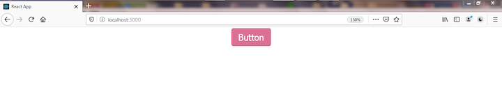
To create a styled button component:
js
// test.js
import styled from "./"
const Button = styled.button`
    padding: 6px 12px;
    background: palevioletred;
    color: white;
    border: 1px solid transparent;
    border-radius: 4px;
    font-size: 16px;
    margin: 2px;
`
<button>Button</button>
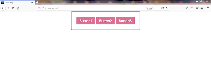
To use the styled button component in a React app:
js
// App.js
import React from 'react';
import "./App.css"
import styled from "./"
const Div = styled.div`
    border: 2px solid palevioletred;
    border-radius: 3px;
    padding: 20px;
`
const Button = styled.button`
    padding: 6px 12px;
    background: palevioletred;
    color: white;
    border: 1px solid transparent;
    border-radius: 4px;
    font-size: 16px;
    margin: 2px;
`
class App extends React.Component {
    render() {
        return (
          <div>
            <button>Button1</button>
            <button>Button2</button>
            <button>Button3</button>
          </div>
) } } export default App
Congratulations! You’ve built your very own version of styled-components.
Our styled-components supports only the button and div tags. Herer’s how you can add other HTML elements:
js
const tags = [
    "button",
    "div",
    "a",
    "input",
    "select"
]
styled-components exports a ThemeProvider component that is used to theme styled-components.
To add theming capabilities to your styled-components, pass an object that contains your theme to the theme prop in ThemeProvide``r. Then, the styled components you want to be themed will be placed between ThemeProvider tags. You reference the props.theme properties in the styled-components CSS.
To add the ThemeProvider component, create a Context using createContext and use the Provider component to pass the theme in the theme props down the styled-components tree.
js
import React, { createElement, Component, useContext } from 'react';
const ThemeContext = React.createContext()
...
function ThemeProvider(props) {
    const outerTheme = props.theme
    const innerTheme = useContext(ThemeContext)
    const theme = { ... outerTheme, ... innerTheme }
    return (


                {props.children}


    )
}
...
export {
    ThemeProvider
}
We imported the useContext hook. Then, we created a context (ThemeContext) using React.createContext().
Our ThemeProvider is a function component. Since it will accept a theme object in the props, we reference the theme from the props object and store it in an outerTheme var. Then, we consume the inner theme we have in our ThemeContext using the useContext hook. There is no initial theme in our Context, but we consumed it so our code wouldn’t break if we decide to add an inner theme in the ThemeContext.
Next, we merge the innerTheme and outerTheme to one theme. Then, we render the child component of the ThemeProvider component. This child props is wrapped between the ThemeContext.Provider component in the ThemeContext. We pass the theme to the ThemeContext.Provider via the value prop. This will make the theme available to its children components.
We export the ThemeProvider to be imported via this { ThemeProvider }.
Now let’s modify the component returned for every styled-component so that it will consume the theme context if provided.
js
...
function genComponentStyle(tag) {
    return function(strings, ...vals) {
        return class extends Component {
            static contextType = ThemeContext
            constructor(props, context) {
                super(props, context)
                this.style = {}
            }
            componentWillMount() {
                if(this.context)
                    this.props = { ...this.props, theme: this.context}
                this.style = computeStyle(this.props, strings, vals)
            }
            componentWillUpdate(props) {
                if(this.context)
                    props = { ...props, theme: this.context}
                this.style = computeStyle(props, strings, vals)
            }
            render() {
                let props = this.props
                if(this.context) {
                    props = { ...this.props, theme: this.context }
                    this.style = computeStyle(props, strings, vals)
                }
                return (
                    createElement(tag, { style: this.style, ...props }, [...props.children])
                )
            }
        }
    }
}
...
First, we set the static contextType variable to the ThemeContext. This will make the theme object passed to the ThemeProvider avialable in the component. The theme will be passed to this.context.
So we modified the code in componentWillMount and componentWillUpdate, rendered to check for the this.context, and merged the theme object in it in a theme property with the props. This makes the theme property available in the props object passed to the styled-components.
That’s it — we’ve added theming capabilities to our version of styled-components.
Here’s the full code to add theming capabilities to styled-components:
import React, { createElement, Component, useContext } from 'react';
const ThemeContext = React.createContext()
const tags = [
    "button",
    "div"
]
function evalInterpolation(props, strings, vals) {
    let resultStr = ""
    for (var i = 0; i < strings.length; i++) {
        var str = strings[i];
        var val
        if(vals) {
            val = vals[i]
            if(val !== undefined) {
                if(typeof val === "function") {
                    val = val(props)
                }
                str += val
            }
        }
        resultStr += str
    }
    return resultStr
}
function computeStyle(props, strings, vals) {
    strings = evalInterpolation(props, strings, vals)
    const style = {}
    strings.split(";").forEach((str)=> {
        let [prop, val] = str.trim().split(":")
        if(prop !== undefined && val !== undefined) {
            prop = prop.trim()
            val = val.trim()
            style[prop] = val
        }
    });
    return style
}
function genComponentStyle(tag) {
    return function(strings, ...vals) {
        return class extends Component {
            static contextType = ThemeContext
            constructor(props, context) {
                super(props, context)
                this.style = {}
            }
            componentWillMount() {
                if(this.context)
                    this.props = { ...this.props, theme: this.context}
                this.style = computeStyle(this.props, strings, vals)
            }
            componentWillUpdate(props) {
                if(this.context)
                    props = { ...props, theme: this.context}
                this.style = computeStyle(props, strings, vals)
            }
            render() {
                let props = this.props
                if(this.context) {
                    props = { ...this.props, theme: this.context }
                    this.style = computeStyle(props, strings, vals)
                }
                return (
                    createElement(tag, { style: this.style, ...props }, [...props.children])
                )
            }
        }
    }
}
function ThemeProvider(props) {
    const outerTheme = props.theme
    const innerTheme = useContext(ThemeContext)
    const theme = { ... outerTheme, ... innerTheme}
    return (
        <React.Fragment>
            <ThemeContext.Provider value={theme}>
                {props.children}
            </ThemeContext.Provider>
        </React.Fragment>
    )
}
export {
    ThemeProvider
}
const styled = {}
tags.forEach(tag => {
    styled[tag] = genComponentStyle(tag)
})
export default styled
To theme a bunch of styled-components:
import React from 'react';
import styled, { ThemeProvider } from "./styled.js"
const Div = styled.div`
    border-radius: 3px;
    border: 2px solid ${props => props.theme.bgColor};
    padding: 20px;
`
const Button = styled.button`
    padding: 6px 12px;
    background: ${(props) => props.theme.bgColor};
    color: white;
    border: 1px solid transparent;
    border-radius: 4px;
    font-size: 16px;
    margin: 2px;
`
export default class ThemeStyled extends React.Component {
    constructor() {
        super()
        this.state = {
            theme: {
                bgColor: "violet"
            }
        }
    }
    setTheme(bgColor) {
        this.setState({...this.state.theme, theme: { bgColor }})
    }
    render() {
        return (
            <ThemeProvider theme={this.state.theme}>
                <Div>
                    <Button onClick={()=> this.setTheme("red")}>Set Theme(Red)</Button>
                    <Button onClick={()=> this.setTheme("green")}>Set Theme(Green)</Button>
                    <Button onClick={()=> this.setTheme("violet")}>Set Theme Default</Button>
                </Div>
            </ThemeProvider>
        )
    }
}
We maintain a theme state with the bgColor property set to violet. We have a Div and Button styled-component. We have the Div component’s border color set by the bgColor in the theme object. Also, the background color of the Button component is set by the theme.bgColor.
We render a Div and three Buttons: "S``et Theme(Red``)", "S``et Theme(Green``)", "S``et Theme(Default``)".
When any of these buttons are clicked, they change the state object’s bgColor property. "Set Theme(Red)" changes the bgColor to red, which changes the Div border color as well as the button’s background color to red. Likewise, the "Set Theme(Green)" and "Set Theme(Default)" buttons will change the theme color to green and violet (the default color), respectively.
As you can see, it’s actually pretty easy to understand how styled-components work. You can even create your own styled-components.
Most of the confusion around styled-components stems from the tagged template literal feature. But now you understand how tagged template literals work, too.
With a fuller picture of how the nuts and bolts work underneath the hood, you should be able to approach using styled-components — and, indeed, even creating your own — with full confidence and relative ease.
Debugging code is always a tedious task. But the more you understand your errors, the easier it is to fix them.
LogRocket allows you to understand these errors in new and unique ways. Our frontend monitoring solution tracks user engagement with your JavaScript frontends to give you the ability to see exactly what the user did that led to an error.

LogRocket records console logs, page load times, stack traces, slow network requests/responses with headers + bodies, browser metadata, and custom logs. Understanding the impact of your JavaScript code will never be easier!
Would you be interested in joining LogRocket's developer community?
Join LogRocket’s Content Advisory Board. You’ll help inform the type of content we create and get access to exclusive meetups, social accreditation, and swag.
Sign up now
Get to know RxJS features, benefits, and more to help you understand what it is, how it works, and why you should use it.

Explore how to effectively break down a monolithic application into microservices using feature flags and Flagsmith.

Native dialog and popover elements have their own well-defined roles in modern-day frontend web development. Dialog elements are known to […]

LlamaIndex provides tools for ingesting, processing, and implementing complex query workflows that combine data access with LLM prompting.

 Learn more →

One Reply to "Build your own styled-components library"
how would you manage events in css like hover or active?