Editor’s note: This post was updated on 8 November 2021 to replace the tutorial, add a section on extracting utility classes to components, and remove outdated information.

In this article, we’ll build a simple responsive pricing table component from scratch with HTML and Tailwind CSS — a utility-first CSS framework.
Tailwind offers no pre-configured styles and components to build with — rather, it offers you a set of unopinionated building blocks, known as utility or helper classes, to help you style your components. This helps with creating custom designs without having to override unwanted styles.
Plus, it gives you the flexibility to build custom interfaces by directly adding CSS classes to the HTML.
We will replicate this component’s design using just HTML and Tailwind CSS.
Make sure you have the following installed:
First, let’s create our project directory:
mkdir pricing-component
Next, change the directory to the created folder:
cd pricing-component
Proceed to create an Index.html file and include the following content in it:
<!DOCTYPE html>
<html lang="en">
<head>
    <meta charset="UTF-8">
    <meta name="viewport" content="width=device-width, initial-scale=1.0">
    <title>Tailwind Pricing Component</title>
</head>
<body>

</body>
</html>
To install Tailwind with npm, type in the following command in your terminal:
npm i tailwindcss
This command adds the latest stable version of Tailwind CSS as a dependency.
Next, proceed to create a default configurations scaffold. This helps to customize your Tailwind installation using the Tailwind CLI utility included when you install the tailwindcss package:
npx tailwindcss init
This command creates an empty tailwind.config.js in your project’s base directory. In this file, you can define any customization.
Alternatively, you can get started with Tailwind by simply pulling in the latest default configuration build via CDN and linking it in the head tag of your HTML:
<link href="https://unpkg.com/tailwindcss@^1.0/dist/tailwind.min.css" rel="stylesheet">
However, it’s important to note that many Tailwind CSS features are not available using the CDN build. To get the most out of Tailwind, you really should install it using a package manager.
Proceed to create a css/styles.css within our root folder, to house our stylesheets.
We need to define our custom styles like width, color, and fonts in our configuration file. First, open the tailwind.config.js file and include the following inside the theme object.
fontFamily: {
      'sans': [
        'Montserrat',
        'sans-serif',
      ],
    }
Next, create an extend object inside the theme object and include the following:
colors:{
    primary: {
          blue: "#34495E",
          grey: "#212121",
          normal: "hsl(233, 13%, 49%)",
          dark: "hsl(232, 13%, 33%)",
          white: "#FFFFFF"
        },
  },
width: {
    custom: '31%'
  }
After including our custom styles, the config file should look similar to this:
module.exports = {
  purge: [],
  darkMode: false, // or 'media' or 'class'
  theme: {
    extend: {
      colors: {
        primary: {
          blue: "#34495E",
          grey: "#212121",
          normal: "hsl(233, 13%, 49%)",
          dark: "hsl(232, 13%, 33%)",
          white: "#FFFFFF"
        },
      },
      width: {
        custom: "31%",
      },
    },
    fontFamily: {
      'sans': ["Montserrat", "sans-serif"],
    },
  },
  variants: {},
  plugins: [],
};
Next, run this command to create a tailwind.css file based on the configuration in our tailwind.config.js file.
npx tailwindcss -o tailwind.css
This generates an opinionated set of base styles and uses modern-normalize, which solves cross-browser issues and inconsistencies in your Tailwind projects. It also includes custom styles that are defined in the configuration file.
Next, go to our index.html file and import the Montserrat font:
<link href="https://fonts.googleapis.com/css2?family=Montserrat:wght@400;700;900&display=swap" rel="stylesheet"/>
Since we’re not using PostCSS, you can run the following command to populate css/styles.css with our Tailwind styles:
npx tailwindcss build tailwind.css -o css/styles.css
Then, proceed to import your css/styles.css file into your project, either in your JavaScript file or as a link in your HTML file, like this:
<link href="css/styles.css" rel="stylesheet">
Or, you can also just import tailwind.css into your index.html file directly.
Also, you can run npx tailwindcss -o tailwind.css --watch so it can watch for changes in the config file and rebuild our tailwind.css.
We will begin by writing the HTML for our design without styles, which makes our work faster as we can just dive right into styling the HTML from there.
First, let’s create a header element inside our body tag. This will contain the pricing text and the toggle switch.
<header class=""> </header>
Now, inside the header tag, we’ll add a h2 element that will contain the text.
<header class="">
  <h2 class="">Pricing</h2>
</header>
Let’s proceed to create the pricing table section. We’ll create a section tag and, inside it, an article tag that will contain our pricing information:
<section class=" ">
  <article class="">
     <h5 class="">Standard</h5>
     <h2 class="">
       <span class="">$</span>
       <span class="l"> 100</span>
     </h2>
     <ul class="">
      <li class="">50,000 Requests</li>
       <li class="">4 contributors</li>
       <li class="">Up to 3 GB storage space</li>
    </ul>
     <button class="">
       Learn More
     </button>
   </article>
</section>
To finish this up, we just need to replicate the article tag two more times and change the content inside of it:
<section class=" ">
   <article class="">
     <h5 class="">Standard</h5>
     <h2 class="">
       <span class="">$</span>
       <span class="l">100</span>
     </h2>
     <ul class="">
       <li class="">50,000 Requests</li>
       <li class="">4 contributors</li>
       <li class="">Up to 3 GB storage space</li>
     </ul>
     <button class="">
      Learn More
     </button>
   </article>
   <article class="">
     <h5 class="">Pro</h5>
     <h2 class="">
       <span class="">$</span>
       <span class="">200</span>
     </h2>
     <ul class="">
       <li class="">100,000 Requests</li>
       <li class="">7 contributors</li>
       <li class="">Up to 6 GB storage space</li>
     </ul>
     <button class="">
       Learn More
     </button>
   </article>
   <article class="">
     <h5 class="">Expert</h5>
     <h2 class="">
       <span class="">$</span>
       <span class="">500</span>
     </h2>
     <ul class="">
       <li class="">200,000 Requests</li>
       <li class="">11 contributors</li>
       <li class="">Up to 10 GB storage space</li>
     </ul>
     <button class="">
       Learn More
     </button>
   </article>
 </section>
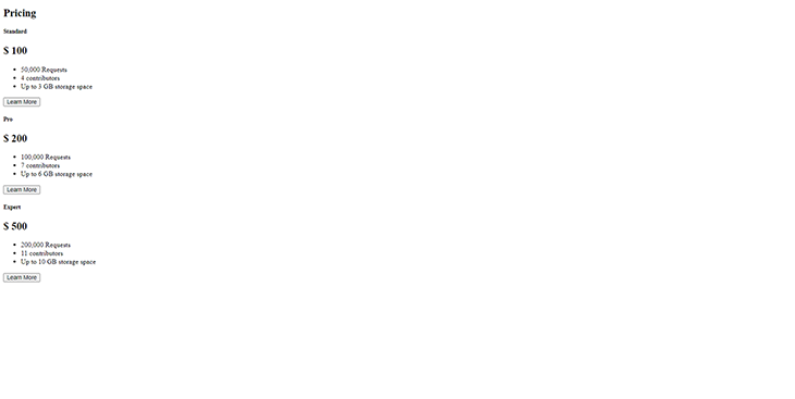
When we’re done with that, the contents of our HTML will look like this:
<!DOCTYPE html>
<html lang="en">
  <head>
    <meta charset="utf-8" />
    <meta name="viewport" content="width=device-width, initial-scale=1, shrink-to-fit=no"/>
    <link rel="stylesheet" href="styles/styles.css">
    <title>Welcome to Tailwind!</title>
  </head>
  <body class="">
    <header class="">
      <h2 class="">Pricing</h2>
    </header>
    <section class=" ">
   <article class="">
     <h5 class="">Standard</h5>
     <h2 class="">
       <span class="">$</span>
       <span class="l">100</span>
     </h2>
     <ul class="">
       <li class="">50,000 Requests</li>
       <li class="">4 contributors</li>
       <li class="">Up to 3 GB storage space</li>
     </ul>
     <button class="">
      Learn More
     </button>
   </article>
   <article class="">
     <h5 class="">Pro</h5>
     <h2 class="">
       <span class="">$</span>
       <span class="">200</span>
     </h2>
     <ul class="">
       <li class="">100,000 Requests</li>
       <li class="">7 contributors</li>
       <li class="">Up to 6 GB storage space</li>
     </ul>
     <button class="">
       Learn More
     </button>
   </article>
   <article class="">
     <h5 class="">Expert</h5>
     <h2 class="">
       <span class="">$</span>
       <span class="">500</span>
     </h2>
     <ul class="">
       <li class="">200,000 Requests</li>
       <li class="">11 contributors</li>
       <li class="">Up to 10 GB storage space</li>
     </ul>
     <button class="">
       Learn More
     </button>
   </article>
 </section>
  </body>
</html>
and the output will look similar to this:
Next, let’s begin adding our styles to the HTML:
<body class="h-full py-16 antialiased bg-primary-very-light sans">
  <header class="flex flex-col items-center mb-12">
    <h2 class="text-3xl text-primary-white font-bold">Pricing</h2>
  </header>
Here is a summary of what we’ve just done in the above code:
body tag a height of 100 percentantialiasedfont-family to Montserrat, the font we defined in the config fileflex class to the header tag with a flex-direction: columnfont-size of our pricing textNext, let’s style the pricing cards section:
<section
      class="flex flex-col lg:flex-row items-start items-center lg:justify-center w-full w-full lg:px-10 py-12 "
    >
      <article
        class="w-4/5 lg:w-custom mb-10 lg:px-4 py-10 text-center text-primary-dark bg-primary-white"
      >
        <h5 class="font-bold text-base">Standard</h5>
        <h2 class="pb-4 flex justify-center font-bold border-b border-gray-300">
          <span class="text-6xl mr-1">$</span
          ><span class="text-6xl"> 100</span>
        </h2>
        <ul class="text-sm font-bold">
          <li class="pt-4 pb-4 border-b border-gray-300">50,000 Requests</li>
          <li class="pt-3 pb-4 border-b border-gray-300">4 contributors</li>
          <li class="pt-4 pb-4 border-b border-gray-300">Up to 3 GB storage space</li>
        </ul>
        <button
          class=" uppercase text-center text-sm mt-12 xl:px-24 px-12 sm:px-16 py-2 font-bold text-primary-very-light rounded-md"
        >
        Subscribe
        </button>
      </article>
      <article
        class="lg:w-custom w-4/5 mb-10 py-16 lg:-mt-6 text-white bg-primary-blue text-center"
      >
        <h5 class="font-bold text-base ">Pro</h5>
        <h2
          class="font-bold pb-4 mt-2 border-b border-gray-100 flex justify-center"
        >
          <span class="text-6xl mr-1">$</span
          ><span class="text-6xl "> 200</span>
        </h2>
        <ul class=" text-sm font-bold">
          <li class="pt-4 pb-4 border-b border-gray-200">100,000 Requests</li>
          <li class="pt-4 pb-4 border-b border-gray-200">7 contributors</li>
          <li class="pt-4 pb-4 border-b border-gray-200">Up to 6 GB storage space</li>
        </ul>
        <button
          class="uppercase text-center text-sm mt-10 xl:px-24 px-12 sm:px-16 py-2 rounded-md font-bold bg-primary-very-light text-primary-white"
        >
          Subscribe
        </button>
      </article>
      <article
        class="bg-white w-4/5 lg:w-custom mb-10 lg:px-4 py-10 text-center text-primary-dark"
      >
        <h5 class="font-bold text-base">Expert</h5>
        <h2 class="flex justify-center pb-4 font-bold border-b border-gray-200">
          <span class="text-6xl mr-1">$</span
          ><span class="text-6xl">500</span>
        </h2>
        <ul class="text-sm font-bold">
          <li class="pt-4 pb-4 border-b border-gray-200">200,000 Requests</li>
          <li class="pt-4 pb-4 border-b border-gray-200">11 contributors</li>
          <li class="pt-4 pb-4 border-b border-gray-200">Up to 10 GB storage space</li>
        </ul>
        <button
          class="uppercase text-center text-sm mt-12 xl:px-24 px-12 sm:px-16 py-2 rounded-md font-bold text-primary-very-light"
        >
        Subscribe
        </button>
      </article>
    </section>
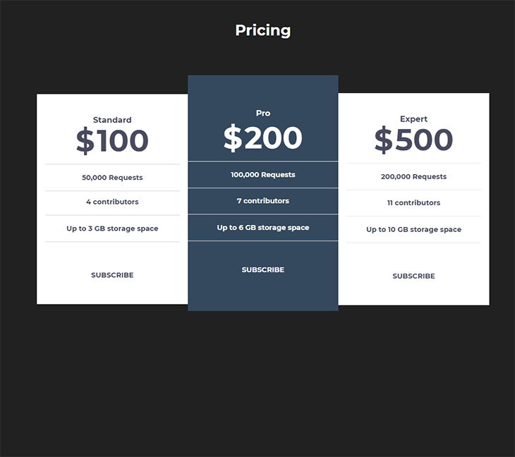
In this code snippet, we give our <section> a class of flex and a flex-direction:column on smaller screens and row on bigger ones. Then, we centered the content along the main axis.
We also styled our article tags by giving them a custom width of 31 percent on large screens and a width of 80 percent on smaller ones. We also aligned our texts to the center and made the background of the second price category a bg-primary-blue, while giving the buttons a text-transform: uppercase. All three price cards have no border-radius, just like the design.
Our final code should look like this:
<!DOCTYPE html>
<html lang="en">
<head>
    <meta charset="UTF-8">
    <meta name="viewport" content="width=device-width, initial-scale=1.0">
    <link href="https://fonts.googleapis.com/css2?family=Montserrat:wght@400;700;900&display=swap" rel="stylesheet"/>
    <link rel="stylesheet" href="/css/styles.css">
    <title>Tailwind Pricing Component</title>
</head>
<body class="sans h-full py-16 antialiased bg-primary-grey">
    <header class="flex flex-col items-center mb-12">
      <h2 class="text-3xl text-primary-white font-bold">Pricing</h2>
    </header>
    <section
      class="flex flex-col lg:flex-row items-start items-center lg:justify-center w-full w-full lg:px-10 py-12 "
    >
      <article
        class="w-4/5 lg:w-custom mb-10 lg:px-4 py-10 text-center text-primary-dark bg-primary-white"
      >
        <h5 class="font-bold text-base">Standard</h5>
        <h2 class="pb-4 flex justify-center font-bold border-b border-gray-300">
          <span class="text-6xl mr-1">$</span
          ><span class="text-6xl"> 100</span>
        </h2>
        <ul class="text-sm font-bold">
          <li class="pt-4 pb-4 border-b border-gray-300">50,000 Requests</li>
          <li class="pt-3 pb-4 border-b border-gray-300">4 contributors</li>
          <li class="pt-4 pb-4 border-b border-gray-300">Up to 3 GB storage space</li>
        </ul>
        <button
          class=" uppercase text-center text-sm mt-12 xl:px-24 px-12 sm:px-16 py-2 font-bold text-primary-very-light rounded-md"
        >
        Subscribe
        </button>
      </article>
      <article
        class="lg:w-custom w-4/5 mb-10 py-16 lg:-mt-6 text-white bg-primary-blue text-center"
      >
        <h5 class="font-bold text-base ">Pro</h5>
        <h2
          class="font-bold pb-4 mt-2 border-b border-gray-100 flex justify-center"
        >
          <span class="text-6xl mr-1">$</span
          ><span class="text-6xl "> 200</span>
        </h2>
        <ul class=" text-sm font-bold">
          <li class="pt-4 pb-4 border-b border-gray-200">100,000 Requests</li>
          <li class="pt-4 pb-4 border-b border-gray-200">7 contributors</li>
          <li class="pt-4 pb-4 border-b border-gray-200">Up to 6 GB storage space</li>
        </ul>
        <button
          class="uppercase text-center text-sm mt-10 xl:px-24 px-12 sm:px-16 py-2 rounded-md font-bold bg-primary-very-light text-primary-white"
        >
          Subscribe
        </button>
      </article>
      <article
        class="bg-white w-4/5 lg:w-custom mb-10 lg:px-4 py-10 text-center text-primary-dark"
      >
        <h5 class="font-bold text-base">Expert</h5>
        <h2 class="flex justify-center pb-4 font-bold border-b border-gray-200">
          <span class="text-6xl mr-1">$</span
          ><span class="text-6xl">500</span>
        </h2>
        <ul class="text-sm font-bold">
          <li class="pt-4 pb-4 border-b border-gray-200">200,000 Requests</li>
          <li class="pt-4 pb-4 border-b border-gray-200">11 contributors</li>
          <li class="pt-4 pb-4 border-b border-gray-200">Up to 10 GB storage space</li>
        </ul>
        <button
          class="uppercase text-center text-sm mt-12 xl:px-24 px-12 sm:px-16 py-2 rounded-md font-bold text-primary-very-light"
        >
        Subscribe
        </button>
      </article>
    </section>
  </body>
</html>
And our final design looks like so:
We could further build this component by extracting duplicate utility classes to a component such as the styles in our article tag. For example, instead of repeating the styles in our pricing card in the <article/> tag, we can extract all the styles using @apply and assign it to one single class.
<article class="pricing-card">
  Click me
</article>

<style>
  .pricing-card {
    @apply bg-white w-4/5 lg:w-custom mb-10 lg:px-4 py-10 text-center text-primary-dark;
  }
</style>
The same thing can be said about smaller components with repetitive styling, such as buttons and the pricing features. You can find out more about extracting components and classes on the LogRocket Blog, as well as in Tailwind CSS’s documentation.
In this article, we explored how to build a responsive pricing component with Tailwind CSS.
Tailwind CSS really makes building and prototyping things a breeze. You can check out the repository for this article on GitHub as well as the hosted demo on Netlify.
Tailwind’s documentation is well detailed and the video tutorials are also good resources to learn more about the framework and how to get you started. Also, you can learn about using Tailwind in other frontend frameworks, such as with this tutorial on using Tailwind in Svelte.
As web frontends get increasingly complex, resource-greedy features demand more and more from the browser. If you’re interested in monitoring and tracking client-side CPU usage, memory usage, and more for all of your users in production, try LogRocket.

LogRocket is like a DVR for web and mobile apps, recording everything that happens in your web app, mobile app, or website. Instead of guessing why problems happen, you can aggregate and report on key frontend performance metrics, replay user sessions along with application state, log network requests, and automatically surface all errors.
Modernize how you debug web and mobile apps — start monitoring for free.
Would you be interested in joining LogRocket's developer community?
Join LogRocket’s Content Advisory Board. You’ll help inform the type of content we create and get access to exclusive meetups, social accreditation, and swag.
Sign up now
Get to know RxJS features, benefits, and more to help you understand what it is, how it works, and why you should use it.

Explore how to effectively break down a monolithic application into microservices using feature flags and Flagsmith.

Native dialog and popover elements have their own well-defined roles in modern-day frontend web development. Dialog elements are known to […]

LlamaIndex provides tools for ingesting, processing, and implementing complex query workflows that combine data access with LLM prompting.

 Learn more →
