Editor’s note: This article was last updated on 19 July 2023.

Tailwind is a utility-first CSS framework, which means that, unlike other CSS frameworks like Bootstrap or Materialize CSS, it doesn’t come with ready-made components. Instead, Tailwind CSS provides you with a set of CSS helper classes that allow you to quickly implement custom designs with ease, so you’re not stuck using generic prebuilt components.
With Tailwind, you can implement your custom designs comfortably with predefined CSS classes. In this article, we’ll look at how to set up and start using Tailwind within your Svelte application. We’ll learn how to install the Tailwind library, initialize it, and use it to style our components. To follow along, you should have a working knowledge of JavaScript and Svelte.
Jump ahead:
When building apps with Svelte, there are several reasons why Tailwind should be your first choice to pair with it:
It’s essential to note that using any CSS framework, including Tailwind CSS, comes with a trade-off. The convenience of utility classes can lead to larger CSS file sizes, but Tailwind CSS circumvents that by coming with a utility extractor tool that removes unused CSS classes during the production build, which can lead to smaller CSS file sizes and improved performance.
To create a Svelte app, first ensure you have Node.js installed on your computer. You can check by typing the following command into your terminal:
node -v
If it’s not already installed, simply go to the Node website to download the latest version. You’ll also need to install the Vite library and select the Svelte template, as it’s the most popular template that is still actively maintained in 2023:
npm init vite tailwind -- --template svelte
Then, go to our project folder on the terminal:
cd tailwind
Now that we’ve set it up, we can install our project’s dependencies:
npm install
We can then run the Svelte app with the following:
npm run dev
Now that our Svelte application is ready, we have to install Tailwind using the following command:
npm install -D tailwindcss@latest postcss@latest
When that’s done, we’ll install autoprefixer:
npm install -D autoprefixer@latest
Finally, we can fully get our Tailwind up and running by initializing it using the following command:
npx tailwindcss init -p
For most projects (and to take advantage of Tailwind’s customization features), you’ll want to install Tailwind and its peer dependencies via npm. If you want to install all the processes at once, you can use concurrently, because that allows us to run multiple commands, which we will be using in our npm scripts later.
Because we’re not using the Tailwind CLI to integrate Tailwind into our project, and Tailwind CSS does not provide any vendor prefixing, autoprefixer is recommended. autoprefixer tracks caniuse.com to see which CSS properties need to be prefixed in order to ensure consistency across browsers.
To integrate Tailwind CSS into a pre-existing SvelteKit project, you simply have to add the Tailwind library to your project via the terminal. To do so, run this command:
npx svelte-add@latest tailwindcss pnpm install
Next, we will manually configure our PostCSS configuration file (postcss.config.js) in our base directory.
Add the following lines of code to your file:
import tailwind from 'tailwindcss'
import tailwindConfig from './tailwind.config.js'
import autoprefixer from 'autoprefixer'
export default {
    plugins: [tailwind(tailwindConfig),autoprefixer]
}
PostCSS is necessary to lint our CSS, hence this configuration.
Like the previous step, we will now manually configure our Tailwind configuration file (tailwind.config.js) in the base directory. We can set our own config options. Currently, the config file below uses purge to remove any unused CSS in production:
export default {
  plugins: [],
    theme: {
      extend: {},
    },
  purge: ["./index.html",'./src/**/*.{svelte,js,ts}'], //for unused css
  variants: {
    extend: {},
  },
  darkmode: false, // or 'media' or 'class'
}
Next, we’ll go to the src folder, and inside that, we’ll see a folder named lib. Inside the lib folder, we’ll create a file named TailwindCSS.svelte, and then add the following code inside that file:
<style>
    @tailwind base;
    @tailwind components;
    @tailwind utilities;
</style>
Finally, we can go to our App.svelte file and import the TailwindCSS component we just created, then call it out in the file proper, like this:
<script>
  import svelteLogo from './assets/svelte.svg'
  import viteLogo from '/vite.svg'
  import Counter from './lib/Counter.svelte'
  import TailwindCss from './lib/TailwindCSS.svelte';
</script>

<TailwindCss/>
With that, we’re good to go. We can now start the app by running this:
npm run dev
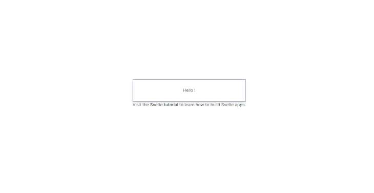
We have successfully integrated Tailwind into our Svelte project! We can confirm this by adding the following Tailwind classes to our App.svelte file:
<main>
  <h1 class="py-8 px-4 border border-indigo-900 shadow-lg">Hello {name}!</h1>
  <p>Visit the <a href="https://svelte.dev/tutorial">Svelte tutorial</a> to learn how to build Svelte apps.</p>
</main>
You should now see this:
N.B., This template supports the use of arbitrary values when styling things like grids.
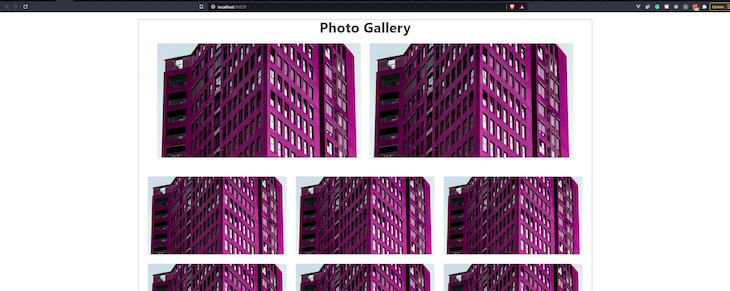
Now, let’s use our newly created CSS library to build a photo gallery. We’re going to clear the existing HTML in our App.svelte and follow this guide to create a gallery like the one pictured here:
First, we’ll create a surrounding div:
<div class="container mx-auto border border-indigo-500 px-4">

</div>
The container class sets the max-width of our div to the min-width of the current breakpoint. This is useful if you’d prefer to design for a fixed set of screen sizes instead of trying to accommodate a fully fluid viewport.
While mx-auto centers the div, border creates a border, and border-indigo-500 adds border color and other styling details:
<div class="container mx-auto border border-indigo-500 px-4">
  <h1 class="font-bold text-5xl">Photo Gallery</h1>
</div>
We then add our “Photo Gallery” title in an h1 tag. The font-bold helps increase the font-weight to 700 and the text-5xl sets the font-size to 3rem.
There are two section elements on the images above. The first section contains two images, while the second section contains six (three images per row):
<main>
  <div class="container mx-auto border border-indigo-500 px-4">
    <h1 class="font-bold text-5xl">Photo Gallery</h1>

    <section class="py-8 px-4">
      <div class="flex flex-wrap mx-4">
        <div class="md:w-1/2 px-4 mb-8 md:mb-0"><img class="rounded shadow-md" src="https://source.unsplash.com/random/1280x720" alt=""></div>
        <div class="md:w-1/2 px-4 mb-8 md:mb-0"><img class="rounded shadow-md" src="https://source.unsplash.com/random/1280x720" alt=""></div>
      </div>
    </section>

    <section class="pt-8 px-4">
      <div class="flex flex-wrap mx-4">
        <div class="md:w-1/3 px-4 mb-8"><img class="rounded shadow-md" src="https://source.unsplash.com/random/1280x720" alt=""></div>
        <div class="md:w-1/3 px-4 mb-8"><img class="rounded shadow-md" src="https://source.unsplash.com/random/1280x720" alt=""></div>
        <div class="md:w-1/3 px-4 mb-8"><img class="rounded shadow-md" src="https://source.unsplash.com/random/1280x720" alt=""></div>
        <div class="md:w-1/3 px-4 mb-8"><img class="rounded shadow-md" src="https://source.unsplash.com/random/1280x720" alt=""></div>
        <div class="md:w-1/3 px-4 mb-8"><img class="rounded shadow-md" src="https://source.unsplash.com/random/1280x720" alt=""></div>
        <div class="md:w-1/3 px-4 mb-8"><img class="rounded shadow-md" src="https://source.unsplash.com/random/1280x720" alt=""></div>
      </div>
    </section>

  </div>
</main>
The first section has class py-8, which adds padding to the top and bottom, and px-4 for padding to the left and right. Then, there is an inner, surrounding div that contains Tailwind classes flex, flex-wrap, and mx-4. These classes set the display to flex, set flex-wrap to wrap, and add a margin to the left and right.
For the images themselves, they are individually surrounded by a div with Tailwind classes *class*="md:w-1/2 px-4 mb-8 md:mb-0". This determines the width of each image, which is 1/2 of the parent div. It also styles the padding and margin.
The images themselves now have the rounded class, which applies border radius sizes. shadow-md adds box shadows to the element. The second section has the same styles. The only difference is that the immediate div surrounding each image has the Tailwind class md:w-1/3, which ensures the width of each image is 1/3 of the parent div, making it three images per row.
A big congrats to you if you’ve made it this far. You have successfully learned how to set up your Svelte project and add beautiful styles with Tailwind.
If you’d like to go further, add more CSS classes to make the photo gallery more beautiful. For example, you can add more pages, components, and even transitions. The Tailwind documentation will show the correct classes for any style you hope to create:
As web frontends get increasingly complex, resource-greedy features demand more and more from the browser. If you’re interested in monitoring and tracking client-side CPU usage, memory usage, and more for all of your users in production, try LogRocket.

LogRocket is like a DVR for web and mobile apps, recording everything that happens in your web app, mobile app, or website. Instead of guessing why problems happen, you can aggregate and report on key frontend performance metrics, replay user sessions along with application state, log network requests, and automatically surface all errors.
Modernize how you debug web and mobile apps — start monitoring for free.
Install LogRocket via npm or script tag. LogRocket.init() must be called client-side, not
server-side
$ npm i --save logrocket

// Code:

import LogRocket from 'logrocket';
LogRocket.init('app/id');
// Add to your HTML:

<script src="https://cdn.lr-ingest.com/LogRocket.min.js"></script>
<script>window.LogRocket && window.LogRocket.init('app/id');</script>

Nushell is a modern, performant, extensible shell built with Rust. Explore its pros, cons, and how to install and get started with it.

The Zed code editor sets itself apart with its lightning-fast performance and cutting-edge collaborative features.

Infinite scrolling in Next.js no longer requires external libraries — Server Actions let us fetch initial data directly on the server.

Create a dynamic demo blog site using Django and React to demonstrate Django’s server-side functionalities and React’s interactive UI.

 Learn more →

4 Replies to "How to use Tailwind CSS with Svelte"
thank you, it worked!
Thanks, very well thought-out tutorial! Helped me a bunch!
Is there a way to use @apply in components style-section?
It works except when you want to use arbitrary values in for example grid sections:
1
2
This Tailwind/Svelte setup wont honor the “grid-cols-[200px_800px]” class. So far i’ve tried many starters, templates and tutorials. But the only one i’ve found that works, is one where it uses tailwindcss/jit with just in time compilation.