Taking extra measures to build more accessible React apps can be a time-consuming process. However, it’s something we need to do in order to create a more inclusive web for everyone.
The goal of this post is to help you understand how to build more accessible React forms by using the popular react-icons library and the very accessible React components made available by the ReachUI library.
The Replay is a weekly newsletter for dev and engineering leaders.
Delivered once a week, it's your curated guide to the most important conversations around frontend dev, emerging AI tools, and the state of modern software.
React Icons provides thousands of free, open-source icons. It includes ten popular open-source icon libraries, including Font Awesome and Material Design. It utilizes ES6 imports that allow you to include only the icons that your project is using. We use react-icons for a number of reasons, mostly to target user inputs and add visual descriptions to form fields. Here are some benefits:
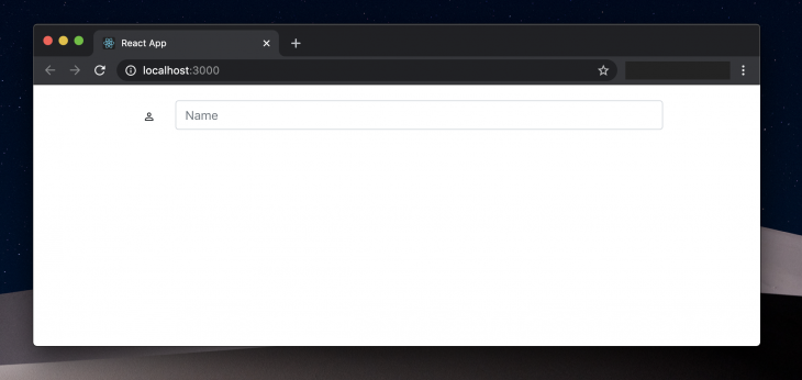
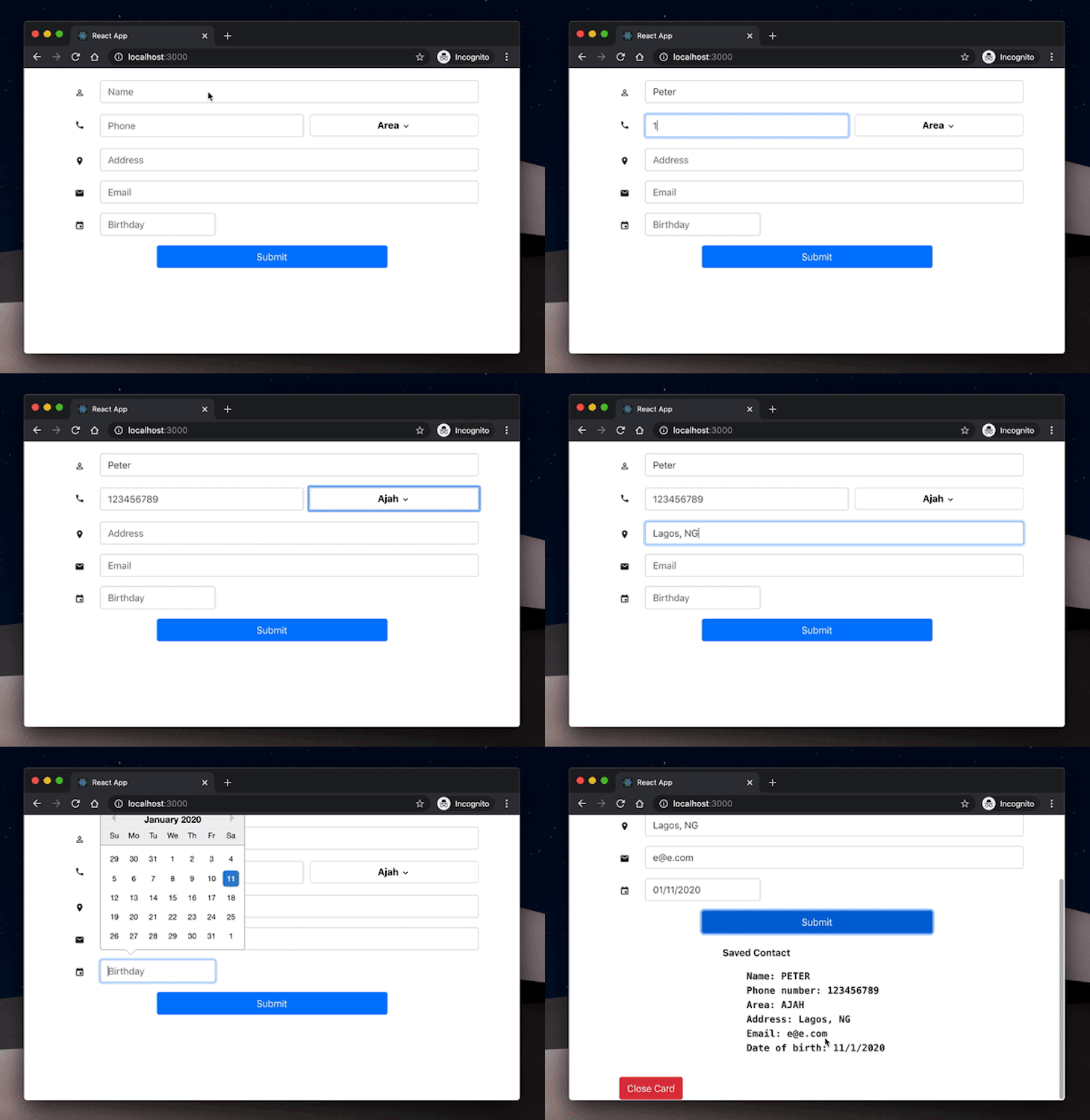
For demonstration purposes and to give you a more practical experience, we’ll build a contact form to collect the details of a new friend. We’ll make this form accessible using Reach UI’s components and React Icons. Here’s a visual output of the end product.
![]()
The most common way to start a React project is by using the create-react-app CLI tool. If you haven’t done this before, go ahead and run the following commands to install the necessary packages and start the local development server:
npx create-react-app accessible-form
cd accessible-form
npm start
If you check your browser on localhost:3000, you should see your project live.

Icons have become an integral part of creating a great user interface. They help present your content in a clear and concise manner that would make navigating your website or application easier for your users.
To build the form fields we make use of the components made available to us from ReachUI. To find out more of ReachUI’s components, visit ReachUI components.
To help us build this project, we’ll reuse some existing libraries:
To install these libraries, open a terminal and run the following commands in the project’s root folder:
npm install --save react-icons react-datepicker bootstrap
In the root directory of the sample project we created, create a new
src/components/Contact.js file. In this file, we’ll set up our contact form and use react-icons to improve its accessibility and overall experience. Open it up and update it with the code below:
import React, { Component } from "react";
import { Combobox, ComboboxInput } from "@reach/combobox";
import { Menu, MenuList, MenuButton, MenuItem } from "@reach/menu-button";
import {
  MdPhone,
  MdPermIdentity,
  MdLocationOn,
  MdEmail,
  MdExpandMore,
  MdEvent
} from "react-icons/md";
import DatePicker from "react-datepicker";
class Contact extends Component {
  render(){
    return(
      <>
      //Form here
      </>
    );
  }
}
Here, we’ve imported a few of the external components that we installed earlier to help us implement the functionalities needed in this application. Let’s take a closer look at their respective features:
<Combobox>: This is an accessible input box component made available by the ReachUI library. Like every other component from the ReachUI library, it is accessible by default and abides by all ARIA element specifications<Menu/>: The ReachUI Menu component is used to provide dropdown selection functionalities in web apps. In our form, we’ll have a dropdown menu that allows users to select the locations they reside in. Using the <Menu/> component gives us accessibility out of the box and also makes the menu items keyboard accessible. Finally, the menu options are well suited for assistive technologies<React Icons/>: The icons we imported into this project are all from material design icons made available to us by the react-icons library. It makes our form fields more visually descriptiveReact DatePicker: This a reusable Datepicker component made specifically for building React applications. We’ll use this component to render the date picker for the birthday selection field. It is keyboard accessible and renders the date efficientlyHaving imported all the necessary external libraries, we can go ahead and define the return() function in our Contact.js file. In it, we’ll use the components we’ve imported to build out the desired form fields.
This is the form field that collects the name of the user. To set this up, we’ll update the previous snippet with the code below:
// imports
class Contact extends Component {
  render(){
    return(
      <>
        <form onSubmit={this.handleSubmit}>
          <Combobox>
            <div>
              <label for="userName">
                <MdPermIdentity />
              </label>
            </div>
            <div>
              <ComboboxInput
                className="form-control"
                id="userName"
                aria-label="user name"
                name="userName"
                value={this.state.userName}
                placeholder="Name"
                onChange={this.handleChange}
              />
            </div>
          </Combobox>
        </form>
      </>
    );
  }
}
export default Contact

Here, we used the <Combobox/> component to define the field that collects the user’s name. While rendering the MDPermIdentity icon, we wrapped it inside a HTML label tag to add more visual accessibility to the form input using the for attribute it provides. Finally, to render the text input component for the field, we used the ComboboxInput component which takes in the aria-label attribute to provide audio accessibility to users who make use of screen-readers.
We’ve also applied the same functionality across all other fields that enable users to input text such as the phone number field, the address field, and the email field.
This is the field where we’ll allow users to select a residential location based on a predefined list of locations. We’ll use the <Menu/> component from ReachUI to accessibly power this functionality. Here’s how we implement that in the Contact.js file:
// imports
class Contact extends Component {
  render(){
    return(
      <>
        <form onSubmit={this.handleSubmit}>
          <div>
            <Menu>
                <MenuButton aria-label="menu button for area">
                  {(this.state.userArea == '') ? ('Area') : (this.state.userArea)}
                  <span aria-hidden><MdExpandMore /></span>
                </MenuButton>
                <MenuList>
                  <MenuItem onSelect={() => this.handleSelect('Ajah', 'userArea' )}>
                    Ajah
                  </MenuItem>
                  <MenuItem onSelect={() => this.handleSelect('Apapa', 'userArea' )}>
                    Apapa
                  </MenuItem>
                  <MenuItem onSelect={() => this.handleSelect('Festac', 'userArea' )}>
                    Festac
                  </MenuItem>
                  <MenuItem
                    onSelect={() => this.handleSelect('Gbagada', 'userArea' )}>
                    Gbagada
                  </MenuItem>
                  <MenuItem onSelect={() => this.handleSelect('Lekki', 'userArea' )}>
                    Lekki
                  </MenuItem>
                  <MenuItem
                    onSelect={()=> this.handleSelect('Victoria Island', 'userArea' )}>
                    Victoria Island
                  </MenuItem>
                </MenuList>
              </Menu>
            </div>
          </div>
        </form>
      </>
    );
  }
}
export default Contact
The Menu component has some extended accessibility features, however, it is still practically a wrapper around the usual HTML elements in the following ways:
<Menu /> component — HTML <select /> HTML element<Menubutton /> — HTML <button /> element<MenuItem/> — HTML <option/> attribute for <select/> elements<MenuList /> — wrapper for the <MenuItem />Once again, we’ve used the aria-label to provide audio accessibility for screen-readers.

Congratulations! You just finished building an accessible contact form in React using React Icons and ReachUI. The goal is to help you get an immediate hands-on approach to building accessible React forms. We didn’t cover the styling of the form in detail so as not to divert attention from the more important aspect of this post. However, you can find the source code with all the styles in the project repository.
Install LogRocket via npm or script tag. LogRocket.init() must be called client-side, not
server-side
$ npm i --save logrocket

// Code:

import LogRocket from 'logrocket';
LogRocket.init('app/id');
// Add to your HTML:

<script src="https://cdn.lr-ingest.com/LogRocket.min.js"></script>
<script>window.LogRocket && window.LogRocket.init('app/id');</script>

Learn about TypeScript v6’s breaking changes, new ES2025 features, and deprecated options. A complete migration guide from v5 to prepare for v7.

Learn how Vite+ unifies Vite, Vitest, Oxlint, Oxfmt, Rolldown, and Node.js management in one CLI.

AI companies are buying developer tools as coding agents turn runtimes, package managers, and linters into strategic infrastructure.

Learn how AI-assisted development governance uses rules, agents, hooks, and protocols to help AI coding tools produce safer, more consistent code.
Hey there, want to help make our blog better?
Join LogRocket’s Content Advisory Board. You’ll help inform the type of content we create and get access to exclusive meetups, social accreditation, and swag.
Sign up now