
In this article, we will learn what headless component libraries are and when to use them, as well as learn about popular options for headless UI libraries in the React Native ecosystem.

Here’s what we’ll discuss today:
You can find the source code repositories for the examples of Tamagui, NativeWind, Dripsy, and Gluestack on my GitHub.
The Replay is a weekly newsletter for dev and engineering leaders.
Delivered once a week, it's your curated guide to the most important conversations around frontend dev, emerging AI tools, and the state of modern software.
As developers, we often build complex apps and websites for clients. This involves components that are complicated to build and very tricky to style.
In many cases, building custom components from scratch is a demanding and time-consuming endeavor because we have to look after a plethora of requirements, which may include:
As an example, let’s take this ListBox component:

As you can see, replicating this behavior in a custom React component is not easy at all. So how do we fix this problem? This is where headless component libraries come in.
They are essentially a set of components that provide the logic, processing, and API, but rely on the developer for styling. In simpler words, these libraries handle all the heavy lifting and all we have to do is to make them look good.
Now that we have learned about the fundamentals of this concept, let’s now explore some popular component libraries for React Native.
Tamagui is a library that provides universally styled components for both React and React Native platforms. Its biggest advantage is that since it supports React and Native, the styling code is unified between both web and mobile platforms. Furthermore, the team also maintains that performance is better than other competing libraries.
To integrate Tamagui into your Expo app, follow these instructions. When that’s done, write the following code in your App.js file:
import { useFonts } from "expo-font";
import { Button, Paragraph, TamaguiProvider, Theme, YStack } from "tamagui";
import config from "./tamagui.config";

export default function App() {
  const [loaded] = useFonts({
    Inter: require("@tamagui/font-inter/otf/Inter-Medium.otf"),
    InterBold: require("@tamagui/font-inter/otf/Inter-Bold.otf"),
  });
  //Render the UI as soon as the resources are loaded
  if (!loaded) {
    return null;
  }

  return (
    <TamaguiProvider config={config}>
      {/*Render a View with dark theme*/}
      <Theme name={"dark"}>
        <YStack f={1} jc="center" ai="center" backgroundColor={"pink"}>
          {/*Render some text onto the screen*/}
          <Paragraph color="black" jc="center" fontSize={50} lineHeight={80}>
            Black
          </Paragraph>
        </YStack>
      </Theme>
      {/*Render another view with light theme*/}
      <Theme name="light">
        <YStack f={1} ai="center" jc="center" backgroundColor="black">
          <Paragraph color="pink" jc="center" fontSize={50} lineHeight={80}>
            Pink
          </Paragraph>
        </YStack>
      </Theme>
      {/*Render a third View with dark theme and display a button*/}
      <Theme name="dark">
        <Button color={"$pink10Dark"}> I am a dark button</Button>
      </Theme>
    </TamaguiProvider>
  );
}
Let’s test it out! To run this code, run this Bash command:
npm run start-android
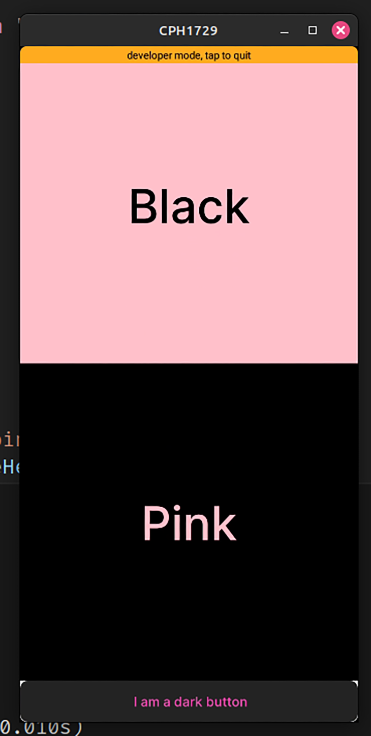
Here are a few factors that make it a great library:
However, there are some things that I didn’t like about Tamagui:
NativeWind is another tool that allows developers to share styling code between React and React Native platforms. However, unlike Tamagui, its key feature is that it lets users use Tailwind’s scripting language to decorate UI elements.
First, to integrate NativeWind in your Expo app, follow these steps. Next, in your tailwind.config.app, add the following lines of code:
module.exports = {
  content: [
    "./app/**/*.{js,jsx,ts,tsx}",
    "/*.{js,jsx,ts,tsx}",
    "./App.{js,jsx,ts,tsx}", //ensures that App.js is styled as well
  ],
//further code..
Let’s now see it in action! To do so, replace all the code in App.js with the following:
import { StatusBar } from "expo-status-bar";
import { Text, View } from "react-native";
import "./global.css";
export default function App() {
  return (
    //apply Tailwind styling to our React Native elements..
    <View className="flex-1 items-center justify-center bg-blue-400">
      <Text className="px-8 text-lg text-rose-800">
        This style is being applied with NativeWind
      </Text>
      <StatusBar style="auto" />
    </View>
  );
}
To run the code, execute this Bash command:
npx expo start -c #clear the cache and then run the app
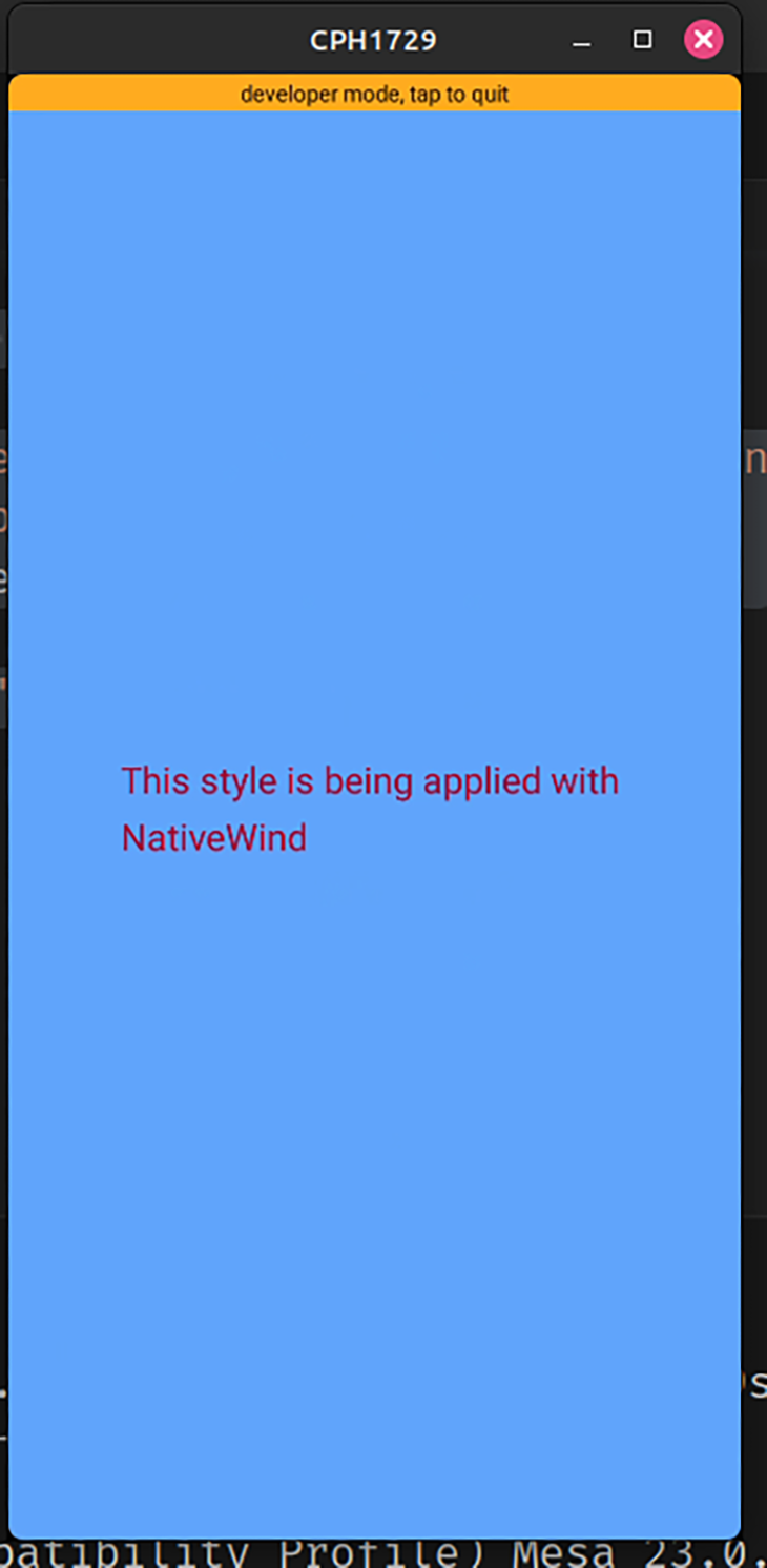
Here are a few key features that help NativeWind stand out:
However, there was one thing that made it unappealing:
Dripsy is another React Native library that, like Tamagui and NativeWind, aids users in unifying styling code between web and mobile. Moreover, compared to its counterparts, Dripsy has a remarkably simple setup process.
To use Dripsy in your app, install it like so:
npm install dripsy
That’s it! To use this library, write the following code in your App.js file:
import { StatusBar } from "expo-status-bar";
import { View, Text } from "dripsy";
import { DripsyProvider } from "dripsy";

export default function App() {
  return (
    <DripsyProvider>
      <View
        //use the 'sx' prop to style our component
        sx={{
          height: "100%",
          backgroundColor: "green",
        }}
      >
        <Text sx={{ marginY: 100, color: "rgb(255,255,255)", fontSize: 30 }}>
          This was styled with Dripsy
        </Text>
        <StatusBar style="auto" />
      </View>
    </DripsyProvider>
  );
}
Let’s now see it in action! Run this piece of code in your terminal:
npx expo start -c
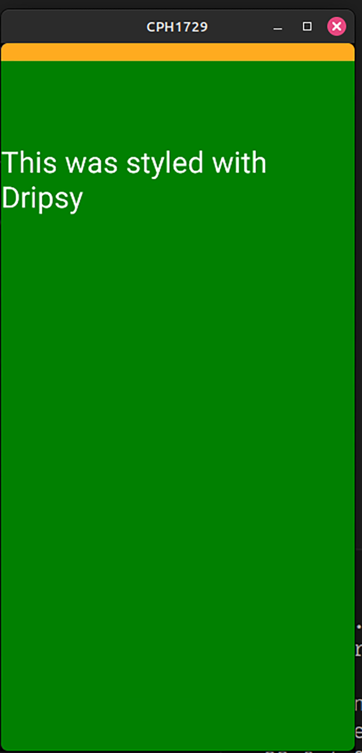
Here are some of the reasons why Dripsy might be suitable for you:
sx prop for more control over UI styling. Furthermore, this prop is also memoized out of the box, thus promising a responsive appBut one thing you want to look out for is:
Just like the other libraries mentioned in this article, Gluestack is another unstyled component library. Originally a part of NativeBase, the developer team created this library to prevent bloat and enhance maintainability of the project.
To install Gluestack in an Expo project, run this Bash command:
npm i @gluestack-ui/themed @gluestack-style/react [email protected]
This block of code demonstrates sample usage of the Gluestack technology:
import { GluestackUIProvider, Text, Box, config } from "@gluestack-ui/themed";

export default function App() {
  return (
    //use the default config
    <GluestackUIProvider config={config.theme}>
      {/*Create first Box element with black background color*/}
      <Box
        width="100%"
        height="50%"
        justifyContent="center"
        alignItems="center"
        bgColor="black"
      >
        <Text color="white">This text was styled using Gluestack</Text>
      </Box>
      {/*Create second Box element with pink background color*/}
      <Box
        width="100%"
        height={"50%"}
        justifyContent="center"
        alignItems="center"
        bgColor="pink"
      >
        <Text color="blue">This second block of text was styled as well</Text>
      </Box>
    </GluestackUIProvider>
  );
}
This will be the result:
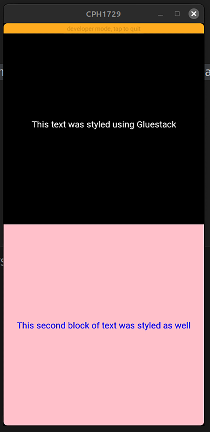
Here are a few factors that make it a decent choice for your project:
However, there are some things that you might want to consider before integrating Gluestack in your app:
react-native-svg. This may break the app due to dependency conflicts:
Here is a table that summarizes all the key features of the libraries discussed earlier:
| Aspect | Tamagui | NativeWind | Dripsy | Gluestack |
|---|---|---|---|---|
| Styling convention | Custom tokens | TailwindCSS | sx prop for styling |
Custom tokens |
| Performance | Faster than others | Small runtime, good performance | Responsive, memoized sx prop |
Substantially faster than NativeBase. Slower than other alternatives, but still competitive |
| Setup process | Tedious for Expo apps, easy for other integrations | Easy to setup for all integrations | Straightforward setup for all integrations | Straightforward setup for all integrations |
| Documentation | Not easy to follow (but LogRocket has a good guide) | Clear documentation | Detailed and easy to follow | Details and easy to follow |
| Theming options | Multiple theming on one screen. Can override themes | Same as TailwindCSS | Can override themes | Can override themes |
| Custom fonts | No | No | Yes | No |
| Follows Tailwind’s convention | No | Yes | No | No |
| Update frequency | Frequent updates | Regular updates | Infrequent updates | Frequent updates |
| Integrations | React Native, Next.js, React | React Native, Next.js, React | React Native, Next.js | React Native, React, Next.js |
Here are the source code repositories for the examples of Tamagui, NativeWind, Dripsy, and Gluestack.
In this article, we briefly discussed the importance of headless component libraries. Furthermore, we also compared some of the most popular headless component technologies for React Native.
In my personal projects, I use NativeWind because it follows Tailwind’s styling language, thus making it effortless to decorate and design UI components. Thank you so much for reading!

LogRocket's Galileo AI watches sessions for you and and surfaces the technical and usability issues holding back your React Native apps.
LogRocket also helps you increase conversion rates and product usage by showing you exactly how users are interacting with your app. LogRocket's product analytics features surface the reasons why users don't complete a particular flow or don't adopt a new feature.
Start proactively monitoring your React Native apps — try LogRocket for free.

A step-by-step guide to building your first MCP server using Node.js, covering core concepts, tool design, and upgrading from file storage to MySQL.

Using security headers in your Next.js apps is a highly effective way to secure websites from common security threats.

A deep dive into April 2026’s AI model and tool rankings. We break down performance, usability, pricing, and real-world capabilities across 50+ features to help you pick the right tools for your development workflow.

A practical guide to Agent Browser CLI. Learn how AI agents navigate, snapshot, and interact with web pages using stable references, enabling efficient automation and exploratory testing.
Hey there, want to help make our blog better?
Join LogRocket’s Content Advisory Board. You’ll help inform the type of content we create and get access to exclusive meetups, social accreditation, and swag.
Sign up now