
Explore a few different types of UI animations, how they differ from motion graphics, some principles of animation to follow, and more.

Understanding how innovation diffuses can help you predict market behavior and prepare for outcomes when looking to introduce a new product.

Discover the differences between symmetrical and asymmetrical balance and their importance in the world of web design.

Let’s talk about the purpose of a one-on-one meeting, what makes a successful one, and strategies to plan and run one effectively.
Here’s a look at the elements of a dropdown menu, its different variations, and the steps to design a dropdown menu in Figma.
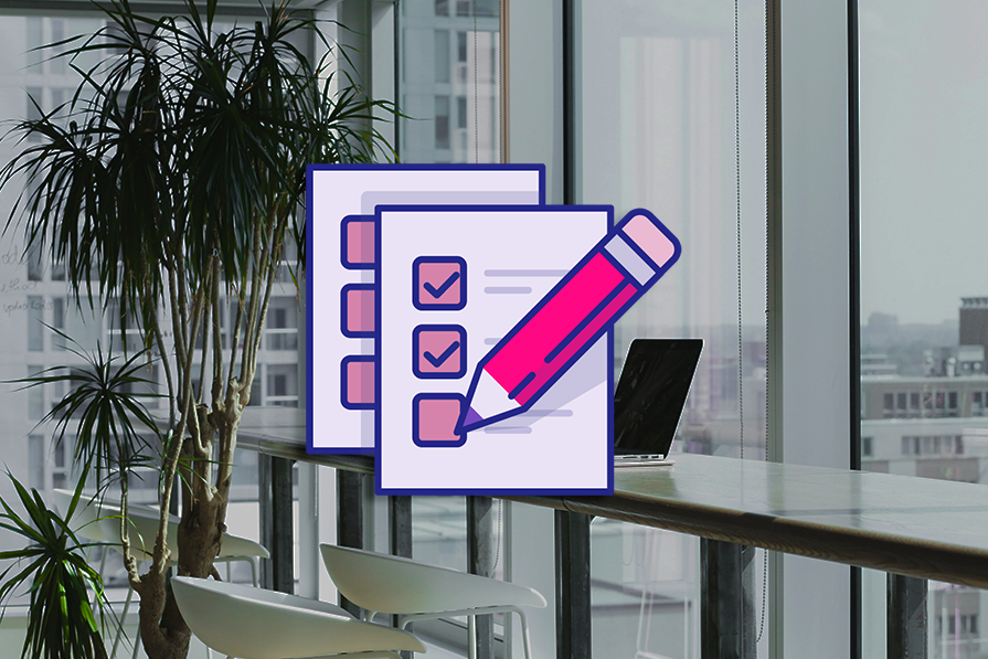
Validating and verifying your designs can spare you from having to rehaul them down the road. Here’s why and how to conduct these processes.

Enterprise design thinking aims to align teams around a common goal and support them in working more efficiently while keeping their work centered around people.

Storybook is a platform for UI development, testing, and documentation that can help designers develop UI components and pages in isolation.
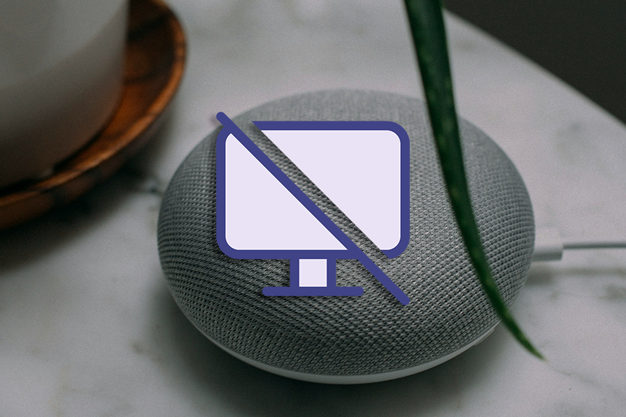
Zero UI is another way of referring to interfaces that don’t require traditional methods of input. Here’s an overview of how to employ it.
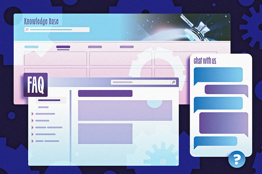
Ideally, UX designers should collaborate with customer support agents more often to improve user experience. Here’s how they can start.
InVision has announced the sale of their design collaboration tool, along with the discontinuation of their services by the end of 2024.
Penpot is an open source design and prototyping tool that aims to bridge the gap between designers and developers in the product workflow.