Commoditized UX design is everywhere — and it’s killing strategy. This blog shows how to push back and reclaim design as a problem-solving tool, not a factory line.

This post breaks down what design debt is and gives you 6 smart ways to fix it, without killing team velocity.
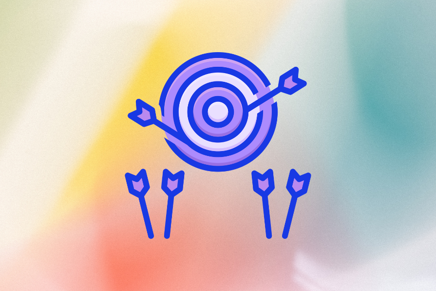
Specialization can make you valuable — or vulnerable. Explore how to build breadth in your design career before you’re forced to pivot.

This one’s for designers stuck in low-maturity orgs. Learn how to survive, drive change, and spot the red flags early.

Promotions don’t just happen. I had to stop waiting, start asking, and rethink what “senior” really means. Here’s how I finally moved forward.

This guide shows you how to apply the UX honeycomb in your design process — plus how it stacks up to other UX models.

Glassmorphism is a UI trend that’s used to create the illusion of a glass-like texture to give a fresh, transparent feel to interfaces.

Improve loading UX with skeleton screens. This guide breaks down what they are, how they work, and how top apps use them.
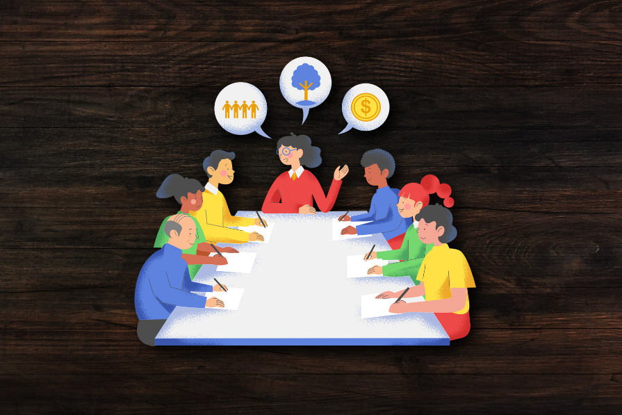
Our team kept running into misalignment, rework, and wasted effort. A simple design kick-off meeting helped us fix it — here’s how.

Progressive disclosure is a design technique that involves revealing information gradually based on the user’s needs.

Dive into the world of mobile UX design and explore the best practices, common challenges, and examples of apps that are doing it right.
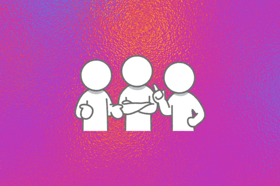
No designer works in a vacuum. If you want your ideas to land, you need facilitation skills. Let’s talk about what that really means.