In product design, lists are a common component we use to organize and present information. Lists appear in many different forms, such as navigation menus, notifications, email inboxes, settings, filters, or search results, to name a few.
However, lists can be tricky to design because of their versatile nature. From designing a simple one-line list to a multiline list with images, metadata, and interactive elements, there are many factors to consider that make lists readable, accessible, and visually appealing.
In this article, we’ll explore some best practices and examples that make list design simple. I’ve also created a Figma template so that you can get a head start on designing your own list.
A list component is essentially a group of list items and can be broken down into three parts:
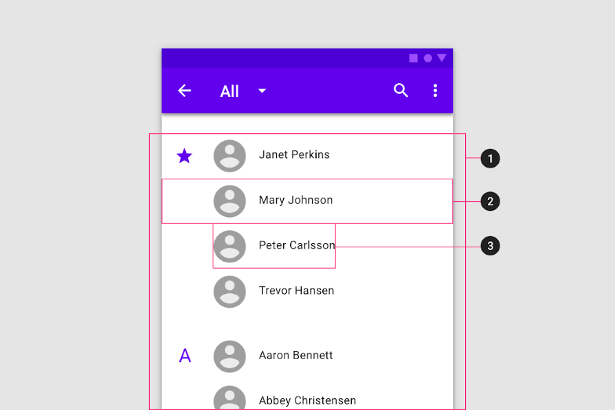
Each list item has its own content, which can include various types of information including a label, primary text, metadata, supporting visuals, and interactive elements. The complexity and type of content shown in a list item depends on the context of the list.
Designers often organize complex lists by using a tree pattern to represent parent-child relationships or to separate sublists by category. Tree list items collapse and expand using chevrons to progressively disclose information to the user. Each child or sublist item is indented to indicate that it belongs under a parent item.
In this example, Finder on Mac uses a tree list to organize list items. Each list item includes an icon to distinguish folders (parents) from files (children), as well as separate spaces for metadata, such as date, size, and file type. The list items indent as folders are expanded, making it easy to scan the list and understand which children belong to each parent item:
An often overlooked element of list design is how list items are separated. Depending on the context, a list can utilize varying amounts of whitespace, depending on the level of detail in the content and how much screen space is available.
For example, Gmail’s inbox is fairly compact in order to display many list items on one page. It uses a thin gray divider between emails to visually separate each list item without standing out too much:
On the other hand, Spotify uses whitespace in lists to give each list item room to breathe. They avoid cluttering the interface with dividers because the whitespace makes it easy to scan the page. Users can hover over a list item to interact with the list, which invokes a row highlight to put the list item in focus, separating it from the items above and below it:
Whether you choose to use visual dividers or whitespace to separate list items, explore different options and select the one that works best for your context.
When the list item content includes multiple pieces of information, it can benefit from a visual hierarchy. You can use a number of techniques to make a list easily scannable, including using different font sizes and styles to highlight the most important information or using color to represent different statuses.
The New York Times does a great job of creating a visual hierarchy in its search result list. It uses a combination of serif fonts for the main text and sans-serif fonts for labels. The font sizes vary depending on the importance of the information.
It also incorporates a subdivider to include additional metadata, creating a separate section that is still visually attached to the list item. The use of dividers and whitespace makes the list easily scannable without cluttering the interface:
In this notification list by SAP, the label of each list item is bolded so that it stands out while scanning the list. The use of iconography and color allows users to quickly understand the urgency of each notification. The Show More link in blue stands out among the sea of notifications, indicating that there are additional details to be read:
Multi-line list item content can easily become disorganized. Using proper alignment between elements can make a list more readable because it creates visual consistency across list items.
When list items contain supporting visuals, such as an image or icon, you can align the content differently depending on the number of lines of text it has. For one-line and two-line list items, the supporting visual should be center-aligned vertically with the text. This creates symmetry with the list item content and consistent spacing between list items:

For list items that contain more than two lines of text, the supporting visual should be top-aligned with the text, so that it appears first when scanning from left to right. It also consistently indicates the start of a new list item, in case some list items have a different number of lines:

List item content contains primary text, and optionally, a label and metadata. Primary text and labels are left-aligned and spaced apart from the support visual. Metadata can be aligned either left or right depending on the style or context of the list. Make sure that all content is aligned with each other on both sides!
Lists are commonly used to facilitate user interactions. With an interactive list, users can perform actions on list items, such as selecting, reordering, deleting, or altering information.
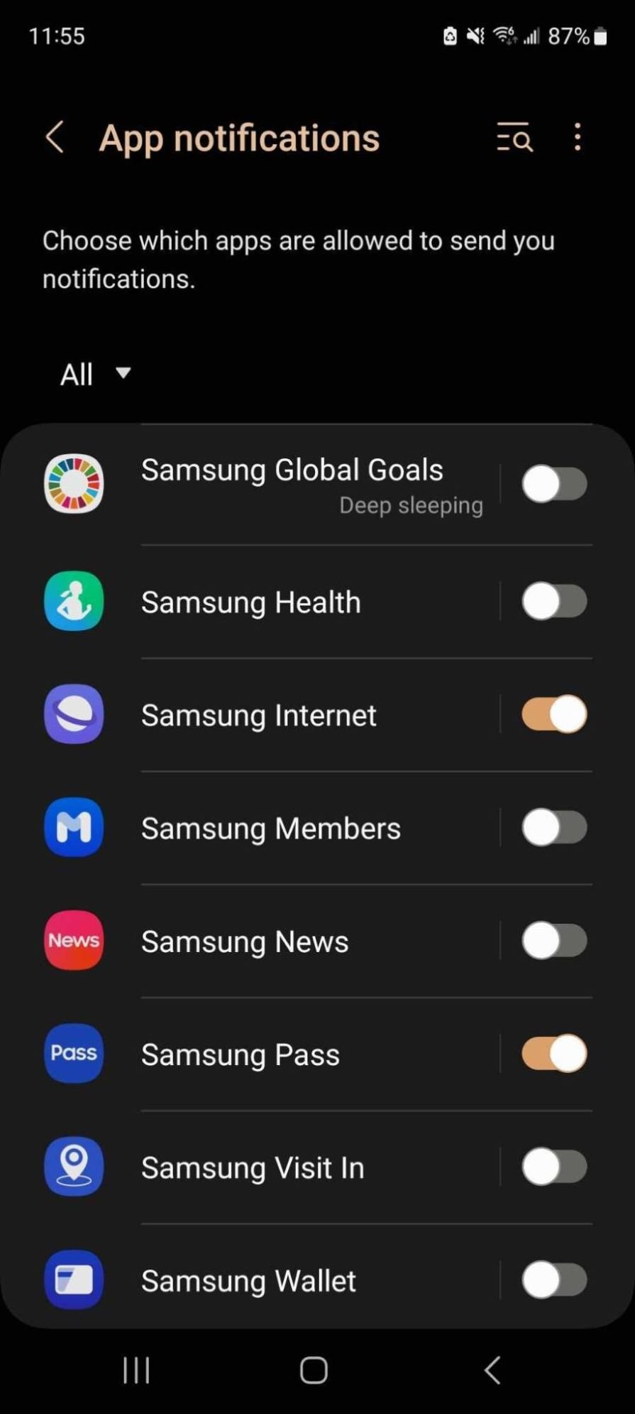
Android’s notifications settings include a toggle switch on the right side of each list item. As each list item contains no more than two lines, the supporting visual is center-aligned vertically with the text and the toggle, which is separated from the text with a subdivider.
This interface effectively uses whitespace to ensure that each element of the list item is consistently spaced out, providing sufficient room for users to interact with the toggle:
Gmail includes actions on both the left and right side of list items. On the left, users have access to a checkbox to select items and a star icon to favorite items. On the right, a contextual icon menu appears upon hovering over the list item, revealing several actions. The menu replaces the date while hovering in order to save space and progressively disclose the action buttons.

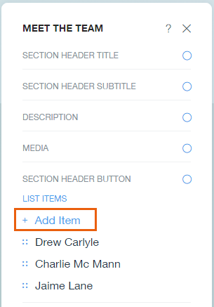
If you don’t have enough space to include a full context menu in the list item, simply use a menu or settings icon to trigger a pop-out menu, as shown in this example from Wix:
Don’t forget to make sure your list design is accessible to all users! People with disabilities often navigate interfaces using assistive devices. Commonly, these users navigate the keyboard to tab through each element while a screen reader describes each element out loud to the user, so it’s important to include proper labels for any interactive elements like buttons.
When designing a customizable list where users can add list items, include the add button at the top of the list so that users don’t have to tab through the entire list to get to it:
Customizable lists often allow users to reorder list items by dragging and dropping them. You can indicate this by a draggable icon that users can click and hold, which will “pick up” the list item.
As the selected list item is dragged, the other list items will be highlighted and moved out of the way to indicate to the user where the list item will be dropped:
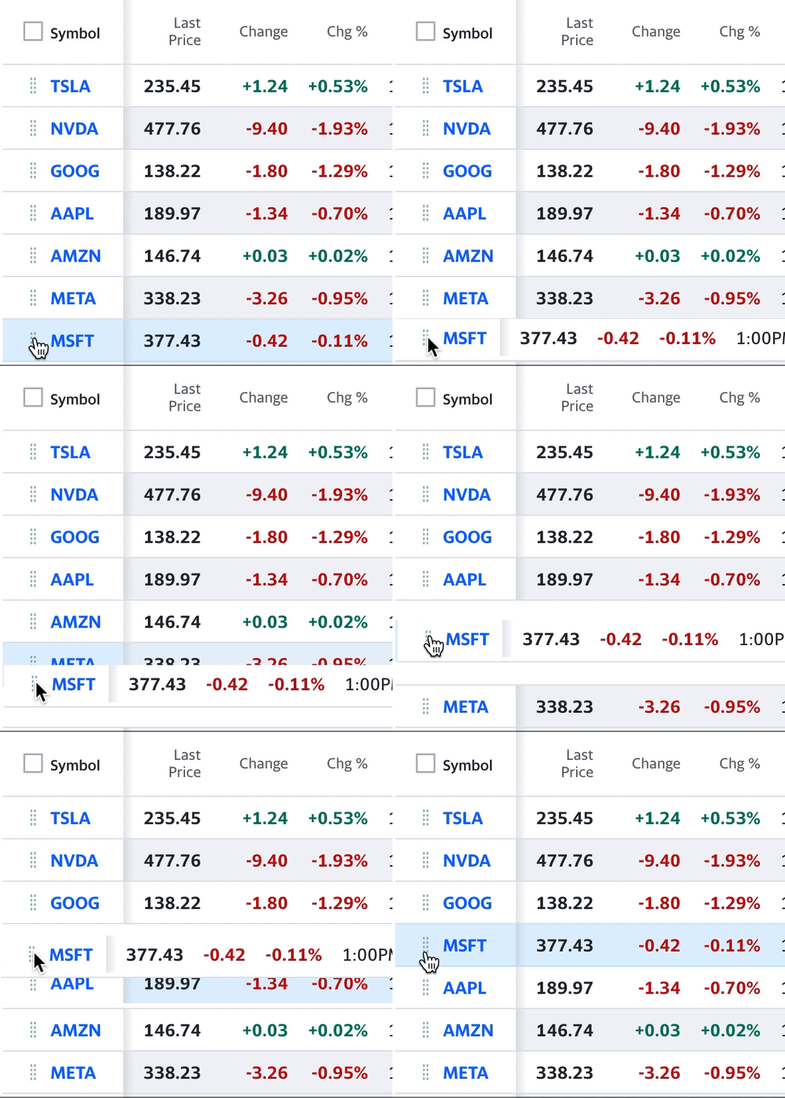
While convenient for most users, drag and drop isn’t accessible for keyboard users. To accommodate keyboard users, provide an alternative to drag and drop so that everyone can have an equal way to reorder list items. This can be done by providing menu options to move list items up or down, which are accessible with keyboards.
Fonts play a big role in creating a visual hierarchy and affect the readability of a list. Play around with different sizes and colors to differentiate list headers, labels, and metadata.
Typically, links adopt a primary color, such as blue, to indicate interactivity. Metadata is often a smaller and lighter font than labels to reduce the initial cognitive load on the user. Aim to make text no smaller than 16px to maintain readability. Secondary text such as metadata are usually 2 to 3px smaller than primary text.
To ensure that your list is accessible to people with low vision or color blindness, check that the colors used for foreground and background have enough color contrast. Use a color contrast checker to test if your design passes accessibility standards.
If you’re looking for a shortcut to create your own lists, I’ve made a Figma list template that you can download. It includes all the best practices we’ve discussed here, and you can tailor it to your project.
Lists come in many variations and forms, but they don’t have to be tricky. Understand the type of list that your design requires, whether it’s a single-line, double-line, or multi-line list with supporting visuals. Use whitespace and dividers to space out list items to support readability. Follow consistent alignment for list content to maintain organization. Most importantly, establish a visual hierarchy for list content so that users can easily understand and consume the most important information first.
Keep in mind accessibility when designing your list, especially when it comes to interactions, such as adding list items or drag and drop. This ensures that all users of any ability will be able to fully use the list. By following these best practices, list design shouldn’t feel so tricky anymore.
Header image source: IconScout
LogRocket's Galileo AI watches sessions and understands user feedback for you, automating the most time-intensive parts of your job and giving you more time to focus on great design.
See how design choices, interactions, and issues affect your users — get a demo of LogRocket today.

Discover how to craft UX-friendly hero sections with examples, design tips, and strategies that drive engagement and conversion.

While Apple’s Liquid Glass can’t yet be perfectly recreated with CSS or Figma, we can still think about how to adopt the effect thoughtfully in our designs.

Figma Make is here to automate your design-to-code workflow. I tested it. Let’s talk about the good, the bad, and the straight-up weird.

After designing AI search systems, I’ve seen what builds trust — and what kills it. Here’s my take on what really works.